.avif)
INSPIRED
Office
Latvia
Riga, Latvia
2011
Maris Lagzdins, Didzis Grodzs
Office
LAYOUT1
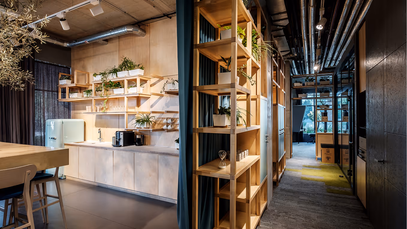
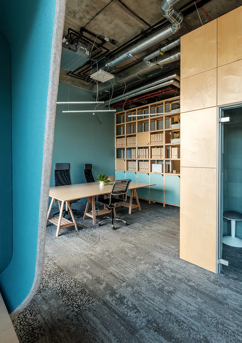
This interior was designed for a bold, fast-paced creative agency, with both sustainability and imagination at the core.
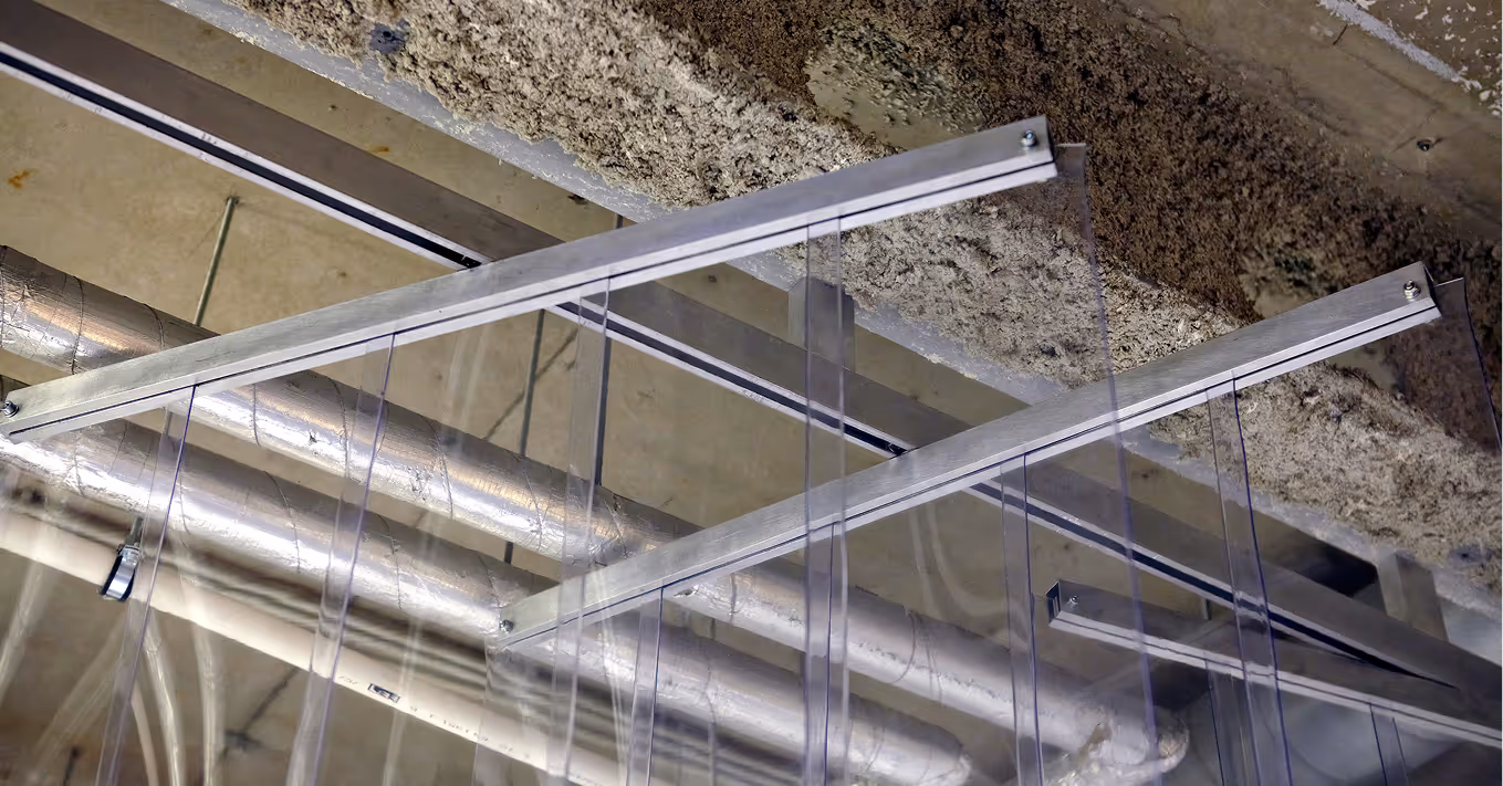
We explored unconventional, budget-friendly materials to create something visually striking yet responsibly sourced. Cardboard tubes form the reception desk, semi-transparent industrial plastic divides the space, and quiet zones or meeting pods are wrapped in layers of old newspapers.)
A space that reflects the energy of its users - raw, honest, and not afraid to challenge the status quo.
.avif)
.avif)
LAYOUT2
.avif)
.avif)
.avif)
.avif)

HANNER
Office
Latvia
Riga, Latvia
2016
Andrey Nikiforov
Office
Hanner
LAYOUT1
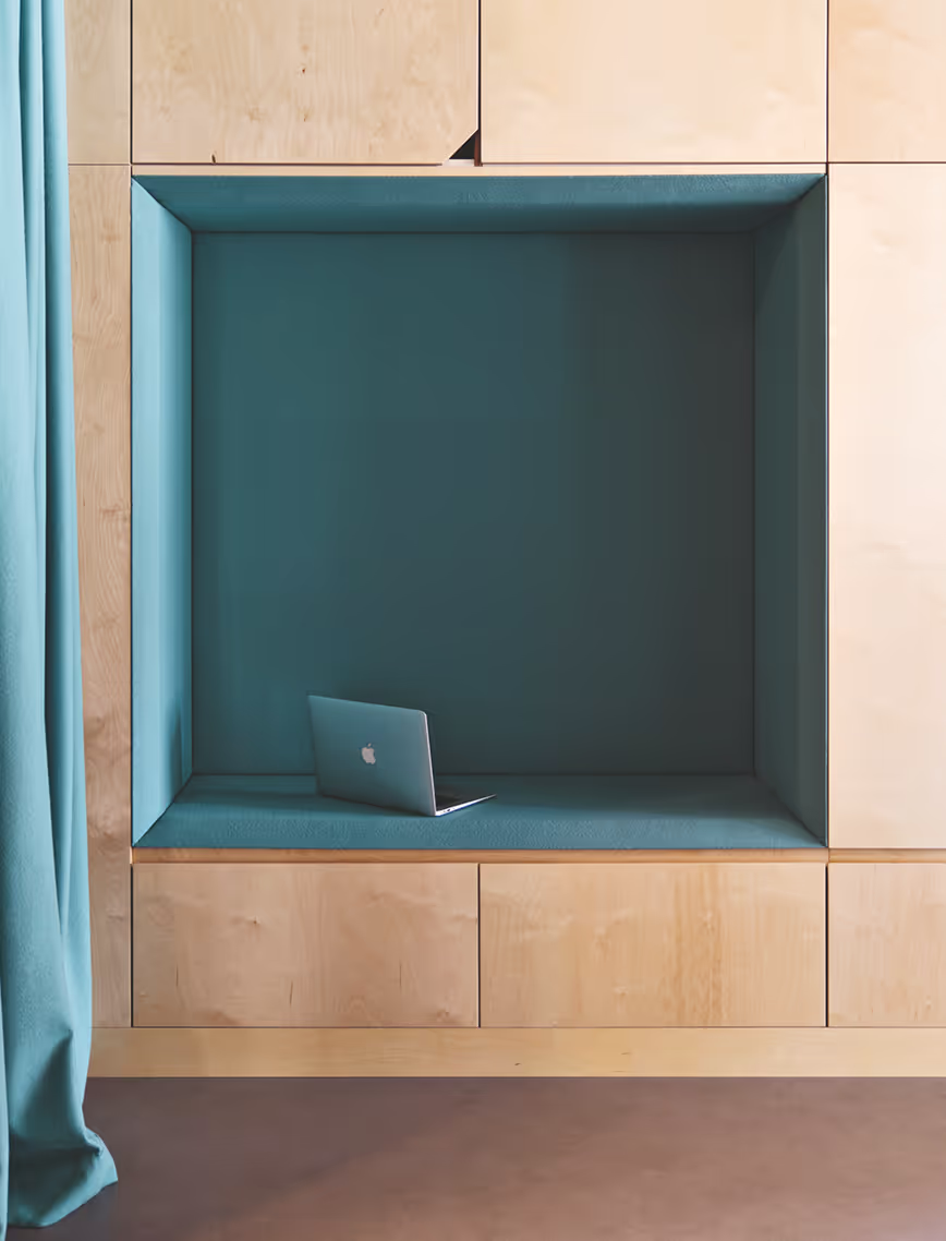
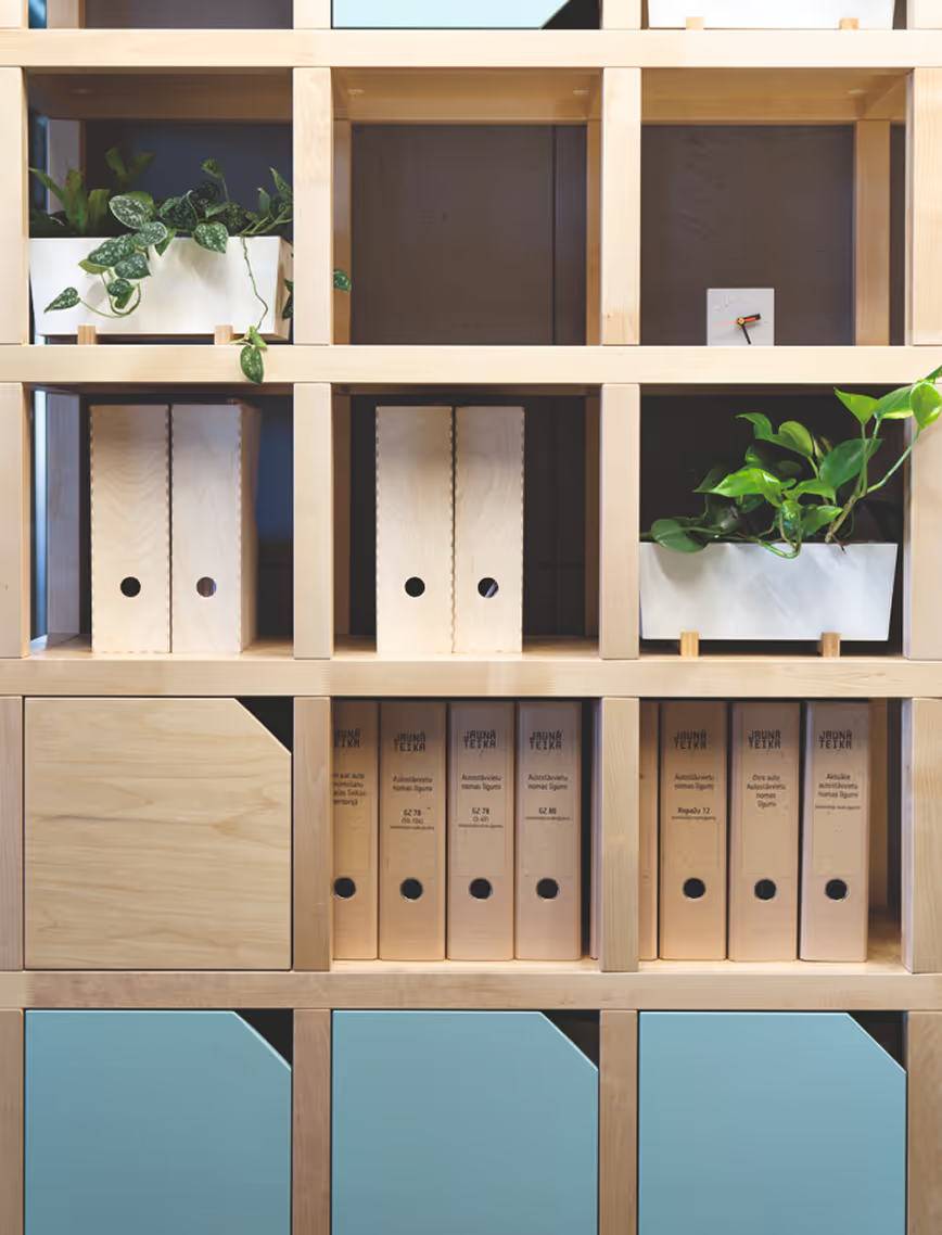
The office interior of real estate developer Hanner is rooted in the activity-based concept. At its core, this is an open plan office without fixed workplaces, allowing employees to start every morning at a different desk. Wood and ascetic yet warm aesthetics dominate the interior. The layout is developed in a way that encourages communication and exchanging ideas. The interior expresses the characteristics of the team – dedicated, creative and full of ideas.
.avif)
LAYOUT2
.avif)
LAYOUT3
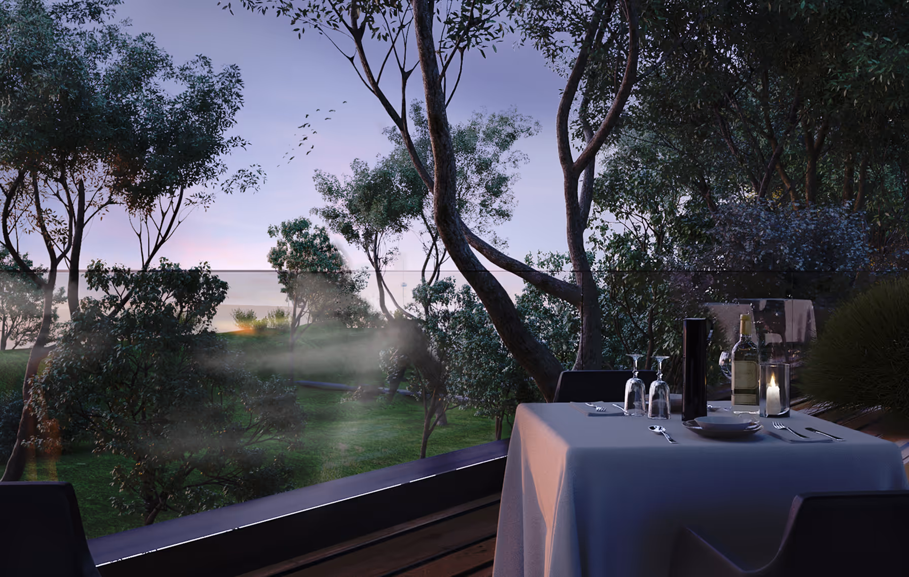
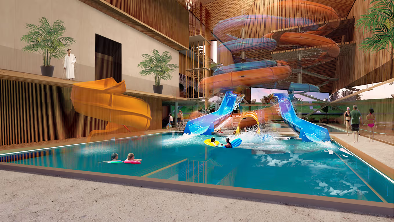
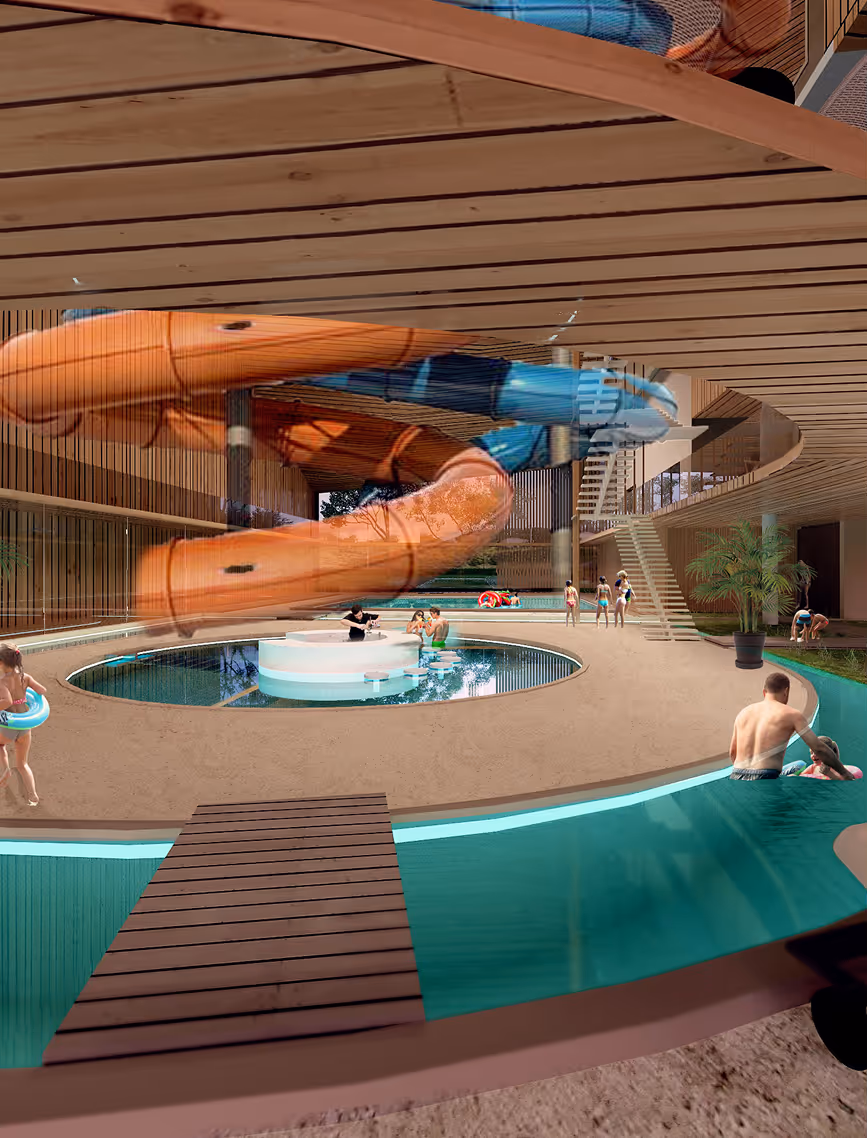
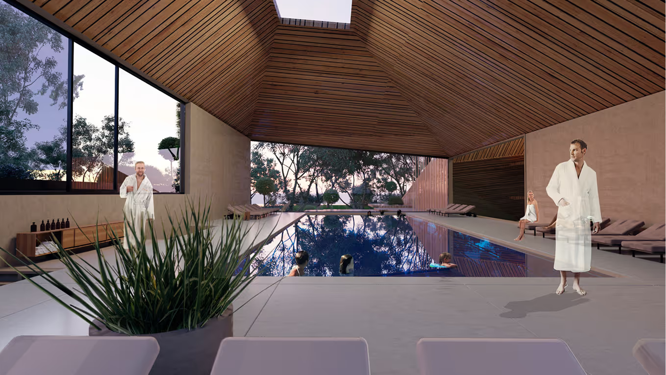
WATER PARK HOTEL
SPA Hotel
Latvia
Liepaja, Latvia
2016 (Idea Proposal)
SPA Hotel
Olga Ponomarjova
LAYOUT1
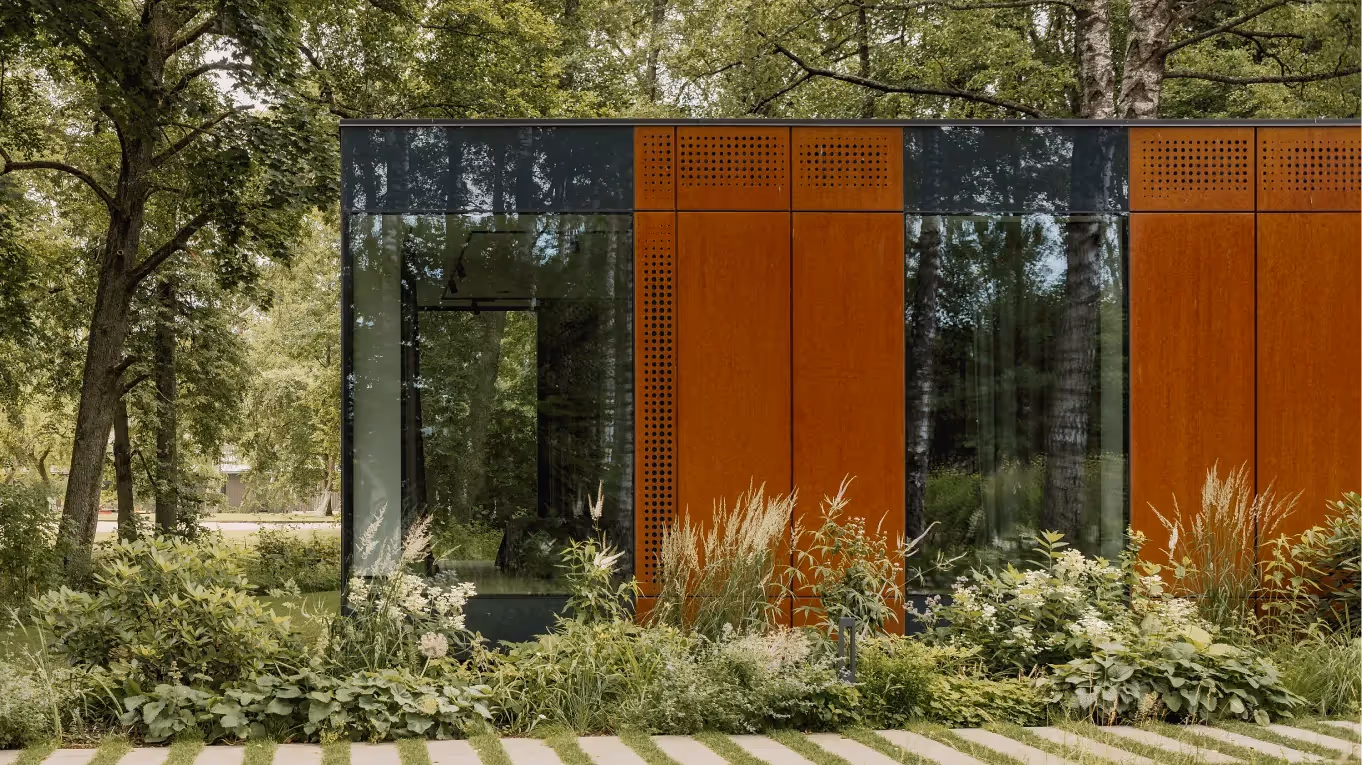
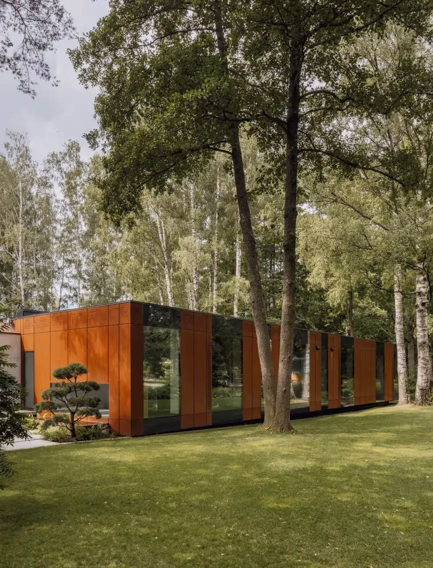
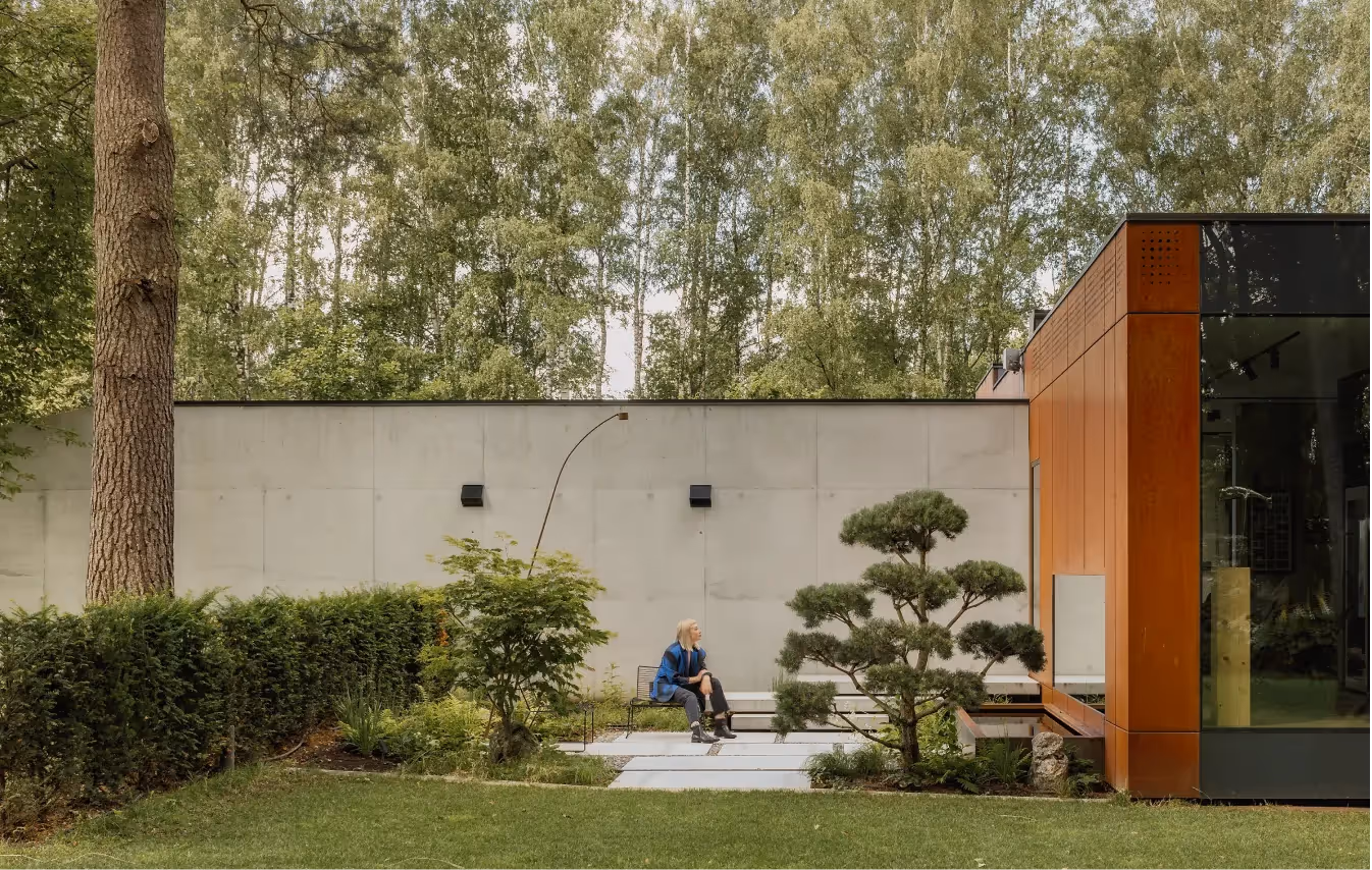
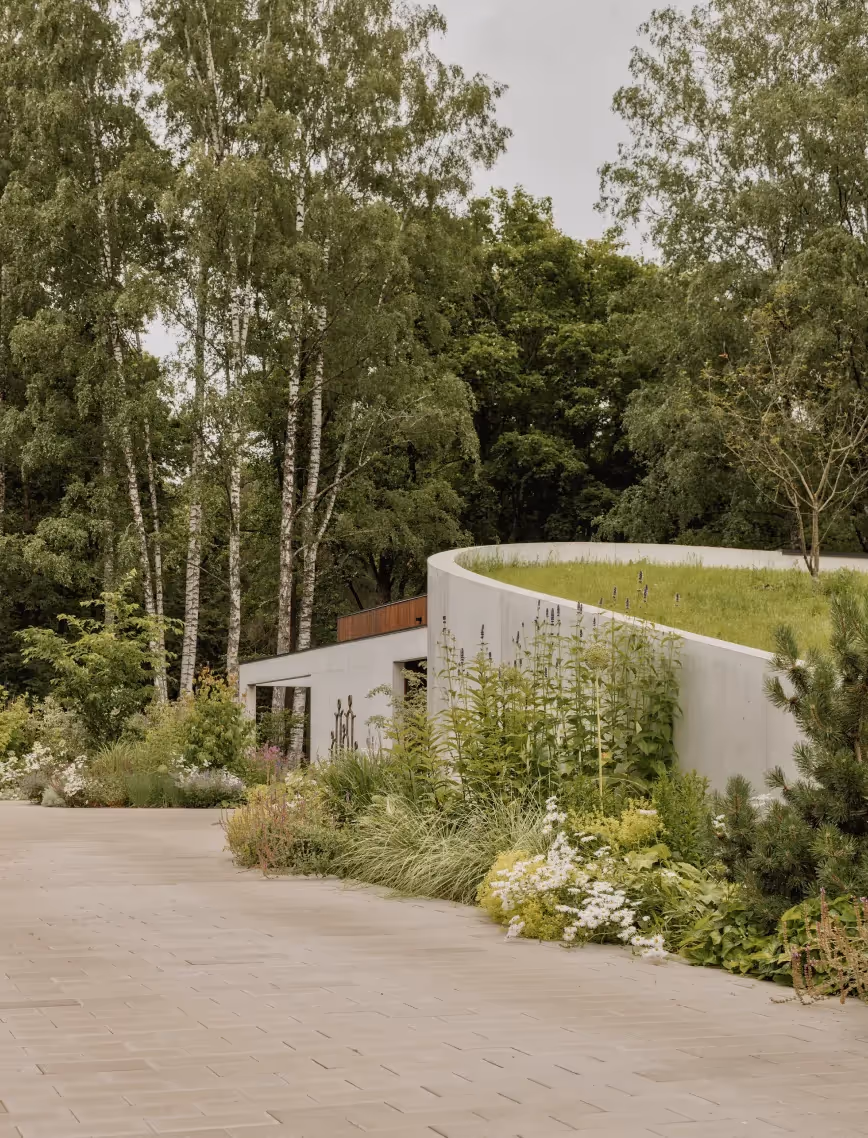
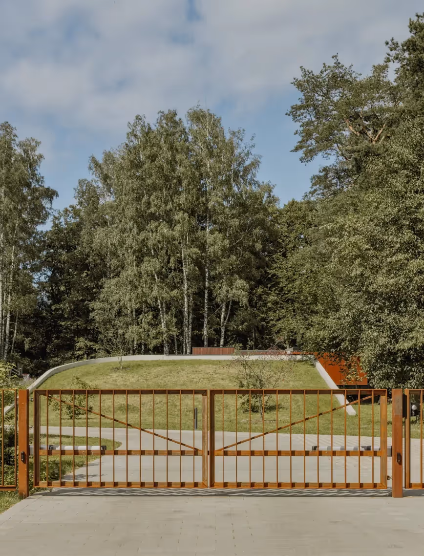
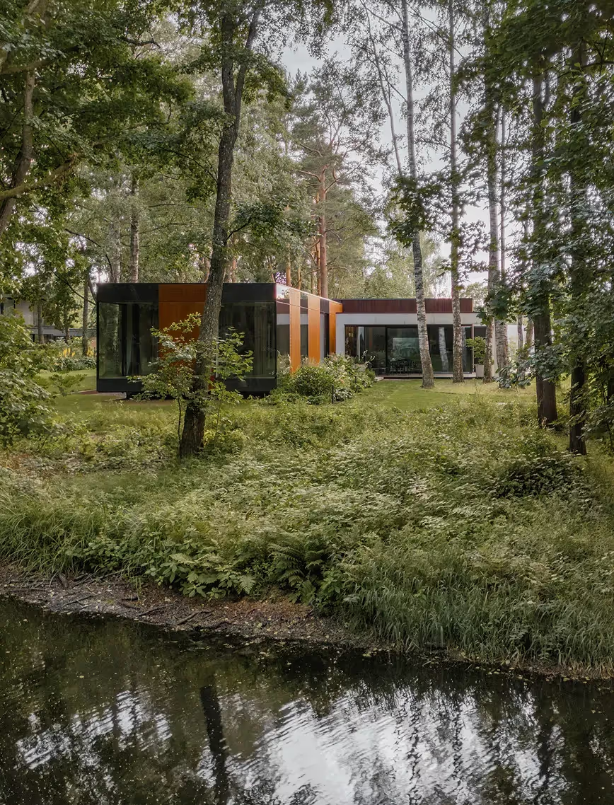
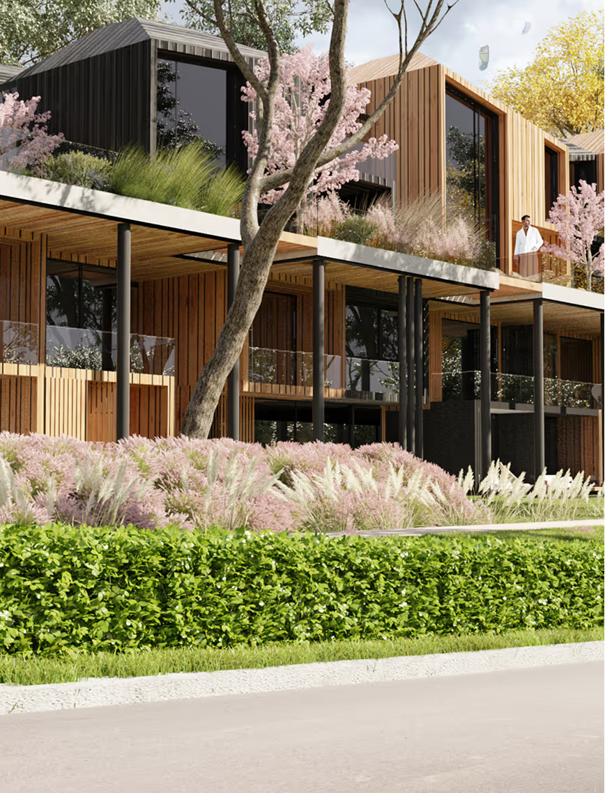
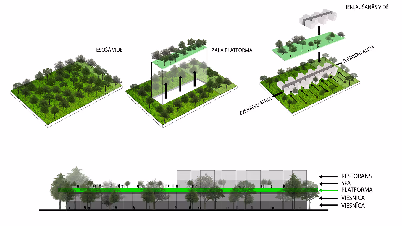
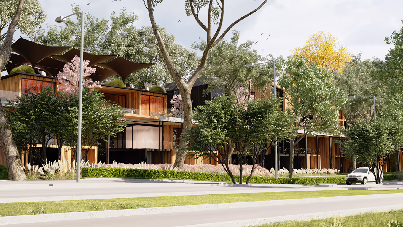
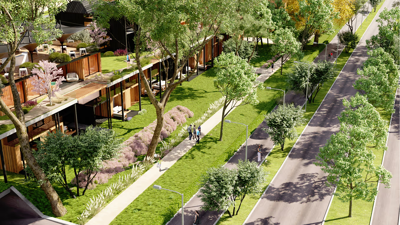
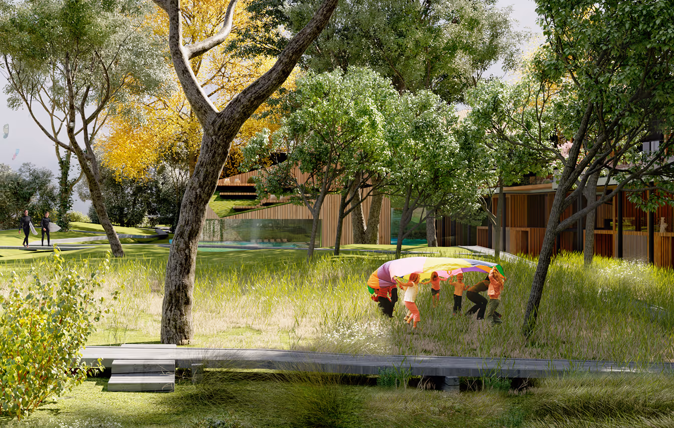
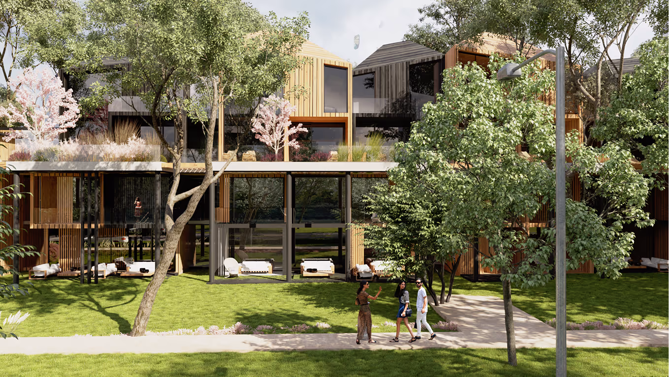
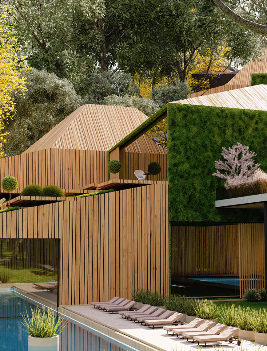
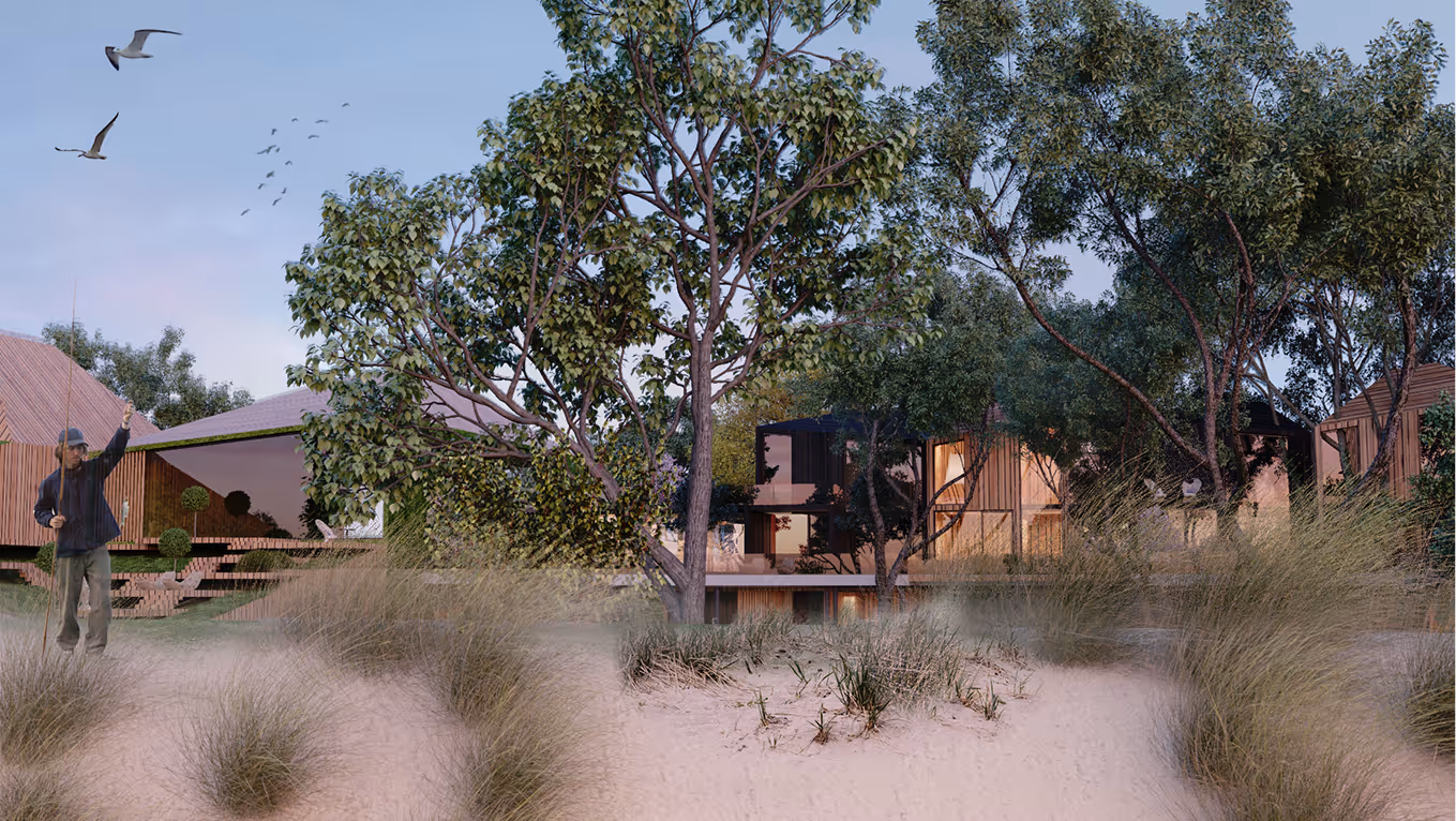
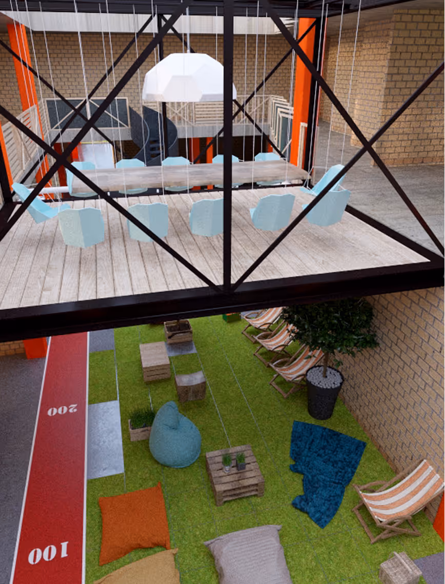
A winning concept for Rietumu Banka, this project reimagines the relationship between architecture, nature, and the user experience.The design lifts a vast green platform high above ground level, as if a slice of earth was cut out and set to float. All supporting structures are tucked underneath, allowing the levitating landscape above to remain untouched, light, and open.The built environment is intentionally low-rise to preserve the most important design value: the view. Capturing expansive sightlines and feelings from the surrounding nature, the project lets you feel immersed in the landscape, not removed from it.
.avif)
LAYOUT2
.avif)
LAYOUT1
.avif)
LAYOUT2
.avif)
LAYOUT2
.avif)

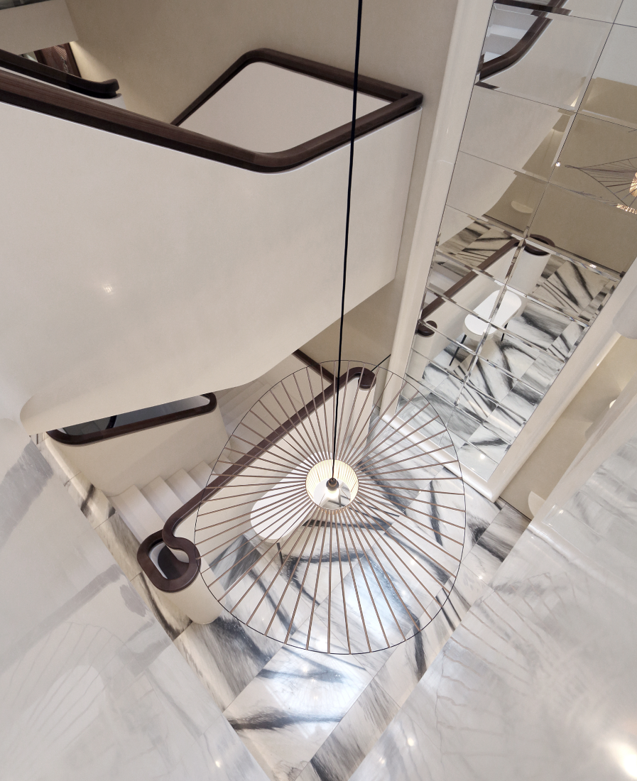
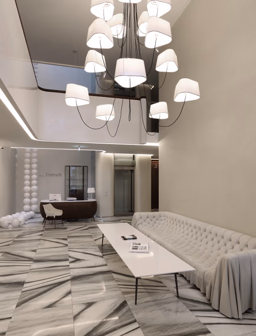
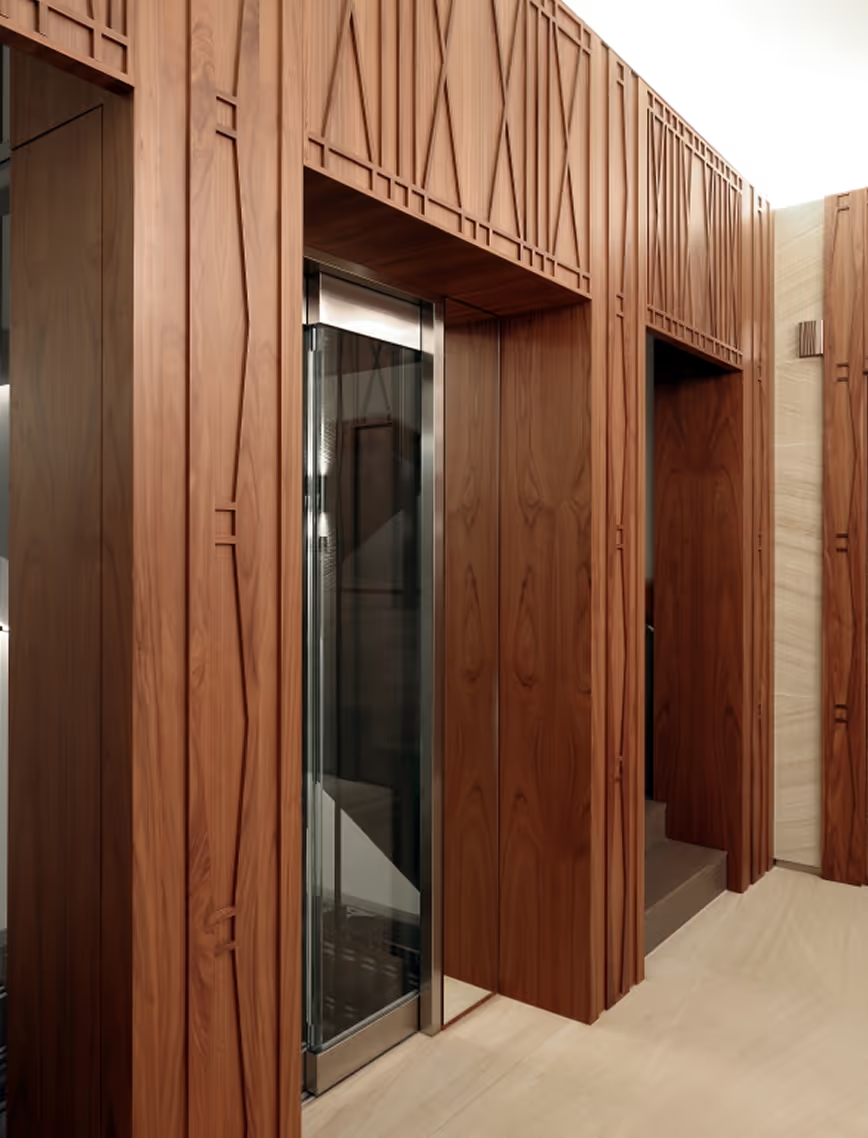
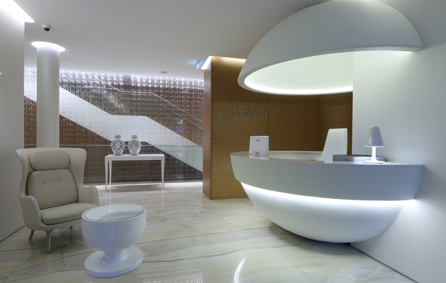
LEGEND
Lobby
Latvia
Jurmala, Latvia
2015
Maris Lapins
Lobby
R.evolution
LAYOUT1
The project Legend contains of multiple villas that each are seeking it’s inspiration from one of historic icons. The sublime Villa Dietrich is laconic and mysterious. The fused tinted glass of the building facades acquires texture, plays and sparkles in the sun as the luxurious outfits of Marlene Dietrich. The architect uses classical balustrades on balconies and the traditional building material of wood, typically characteristic of the Jurmala architecture.
LAYOUT2

LAYOUT2
.avif)
Creators of the project spent a long time picking a personality for the main building of the apartment block. On the one hand, it had to be an absolute leader in life, on the other hand, a gourmand of life, connoisseur of art. Winston Churchill - a politician, an artist, and a writer possesses these qualities as no one else.
LAYOUT1

LAYOUT2

LAYOUT3
Villa Hepburn. The building dedicated to Audrey, like herself, is penetrated by light; it elegantly and organically combines with the classical architecture of Jurmala.

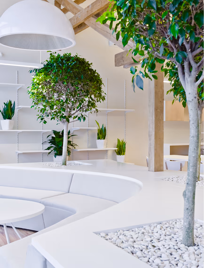
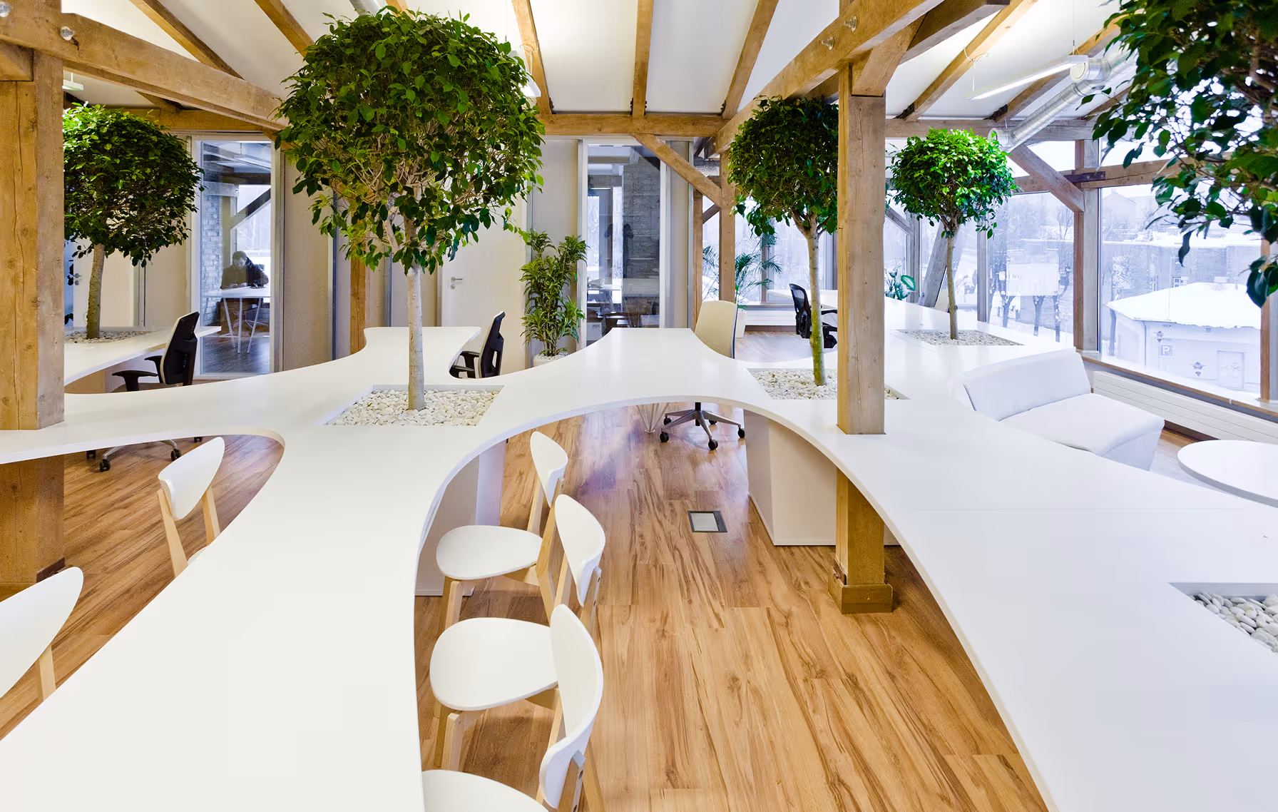
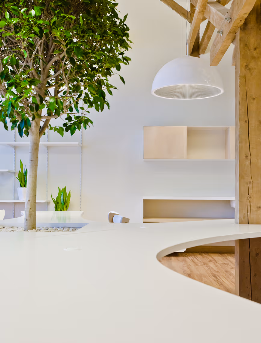
GREENHOUSE
Office
Latvia
Riga, Latvia
2012
Maris Ligzdans
Office
LAYOUT1
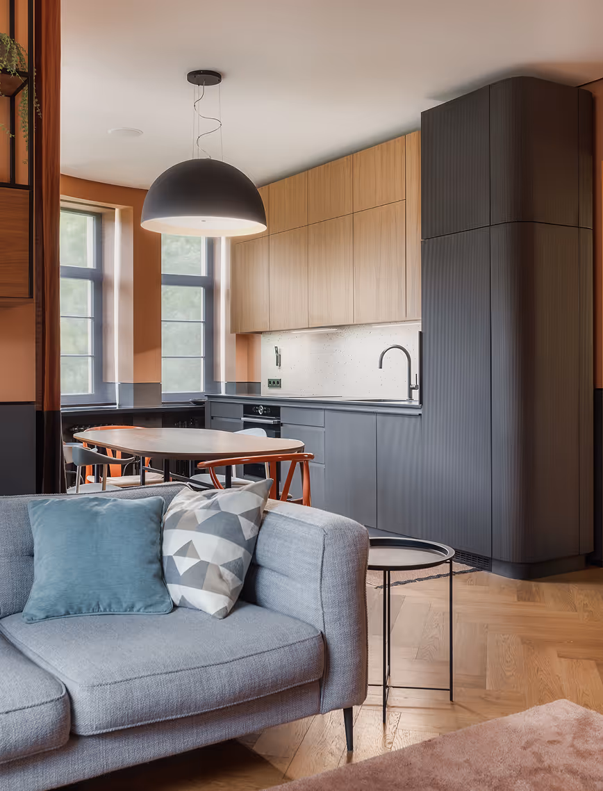
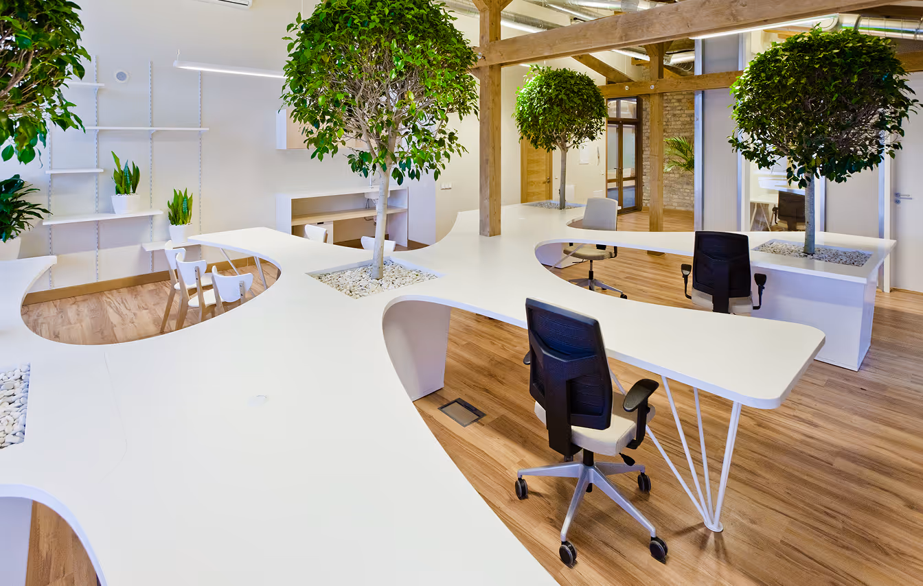
The space allowed us to embrace the open-office concept. Only some groups of employees have individual offices. The open-plan area is focused around one key piece of multifunctional furniture. It consists of desk space, a rest area with sofa, a dining area and special places for the larger plants.
.avif)
LAYOUT2

LAYOUT1
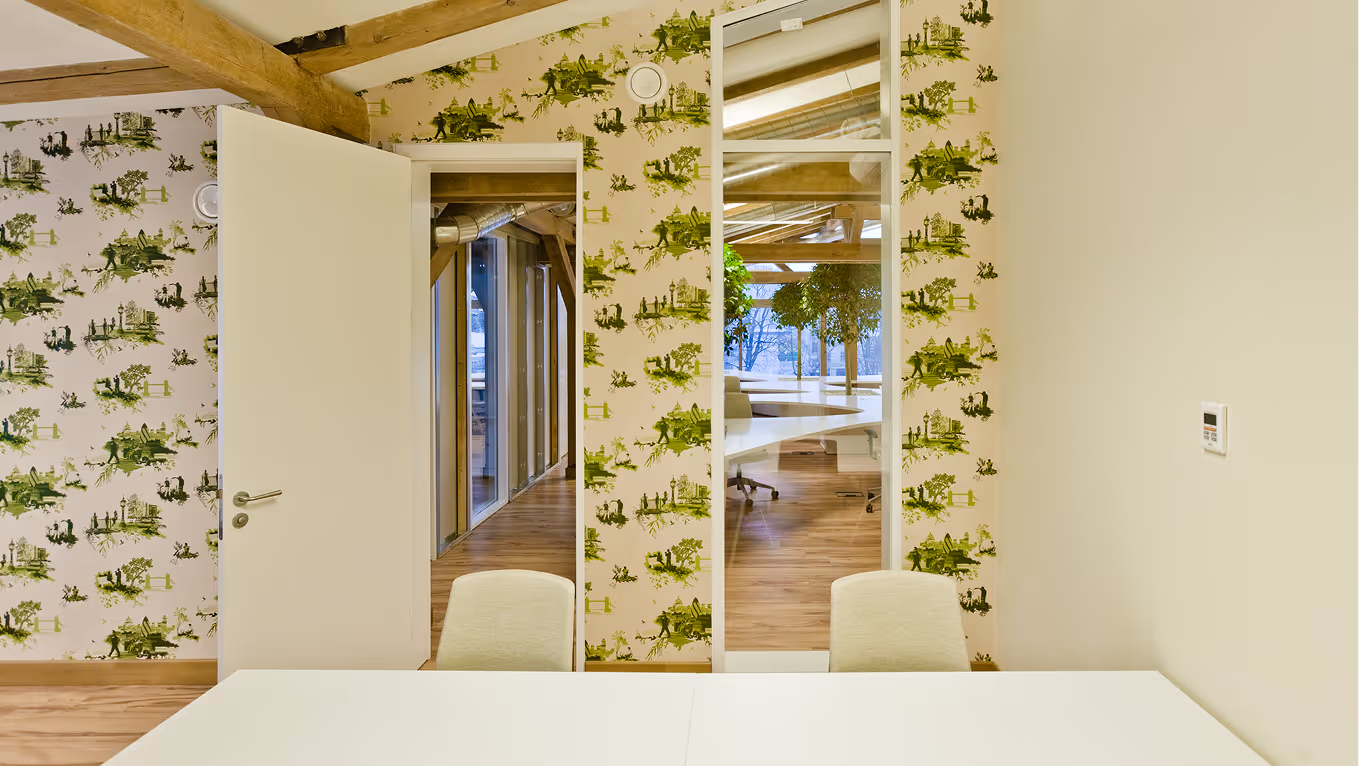
We painted the walls white and left some parts of the brick wall exposed. In the closed office spaces, we used the London Toile wallpaper from the Timorous Beasties series.
.avif)
MUNIO
Pop-Up Store
Latvia
Riga, Latvia
2014 (Idea Proposal)
Pop-Up Store
Aivars Taubers
LAYOUT1
We designed a minimalist pop-up store for Munio, a local candle brand, right in the heart of the city.
The space features large display windows that frame the product beautifully and give the store a gallery-like presence. For the first time, Munio also introduces their interior product line, allowing visitors to step into a world shaped by their signature aesthetic: calm, clean, and rooted in nature.
.avif)
.avif)
.avif)
LAYOUT2
.avif)
.avif)
.avif)
.avif)
LEGEND BEACH
Beach Club
Latvia
Jurmala, Latvia
2014
Maris Lapins (Property of the Developer)
Beach Club
R.evolution
LAYOUT1
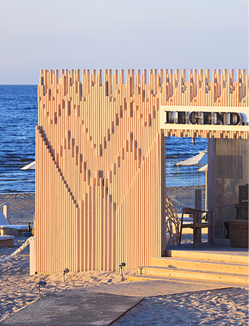
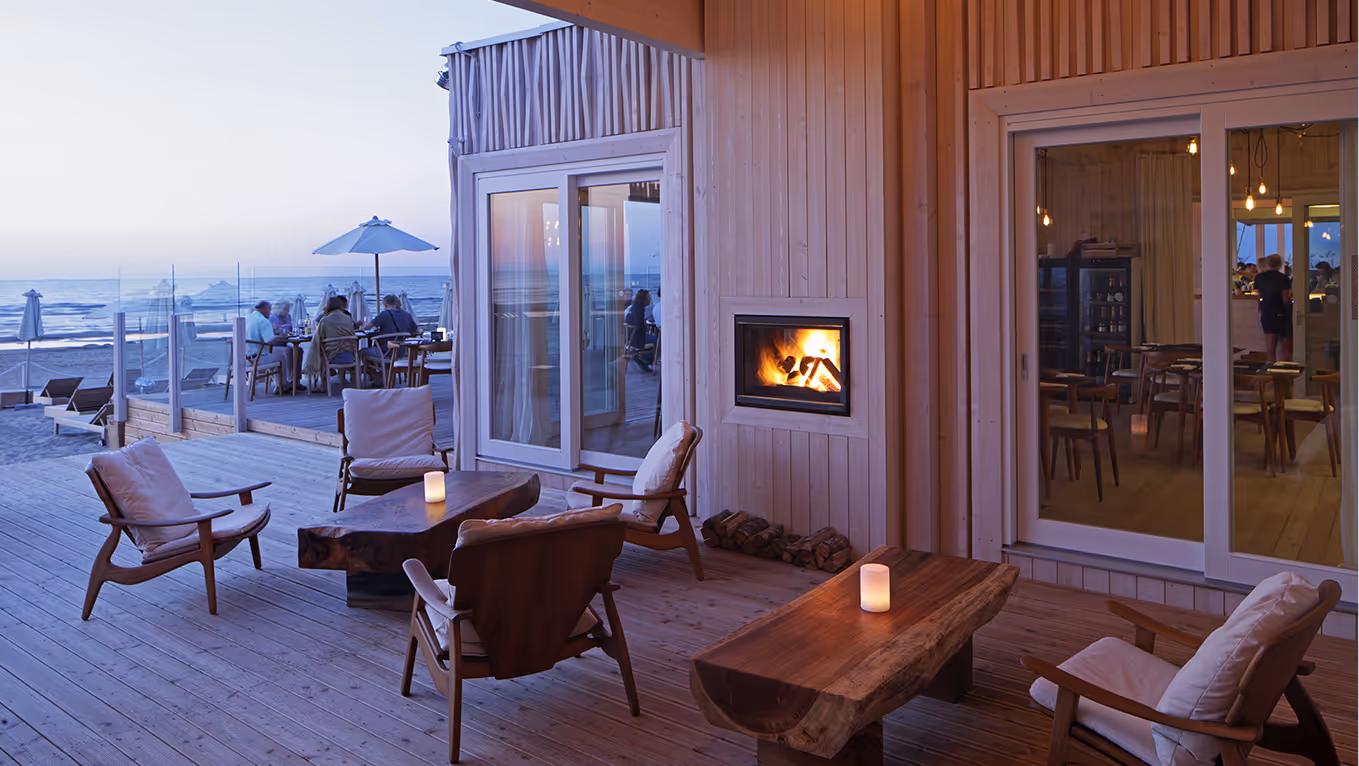
This beach club is part of Legend residential neighbourhood. Within the beach area stretching for 150 meters there is a recreation complex that will include a swimming pool, showers, lounge chairs, umbrellas and tents, a bar, and a restaurant. A pleasant and comfortable addition to the mandatory white sand, amazing beauty of sunsets and the sea breeze permeated by pine aroma.
.avif)
LAYOUT2
.avif)
.avif)
.avif)
.avif)
.avif)
.avif)
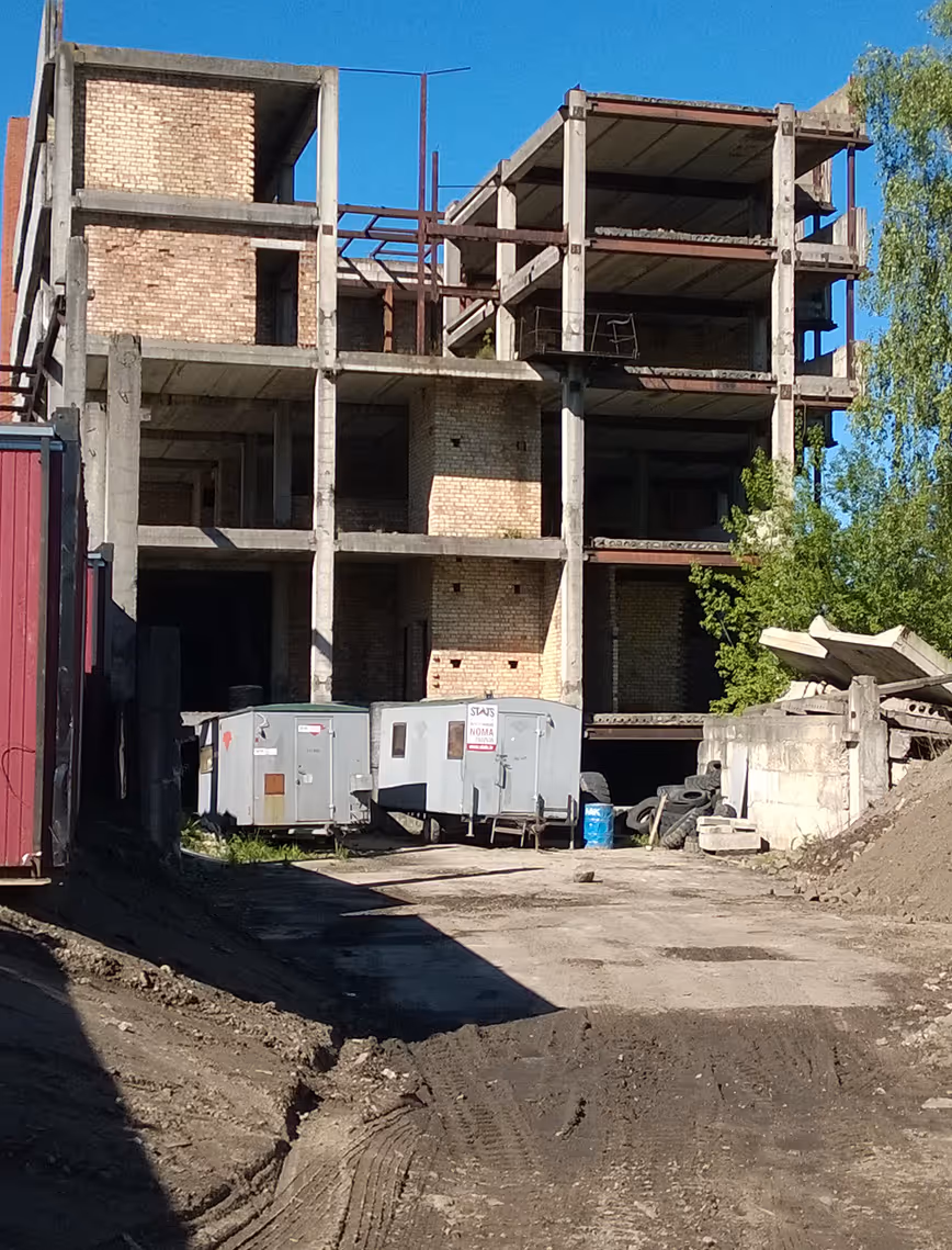
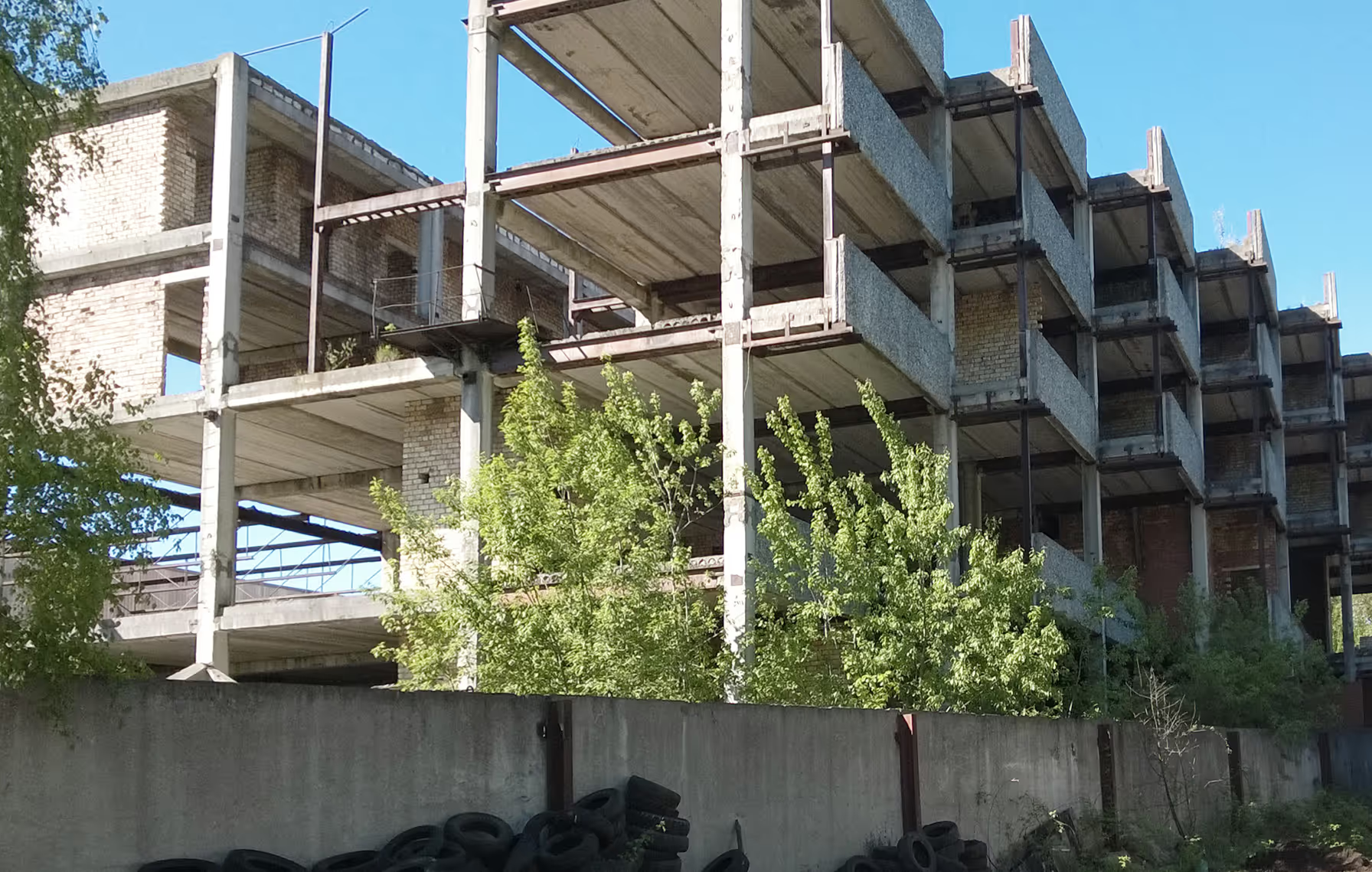
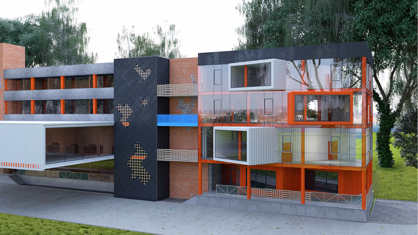
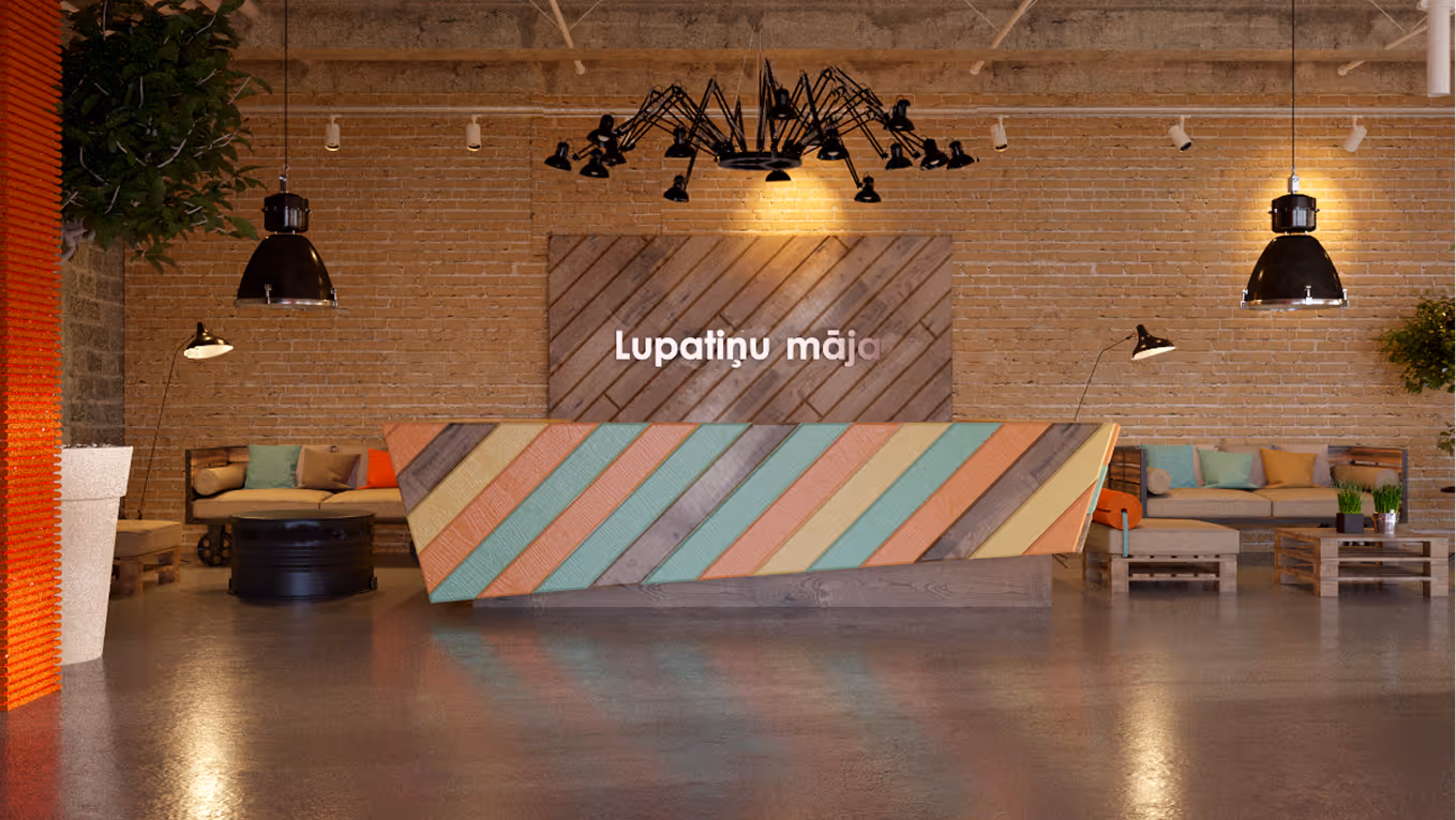
LUPATINAS
Office Complex
Latvia
Riga, Latvia
2015 (Competition Proposal)
Maris Ligzdans
Office Complex
Māris Alberts, STATS
Olga Ponomarjova
LAYOUT1
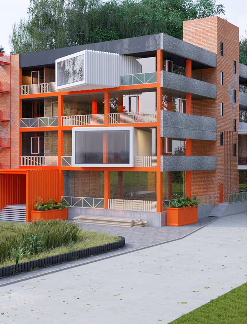
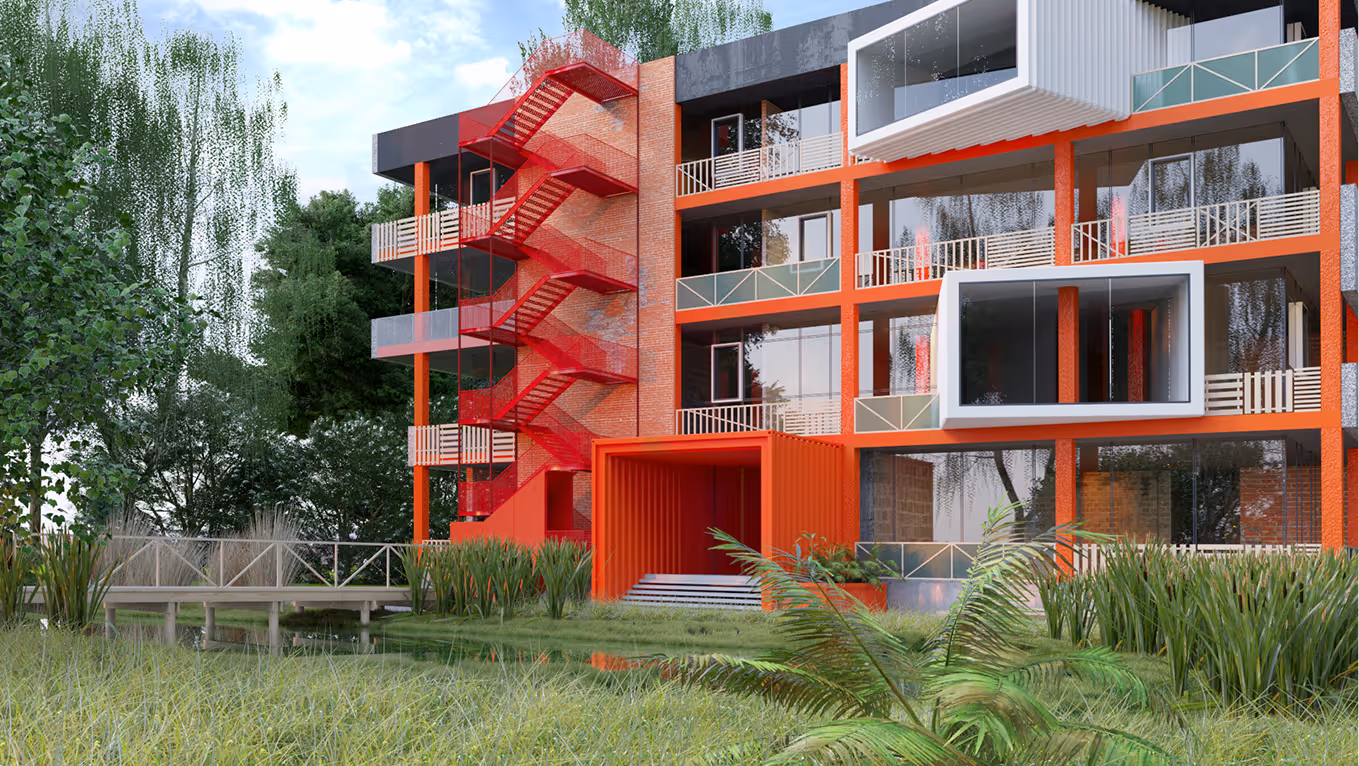
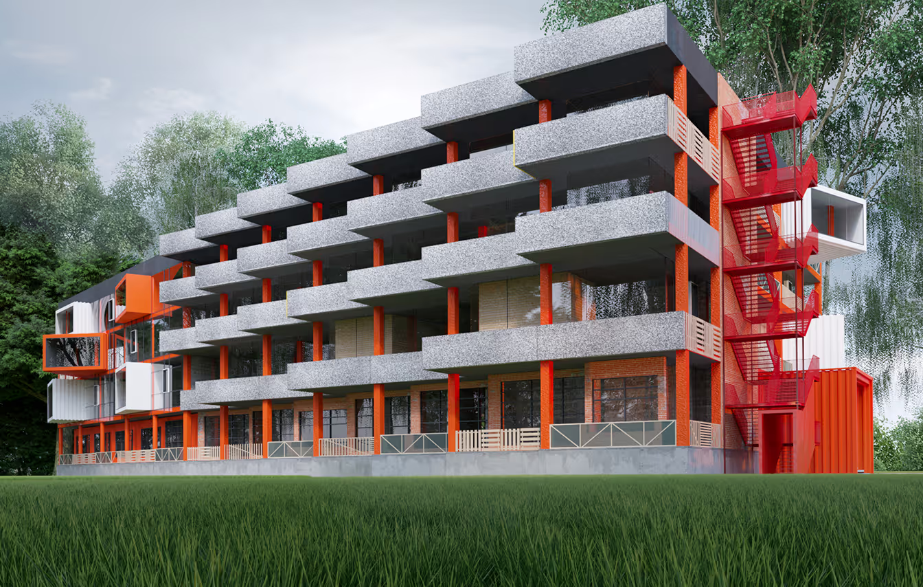
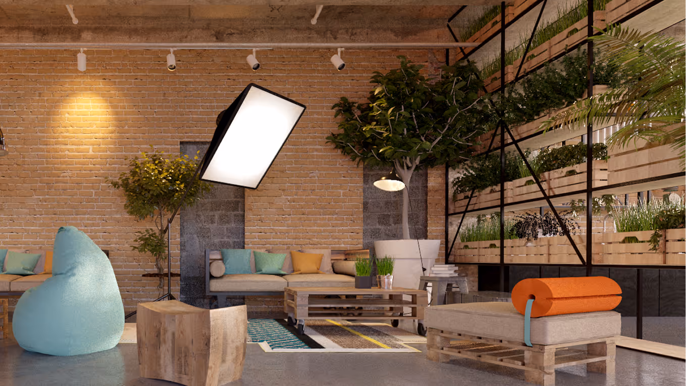
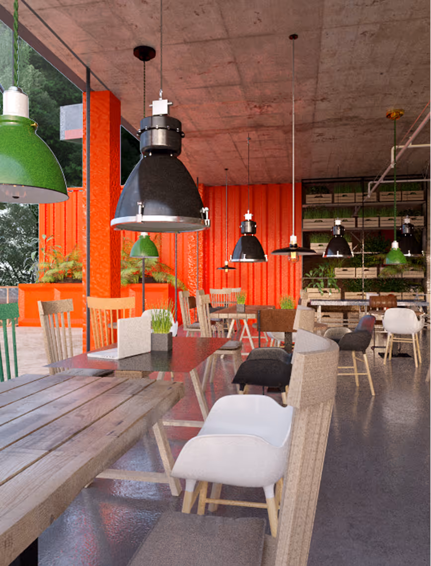
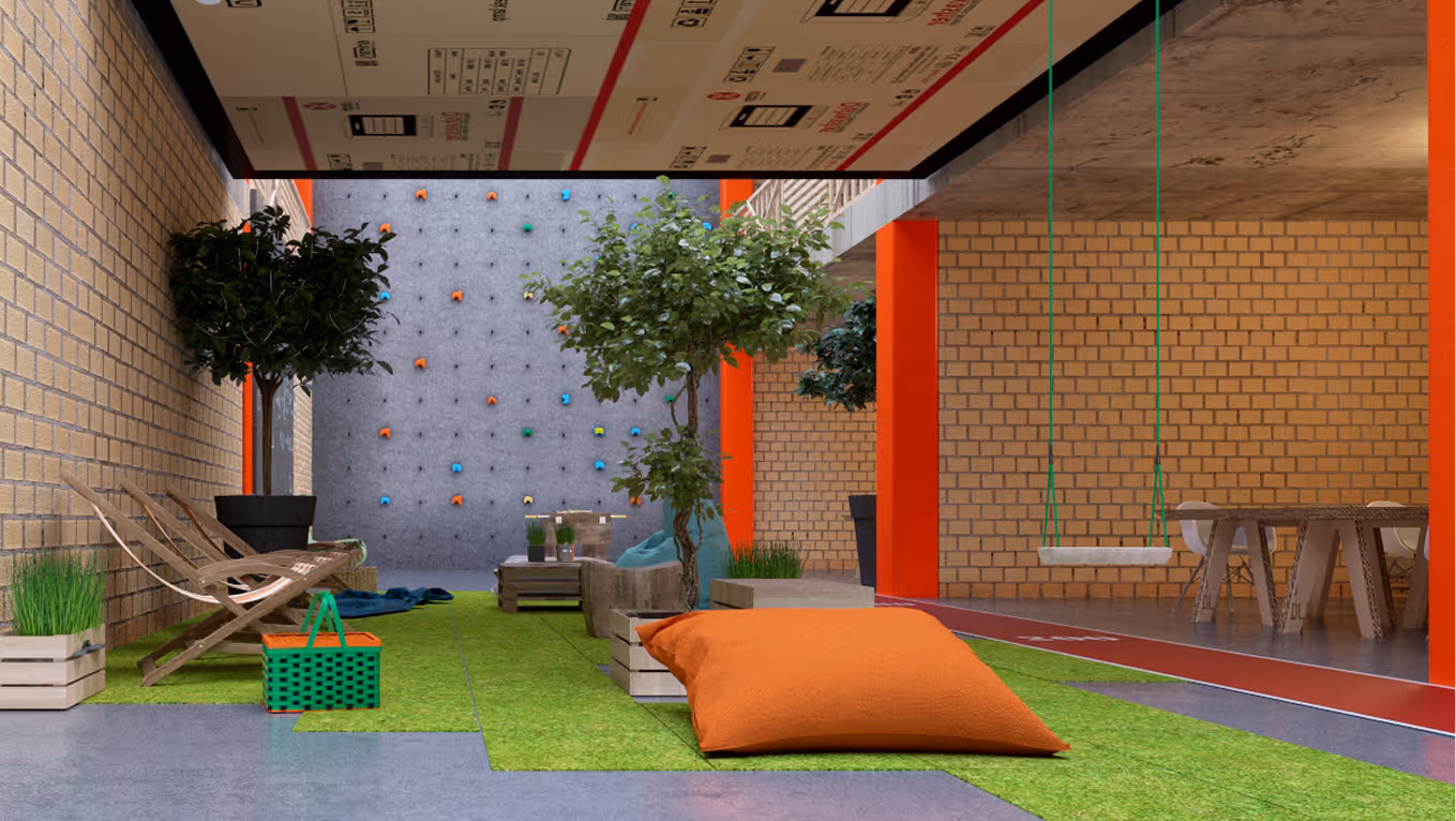
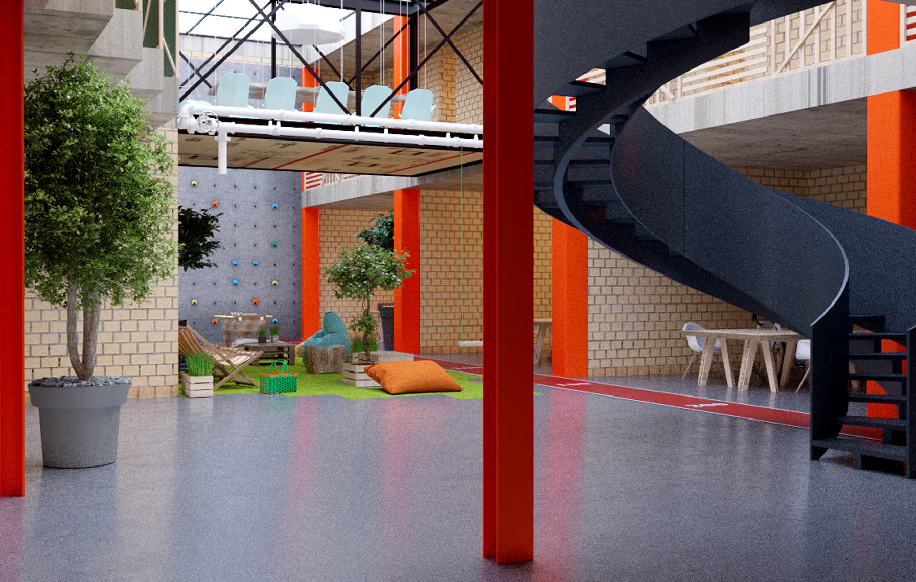
This house concept is a bold experiment in Trash Architecture, an architectural movement that embraces reuse, imperfection, and post-consumer aesthetics. Inspired by the patchwork quilts our grandmothers used to weave from leftover fabric, Lupatiņi takes a similarly tender and rebellious approach to Soviet-era architecture. By “patching up” existing structures and inserting repurposed shipping containers into the typology, the project becomes a stitched-together narrative of memory, utility, and resistance to waste. Rather than demolish what’s outdated, we repair - layer upon layer, container by container. With a clear low-budget agenda, the project is a raw, honest take on contemporary living in a post-consumer world. It doesn’t try to hide its scars; it celebrates them.
.avif)
LAYOUT2

LAYOUT1
LAYOUT1

LAYOUT2
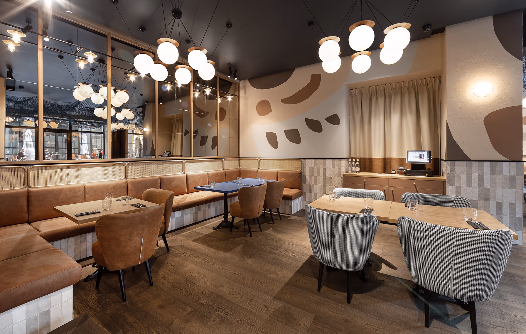
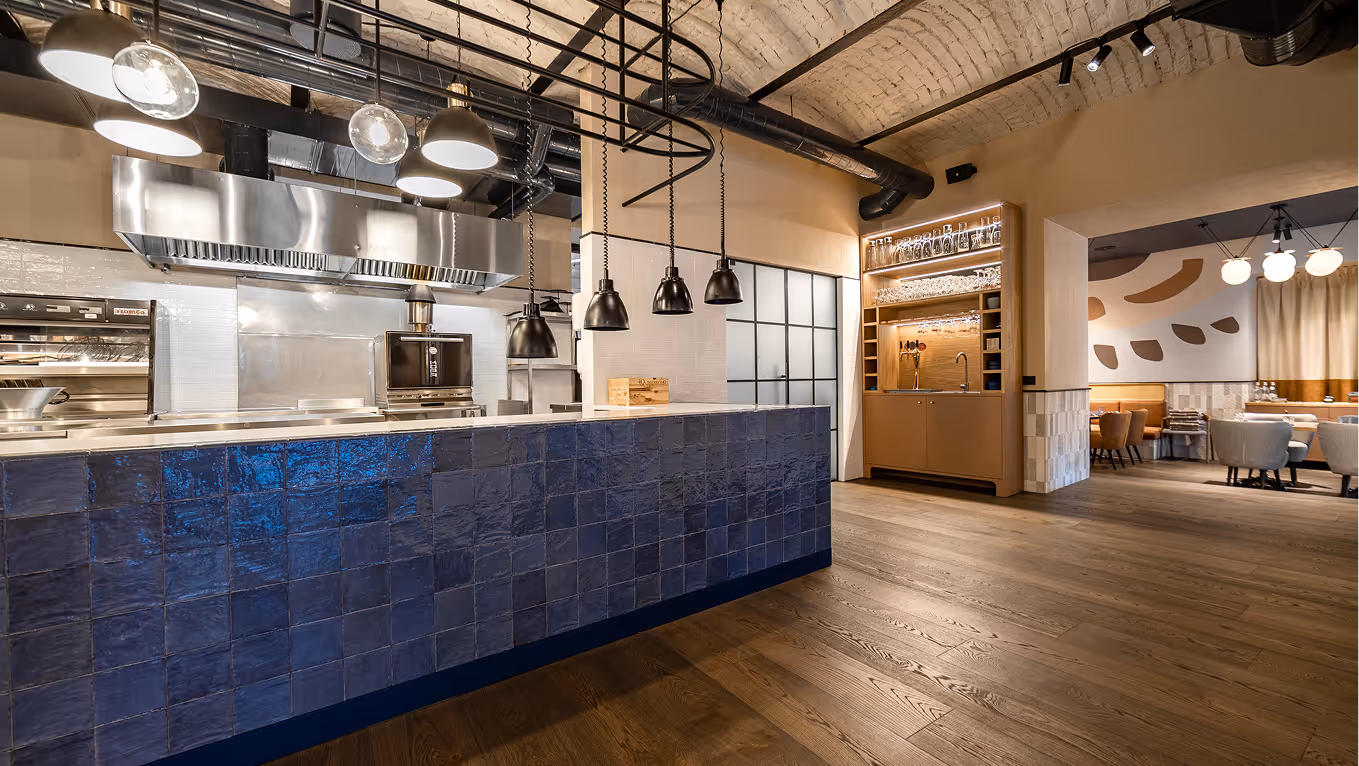
RIT'S CHIPPY
Restaurant
Latvia
Riga, Latvia
2021
Klavs Loris
Restaurant
LAYOUT1
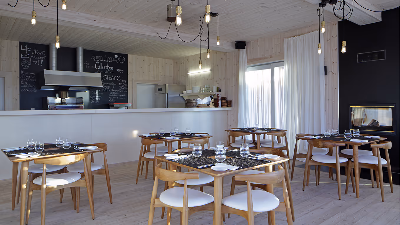
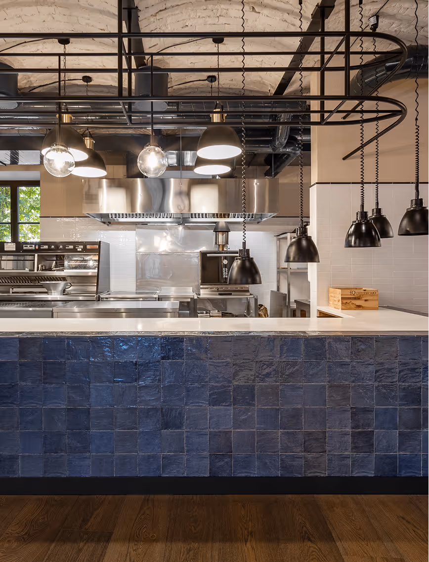
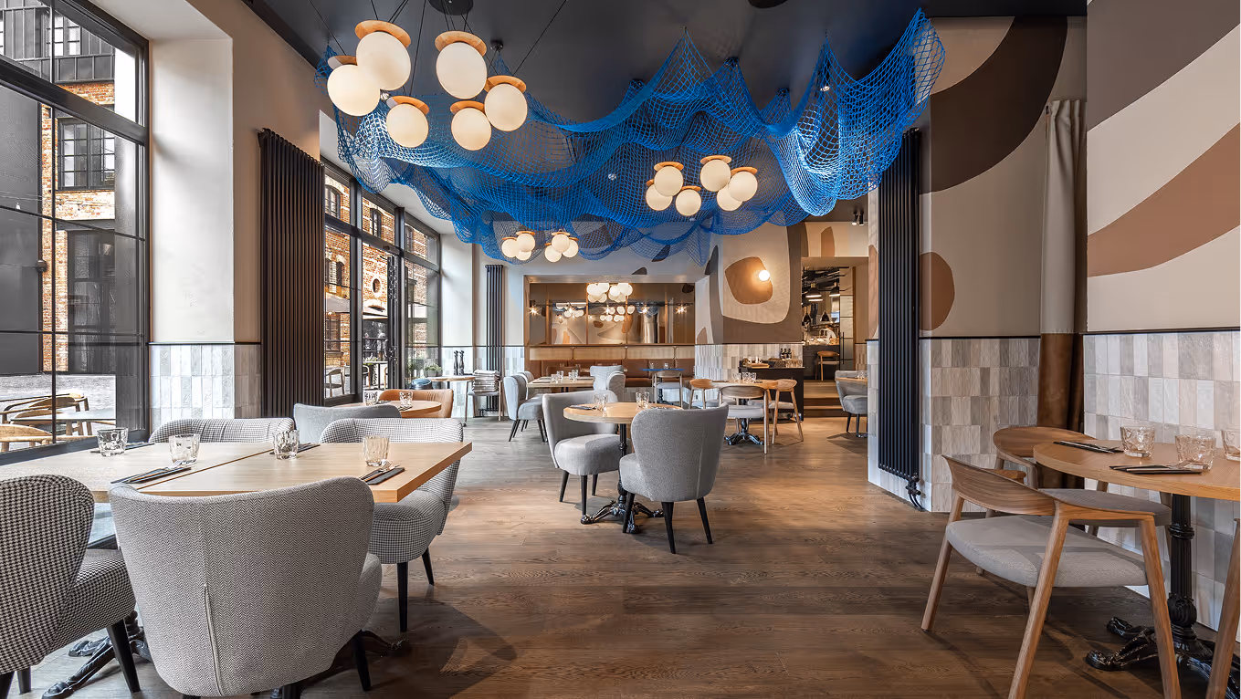
Rit’s Chippy serves seafood in an informal setting and its signature dish is, unsurprisingly, fish and chips. The restaurant is divided into zones, where one is intended for quick bites and collecting takeaways, and the other for unhurried meals and shared experiences. References to the sea and fishing industry permeate the interior, such as glossy tiles with a wavy texture, blues and the colour of sand, a ceiling decor made of netting, and themed murals. The open kitchen is inspired by the chippies of the British seaside while the dining room is informed by casual French brasseries. The original ceiling vaults are a good fit and keep the building’s story alive: it dates back to the 19th century and has an industrial past.
.avif)
LAYOUT3
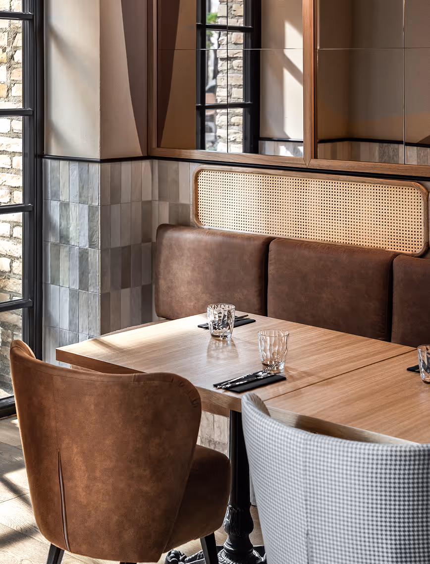
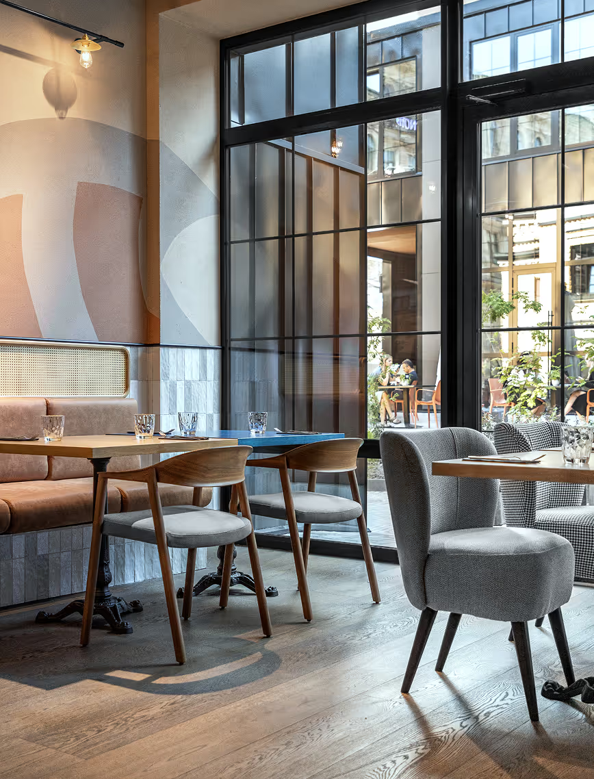
Part of the furniture is custom-designed and built for the location and specific business needs, and is complemented with pieces from Pedralli.
Considering the large concentration of cafes and restaurants in the area, the interior is vital to attracting customers. Together with the eatery’s name, the parts of the interior seen through the window reveal the philosophy of the place and its menu without the need for loud means of advertising.

LAYOUT1