JUR53
Apartment Building
Latvia
Jurmala, Latvija
2022 - ongoing
Apartment Building
R.evolution
Jūras iela, Juras
Olga Ponomarjova, Sergejs Zarovnijs
LAYOUT1
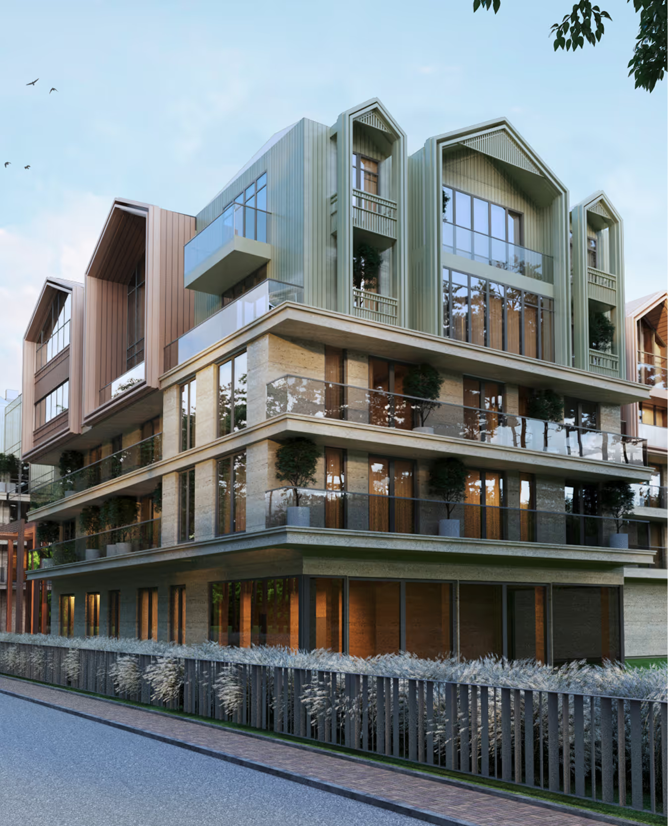
This concept builds on the existing structure of a private home, expanding its volume while preserving and respectfully integrating the original. Located in Jūrmala’s historical zone, the project responds to the area’s distinctive atmosphere and vernacular rhythm. What emerges is a contemporary residence that feels like a cluster, as if several rooftops have been composed into one harmonious whole. A subtle nod to the surrounding architectural language, carefully reimagined within a cohesive complex.
.avif)
.avif)
.avif)


PELEKAIS
Hotel
Latvia
Pavilosta, Latvia
2017 (Competition Proposal)
Hotel
OTTO
Olga Ponomarjova
LAYOUT1
I am PELEKAIS. The Grey. I am grey as a baby mouse. I am grey as a bird, as a speck of dust, as ashes. I am the Speck of Dust.
Only because of me can other colours light up.
I am almost the most important colour.
Everything turns beautiful only when I am placed beside. (The Grey, a tale by Latvian poet Imants Ziedonis)
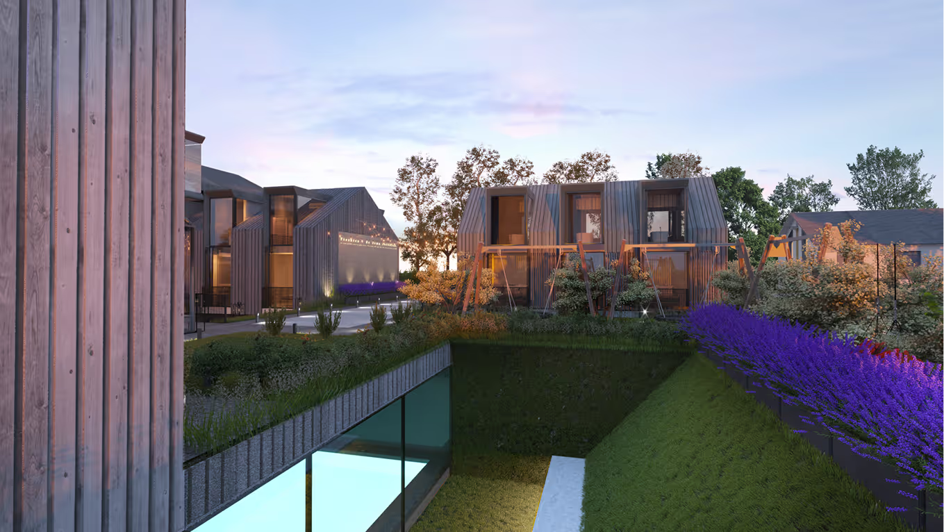
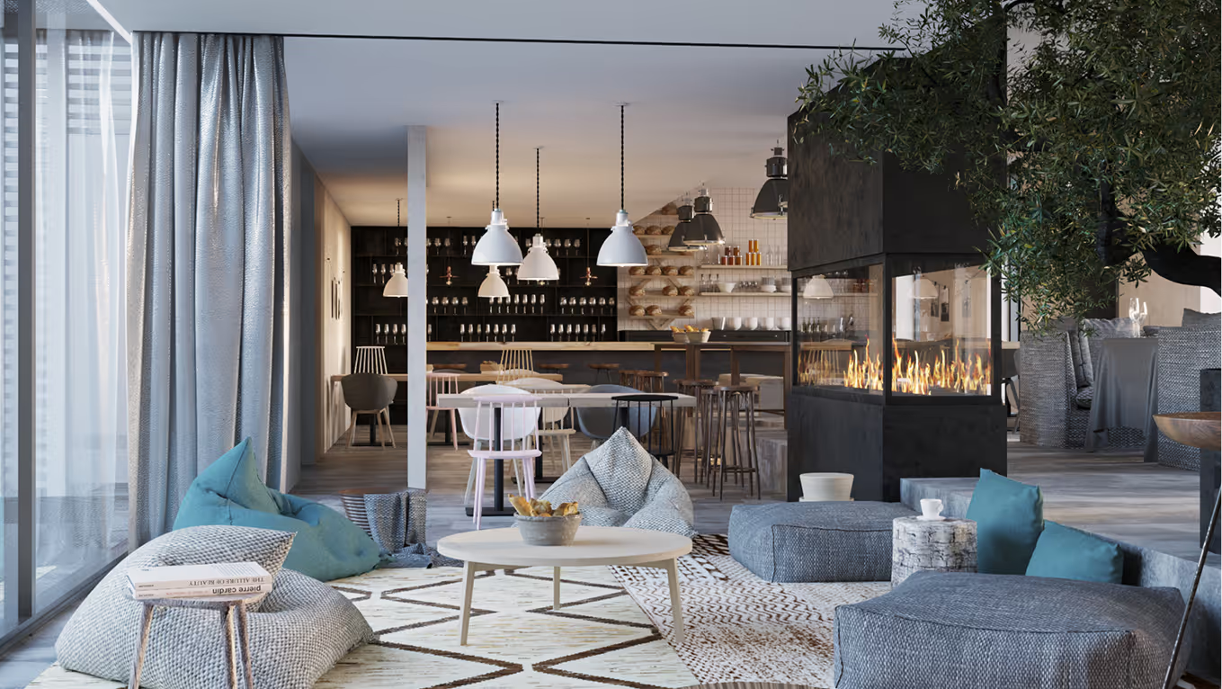
We believe that a space is there for a person to inhabit and colour it with their personality. An environment can nurture a person and a person can nurture an environment.
LAYOUT2
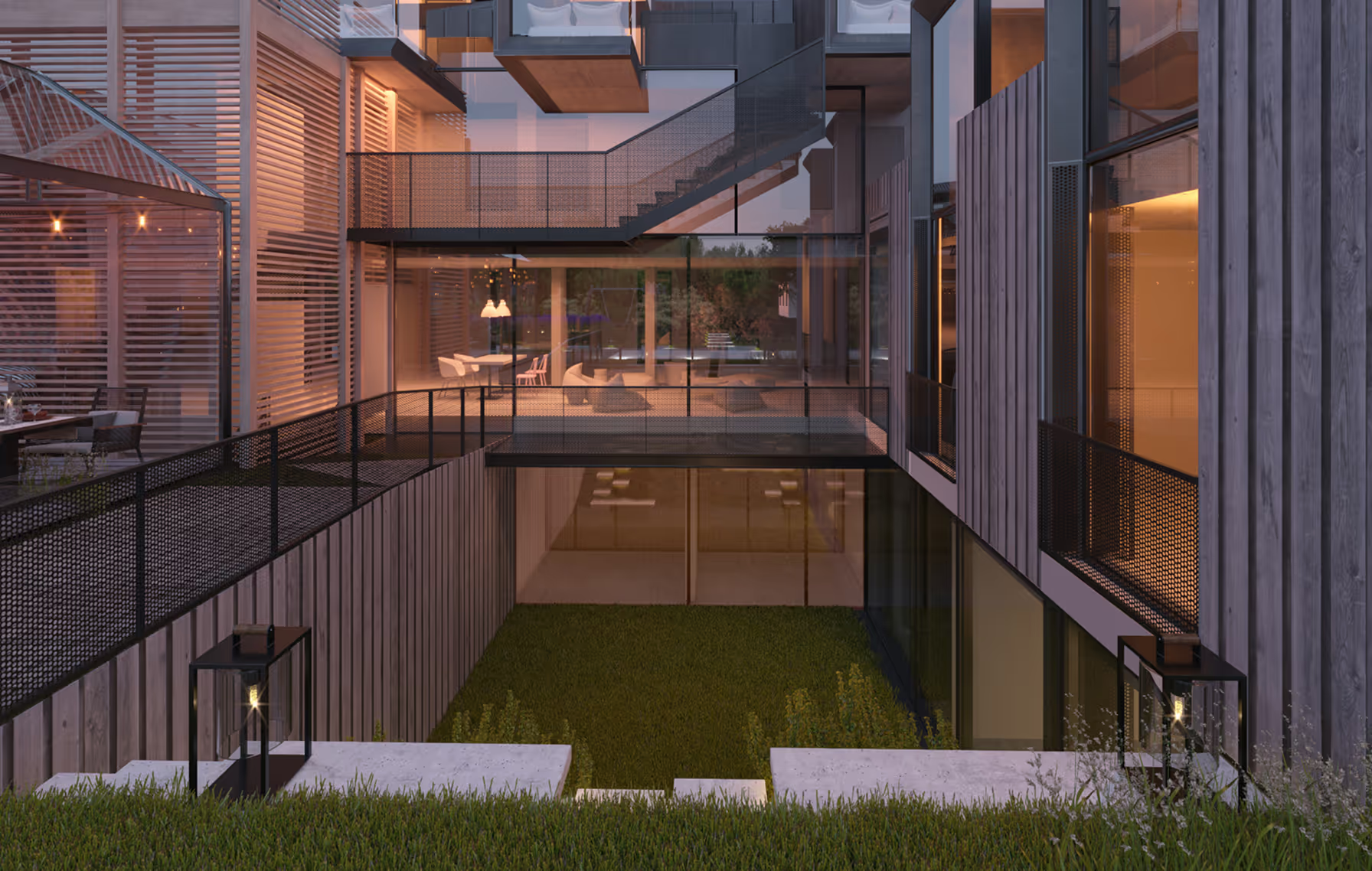
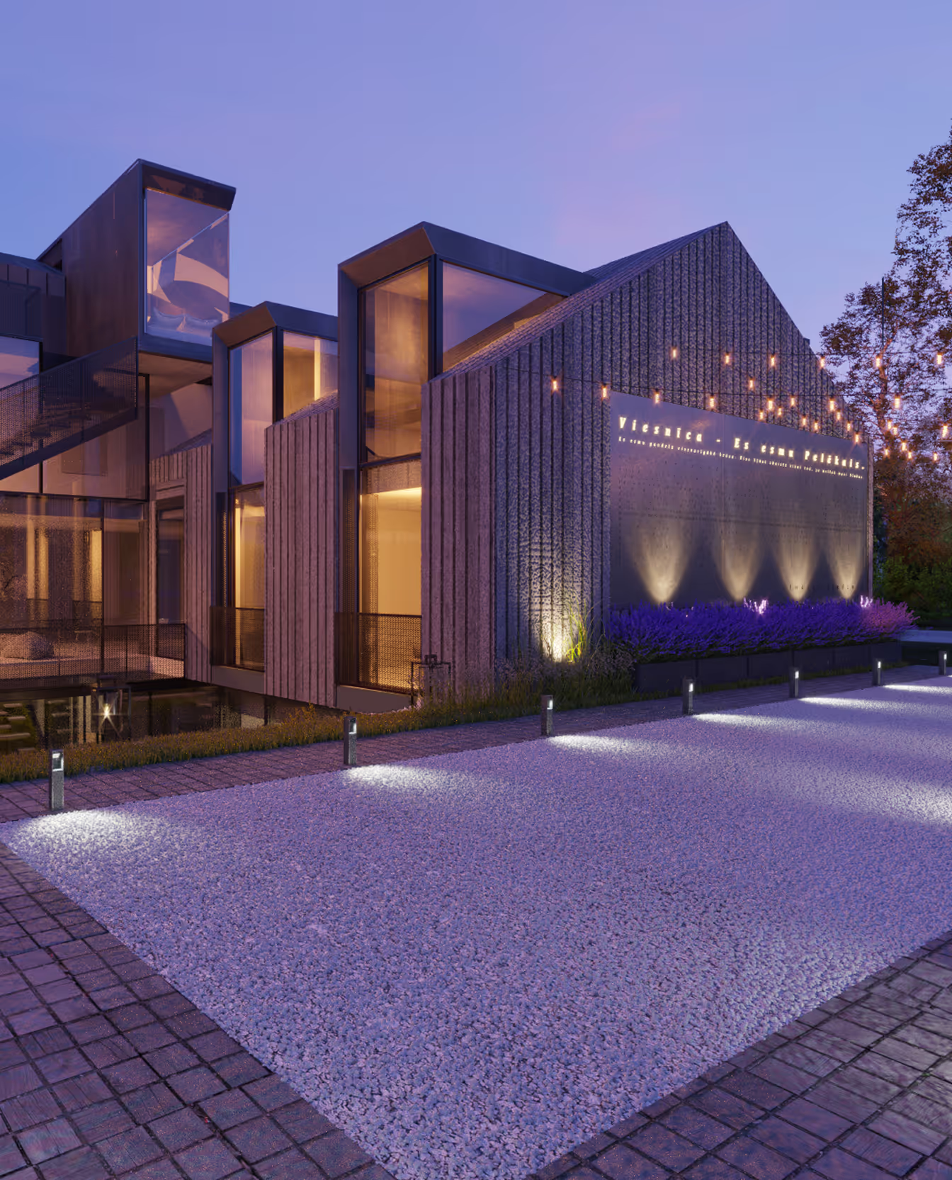
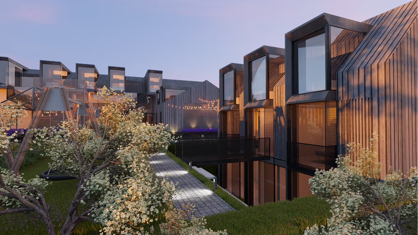
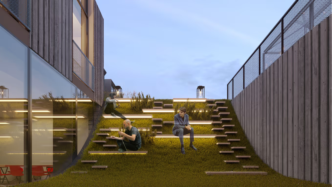
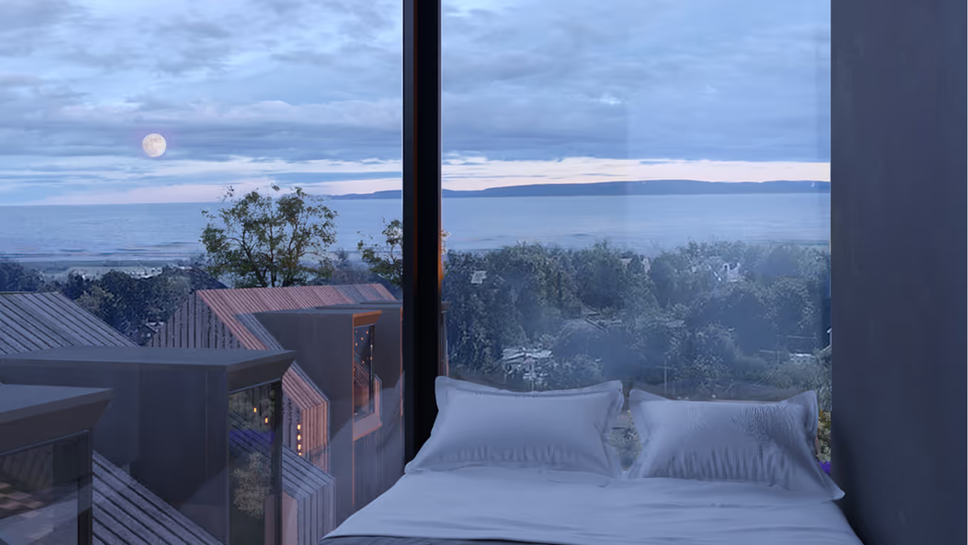
Pavilosta, the location of the planned hotel, is a town on the west coast of Latvia. We’re keen to see it develop, yet retain its historical charm. Therefore we decided to give life to one of its abandoned courtyards, enhancing it literally and abstractly, in terms of both functionally and ambience.

LAYOUT1
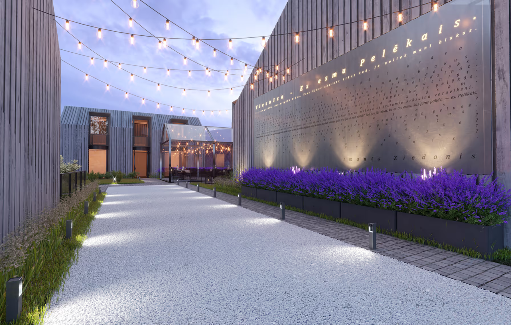
The abovementioned poem by Imants Ziedonis would serve as an invitation into the courtyard. It would be engraved on a metal plaque to hint at the adventure that awaits those who enter.

LAYOUT2


BOUTIQUE HOTEL
Hotel
Armenia
Armenia
2015 (Concept)
Hotel
Olga Ponomarjova, Kristaps Sulcs
LAYOUT1
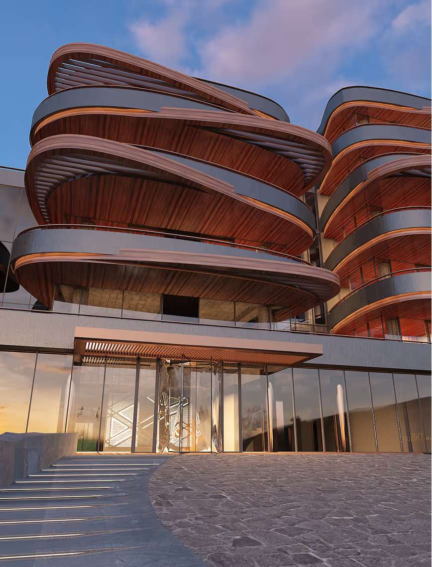
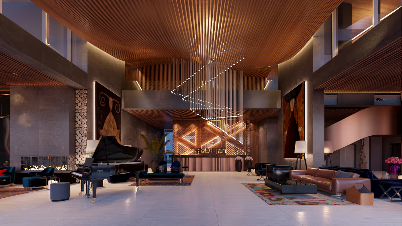
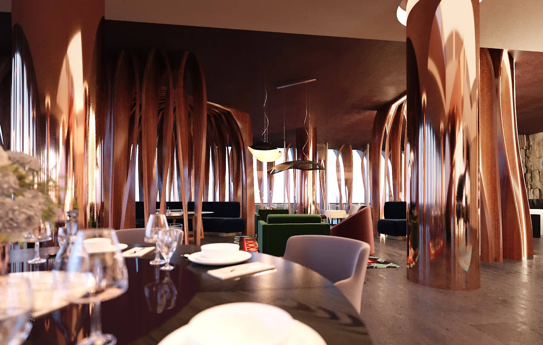
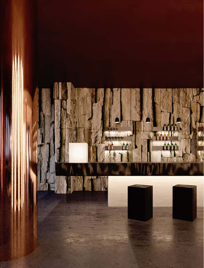
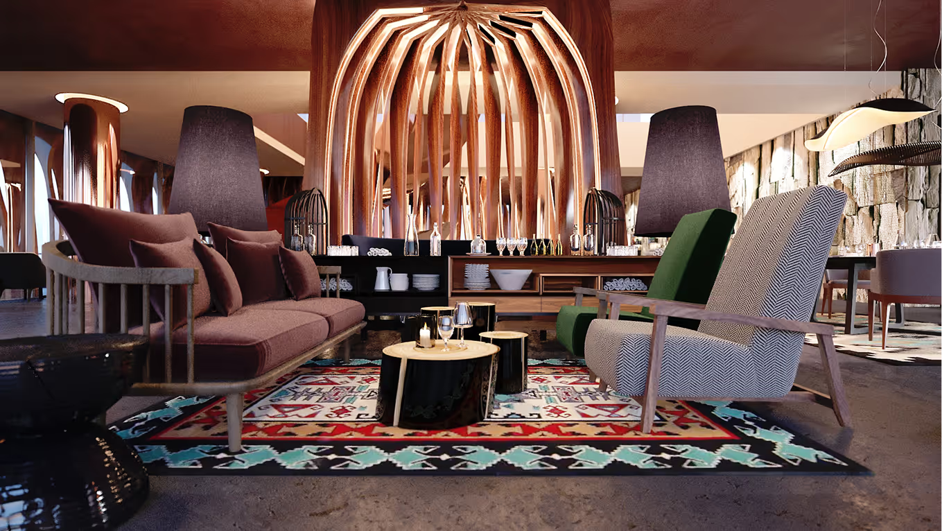
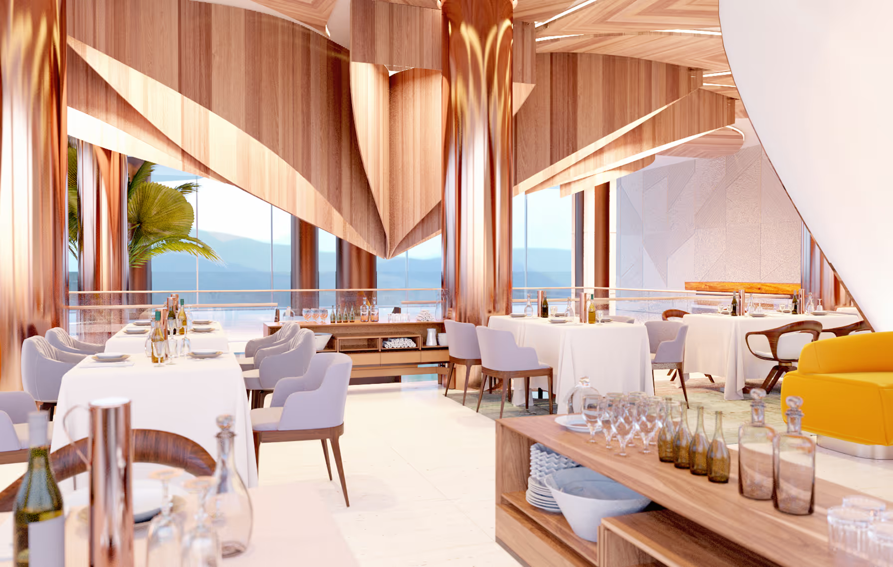
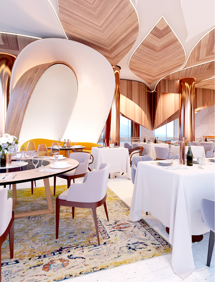
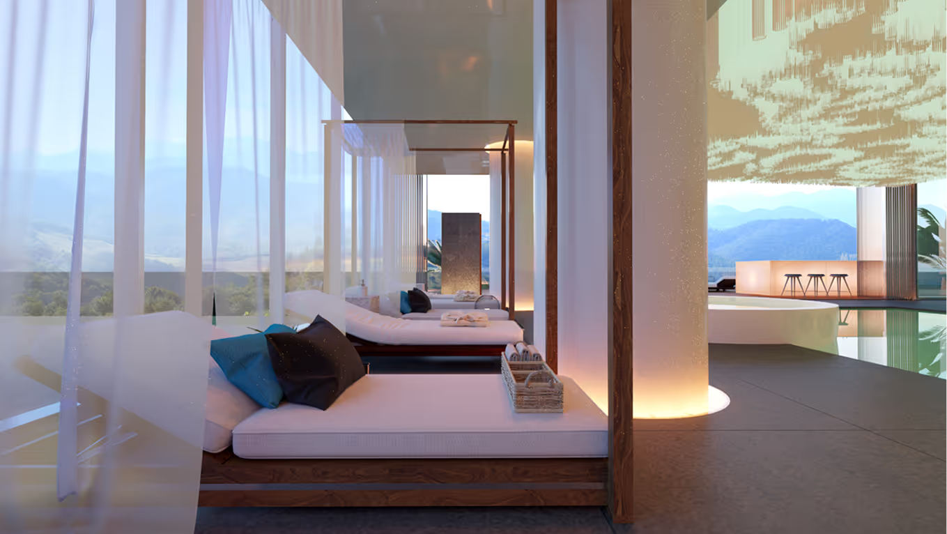
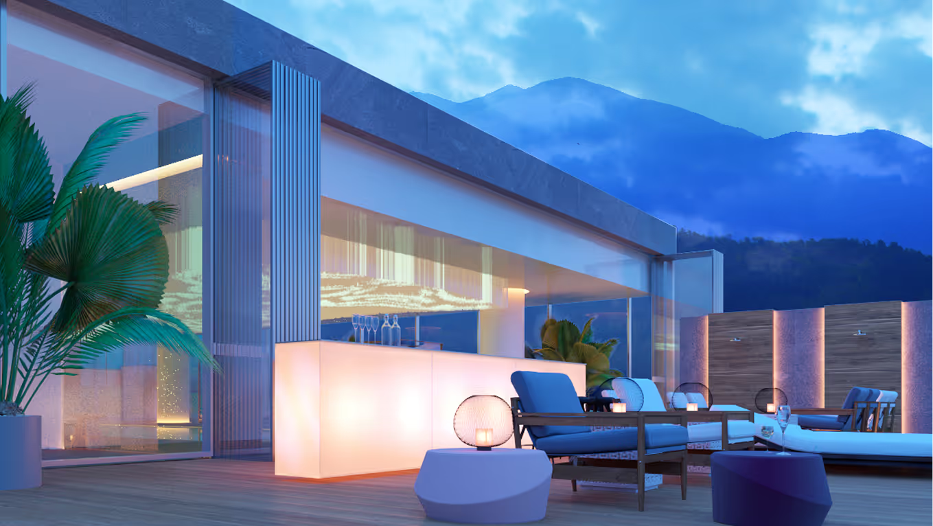
This boutique hotel, restaurant and spa in Armenia is located in the greenest area of the country and amidst a fantastic landscape. The architecture is based on organic inclusion into the mountain landscape while also creating a sense of plasticity.
.avif)
.avif)
LAYOUT2

Viewpoints are ensured at 360 degrees and each room in the hotel offers a view in at least three directions. Local and natural materials have been used, including wood, basalt, noble metals and stone. The emphasis is more on texture than decoration. Traditional ornaments are offered in a modern and ascetic manner so that the main accent is the surrounding landscape.
%20(1).avif)
.avif)
LAYOUT1
.avif)
.avif)

LAYOUT2
LAYOUT2

J42
Office
Latvia
Riga, Latvia
2024
Alvis Rozenbergs
Office
Jelgavas, JEL42
LAYOUT1
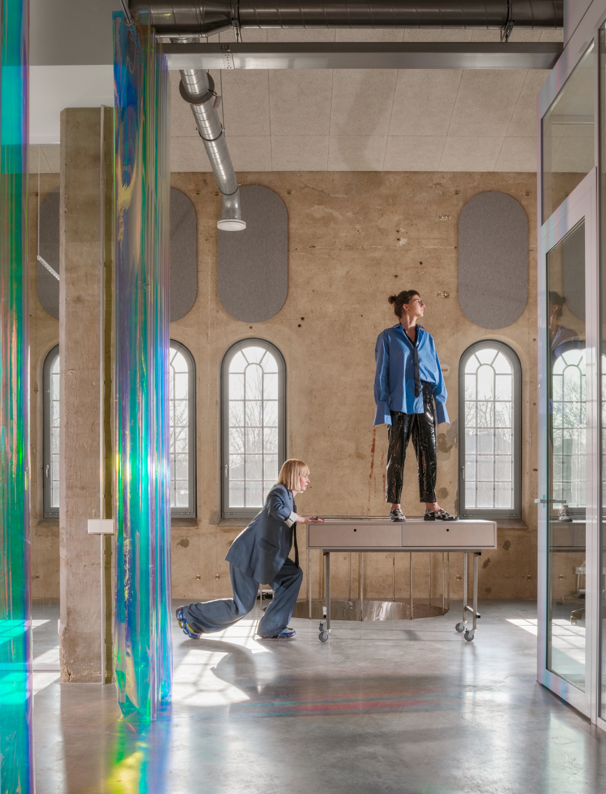
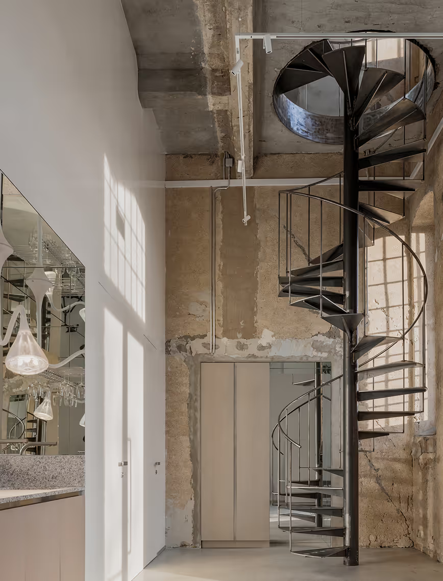
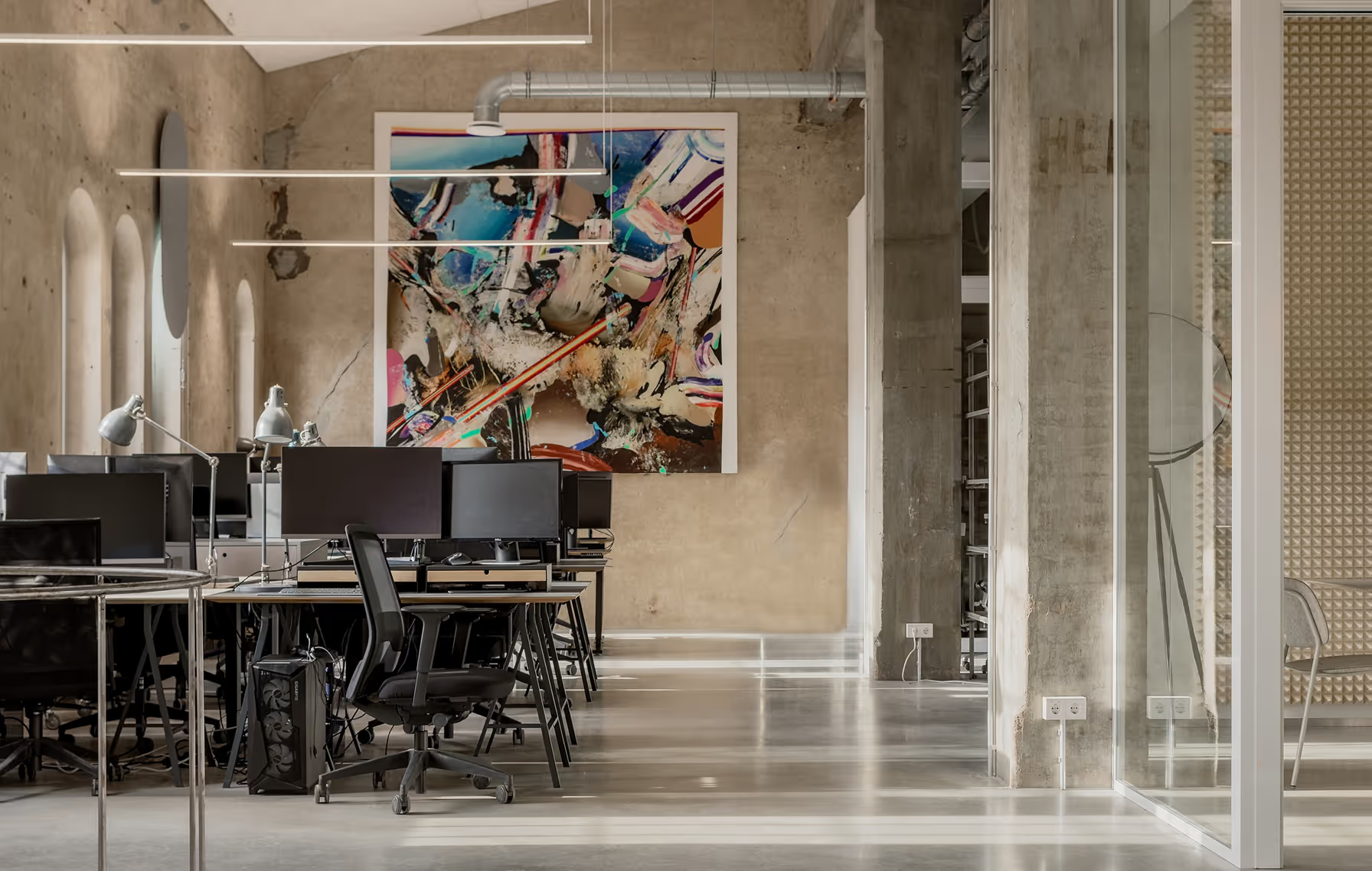
While most see the world in forms and functions, OAD (Open Architecture Design) has built an empire of pure, unfiltered feeling. Their new Riga headquarters isn’t just an office - it’s a cathedral of bold solutions, a lab of architectural rebellion, and a statement that design should be felt, not just seen. OAD has never done "traditional." They’ve floated on canals, occupied shopfronts, and towered over cityscapes. Now, they’ve crash-landed in a historic production site - a raw, industrial three-floor space that caters to their 30-strong team of architects in everything from deep focus to all-out creative mayhem. It’s unapologetic. It’s theatrical. And, naturally, it’s a little provocative.
.avif)
LAYOUT2
.avif)
LAYOUT3
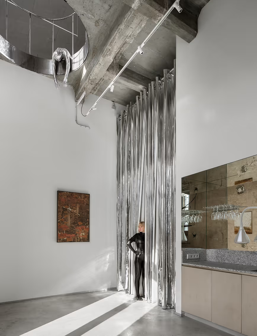
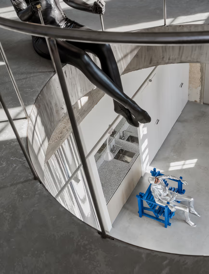
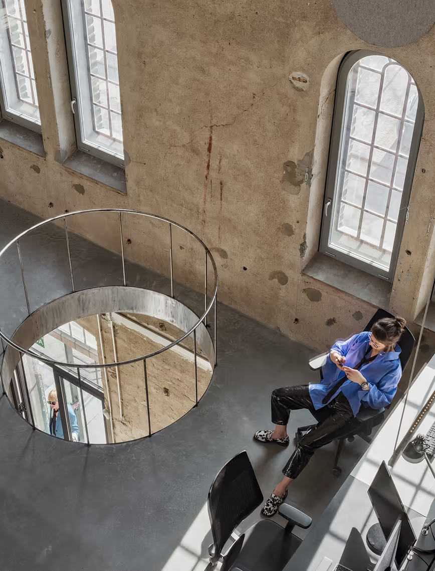
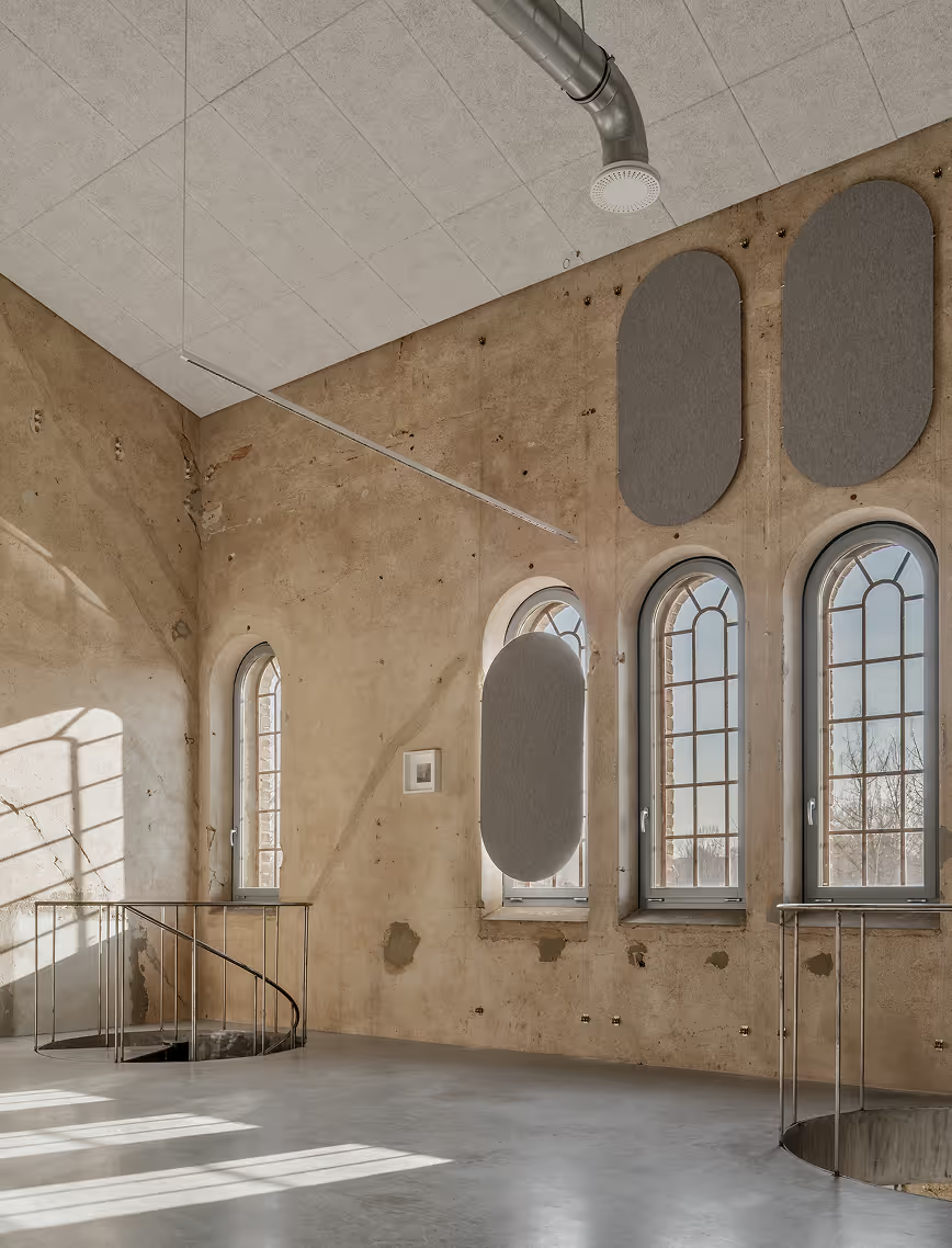
The first floor sets the tone - silver curtains stretch four meters high, catching light like shifting gravity waves, creating an immersive, otherworldly glow. This futuristic backdrop contrasts beautifully with Andris Eglītis raw, textured paintings, which root the space in history, perfectly aligning with the exposed industrial walls. A massive opening between floors acts like a visual wormhole, drawing the eye upward, offering a glimpse of the layers of activity above. This is not just a workspace, it’s an evolving landscape, designed to be experienced in motion.
LAYOUT1

LAYOUT2
LAYOUT3
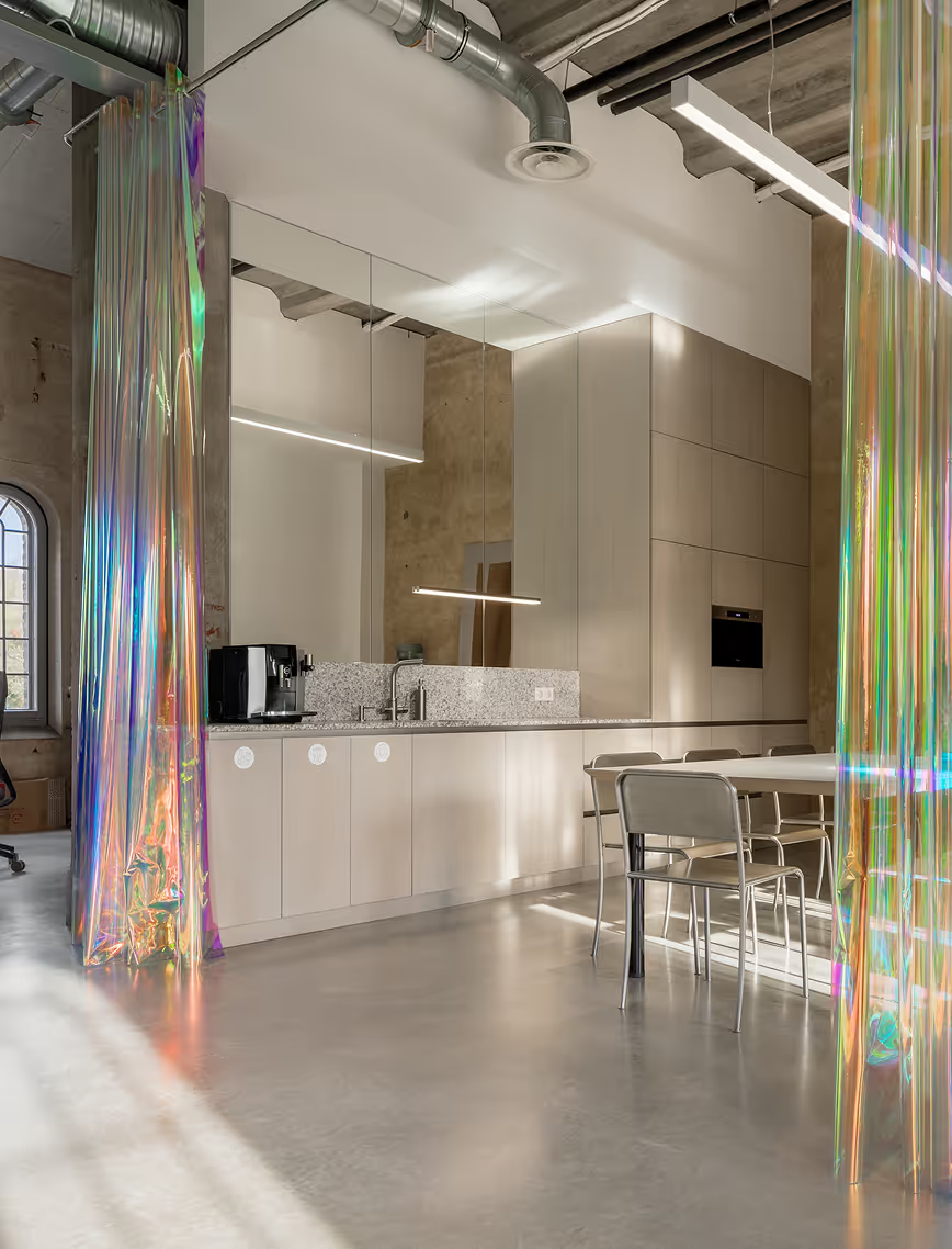

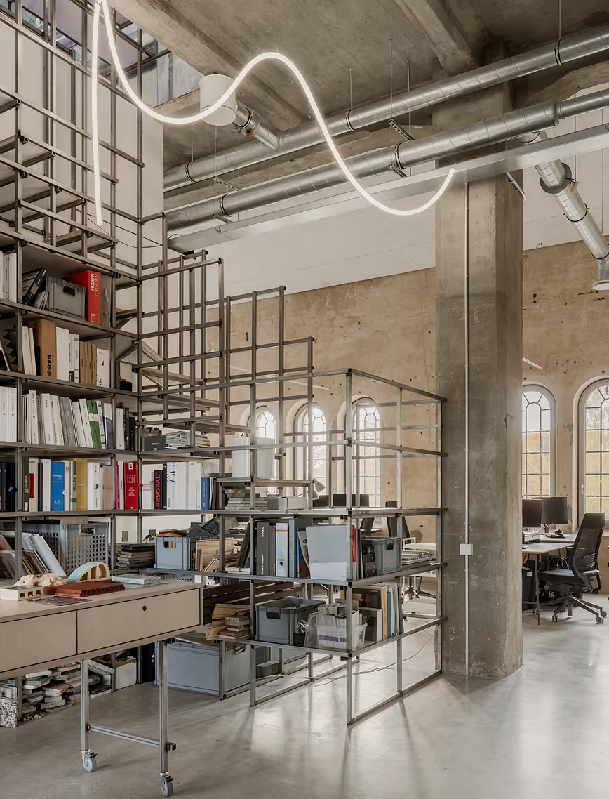
The second floor is an open-plan office where ideas take form. The meeting rooms? Encased in transparent cubicles, where clients and architects work without barriers. They are supported with acoustic foam panels with spiky reliefs both functional and visually arresting. The kitchen is hidden behind glossy latex curtains that catch the afternoon sun like liquid metal, elevating the light play to an entirely new level. The same provocative material shields a raw, industrial sink zone, balancing utility with an unexpected, sensual edge. A custom-built material library staircase connects the second and third floors, doubling as a mood board in motion. Knowing that mood boards are a long lasting process for each project, there are few movable consoles with drawers for each ongoing project.
.avif)
LAYOUT3

LAYOUT3
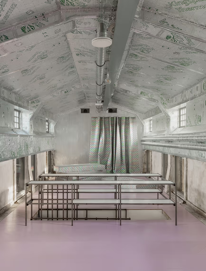
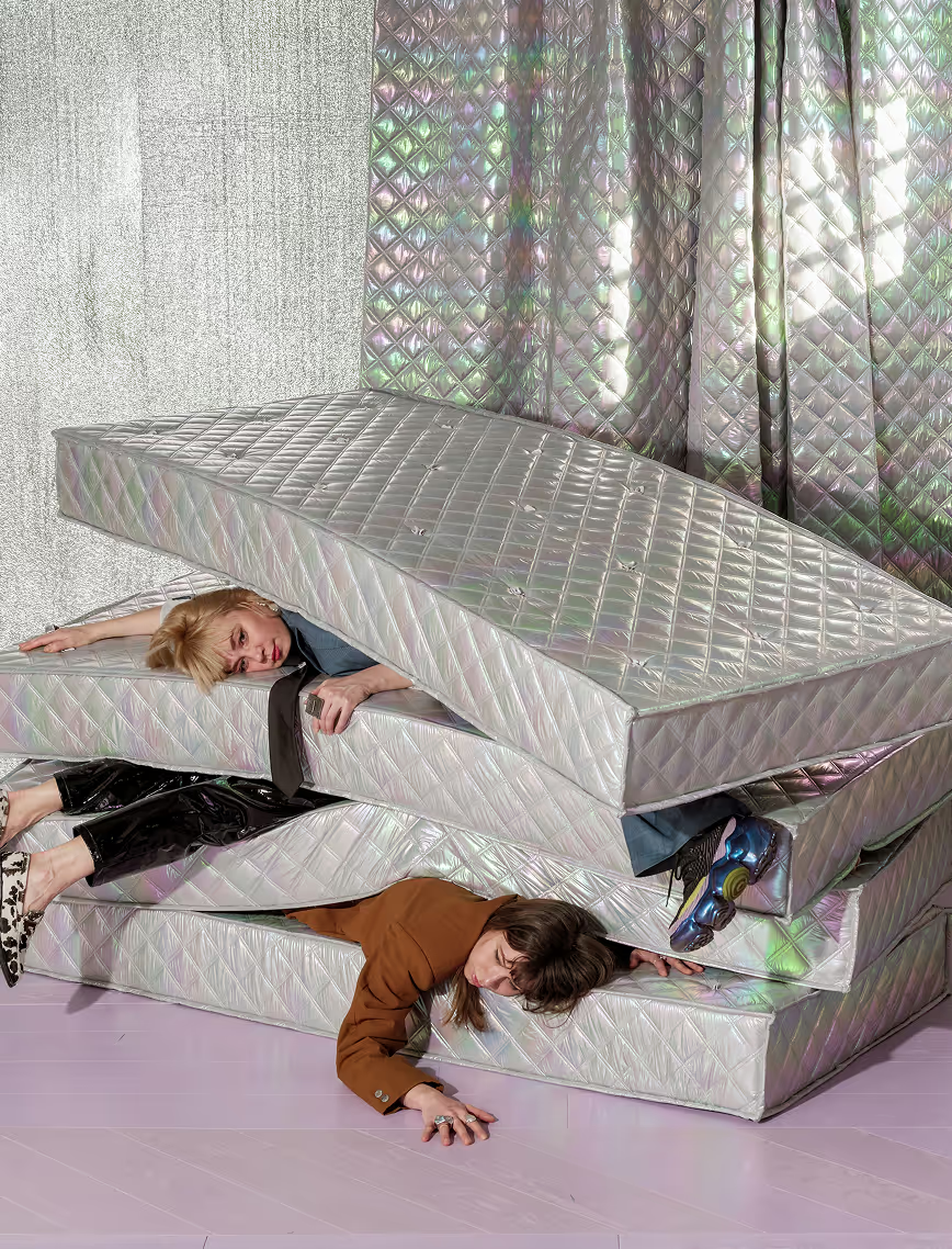
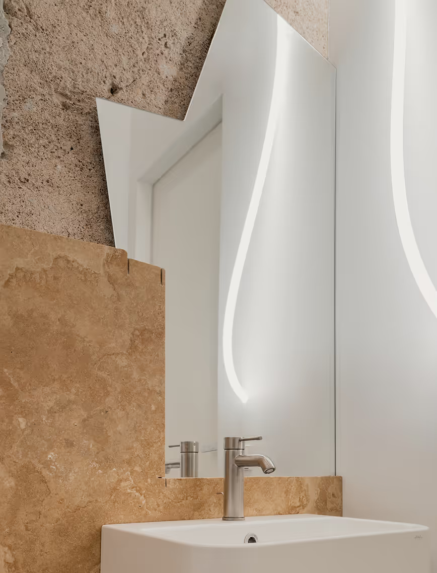
The third floor takes a different approach. Here, the focus shifts from intensity to retreat, offering a space to reset, reflect, and reconnect. The raw insulation layer remains exposed, its silver tones lending a quiet, industrial elegance. A lounge space welcomes afternoon breaks, evening brainstorms, and impromptu yoga sessions - a necessary counterbalance to the fast-paced energy below. As the studio expands, this floor may evolve into the executive hub, but for now, it remains a creative sanctuary.
LAYOUT1
With Riga’s first Michelin-starred restaurant as a neighbor, OAD is doing more than designing an office - they’re redefining a district. This is a hub for experimentation, a space where ideas take form, and a statement that great design should be fearless.
.avif)
%20copy%20soc.avif)
NOBLE
Mixed-Use / Apartment Building
Latvia
Jurmala, Latvia
2024 - ongoing
Mixed-Use / Apartment Building
River Properties
JDZ19
Maria Gembitskaya, Olga Ponomarjova, In Partnership with Apsopic
LAYOUT2
.avif)
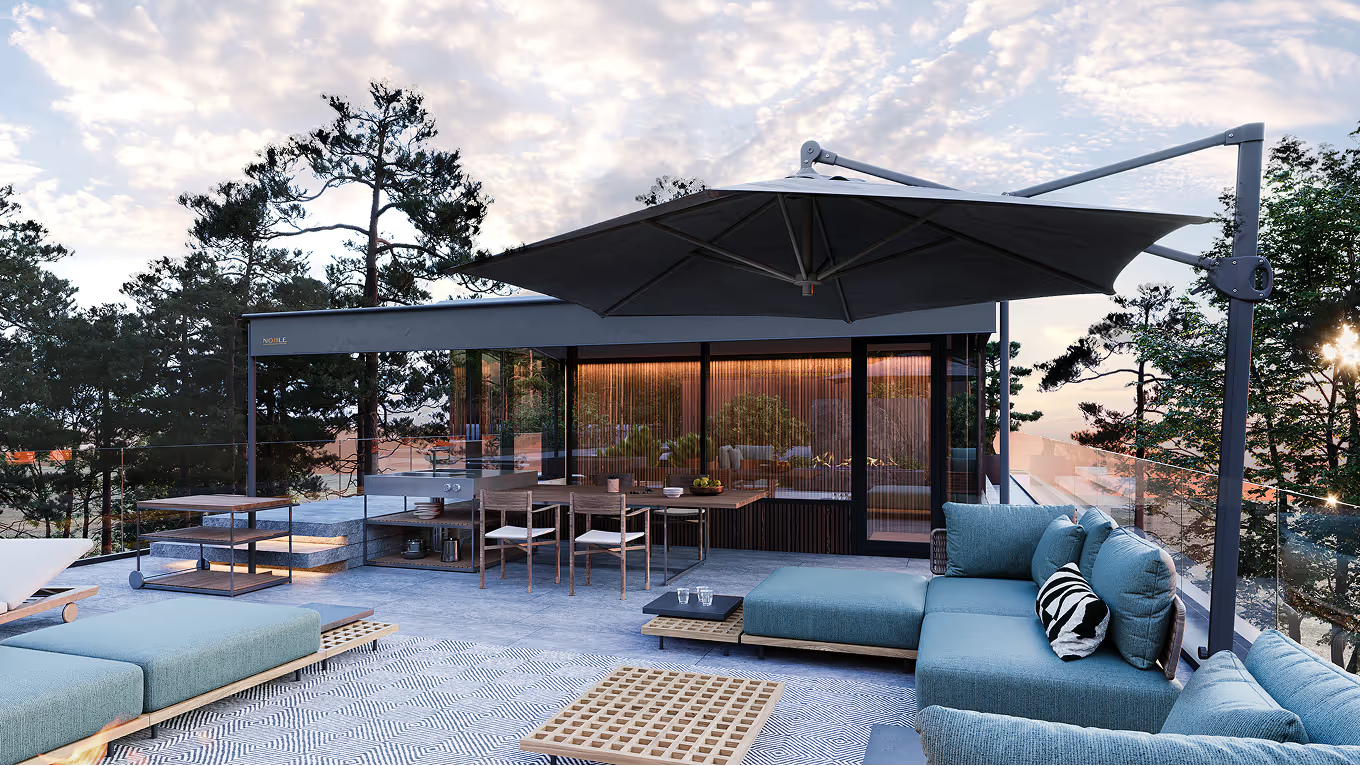
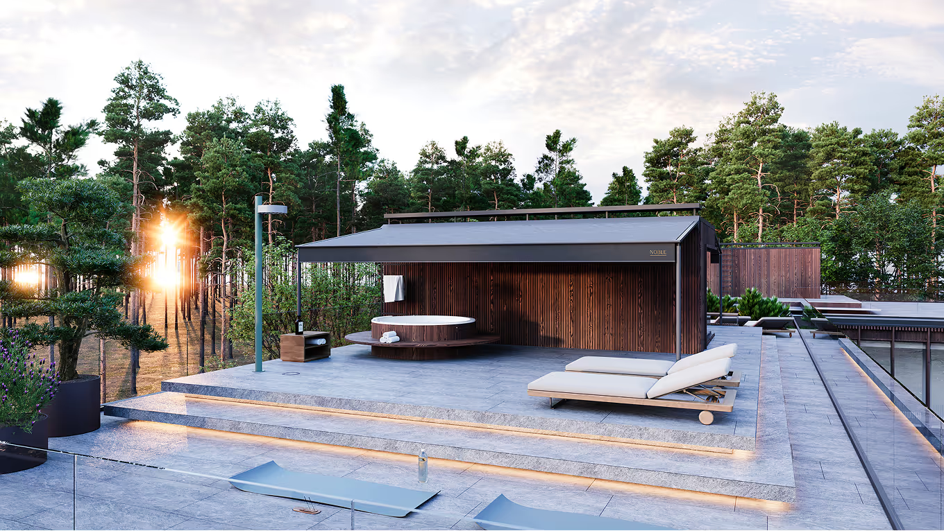
Built on a foundation of functionality, we’ve designed a space that delivers a truly unique experience for both owners and visitors. While the building is primarily perceived from the main street, residents are guided to access it through a corner entrance, reached via an organically woven pedestrian path. This pathway follows the natural dune terrain, complemented by a cultivated native habitat of blueberries, heather, and other local flora, creating a safe and welcoming approach to their new home. Our goal is to ensure the project fully prioritizes the well-being of its end users, fostering a sense of presence and connection through thoughtfully designed focal points and immersive experiences.
%20copy%20soc%20(1).avif)
LAYOUT1
One of the primary inspirations for the project was undoubtedly the surrounding environment—the rugged dunes, the sea, and the area's historic summer homes and cultural heritage. Our goal was to create a timeless approach that conveys values through a noble lens. The two-story stone facade establishes a rhythm that communicates our architectural principles of stability and elegance. The stone and brushed wood finishes reflect the raw touch of the sea, contrasting subtly with the third floor, clad in refined wood detailing. Here, a modern ornamentalism emerges, working with overhangs and their rhythm to create an intricate, lace-like aesthetic reminiscent of the decorative traditions of Jūrmala architecture.
%20copy%20soc%20(1).avif)
LAYOUT2
%20copy%20soc%20(1).avif)
%20copy%20soc.avif)
LAYOUT1
%20copy%20soc.avif)
%20copy%20soc.avif)
LAYOUT1
We've prioritized natural materials that not only enhance sustainability but also allow the building to blend seamlessly into its surroundings. Stone, wood, glass, and copper form the foundation of the design, carefully selected for their aesthetic appeal and enduring qualities.
The facade features a single stone - Grigio Palladio - used in three surface treatments: Medio, Grosso, and Rigato Rock. Beyond its sustainability, this choice symbolizes one of our core values: timelessness. Meanwhile, the pairing of copper and wood creates a natural flow, with meticulously crafted details highlighting the harmony between materials.

LAYOUT1
LAYOUT1

.avif)
LAYOUT1
LAYOUT3
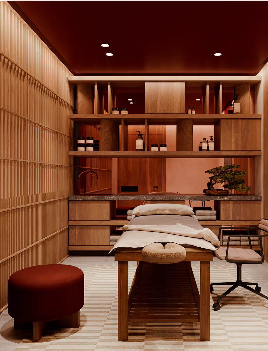
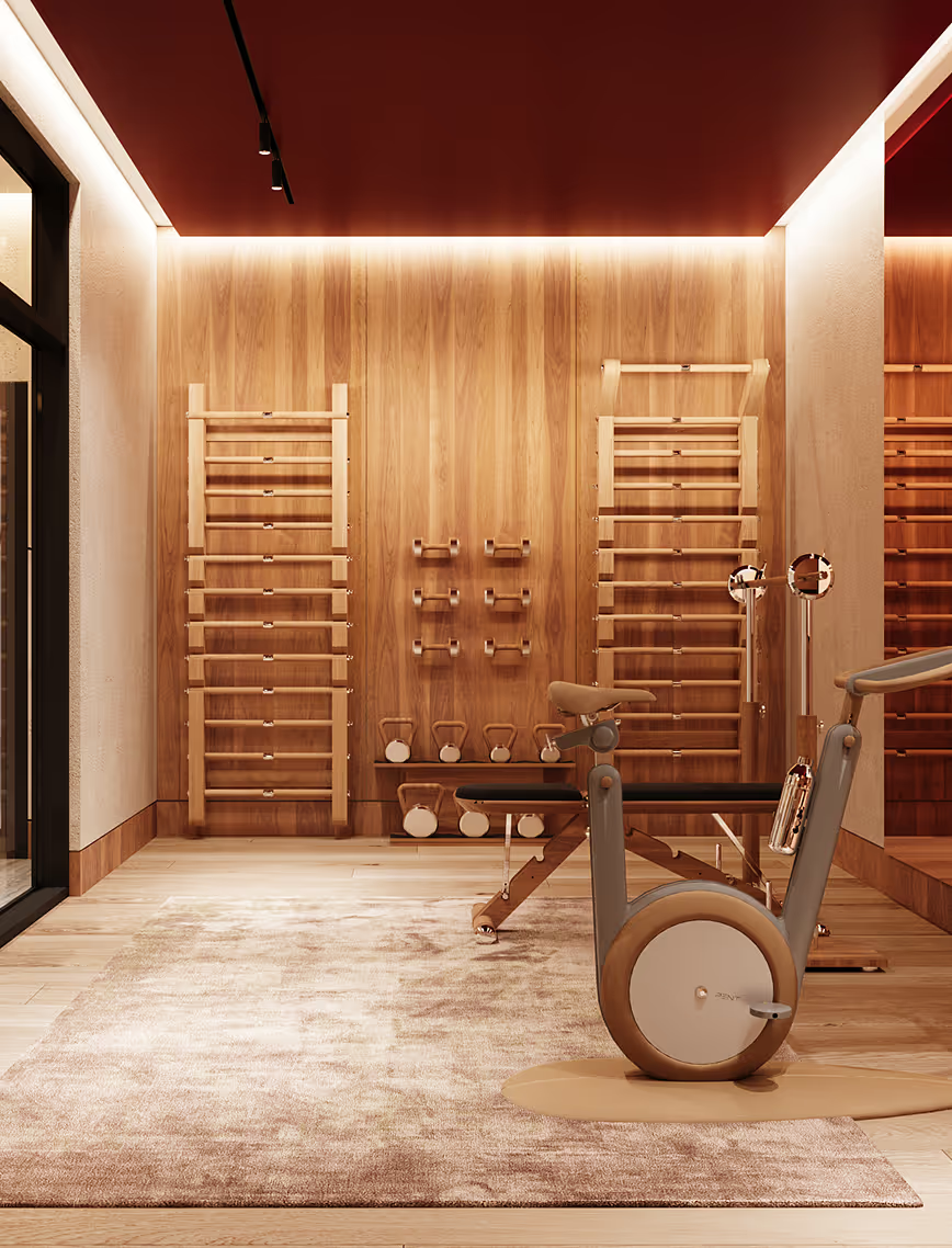
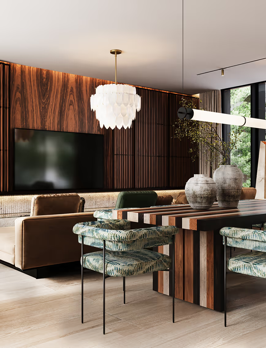
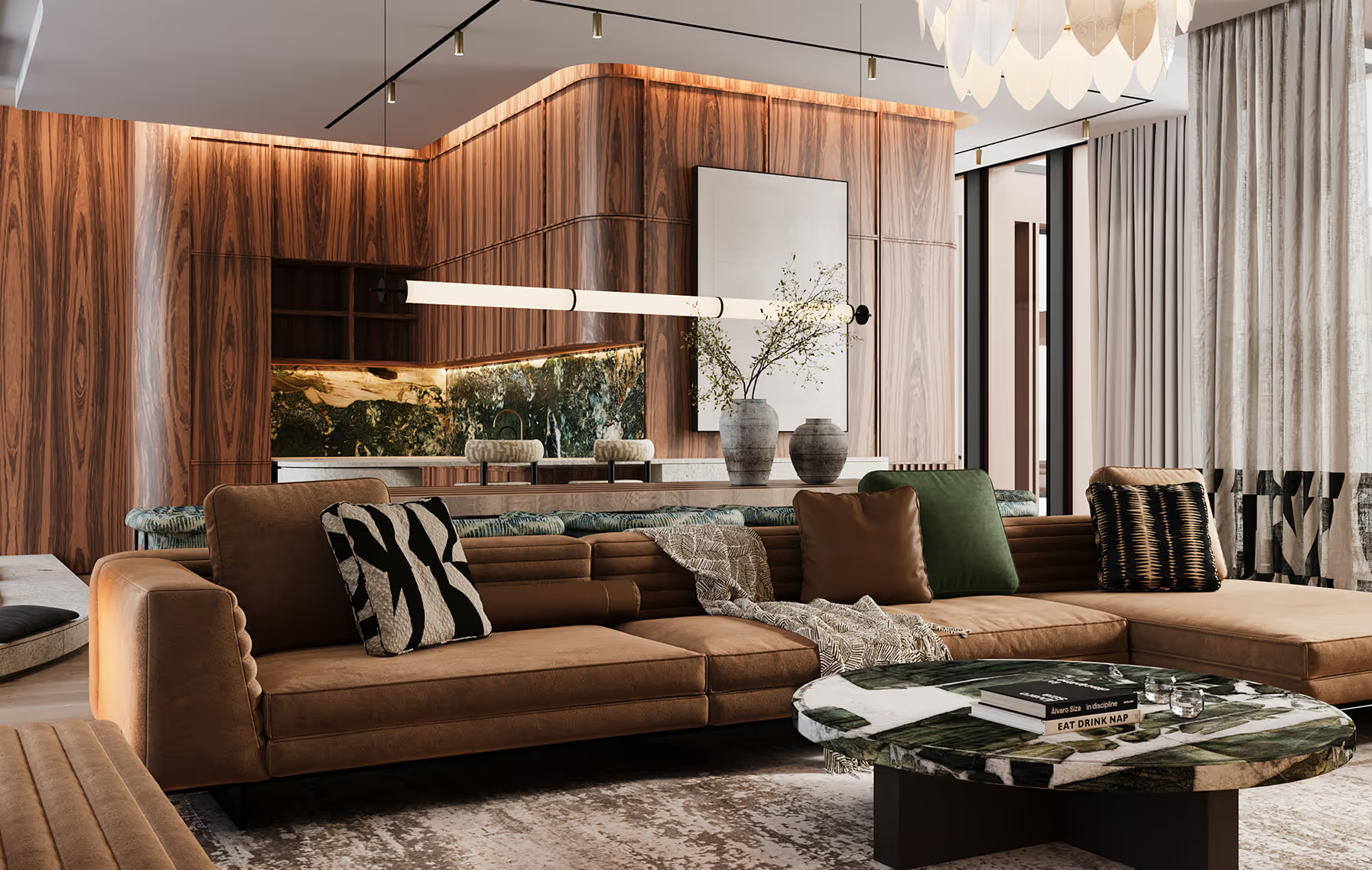
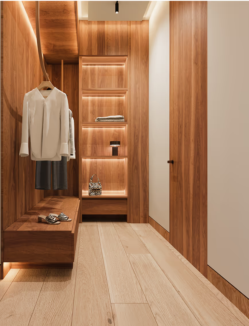
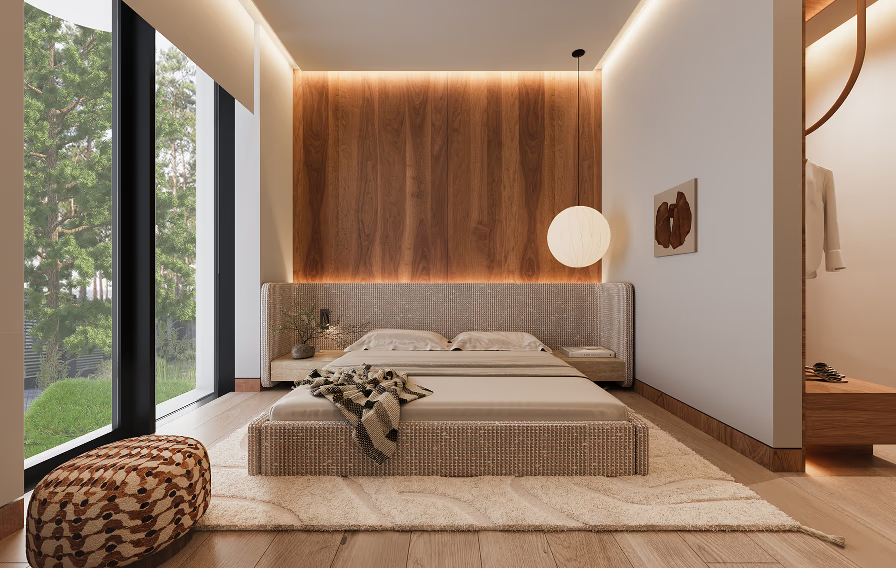
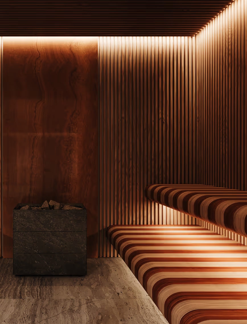
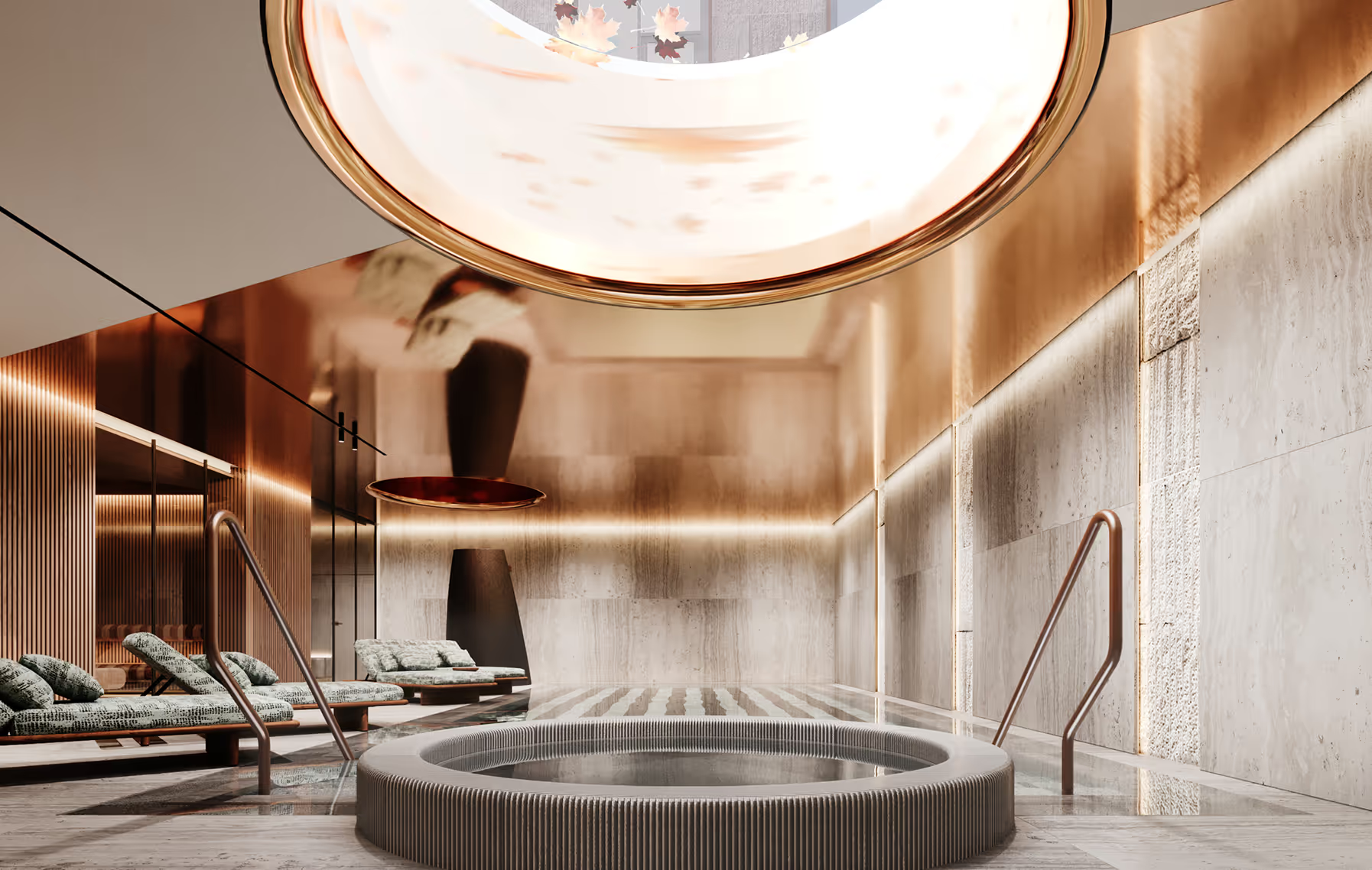
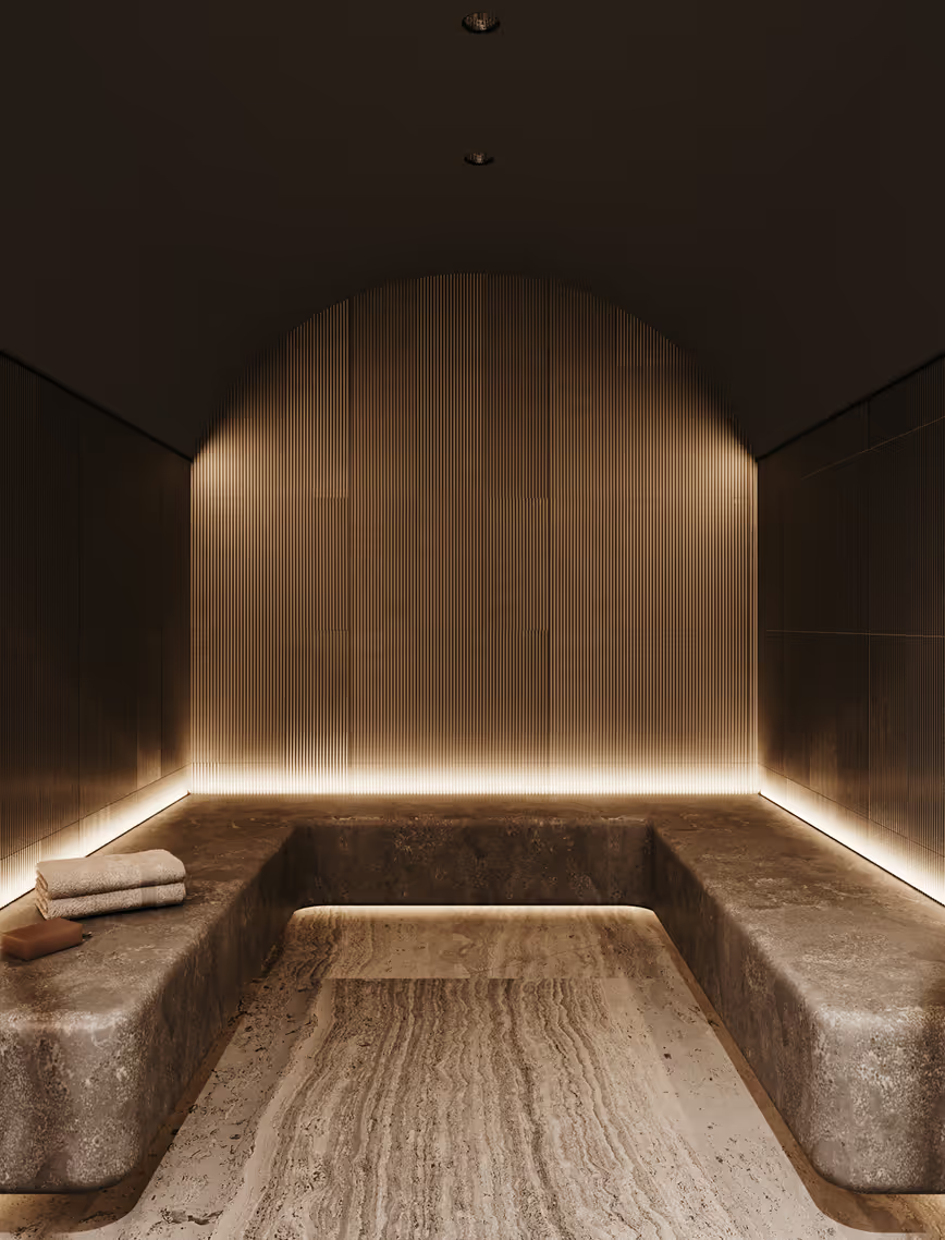
The interior materials echo and interact with the exterior, creating a unified experience. Natural stone extends indoors through flooring and the spa area, with accents in green-toned stones adding depth. Complementing this are warm wooden finishes, natural oak parquet and walnut veneer, that imbue the spaces with a cozy, inviting atmosphere. The building’s lobby continues the theme of natural materials, featuring a lime plaster finish that enriches the shared spaces with texture and warmth.
LAYOUT1
LAYOUT2


HOFT APT
Apartment
Latvia
Riga, Latvia
2023
Alvis Rozenbergs
Apartment
LAYOUT1
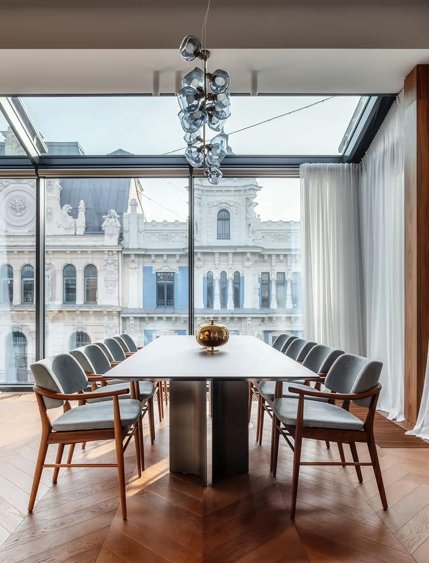
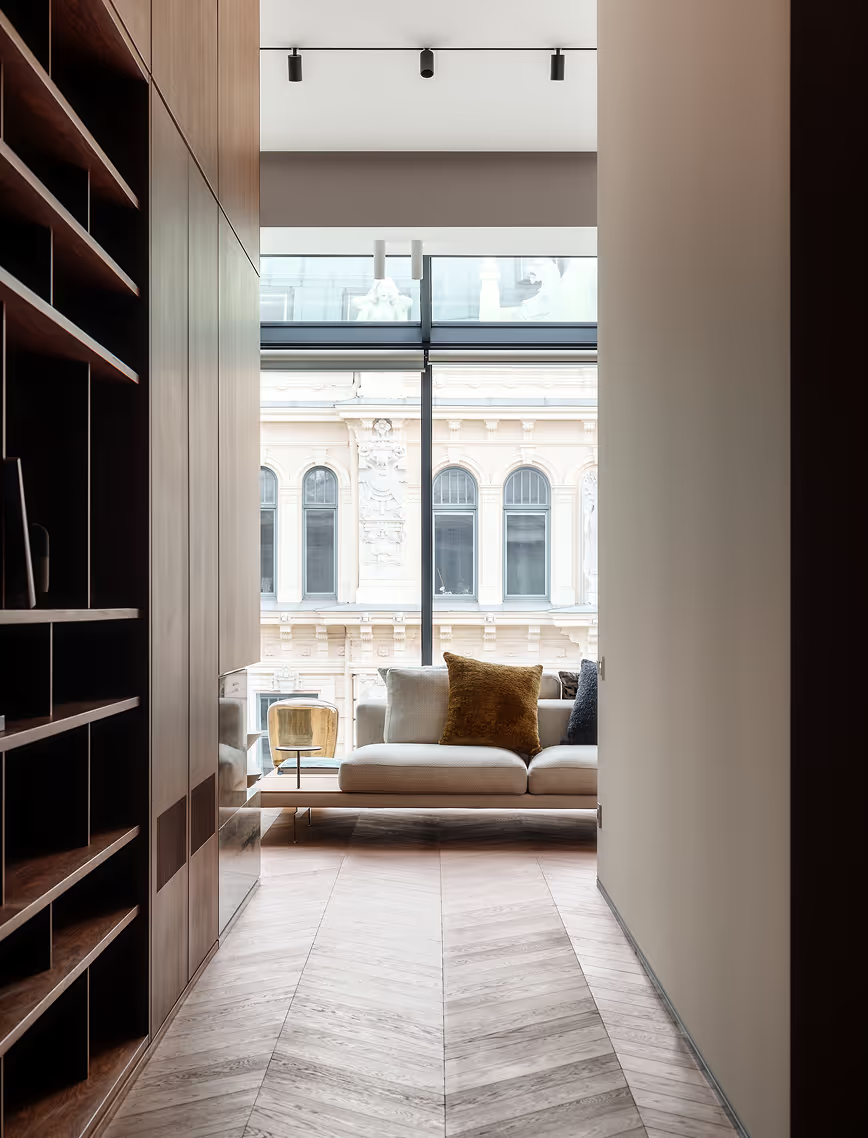
Set in the heart of Riga’s Art Nouveau district, this apartment is a harmonious blend of historical heritage and modern architectural elements. The design ingeniously utilizes a glass wall and a section of the ceiling, transforming the majestic facades of neighboring Art Nouveau buildings into a vast, living artwork that stretches across the space. This unique feature not only enhances the apartment’s aesthetic appeal but also integrates the exterior’s architectural grandeur into the interior experience.
.avif)
LAYOUT2


LAYOUT3

.avif)
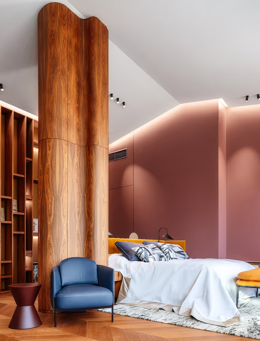
The apartment’s layout is thoughtfully designed, with functional areas seamlessly flowing into one another, creating a light-filled environment that invites residents to appreciate the surrounding Art Nouveau structures in detail. The influence of the district’s distinctive character is evident throughout the design, from overarching concepts to nuanced details.
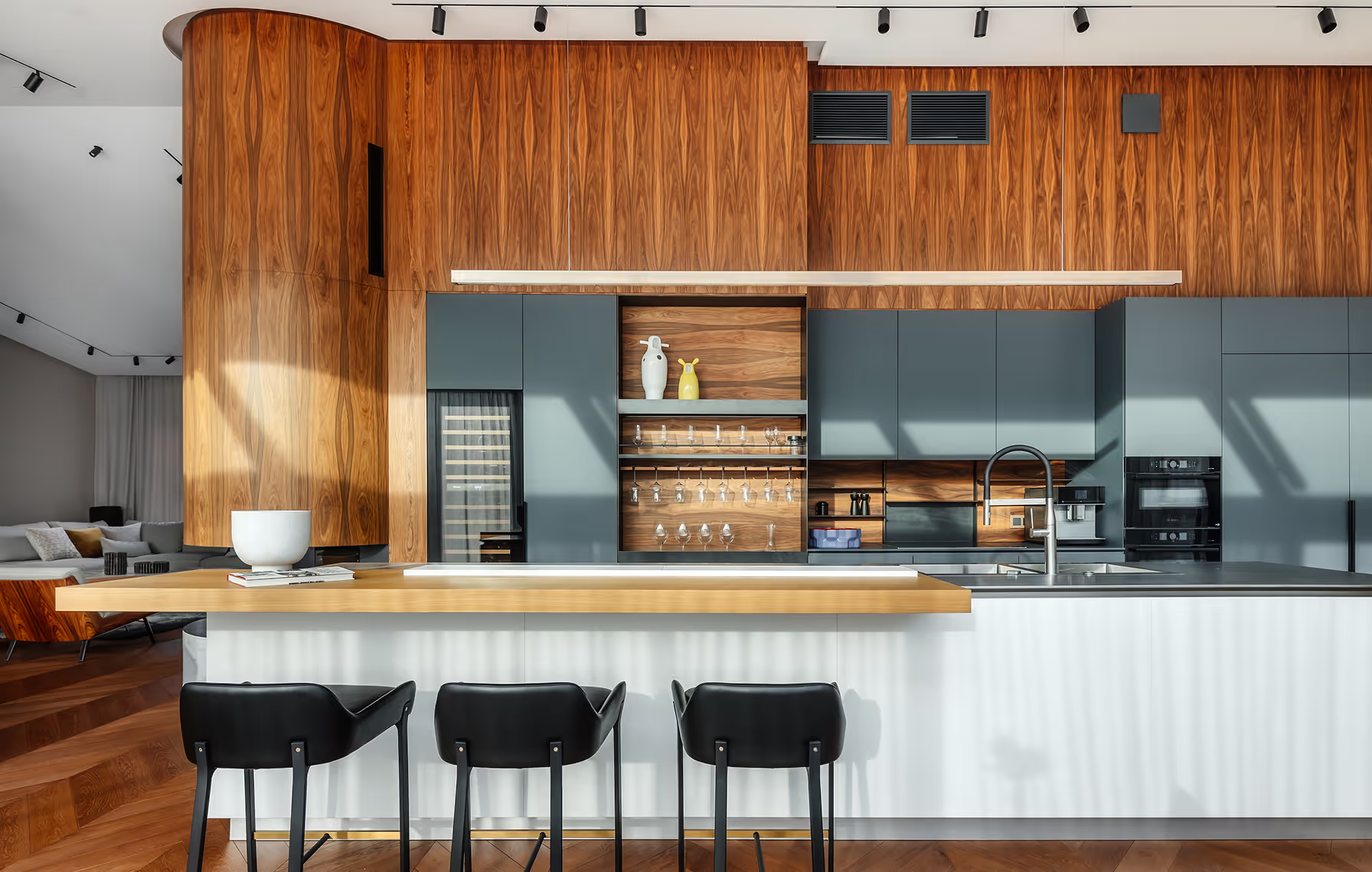
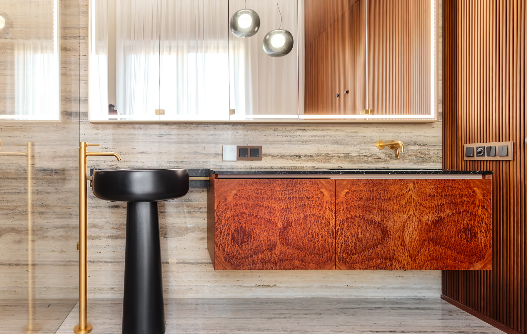
To keep the clean lines, different functional elements have been integrated into seamless panels. For example living room TV section is hidden behind the palisander wall that connects the functional sections of the apartment and continues in the kitchen and rest of the apartment.
LAYOUT1
LAYOUT3
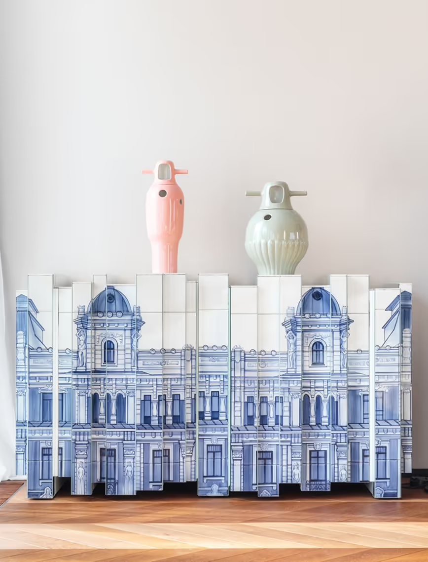
A standout element within the space is the Boca Do Lobo Heritage sideboard, custom-made for the apartment. Each tile is hand-painted using traditional techniques, depicting the Art Nouveau building opposite the residence. This sideboard not only serves as a striking interior feature but also forms a visual connection with the district’s architectural heritage, allowing owners to enjoy a dual view of both the inspired artwork and the original building.
LAYOUT1
LAYOUT2


LAYOUT3
AQUA LUNA
Restaurant
Latvia
Riga, Latvia
2013
Maris Lapins
Restaurant
LAYOUT1
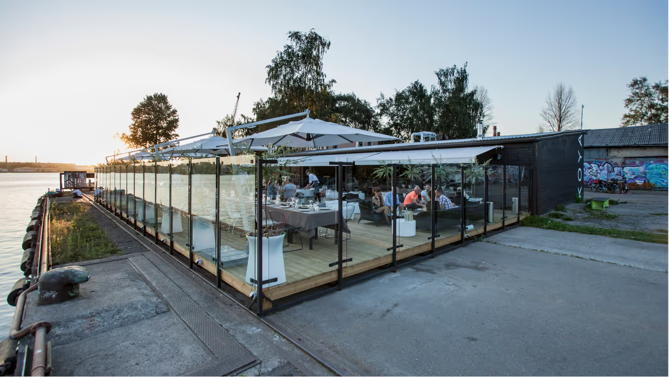
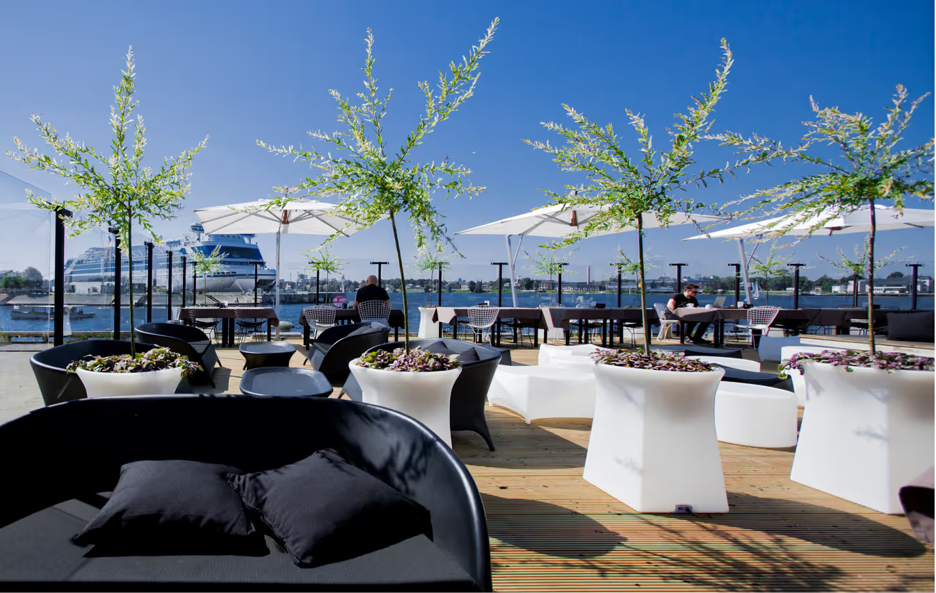
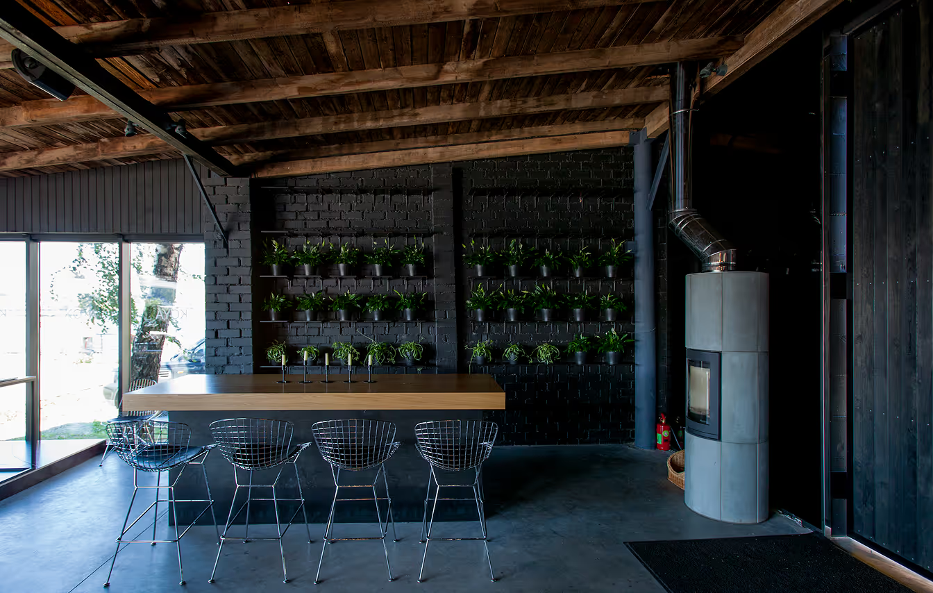
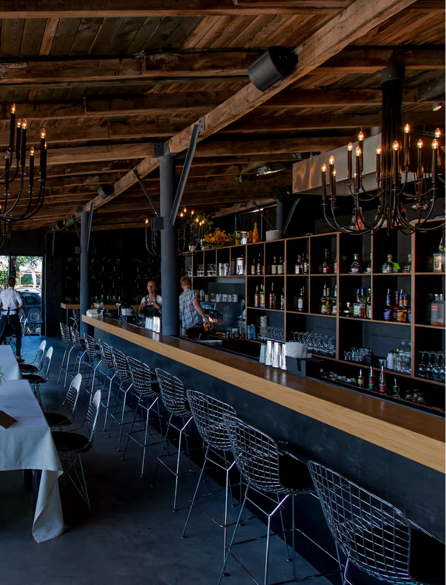
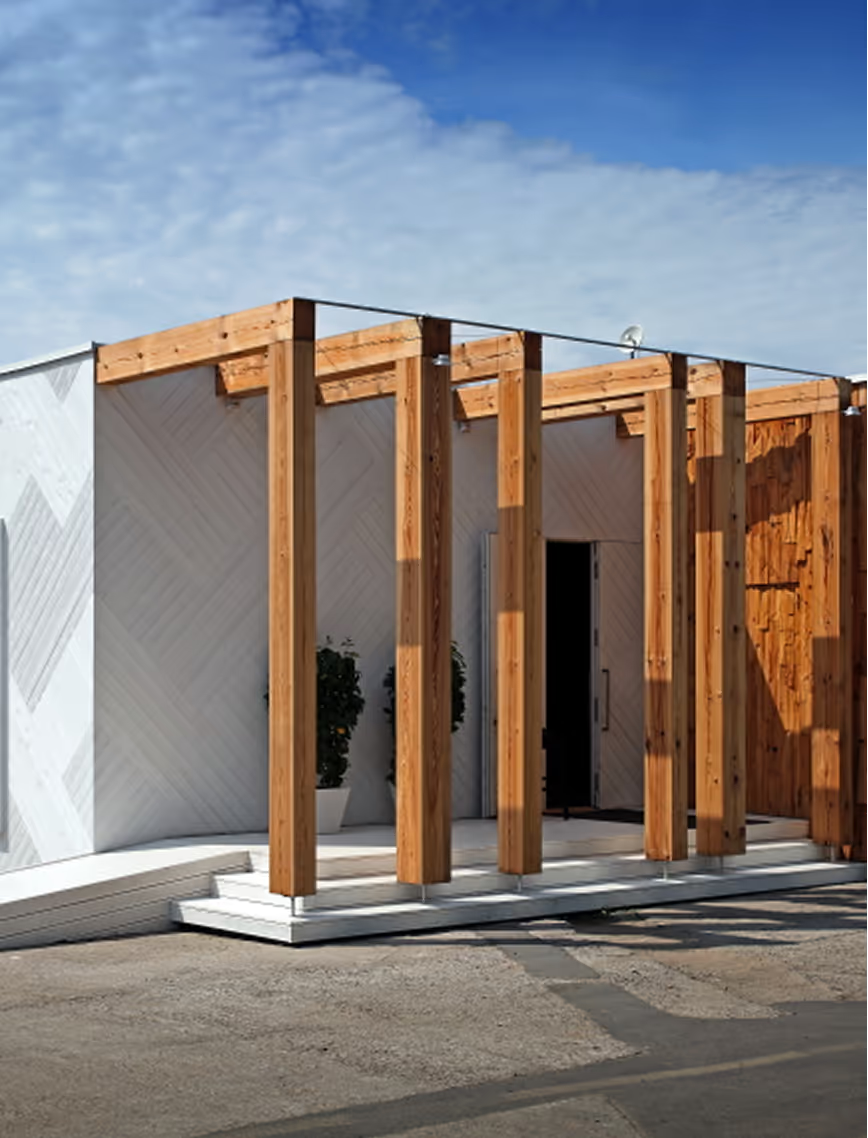
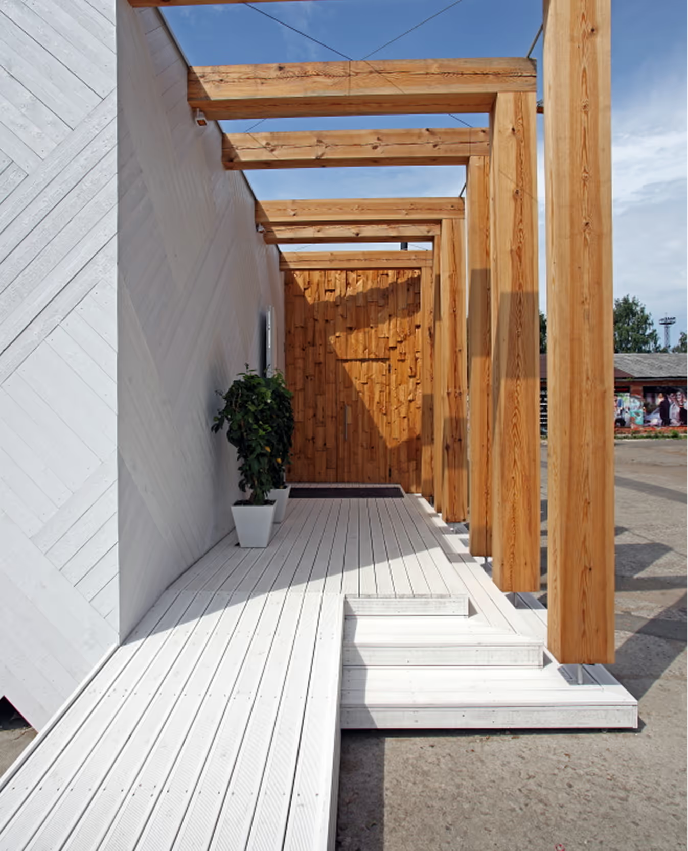
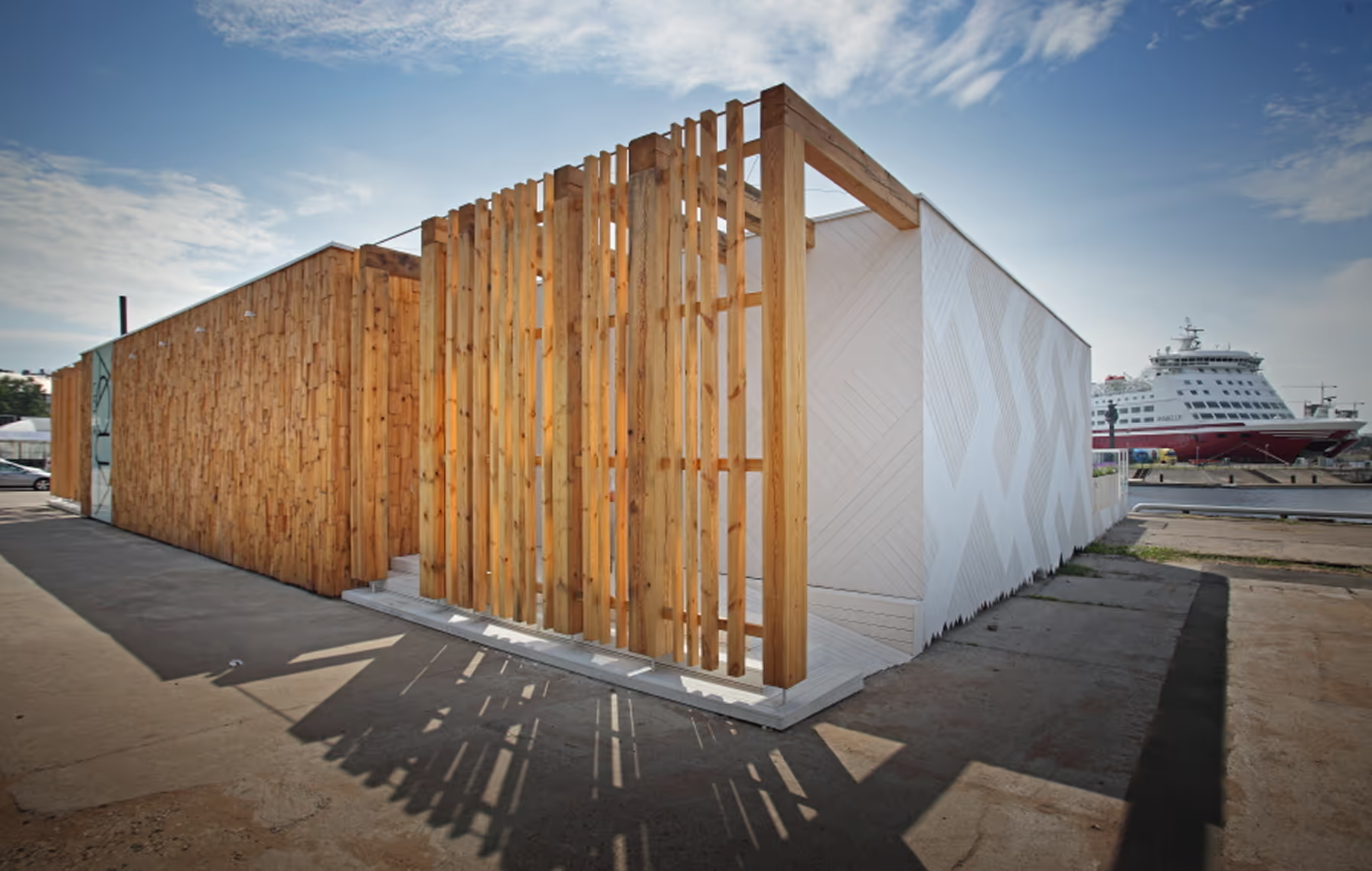
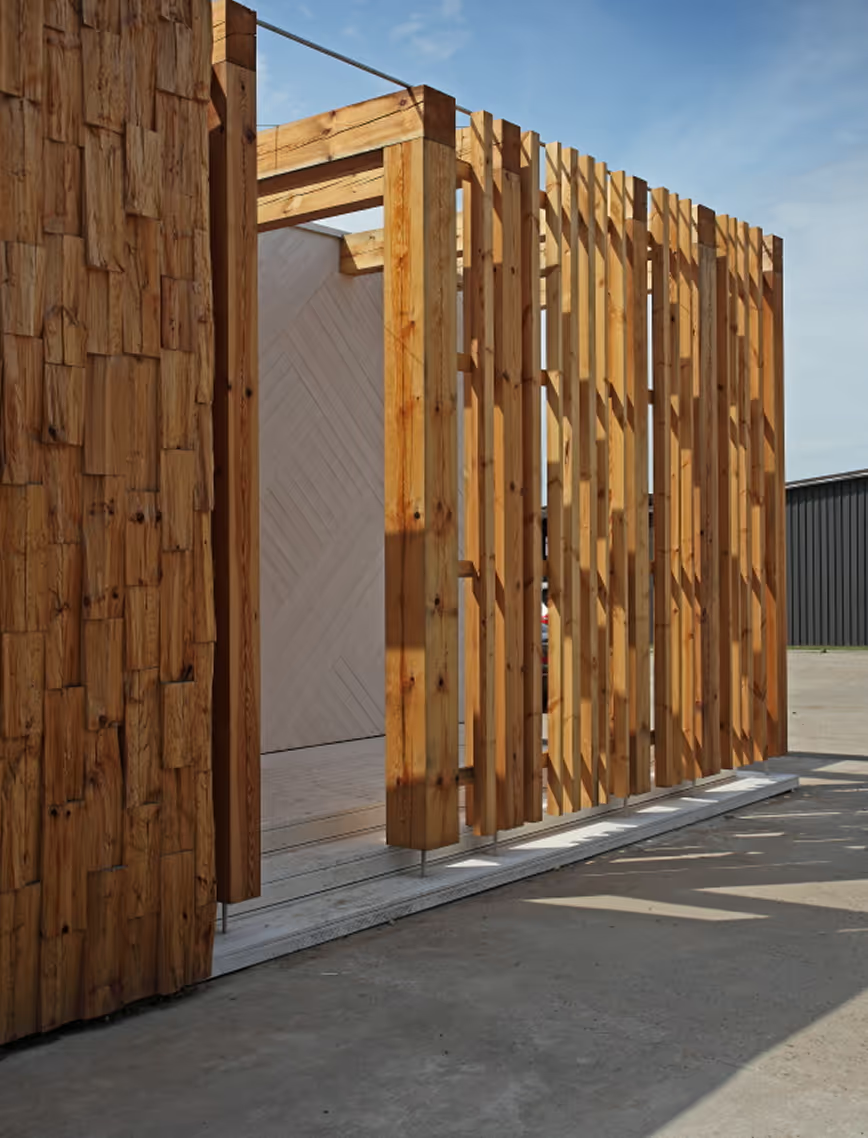
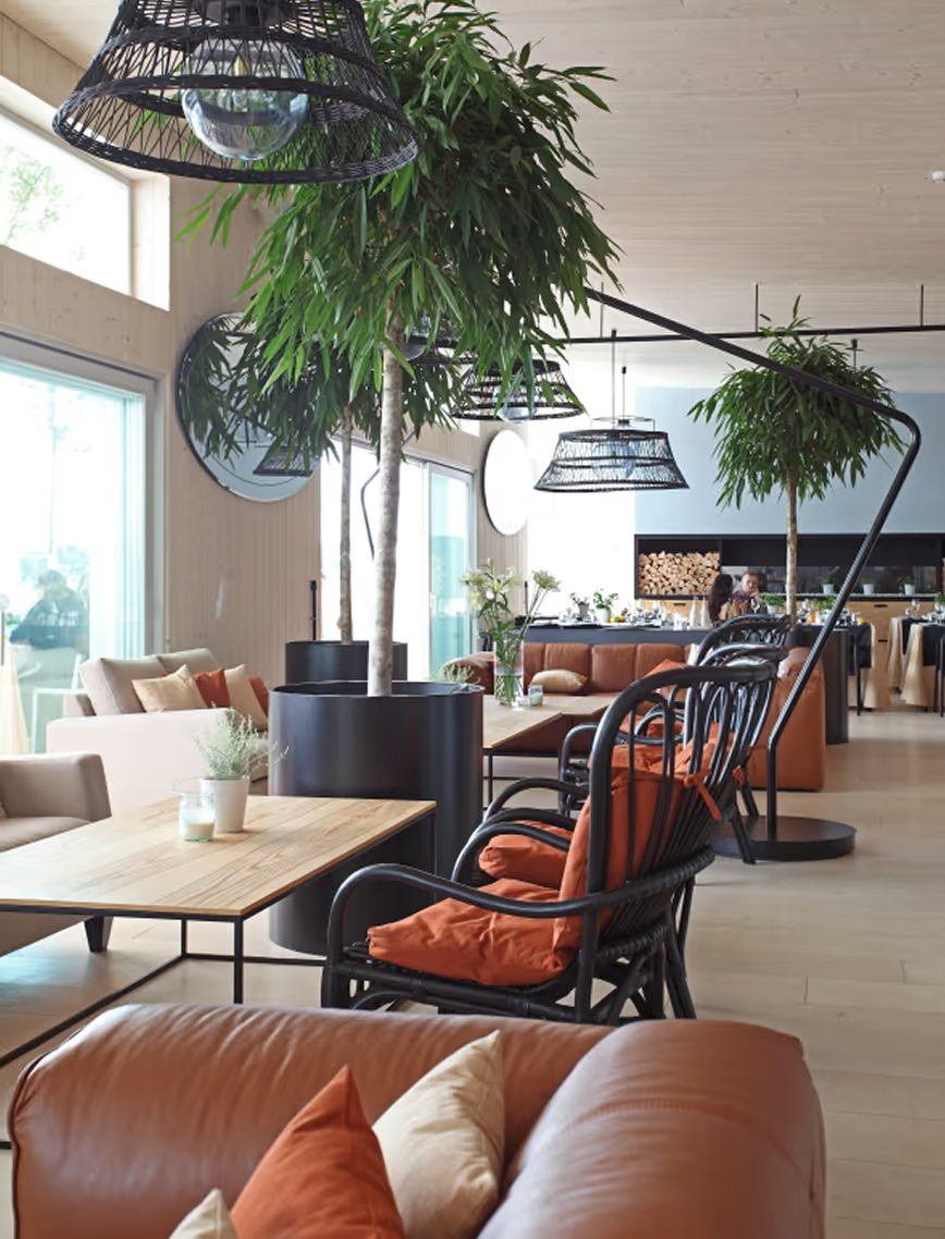
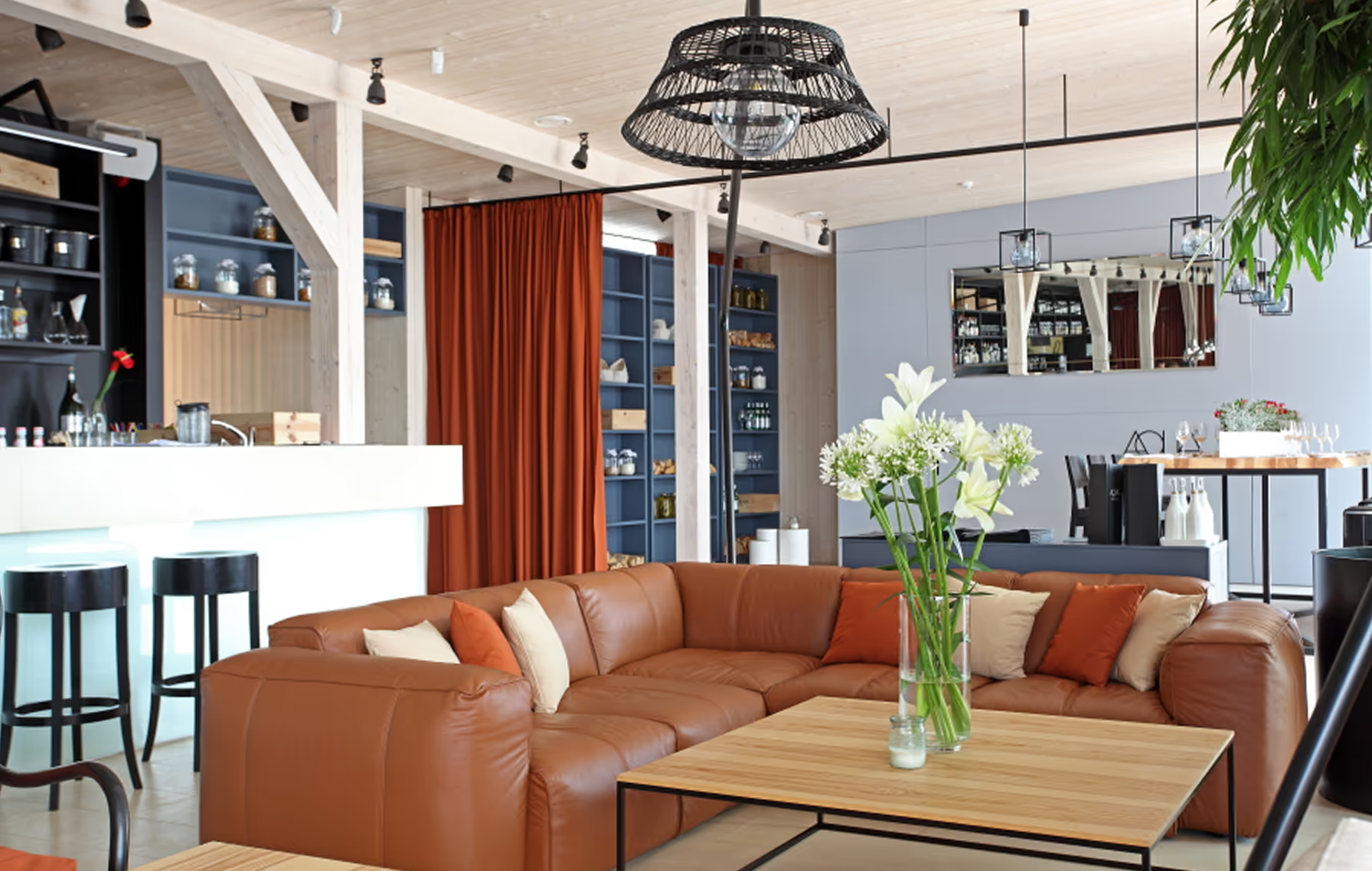
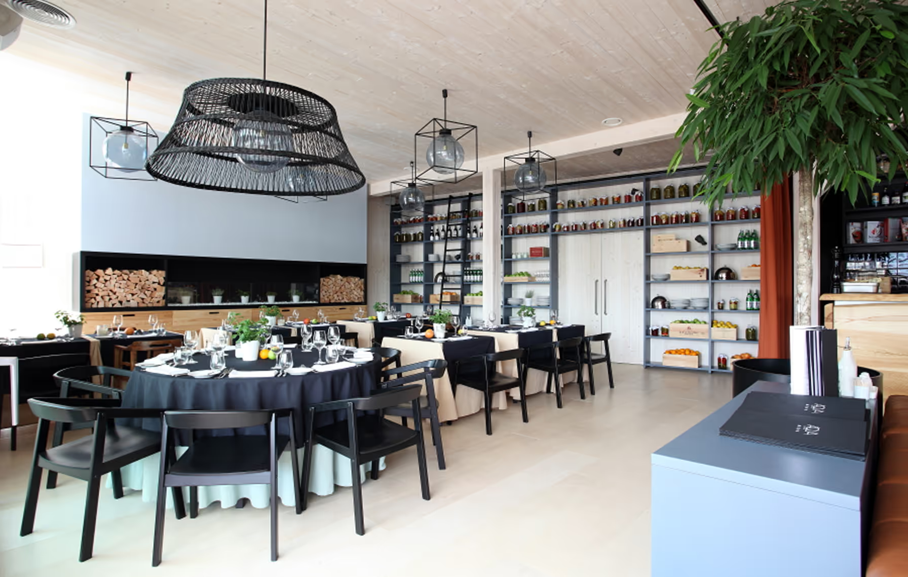
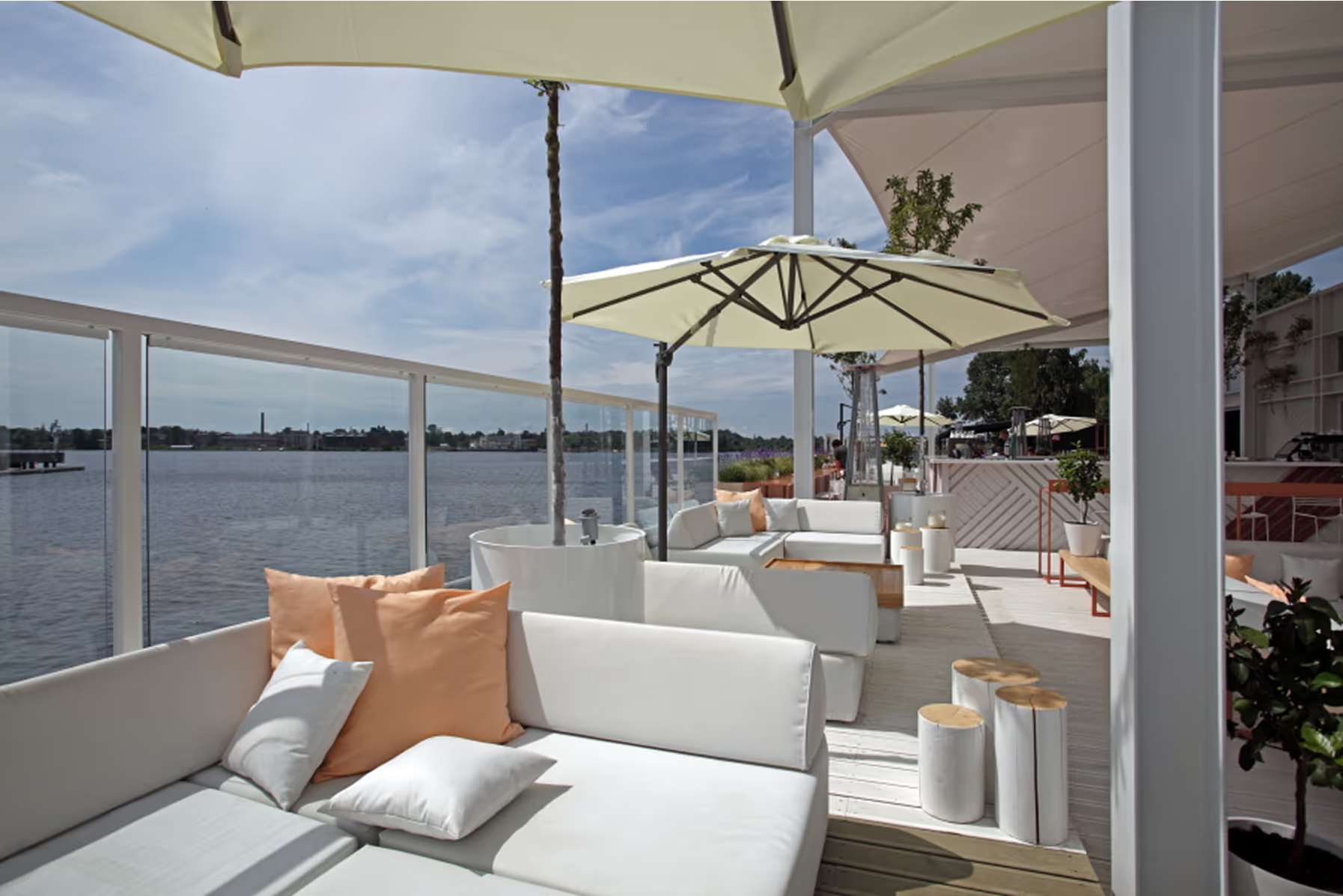
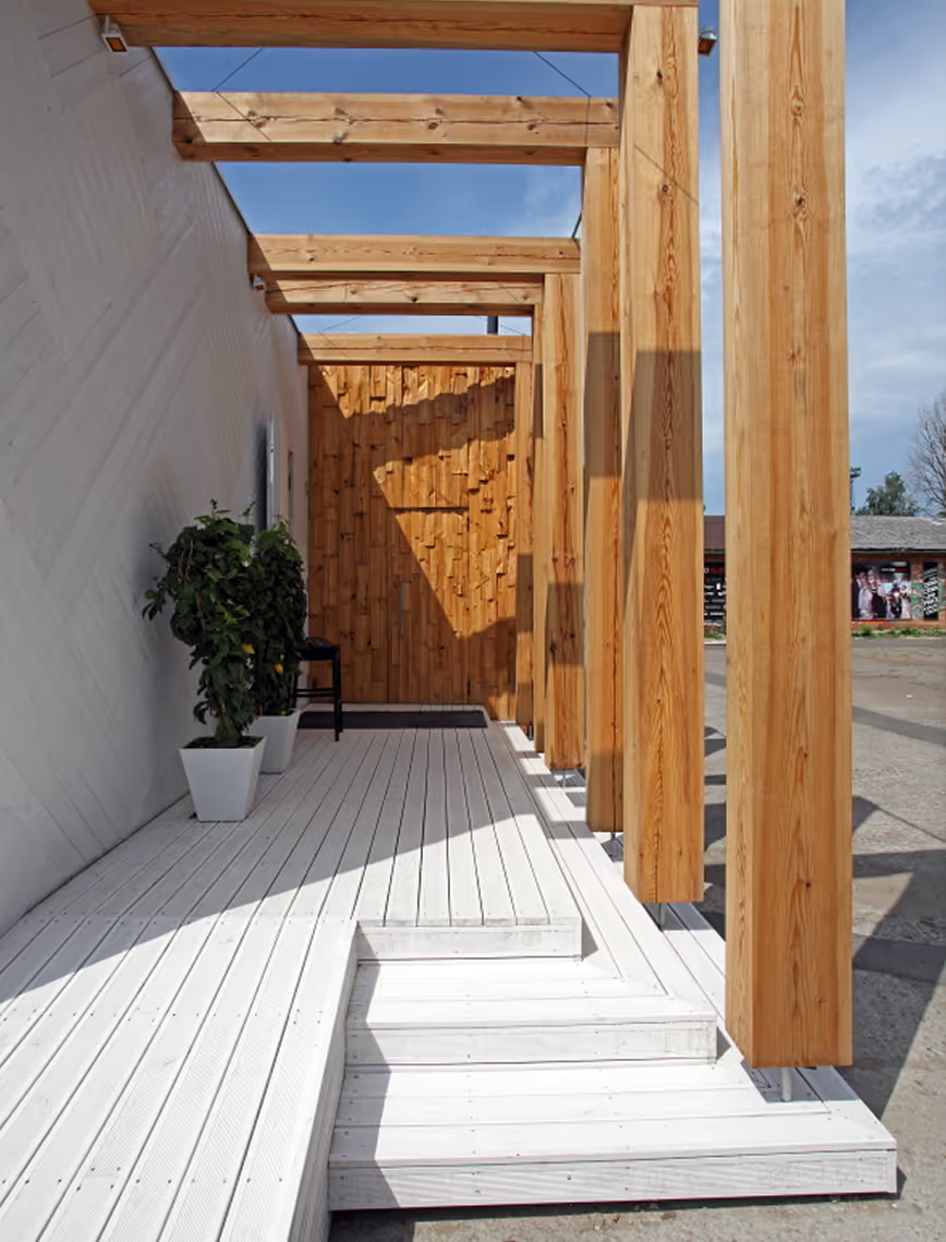
Aqua Luna is a lightweight, foundation-free structure designed as a seasonal summer restaurant. Built using a wooden frame, it serves as a temporary hospitality space, fully adaptable to changing needs and weather conditions.
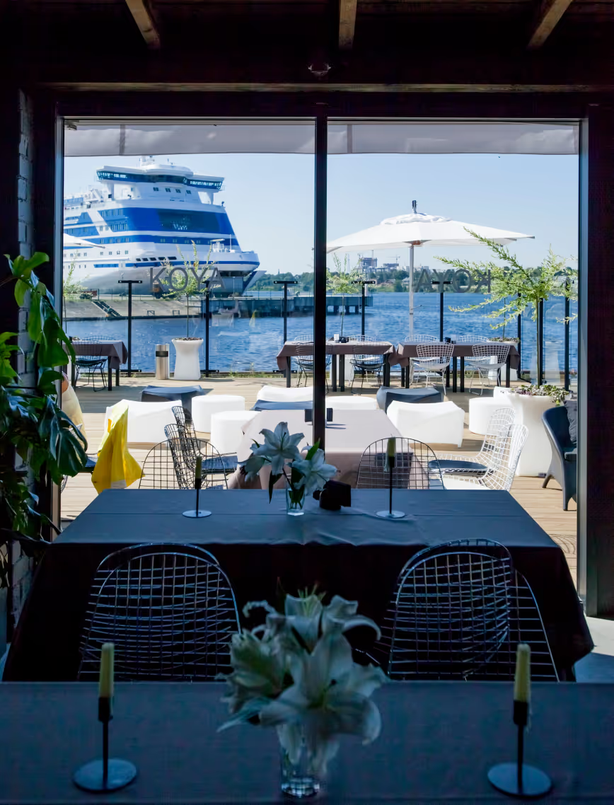
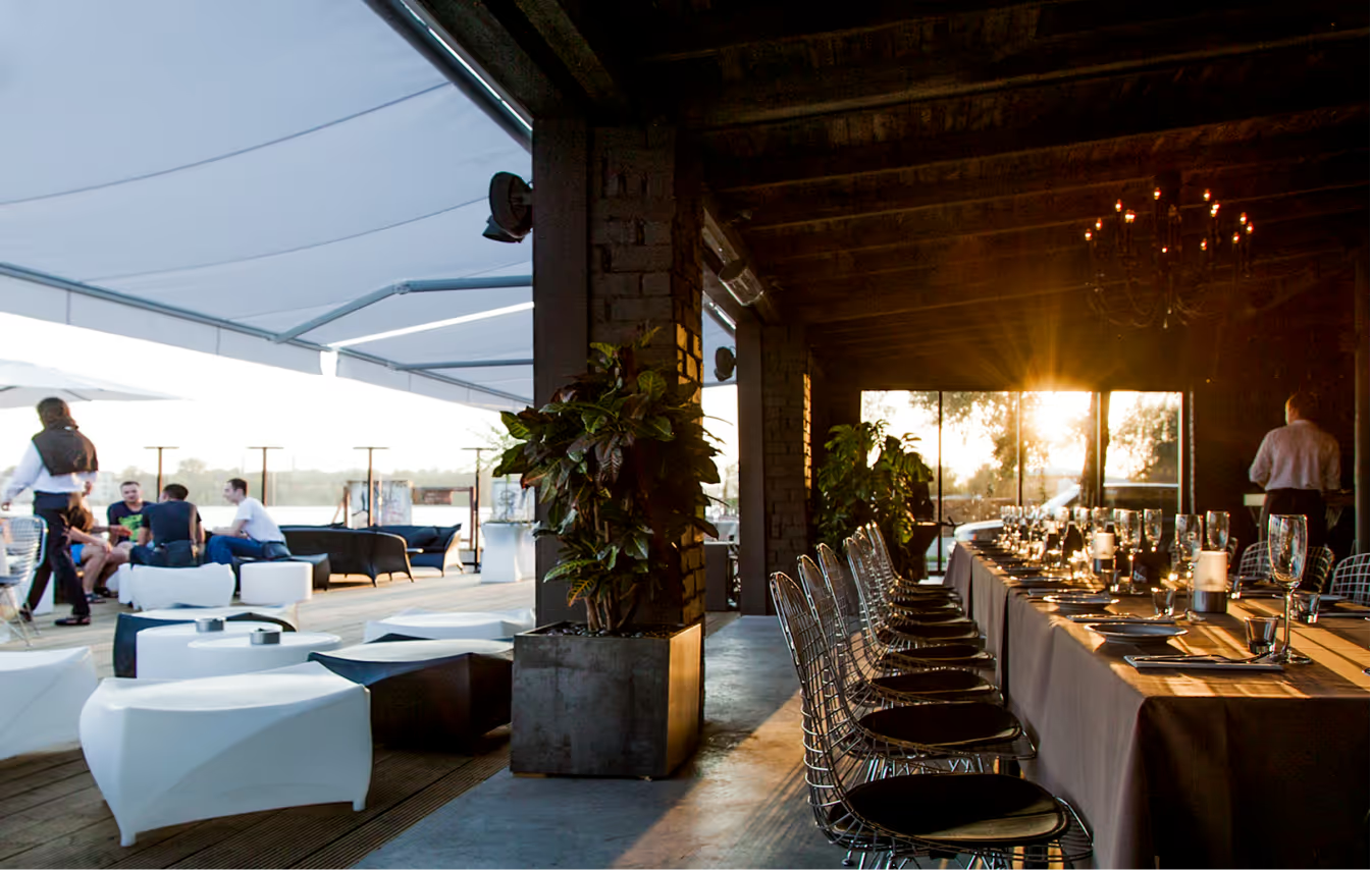
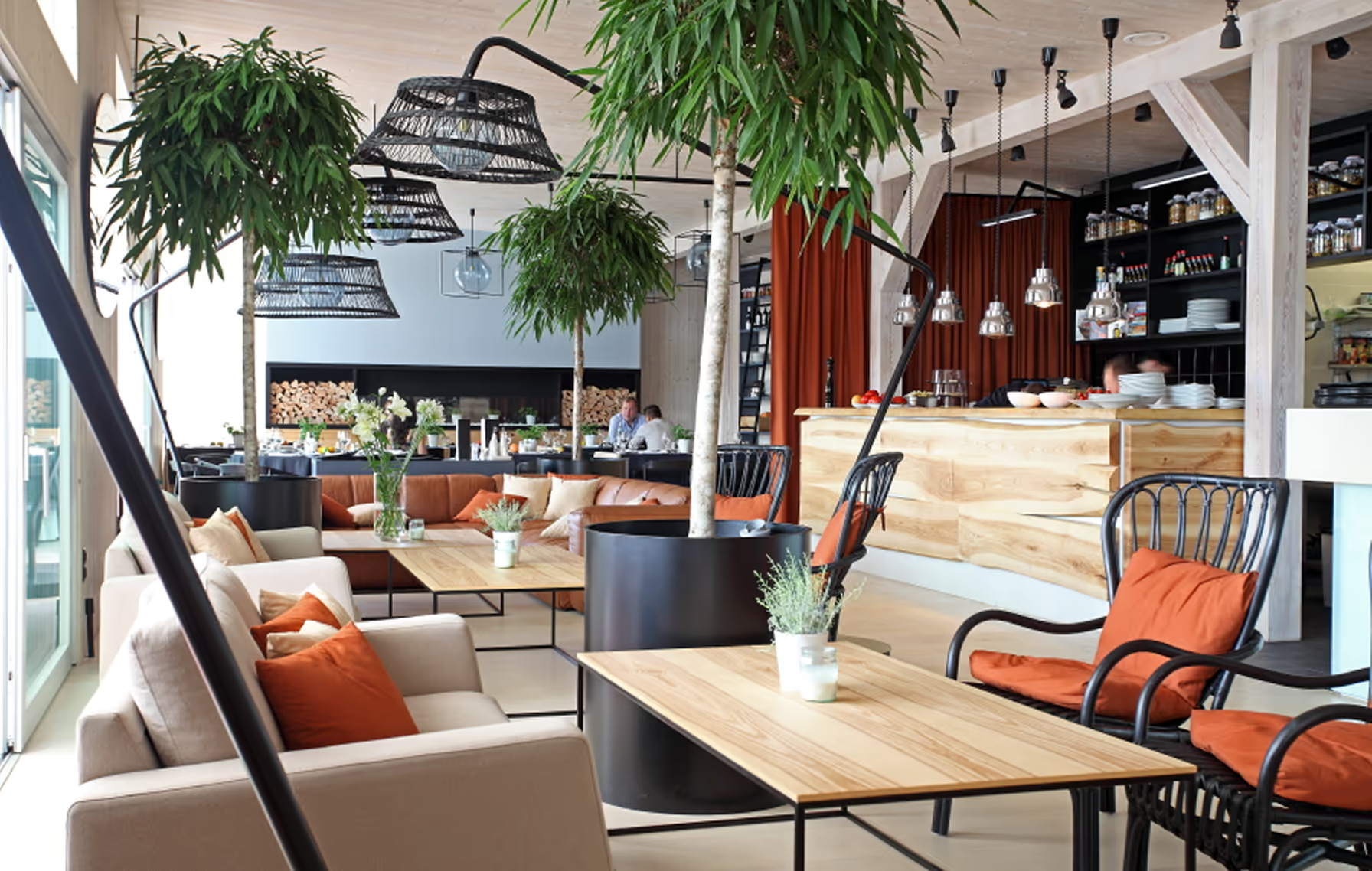
The design features a large outdoor terrace, offering open views and flexible dining arrangements. The interior follows a minimalistic approach, using clean lines and natural materials to support a simple, functional layout. The result is a relaxed, welcoming environment that reflects the casual elegance of summertime dining by the water.
LAYOUT2

LAYOUT2
LAYOUT1

LAYOUT2


LAYOUT2
BDO LAW
Office
Latvia
Riga, Latvia
2014
Ansis Starks
Office
LAYOUT1
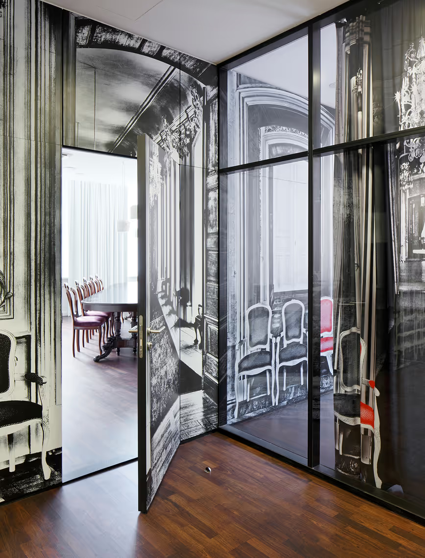
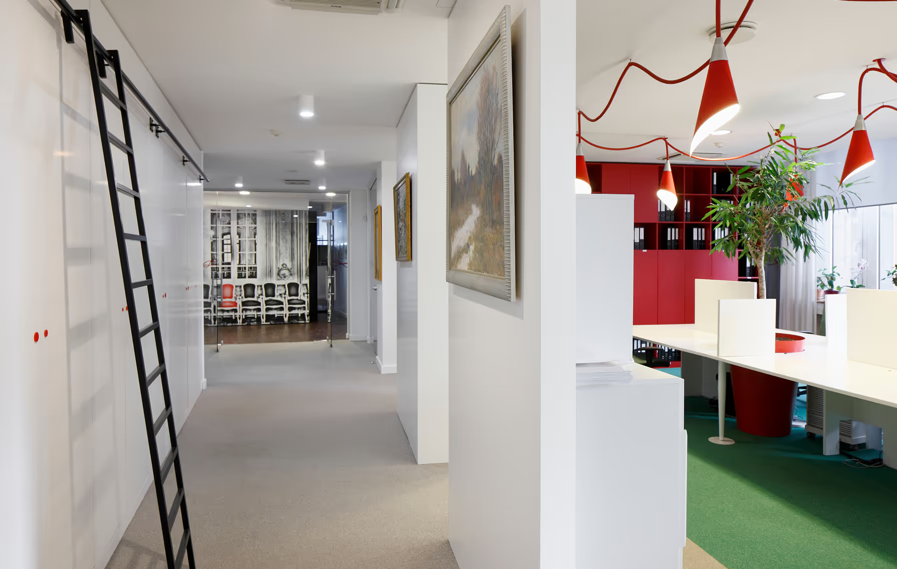
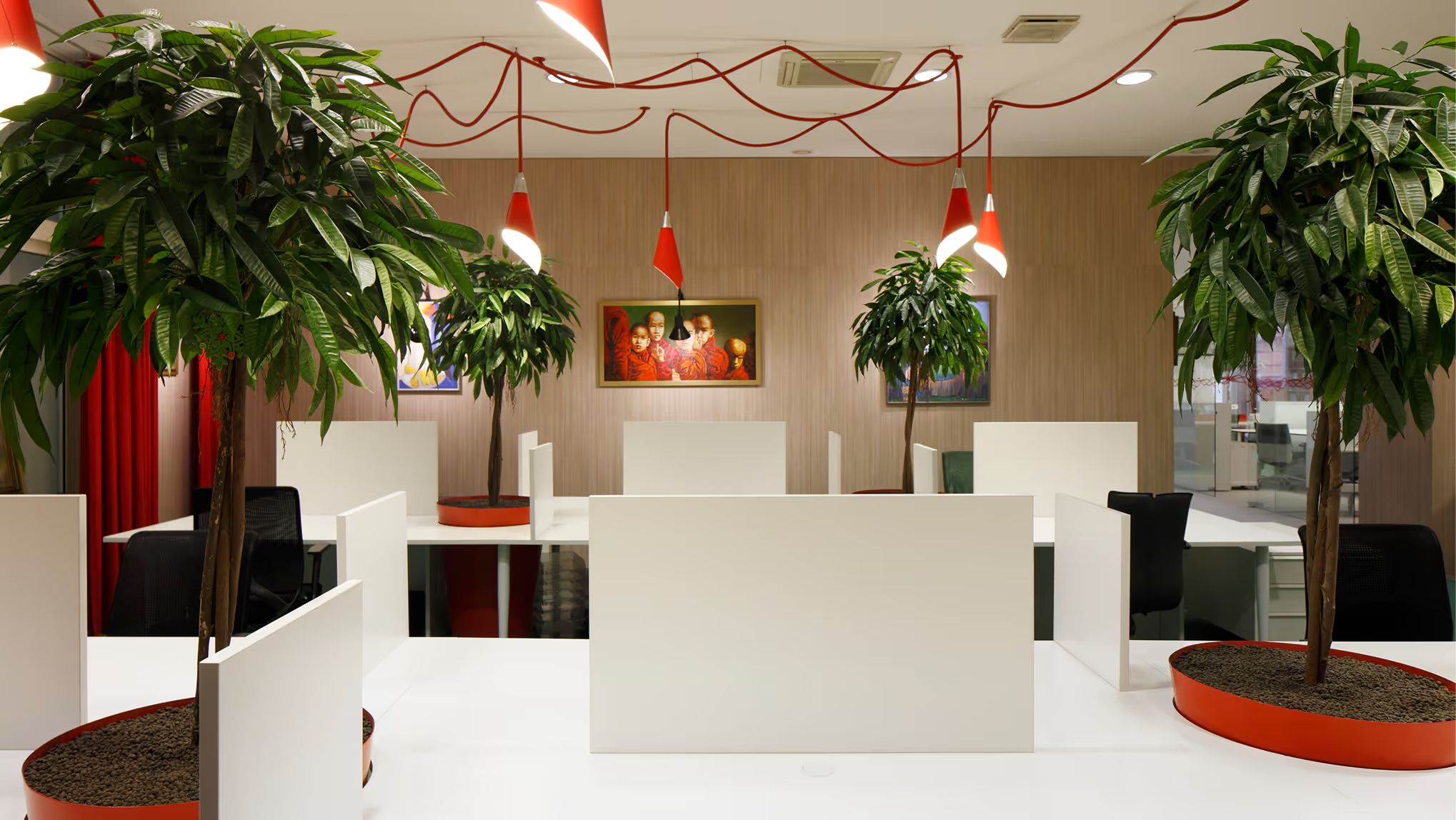
A marriage between the modern and the classic visually, functionally and in the context of the brand. The clients are collectors of art and antique furniture. They didn’t want to work in a predictable law office environment.
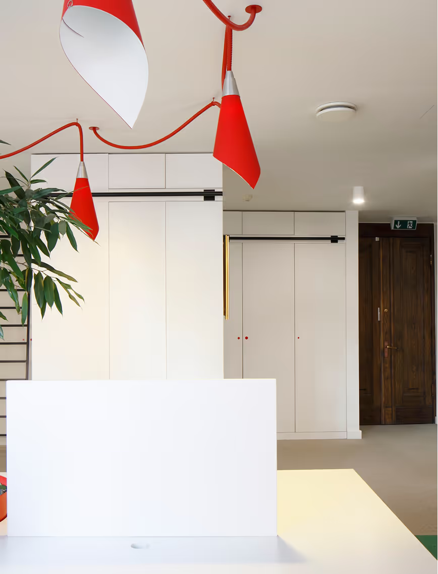
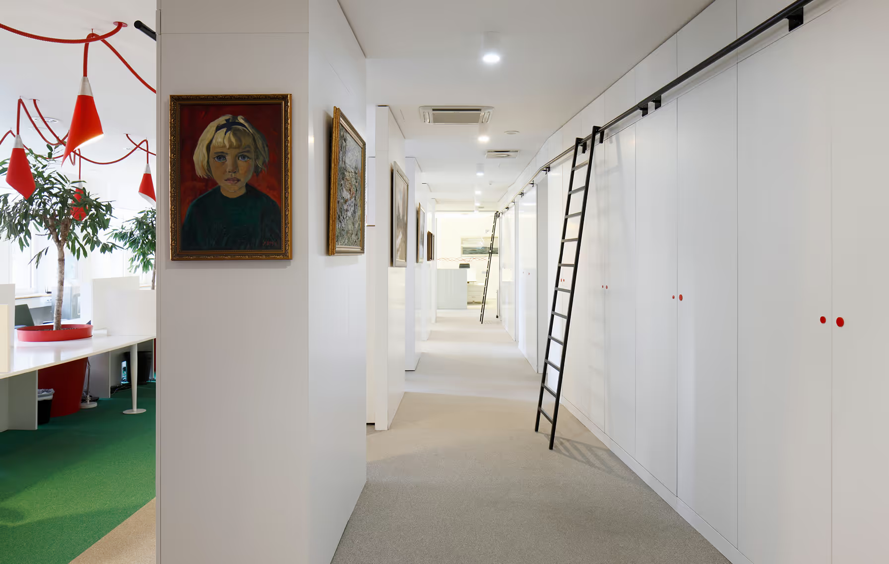
The front office interiors feature antique furniture from the clients’ own collection. We placed it in the conference rooms and paired them with ascetic, contemporary decor to obtain lightness. The back office is furnished with light coloured, contemporary furniture, some of which is taken from the old office.
LAYOUT3

LAYOUT1
We divided the interior into two zones – client-facing and staff only. The ‘front office’ includes a meeting area, conference rooms and executive offices while the back office is intended for use by employees. Unusually for law offices, the clients welcomed the idea of an open office. Since the number of employees is quite high for the amount of space, a classic approach wouldn’t be possible in terms of space, access to daylight and air flow.
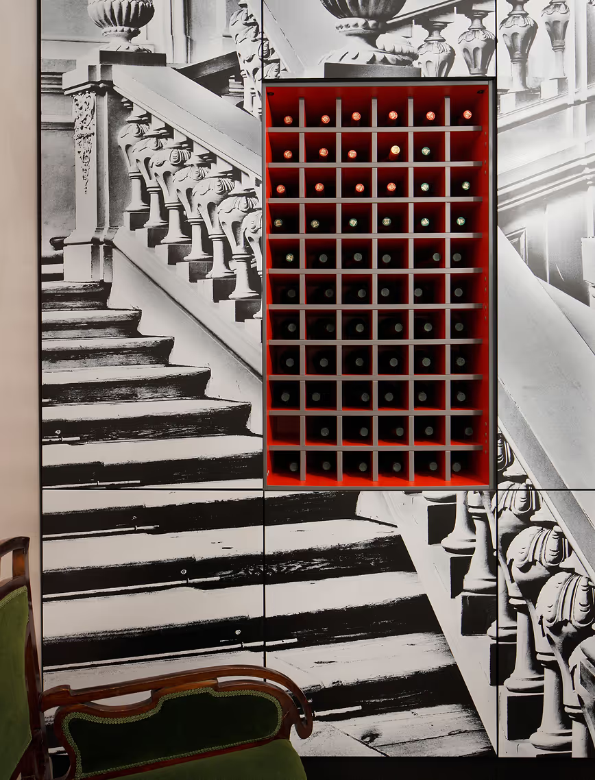
The reception area encapsulates how we paired the classic with the modern. To optically broaden the space and highlight the symbolism, we ordered a photo shoot of Latvia’s Rundale Palace. The photos have been edited into one single image. We created a striking welcome zone by using white print on black wall panels instead of the typical black on white. The reception desk is ascetic for the sake of contrast, visual neatness and a clear perception of the concept.

LAYOUT1

LAYOUT1
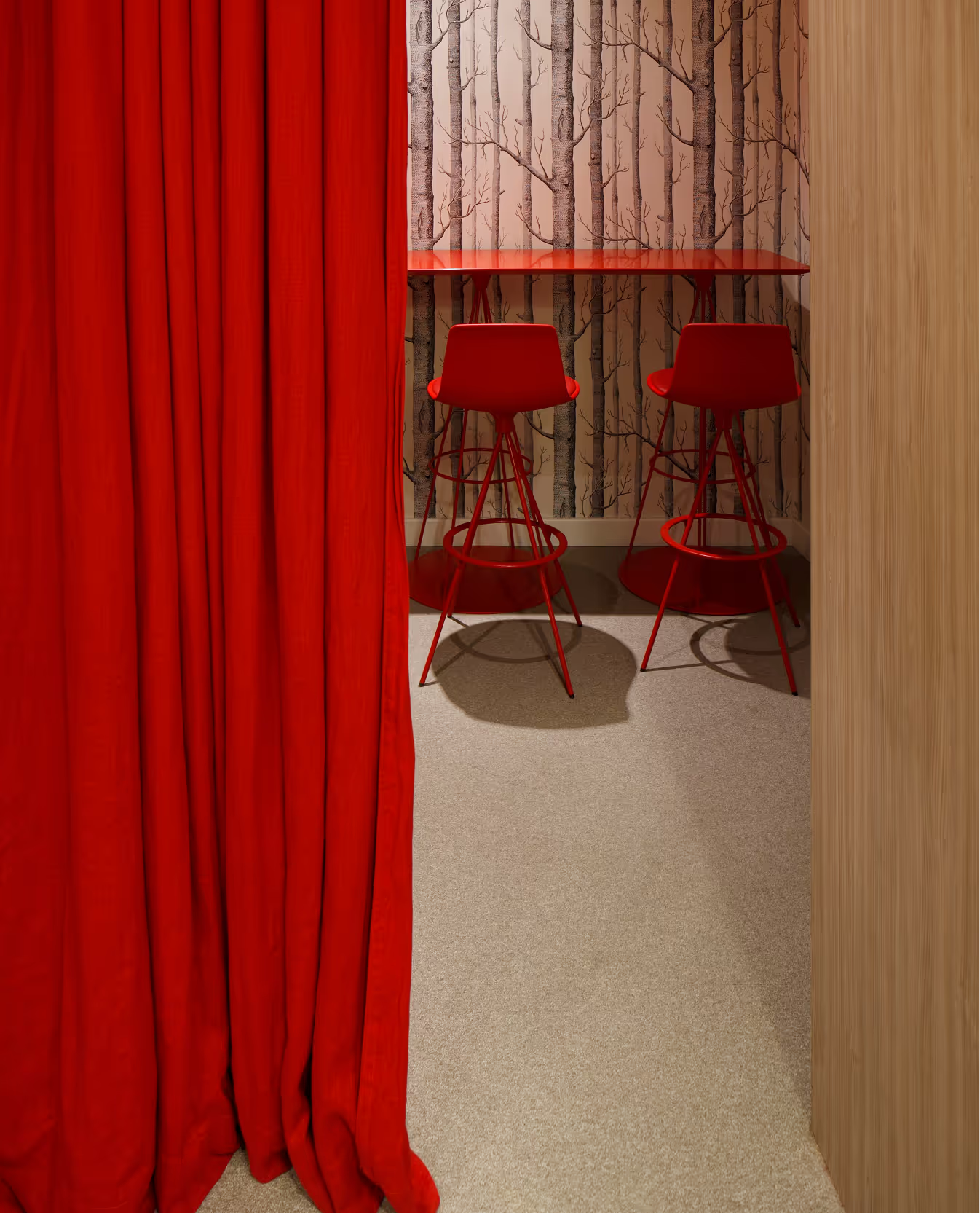
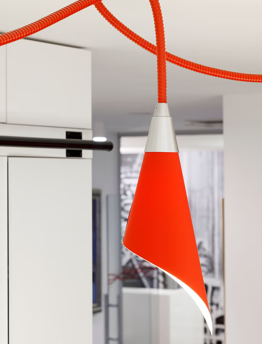
The front and back offices differ one from the other with paintings as a shared element. A red thread cuts through the interior, symbolising energy, movement and vitality. The theme continues in the red accents such as the protective decals on the glass partition walls and locally designed and manufactured lighting solutions.

LAYOUT2

BALTS
Bistro
Latvia
Riga, Latvia
2016
Janis Viksna
Bistro
LAYOUT1
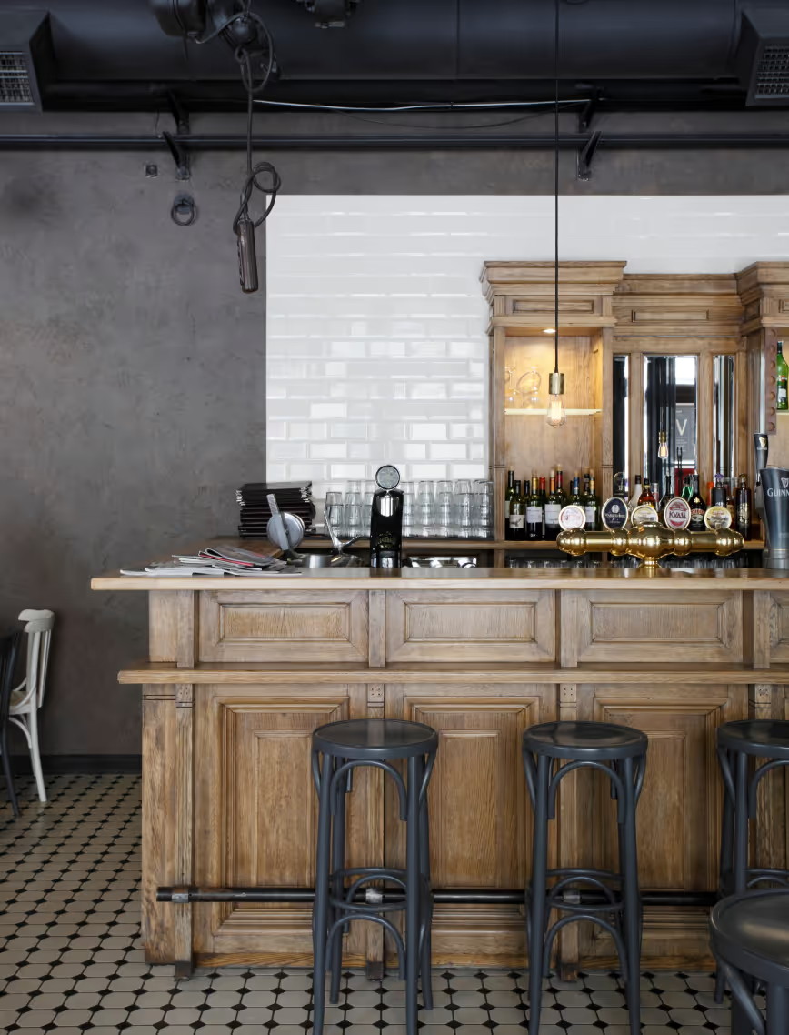
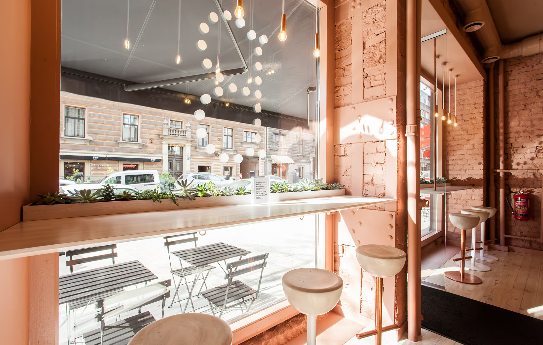
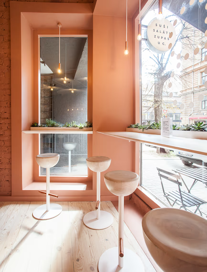
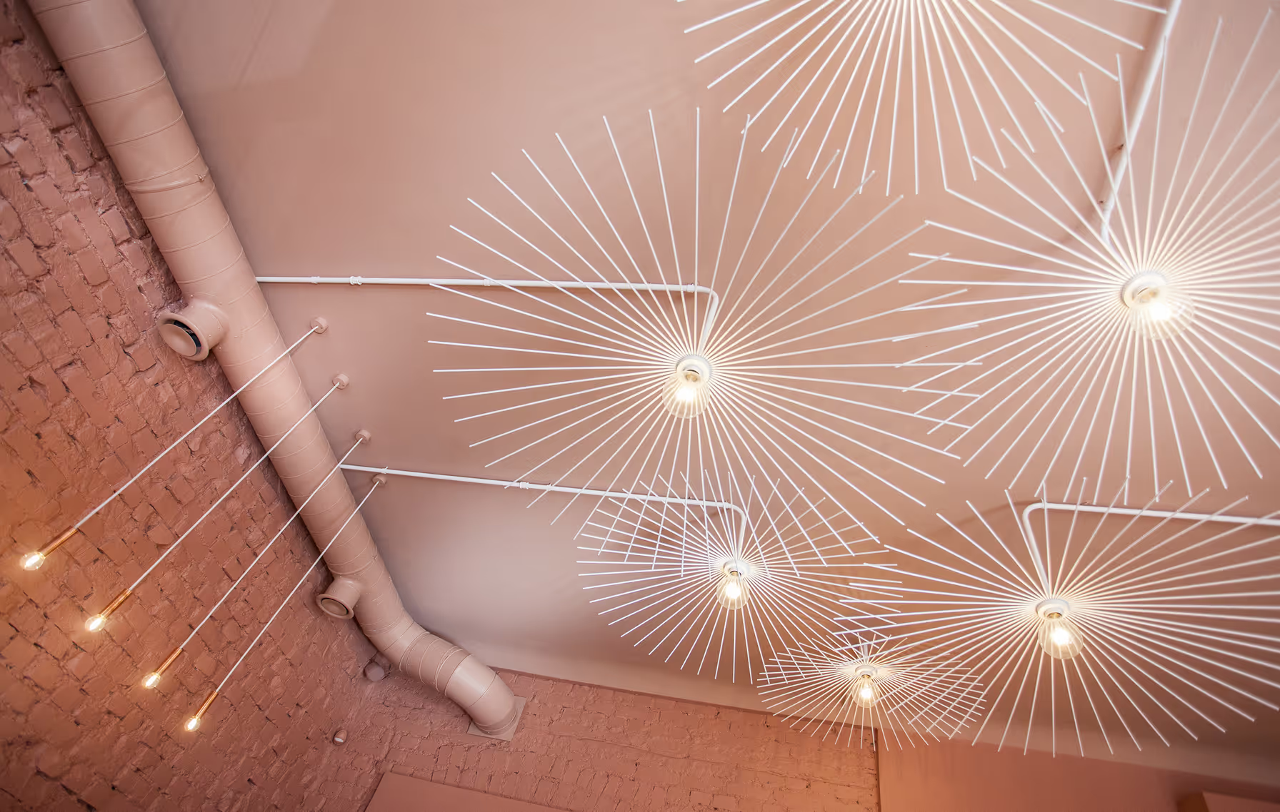
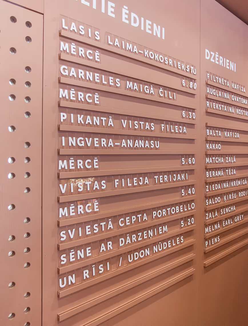
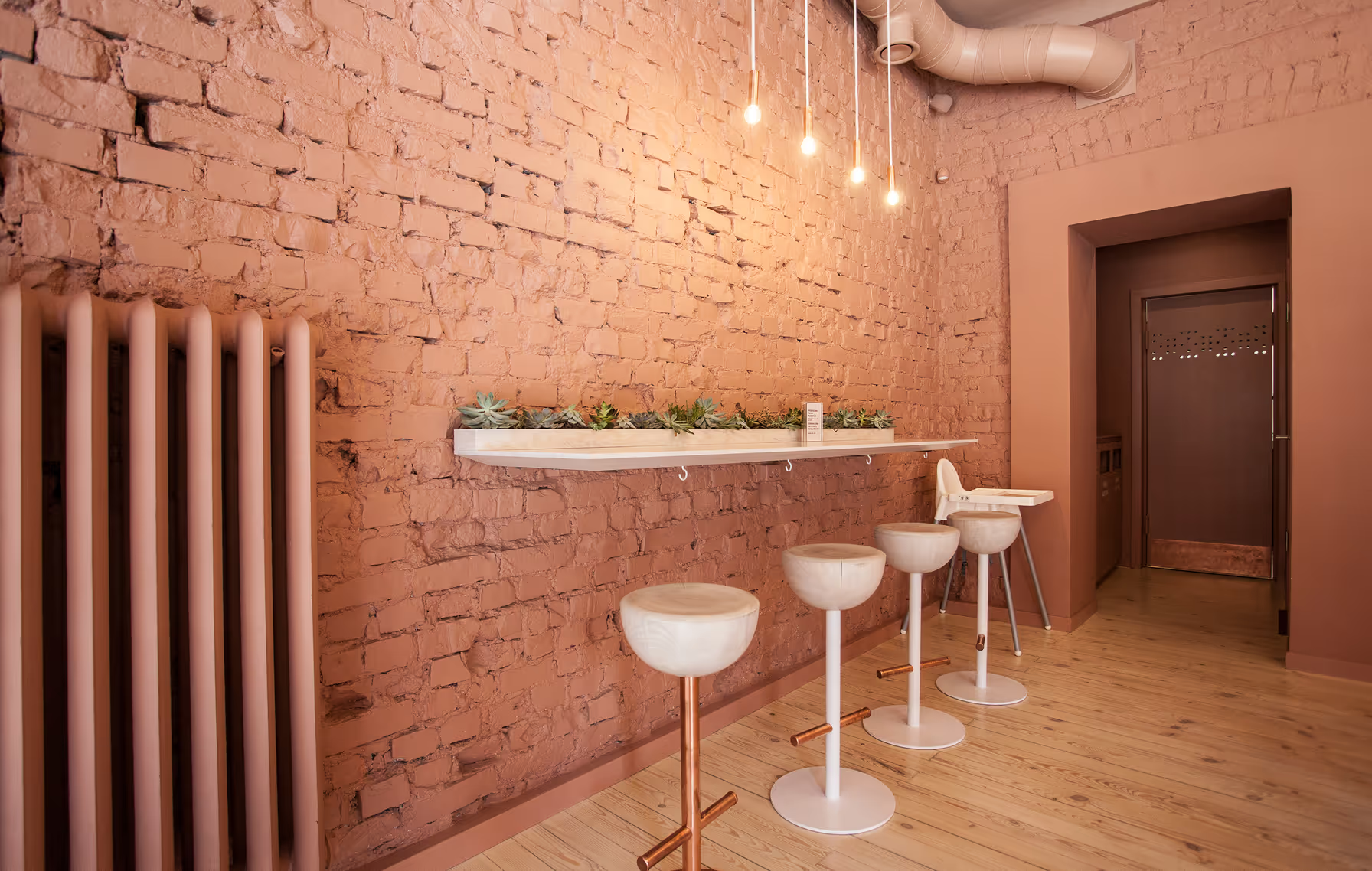
Balts is a celebration of simplicity — in food, in atmosphere, and in space. Designed with a warm, minimalistic approach, the interior reflects the restaurant’s core philosophy.
Every design choice was made to support that clarity. Natural tones, clean lines, and soft textures create a calm backdrop. The layout prioritizes openness and inclusivity, with shared seating arrangements that encourage connection while making the most of a compact floor plan.
Visual identity elements were subtly integrated into the interior — from custom signage to accent colors — creating a seamless brand experience from plate to place.
.avif)
LAYOUT2
LAYOUT1

.avif)
.avif)
LAYOUT2
LAYOUT2

LAYOUT1


