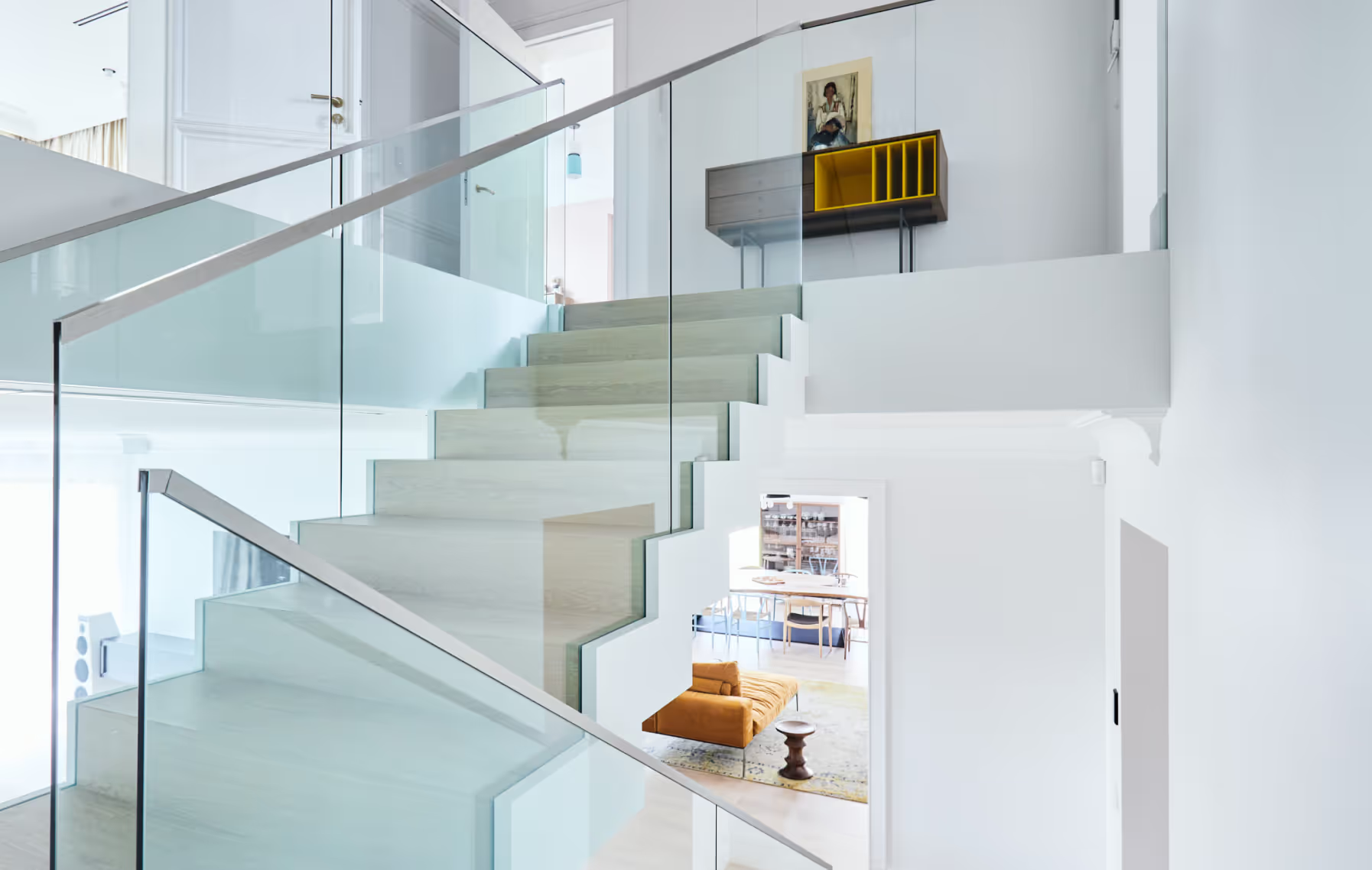
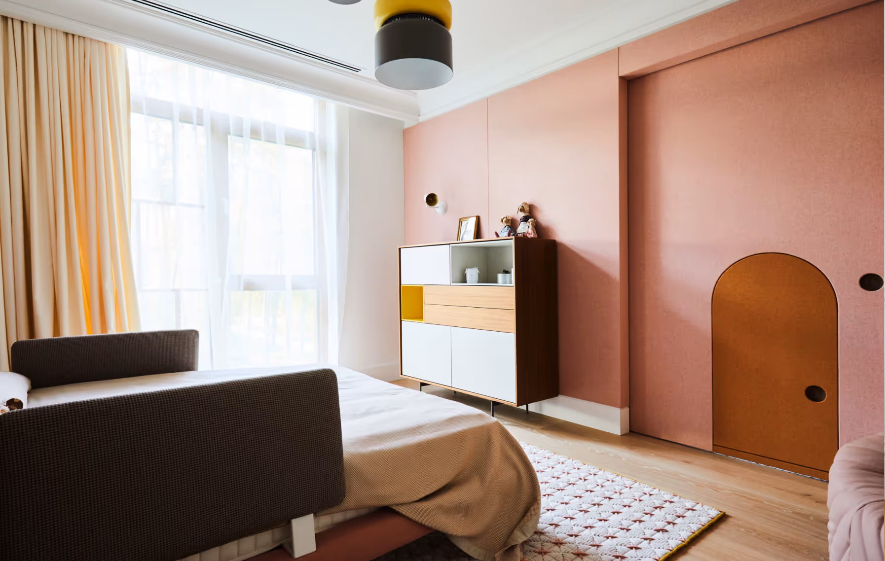
KTR14
Apartment Building
Latvia
Riga, Latvia
2024 - ongoing
Apartment Building
Latvia Sotheby's International Realty
LAYOUT1
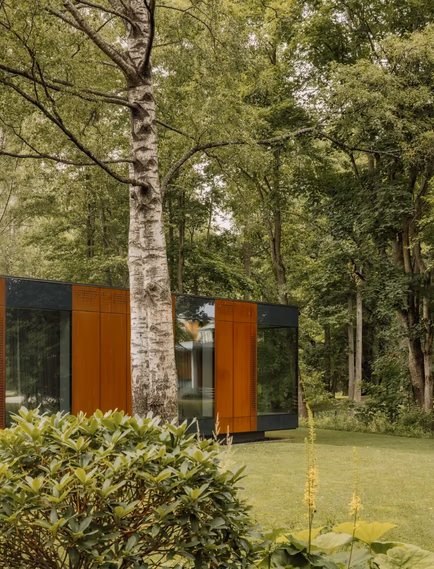
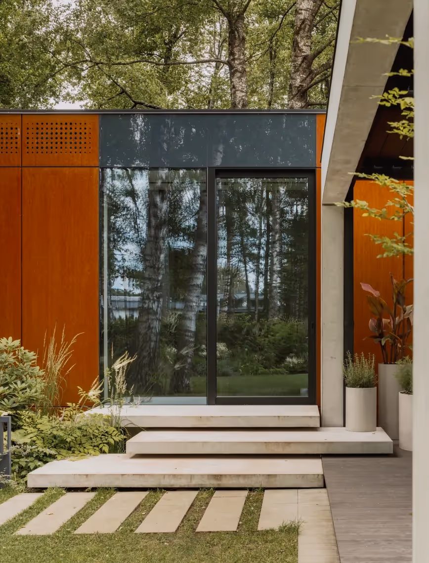
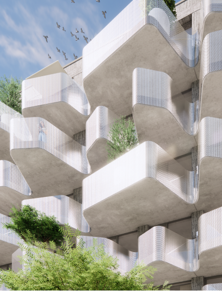
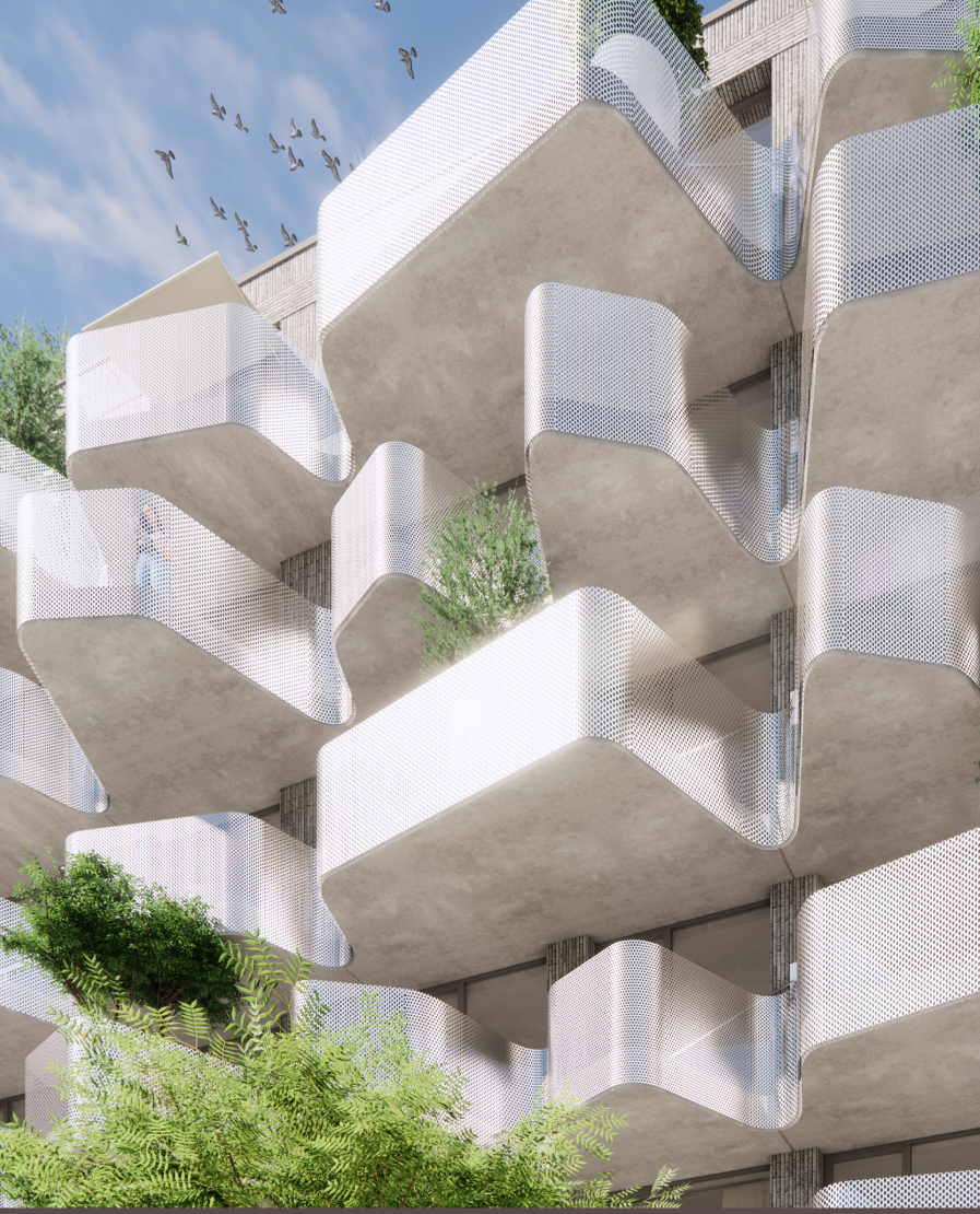
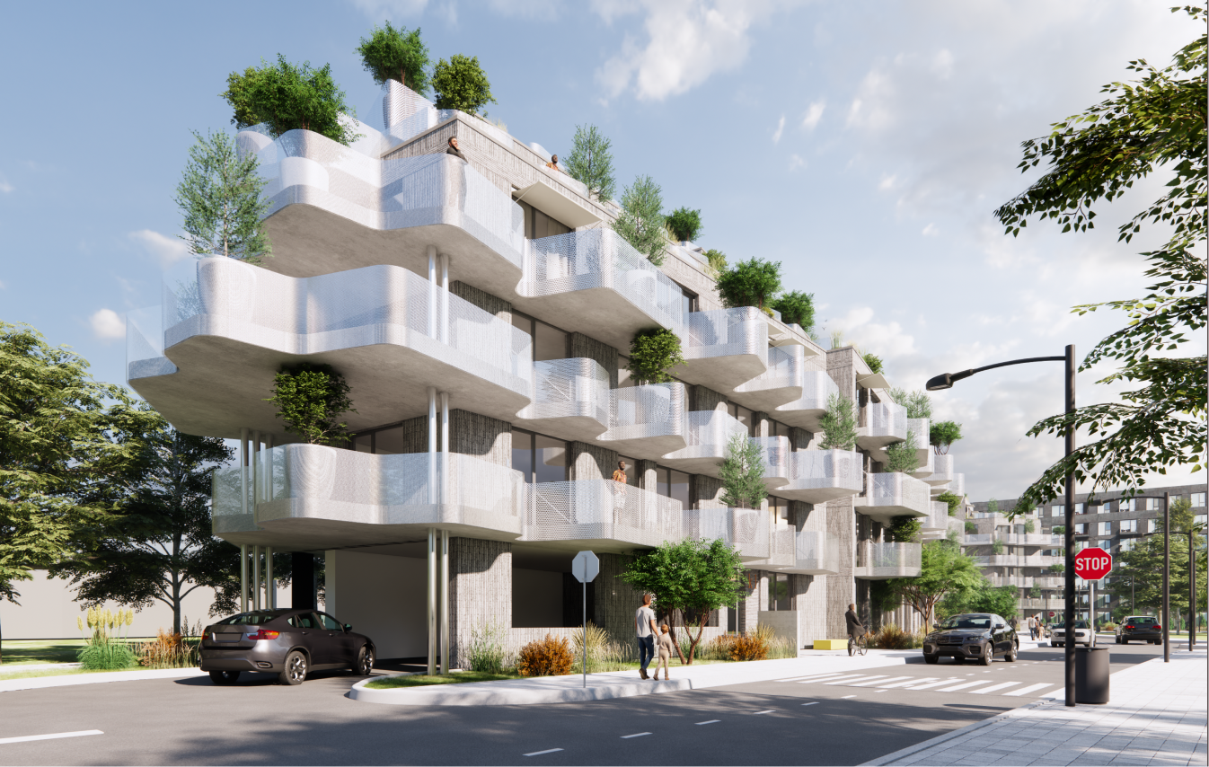
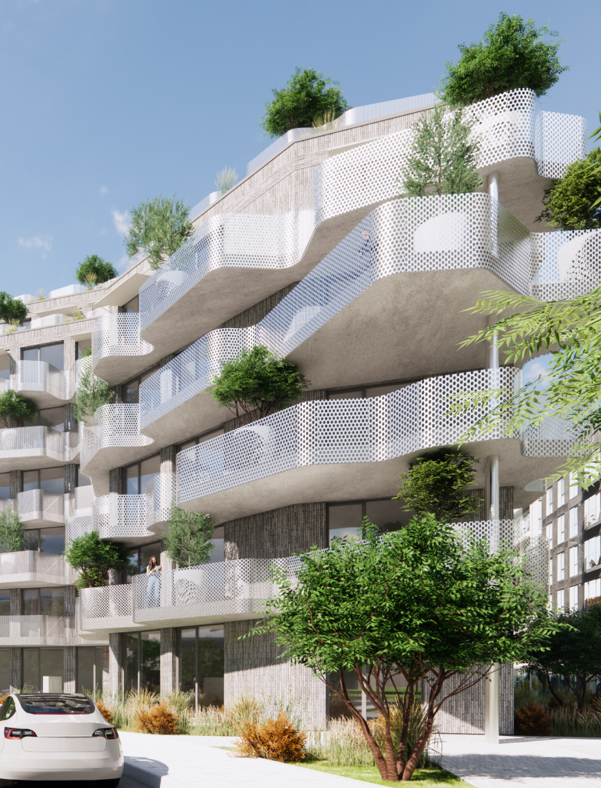
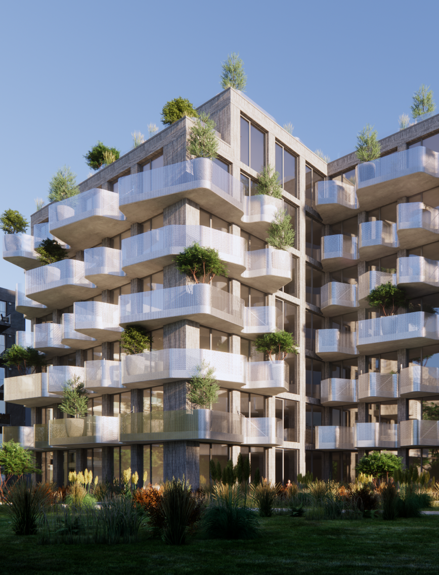
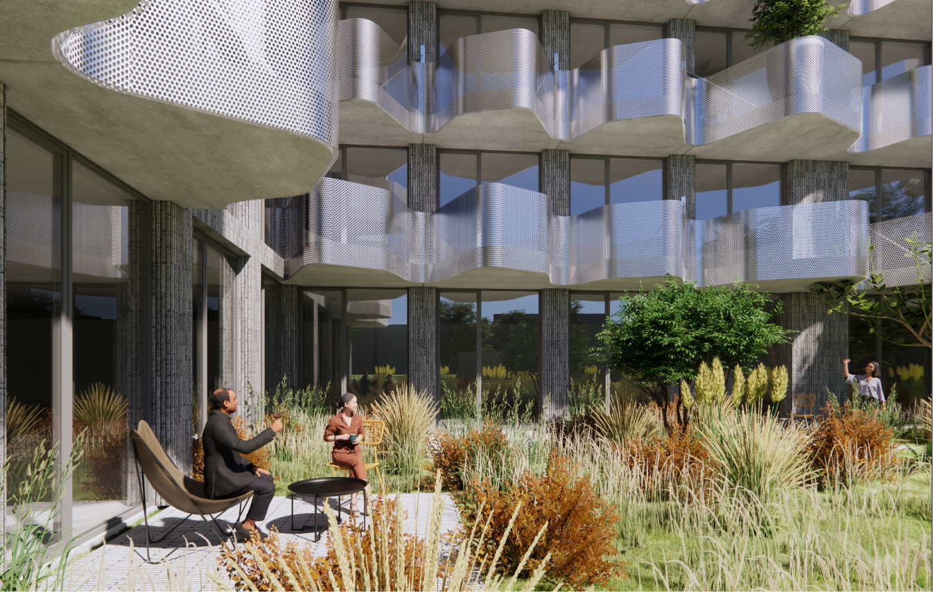
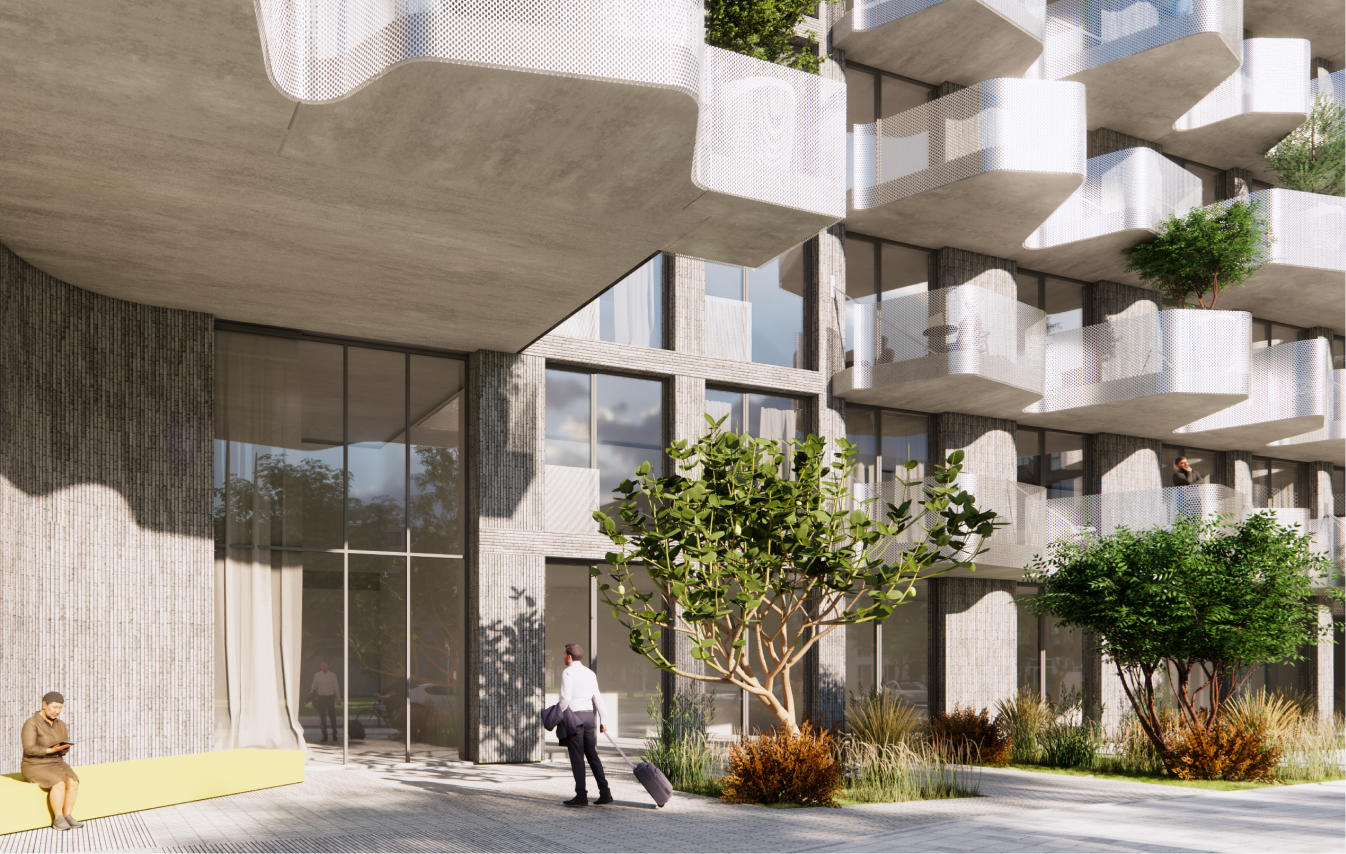
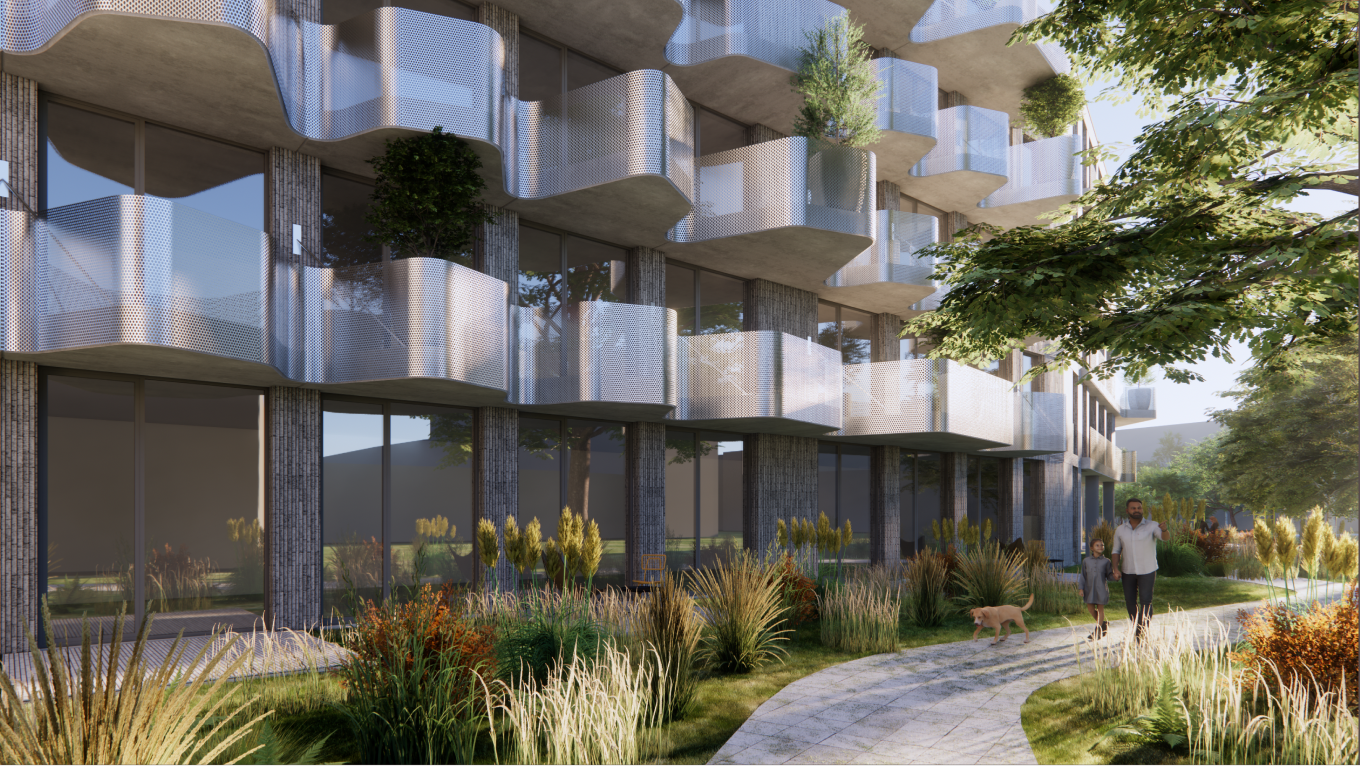
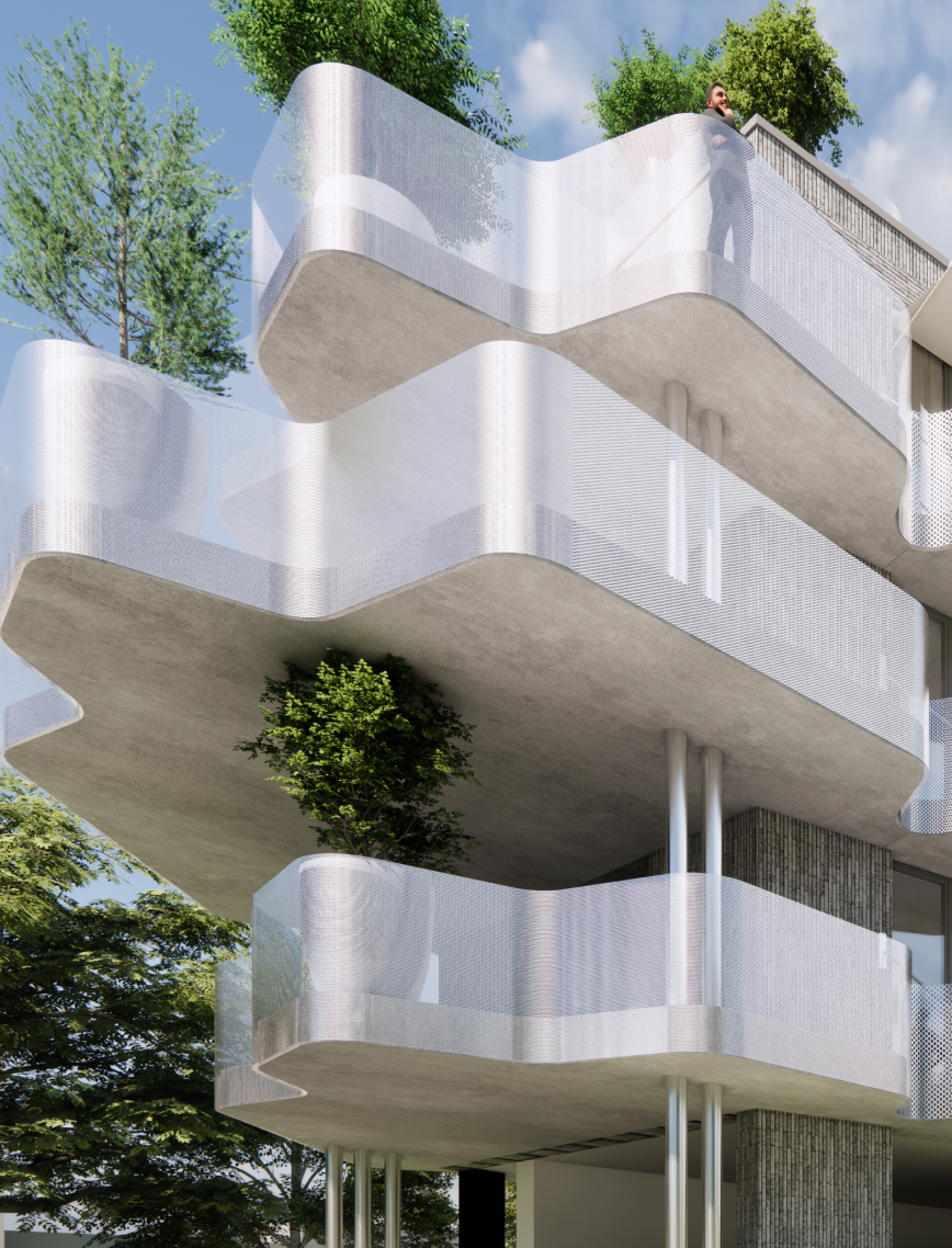
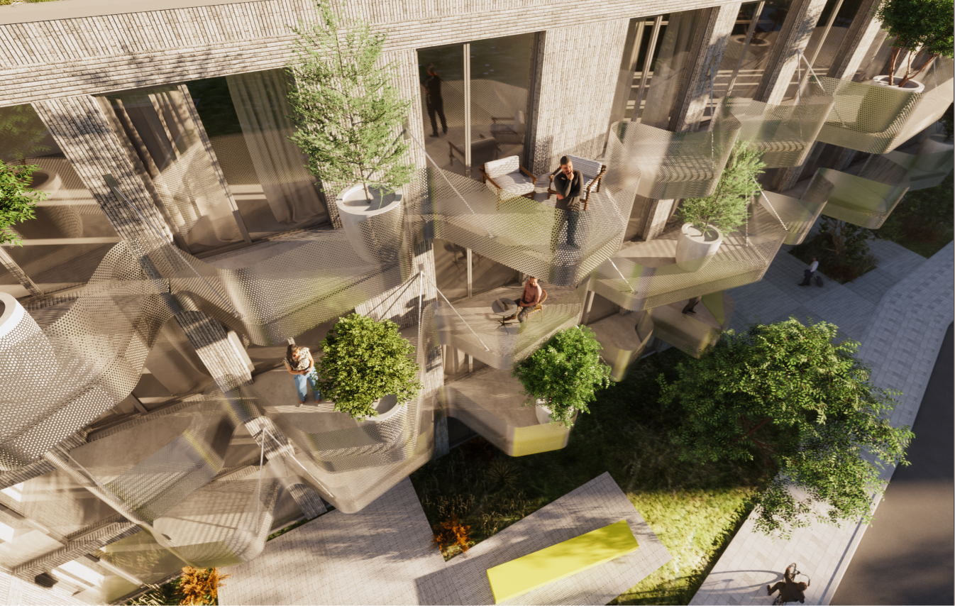
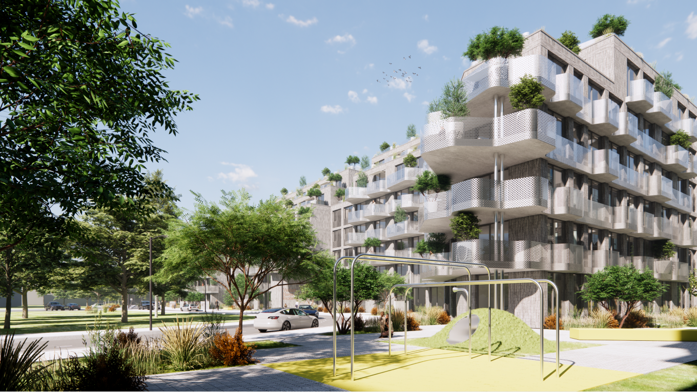
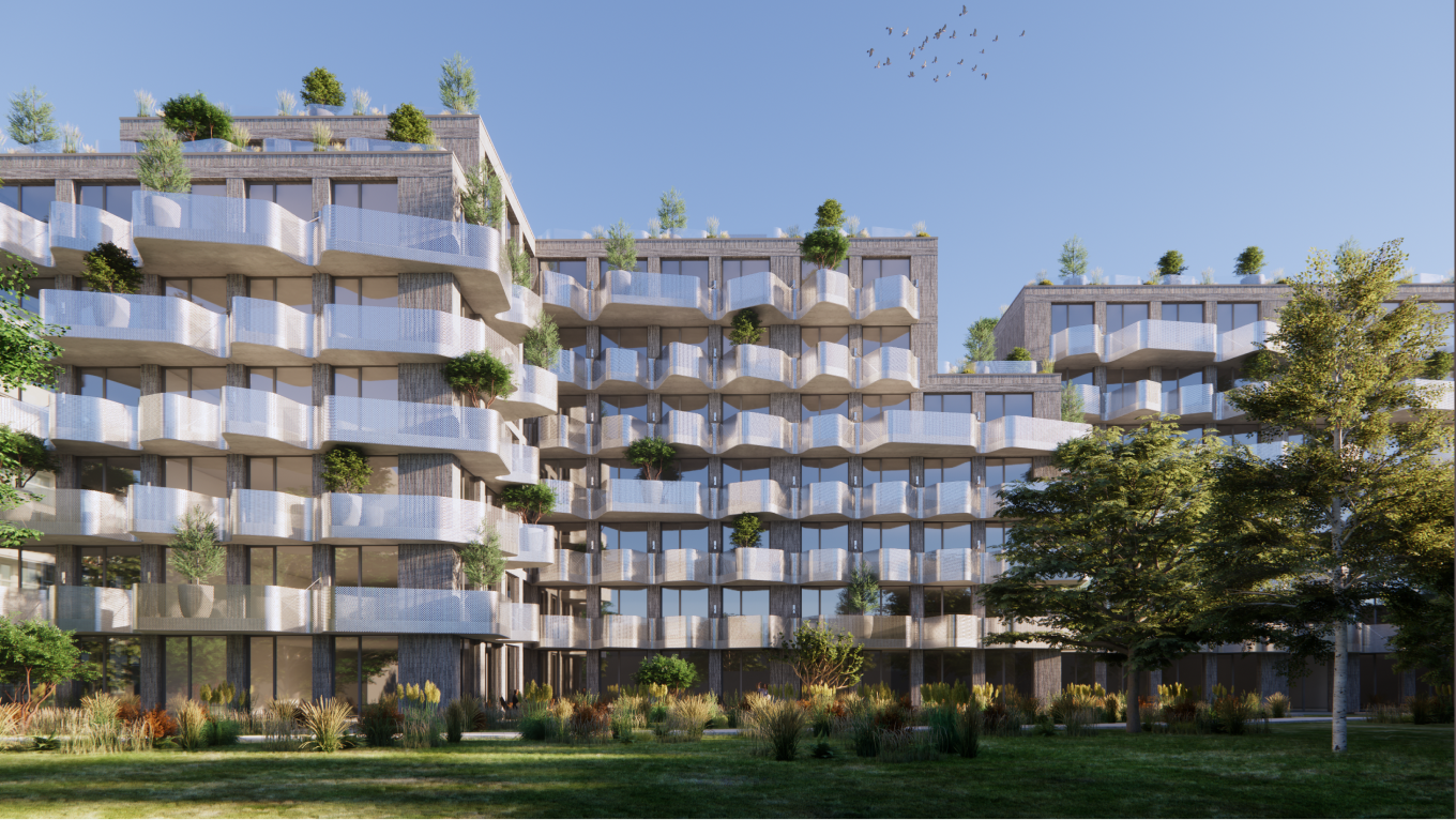
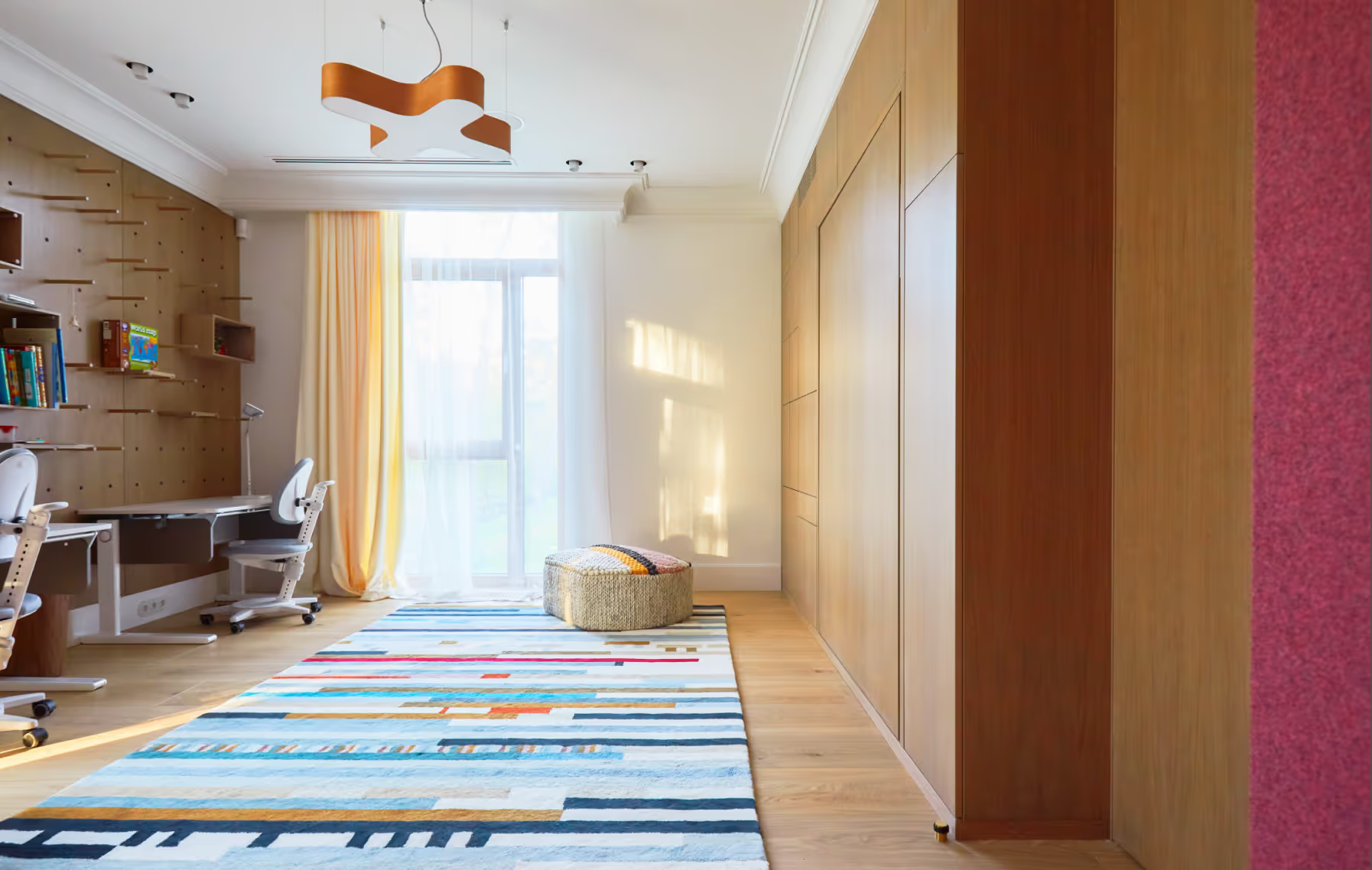
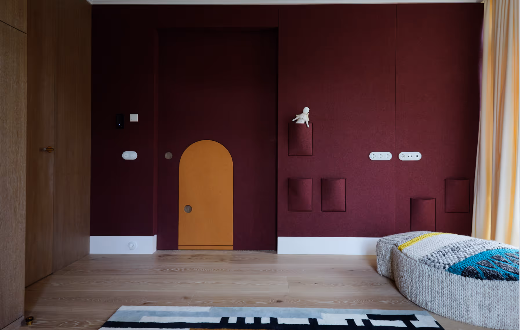
KTR14A is an attainable family-focused apartment development in Riga, Latvia. The building is located near one of Riga's most scenic parks, reflecting its connection to nature via organic and fluid forms in architectural elements.
LAYOUT2
LAYOUT1
LAYOUT2
The housing features commercial areas on the ground floor, incorporating retail spaces and wellness services into the building to meet the every-day needs of its residents.
LAYOUT1
LAYOUT2
LAYOUT3
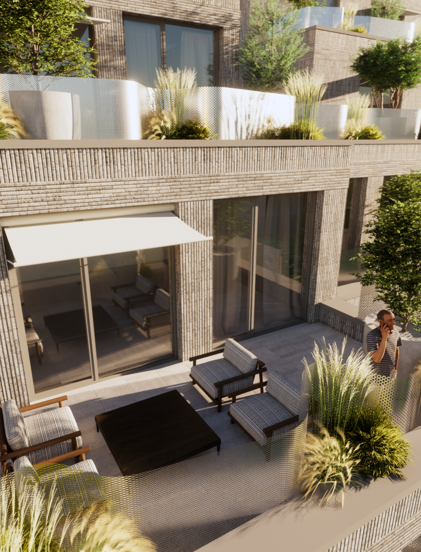
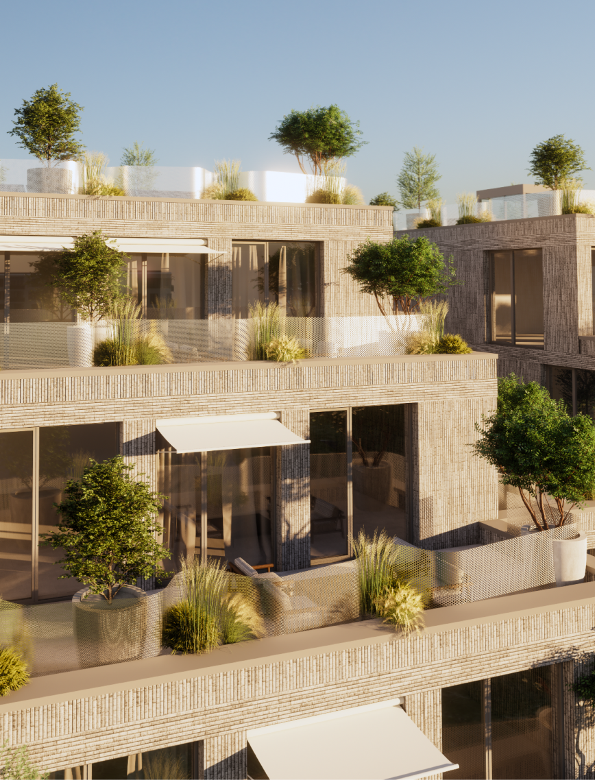
One of the projects greatest assets is its wide, plant-filled terraces and balconies that foster a sense of belonging and provide a refreshing break from the crowded urban landscape.
EYWA WAY OF WATER
Apartment Building
UAE
Dubai, UAE
2022 - ongoing
Apartment Building
R.evolution
Olga Ponomarjova, Maria Gembitskaya, Sergejs Zarovnijs, BINYAN
LAYOUT1
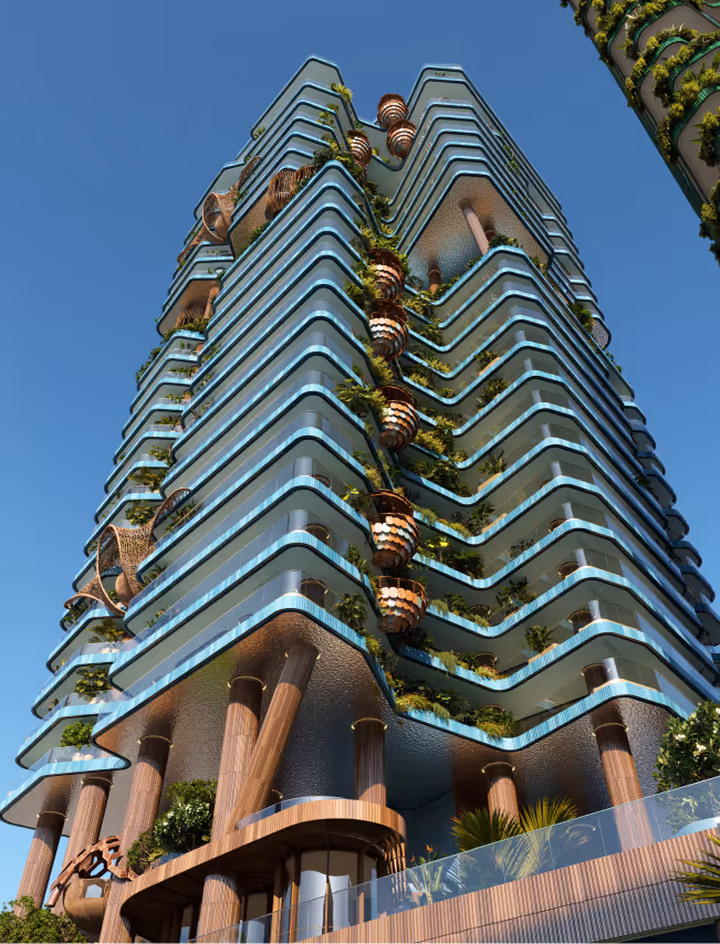
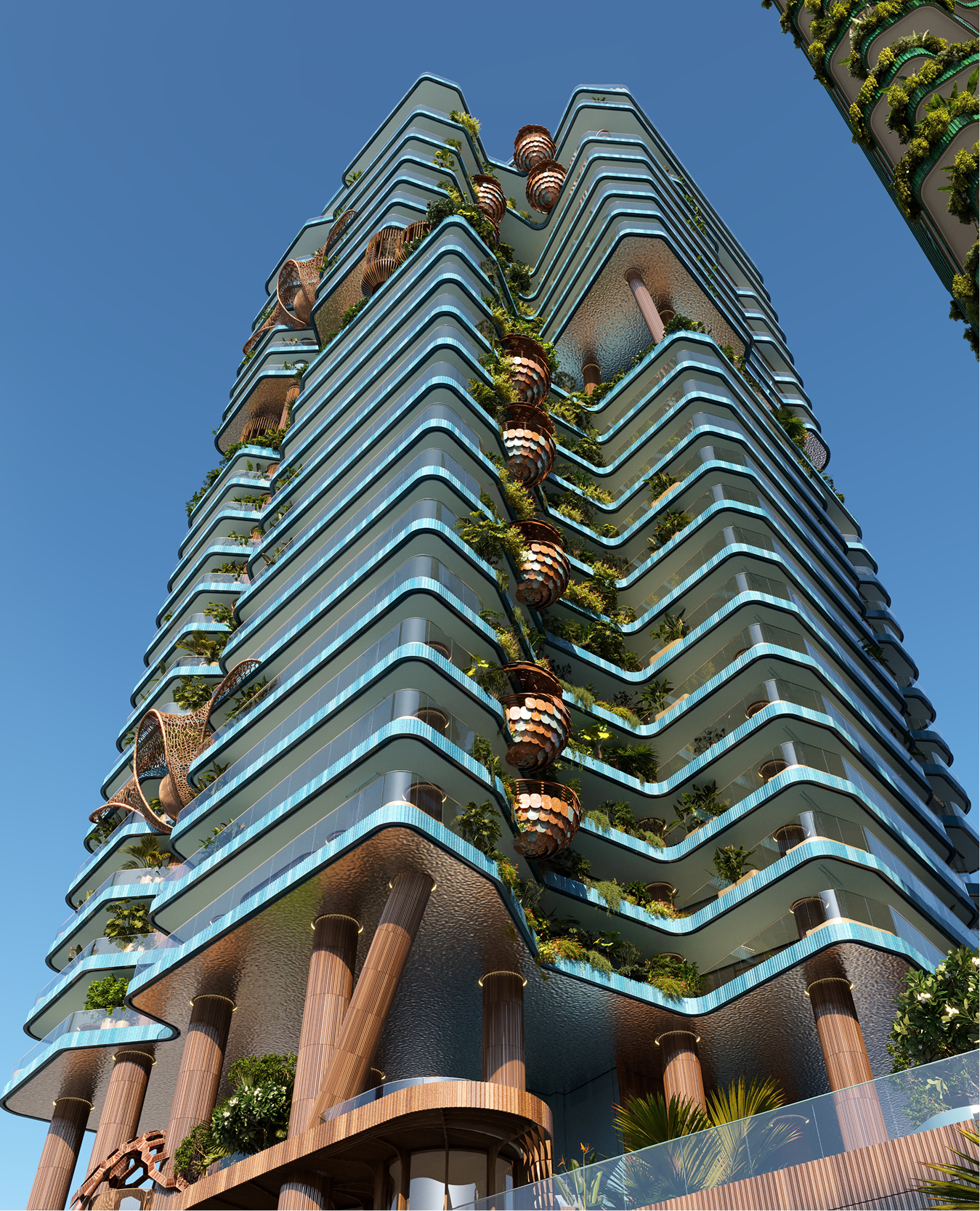
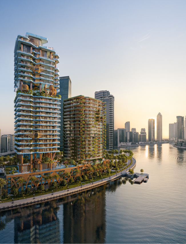
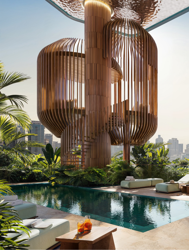
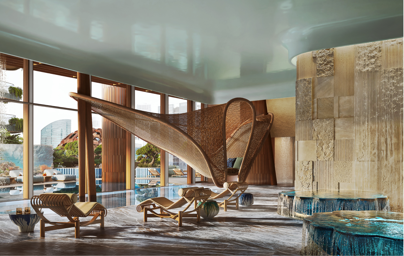
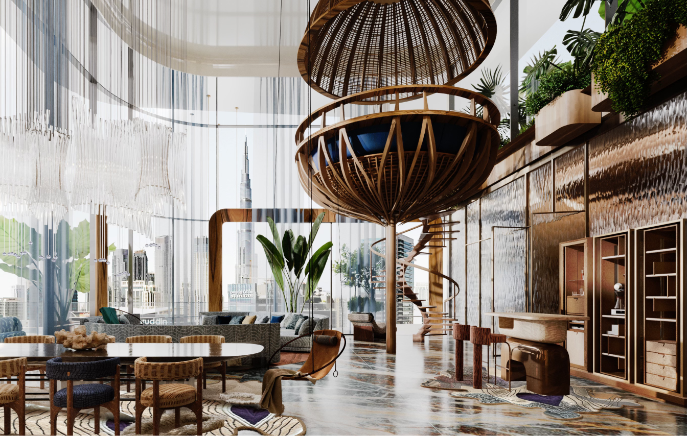
The Eywa project in Dubai is conceived as a visionary residential development inspired by the philosophy of the filmAvatar, yet rather than replicating cinematic imagery, the design translates those deeper themes of interconnectedness, consciousness, and harmony with nature into a unique architectural language. This self - contained micro-world fosters community, shared values, and a profound relationship between people and their environment within the dense urban fabric of the city. The central theme in the second movie of Avatar movies franchise is water - so does architecture and design in Eywa Way of Water revolve around water.
LAYOUT2
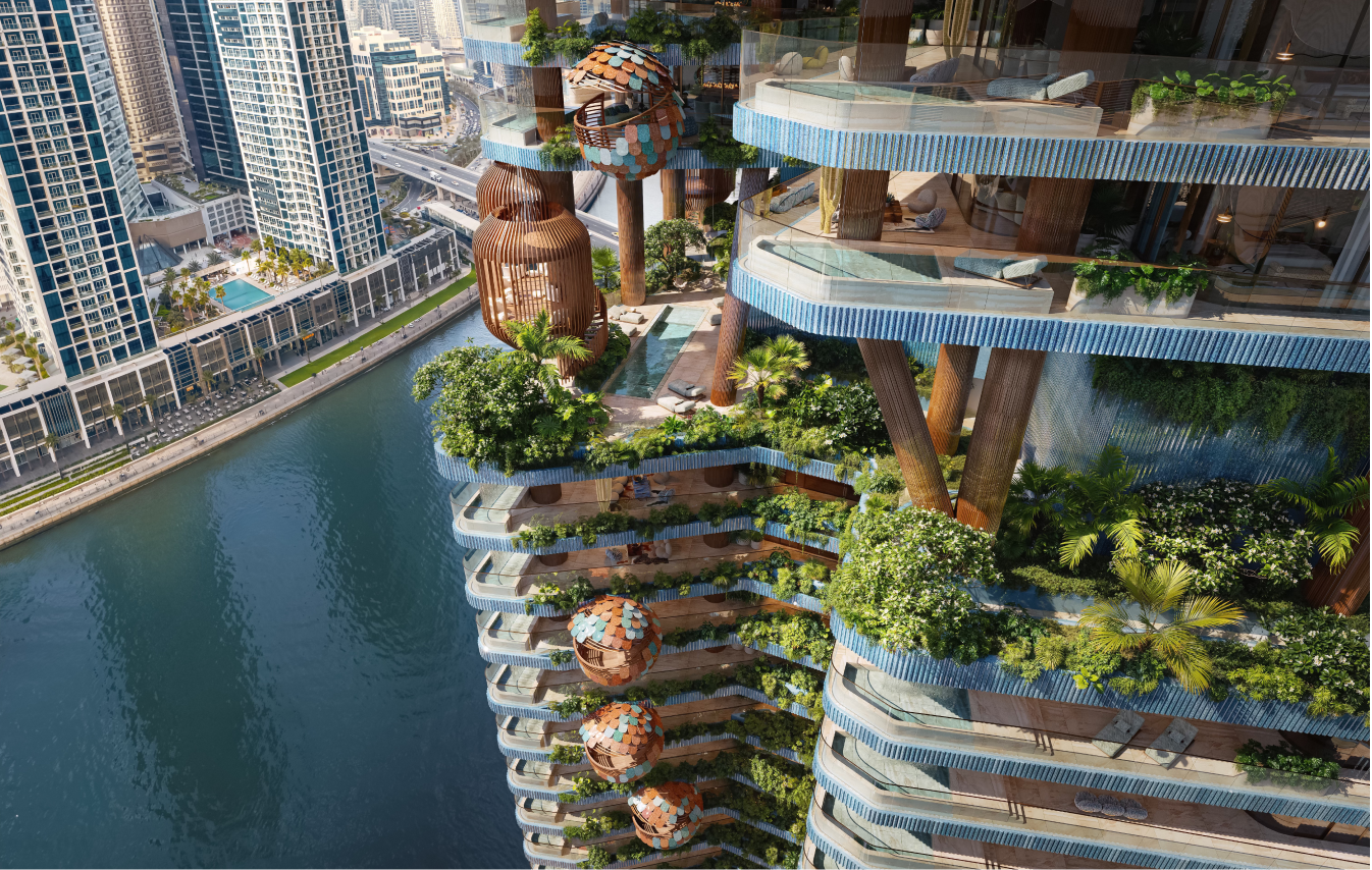
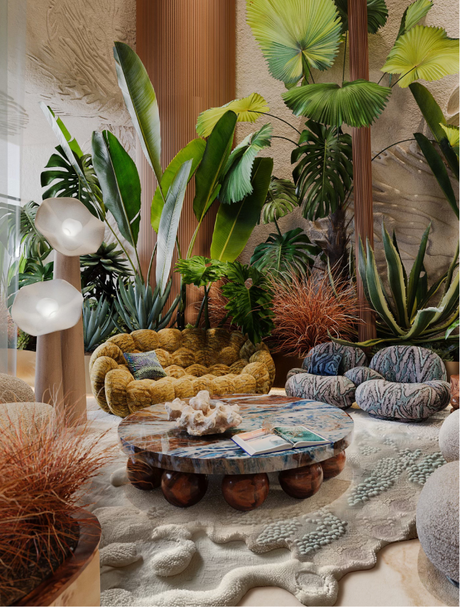
Central to the project is the concept of ‘wild luxury’ - the raw beauty of nature combined with bespoke, handcrafted design and sensory experiences for a lifestyle of wellness and well-being. Eywa’s concept of wild luxury helps us enhance human relationships and experiences by making spaces feel alive and engaging. Well-being is supported through use of natural light, plants, and organic materials, nature-inspired audio systems, wellness amenities, such as SPA, meditation room, sauna, and water and fire features - waterfalls, fireplaces, rain showers.
LAYOUT2
LAYOUT1
LAYOUT2
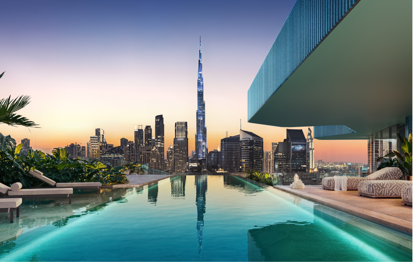
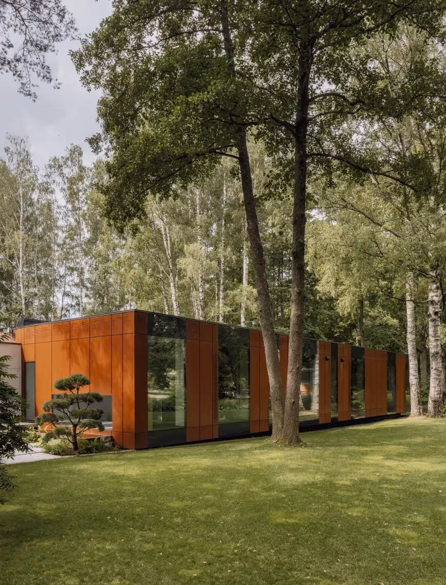
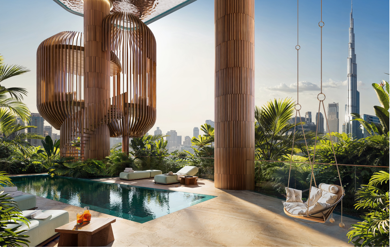
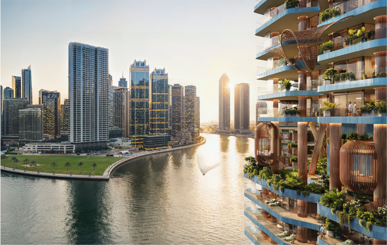
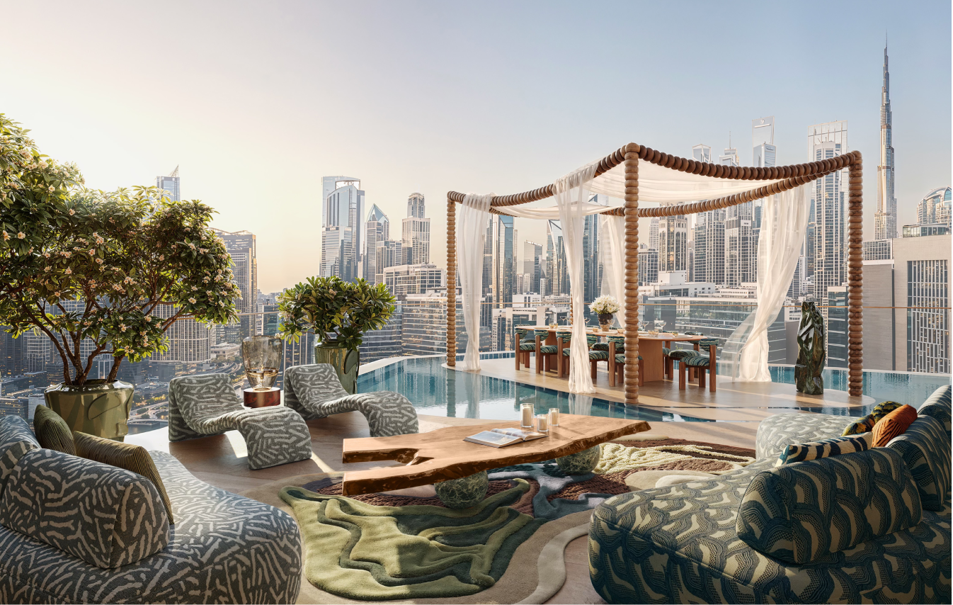
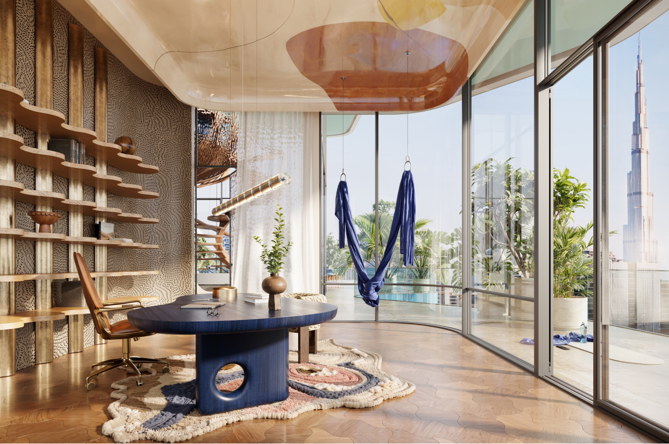
Orientation of the tower maximizes panoramic views, natural daylight, and privacy, ensuring that every residence enjoys expansive perspectives - including views toward Burj Khalifa - while simultaneously optimizing environmental performance and reinforcing a cohesive architectural narrative that merges wild organic forms with refined modern living.
LAYOUT1
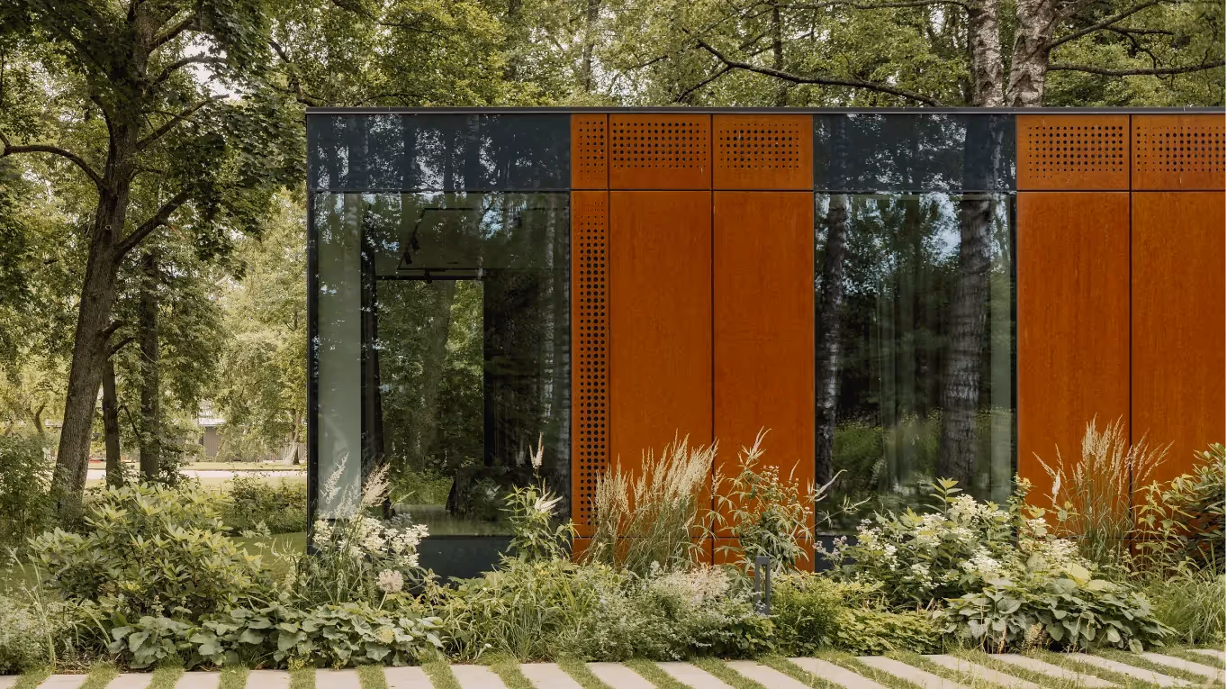
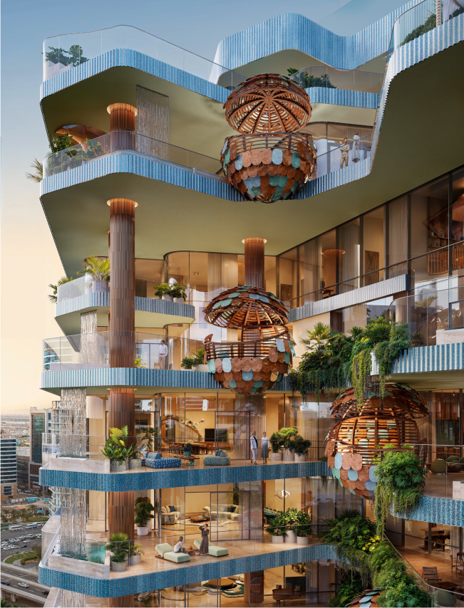
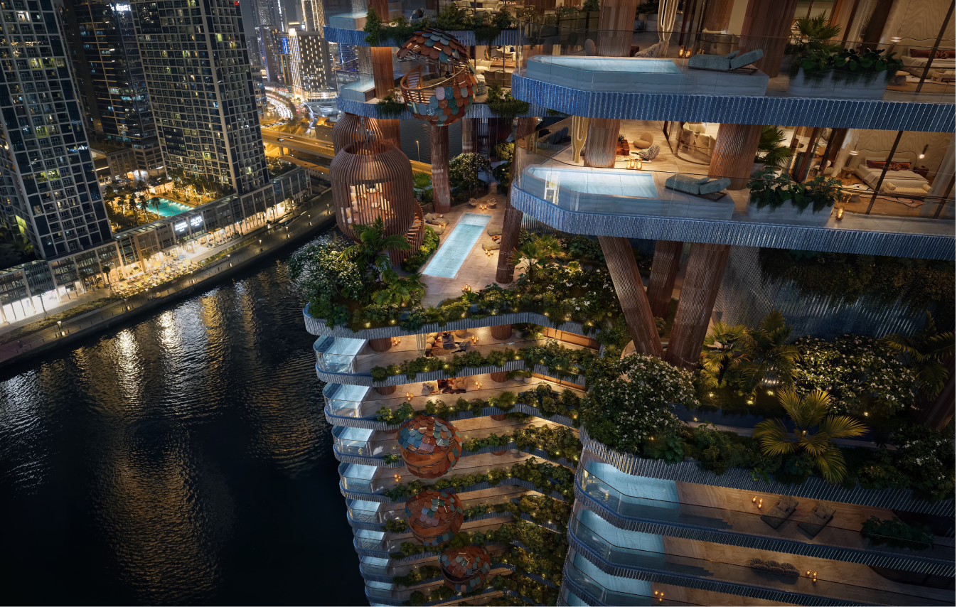
The structural columns are not hidden technical elements but expressive features that shape the building’s identity, forming nest - like balconies that represent family sanctuaries within the greater whole, while the combination of earthy terracotta cladding and contemporary glass surfaces creates a tactile contrast between warmth and transparency, reinforcing the project’s nature - centered aesthetic and establishing a strong visual presence in Business Bay.
LAYOUT1
LAYOUT3
Materiality and sustainability are interwoven throughout the project, with durable natural materials selected for longevity and sensory richness, advanced HVAC and lighting systems reducing energy consumption, smart water management strategies supporting conservation, and biophilic design principles enhancing indoor air quality and well - being, all contributing toward ambitious LEED and WELL Platinum certification goals.
LAYOUT2
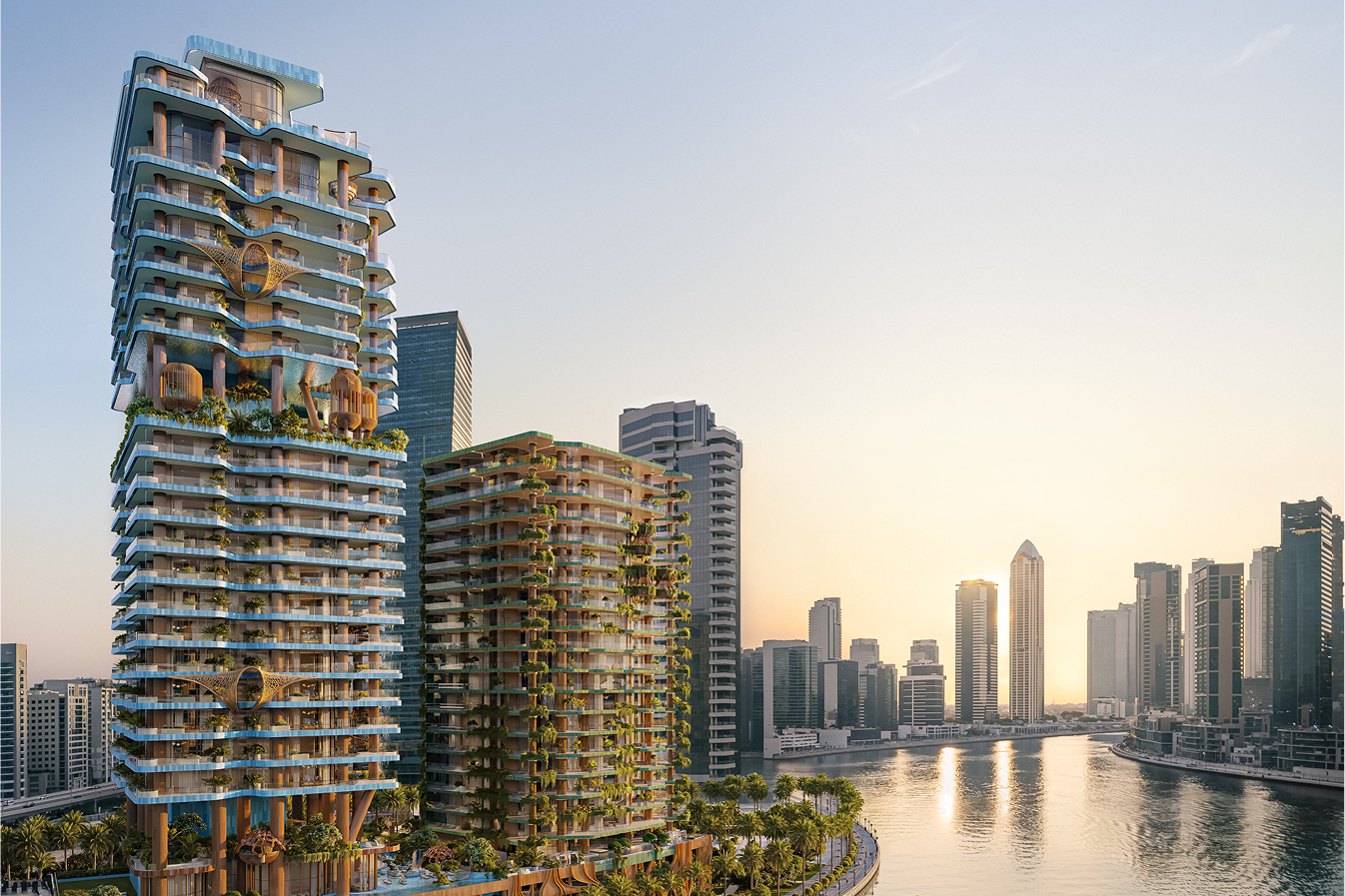
Ultimately, Eywa brings a game-changing experience for the whole city - this nature-inspired building will redefine Dubai’s urban landscape. Our goal is to create a place that goes beyond just shelter, but a sanctuary that feeds the mind, body, and soul, where comfort, peace, and connection are always present.
LAYOUT1
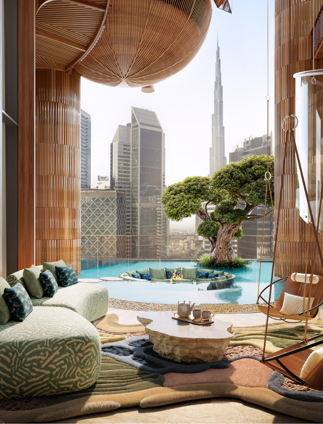
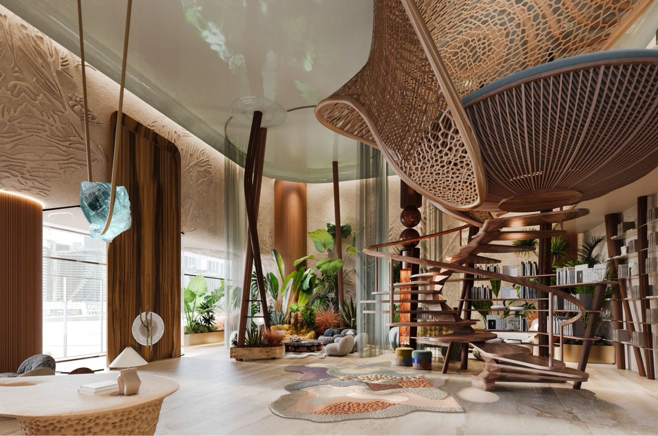
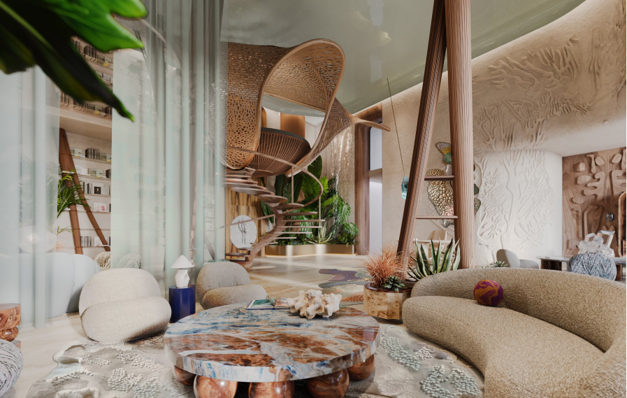
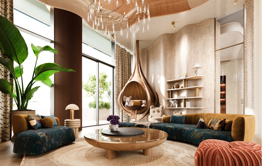
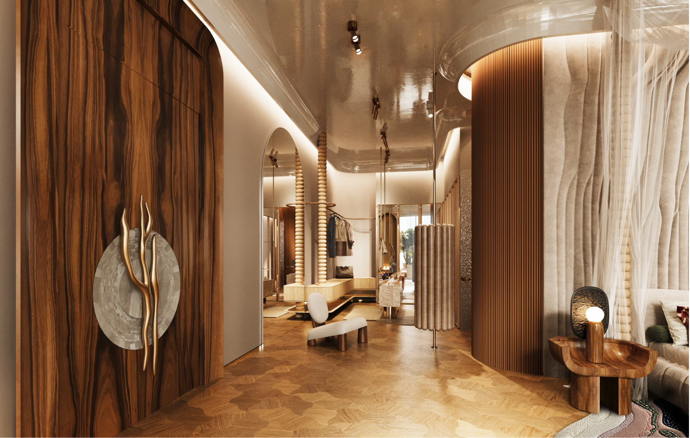
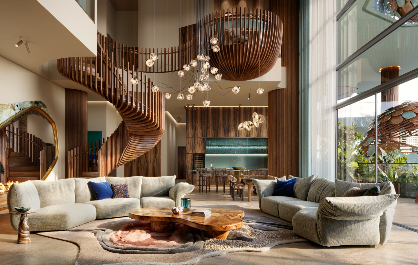
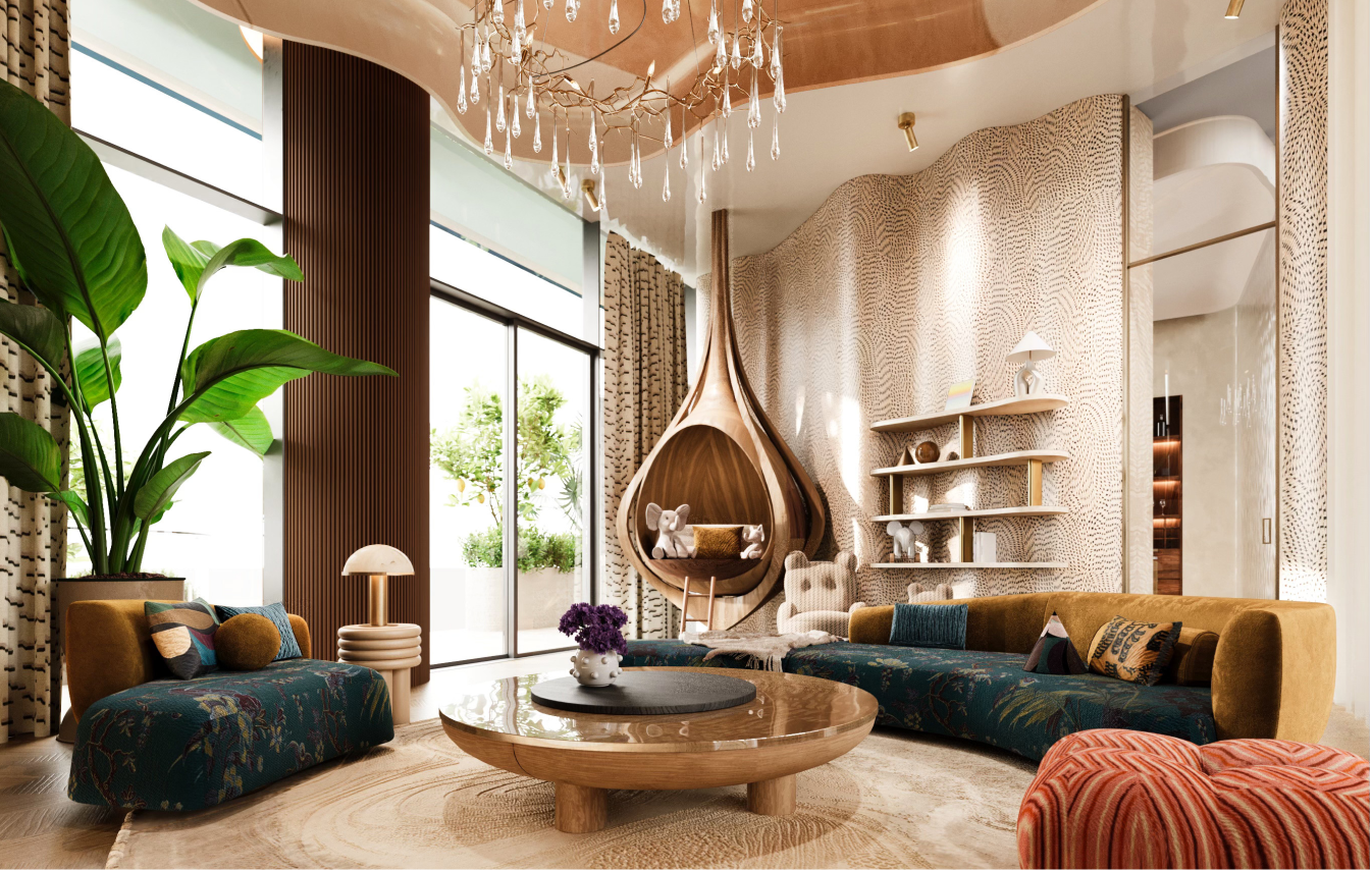
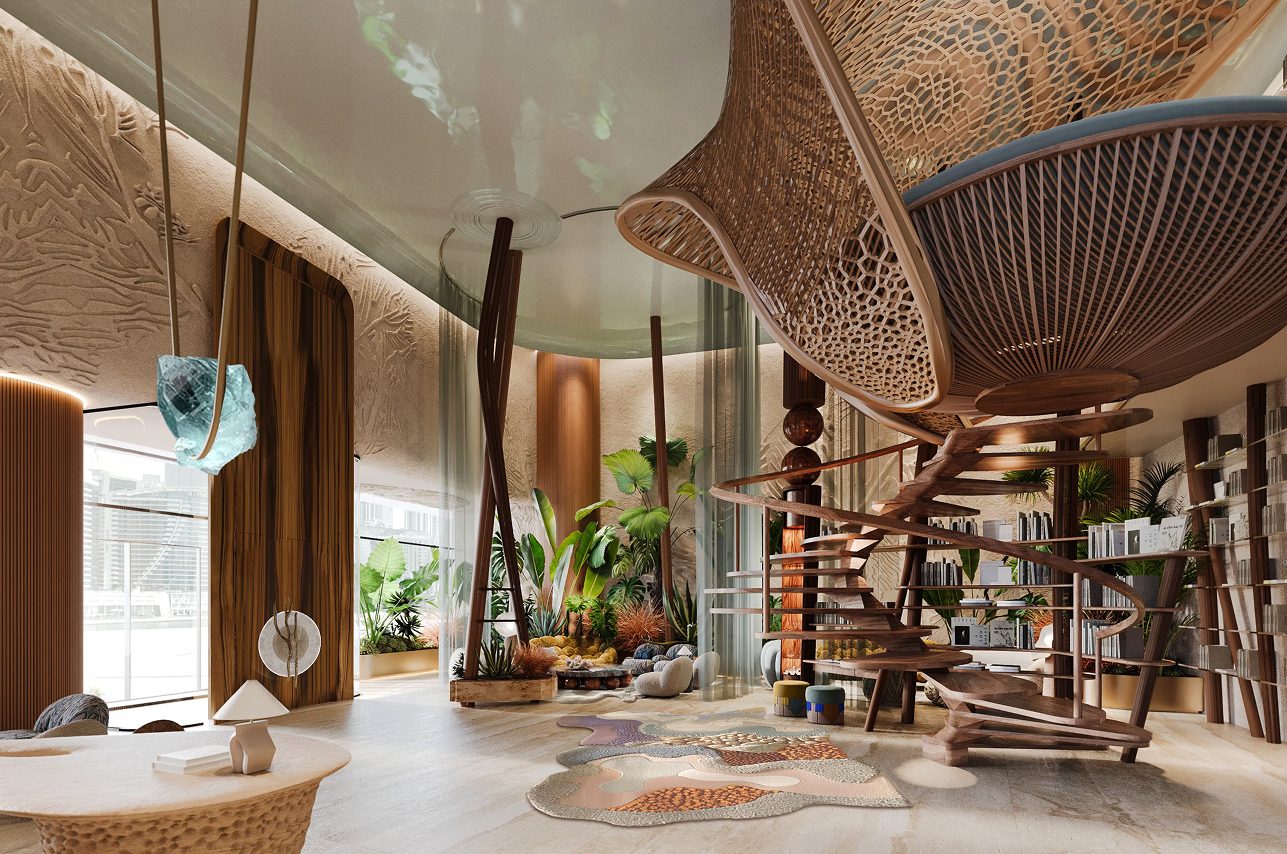
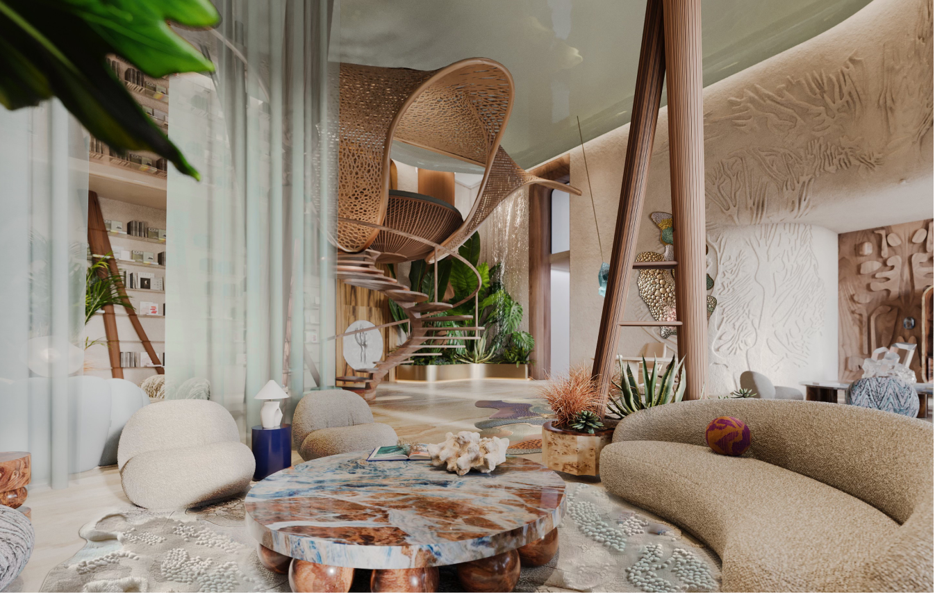
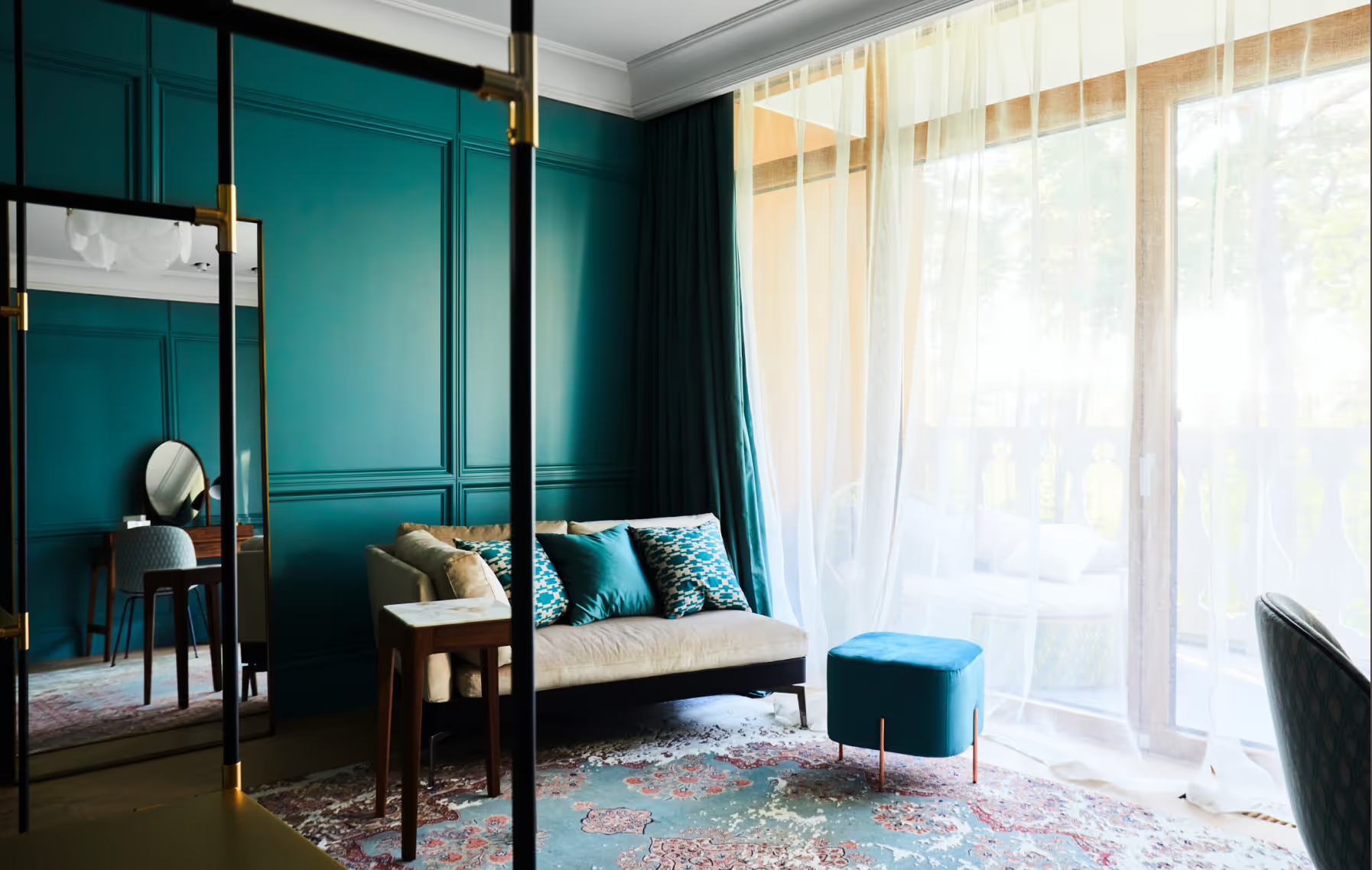
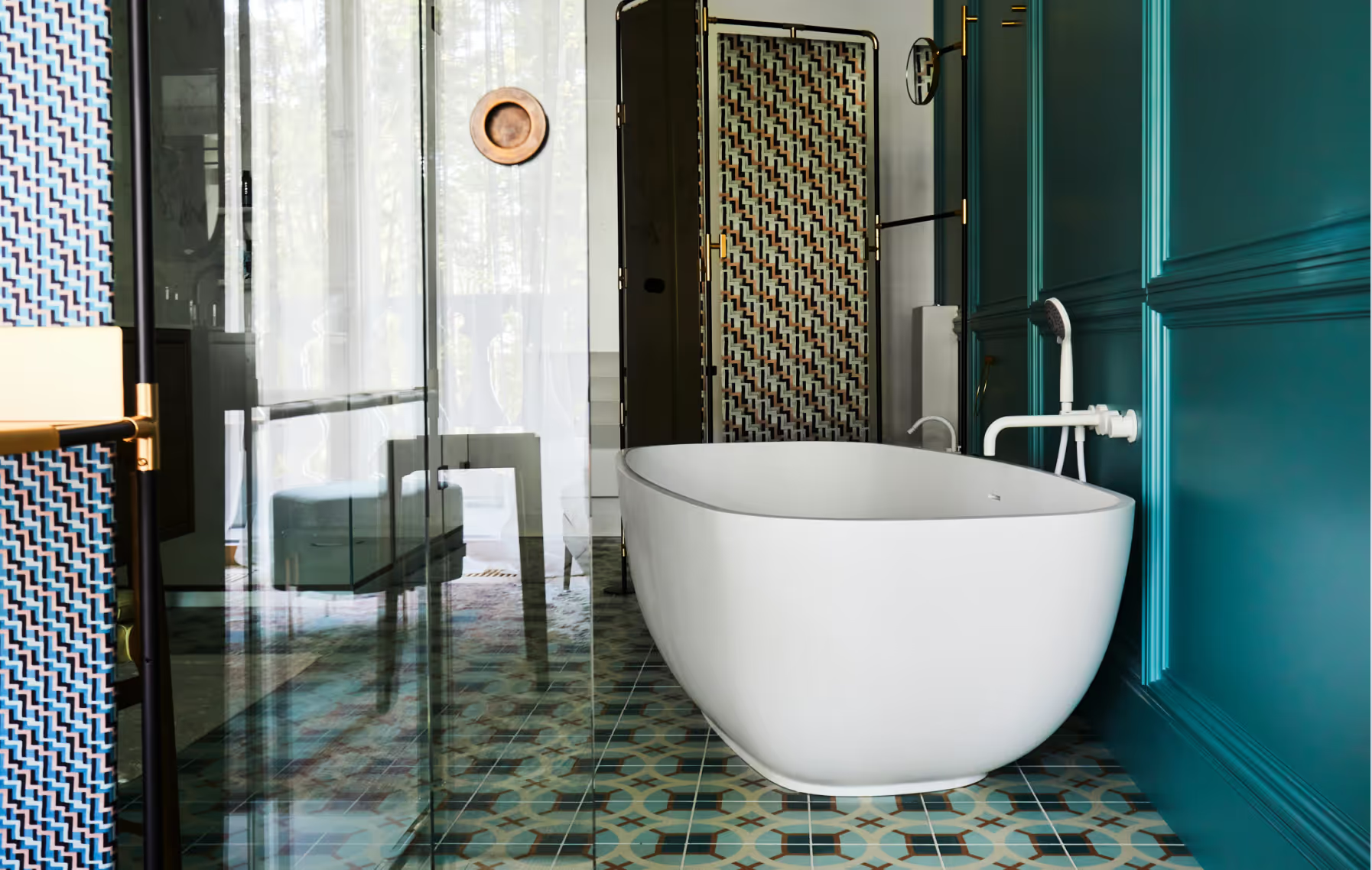
Eywa is a luxury residential building based in Dubai, UAE that aims to redefine current way of urban lifestyle. By relocating focus from minimalistic and angular perfection to natural forms, shapes and textures, the building connects to people on an instinctual level, creating a calming and grounding environment rooted in a lifestyle of wellness and comfort. Inspired by coral reefs and mangrove forests of the UAE, Eywa too is a living organism, a biophilic building that interacts with its guests on all levels. Every detail is designed to offer an immersive sensory experience, from visually pleasing surfaces to signature aromas. The interior is characterized by wavy, organic forms, layered textures and natural, luxurious materials, drawing on the main theme of the building - The Way of Water.
LAYOUT2
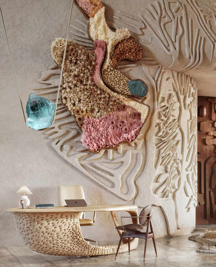
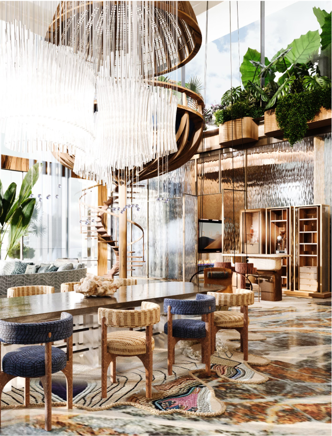
Upon entering the lobby, concealed under a wooden stingray, is an elevated pearl-shaped lounge area that symbolizes the cultural shift from individual families to a larger interconnected community. As a sculptural centerpiece, it honors the region's pearl-diving heritage - an industry that laid the foundations of modern Dubai and Abu Dhabi.
LAYOUT1
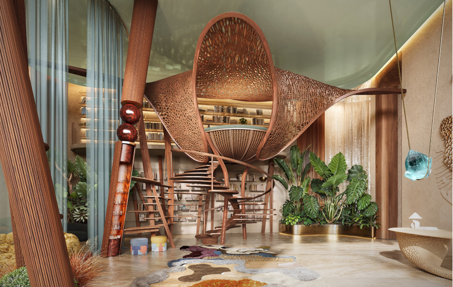
Interior draws inspiration from regional water habitats, with coral and mangrove motifs introduced throughout common and private spaces. Reflective ceilings in the amenities area and private residences represent the ocean surface, while the lobby features wall patterns, color schemes and bespoke furniture guided by shapes and forms of the underwater world.
LAYOUT1
LAYOUT1
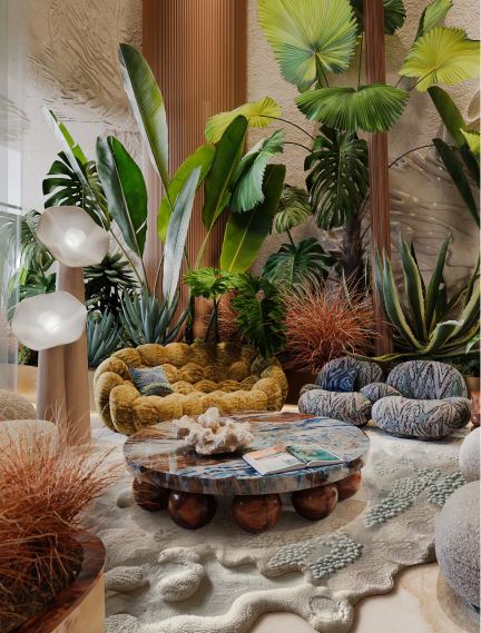
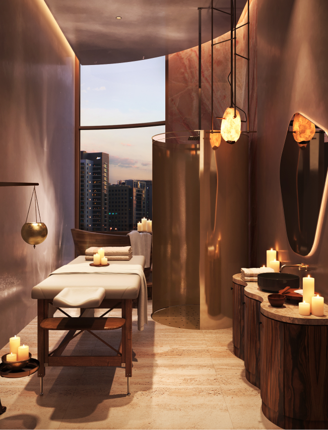
Integrated audio system fills public spaces with nature sounds, with designated music listening spots in the lobby and spa. Bespoke fragrance curated for Eywa is integrated into the ventilation system, and tea ceremonies await guests in the amenities area. Tactile sensory experiences are delivered through use of different materials and textures - smooth brass surfaces contrasted with rough-carved wood interior items, layered rugs soft to touch compliment rough-cut stone sinks.

LAYOUT2
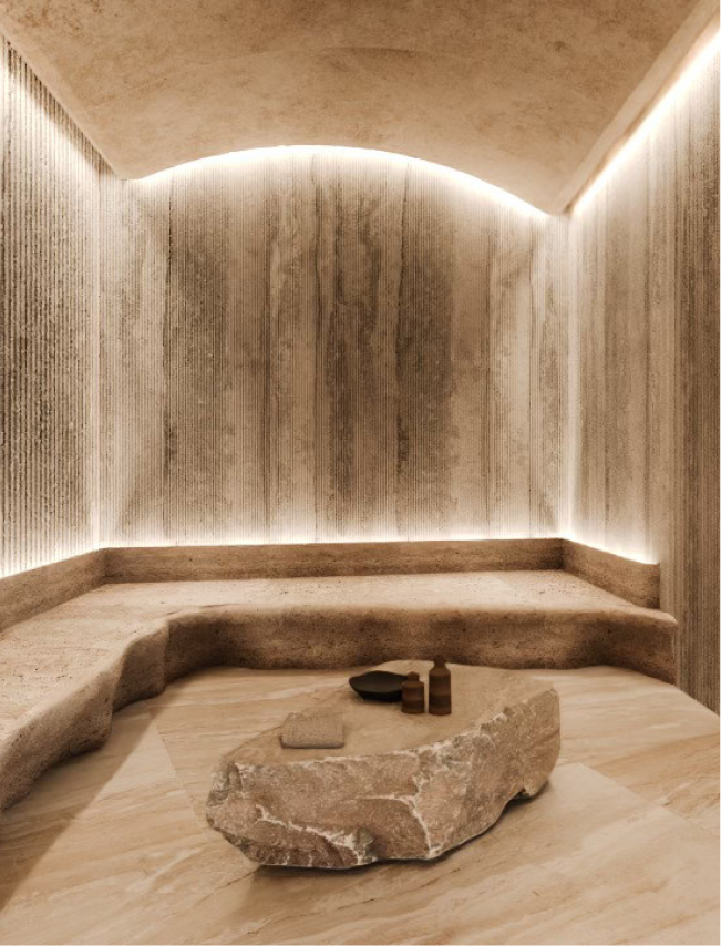
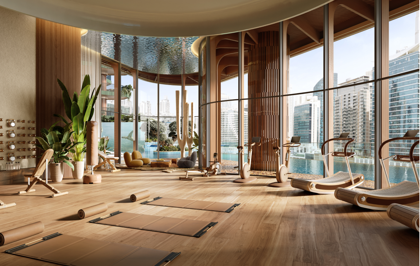
At its core, Eywa is a sanctuary devoted to nurturing the balance of mental, physical and spiritual well-being for its residents. SPA zone features herbal, salt and hammam saunas, meditation and yoga rooms, gym and pool, with a team of specialized trainers and specialists ensuring providing highest quality services.
LAYOUT3
LAYOUT1

LAYOUT2
LAYOUT2
To reflect Eywa's nature-centered vision, materials are left in their natural state - oak parquet floors with only minimal finishing, rough-cut stone slabs and raw crystal elements. A serene and healthy indoor atmosphere is created via careful installation of native and adaptive plant species that are accustomed to the local climate and require minimal maintenance.
LAYOUT1
EYWA 2
Apartment Building
UAE
2022 - ongoing
Apartment Building
R.evolution
wellness
Olga Ponomarjova, Maria Gembitskaya, Sergejs Zarovnijs, BINYAN
LAYOUT1
Eywa is a luxury residential building based in Dubai, UAE that aims to redefine current way of urban lifestyle. By relocating focus from minimalistic and angular perfection to natural forms, shapes and textures, the building connects to people on an instinctual level, creating a calming and grounding environment rooted in a lifestyle of wellness and comfort. Inspired by coral reefs and mangrove forests of the UAE, Eywa too is a living organism, a biophilic building that interacts with its guests on all levels. Every detail is designed to offer an immersive sensory experience, from visually pleasing surfaces to signature aromas. The interior is characterized by wavy, organic forms, layered textures and natural, luxurious materials, drawing on the main theme of the building - The Way of Water
LAYOUT2
Upon entering the lobby, concealed under a wooden stingray, is an elevated pearl-shaped lounge area that symbolizes the cultural shift from individual families to a larger interconnected community. As a sculptural centerpiece, it honors the region's pearl-diving heritage - an industry that laid the foundations of modern Dubai and Abu Dhabi.
LAYOUT1
Interior draws inspiration from regional water habitats, with coral and mangrove motifs introduced throughout common and private spaces. Reflective ceilings in the amenities area and private residences represent the ocean surface, while the lobby features wall patterns, color schemes and bespoke furniture guided by shapes and forms of the underwater world.
LAYOUT1
LAYOUT1
Integrated audio system fills public spaces with nature sounds, with designated music listening spots in the lobby and spa. Bespoke fragrance curated for Eywa is integrated into the ventilation system, and tea ceremonies await guests in the amenities area. Tactile sensory experiences are delivered through use of different materials and textures - smooth brass surfaces contrasted with rough-carved wood interior items, layered rugs soft to touch compliment rough-cut stone sinks.
LAYOUT2
At its core, Eywa is a sanctuary devoted to nurturing the balance of mental, physical and spiritual well-being for its residents. SPA zone features herbal, salt and hammam saunas, meditation and yoga rooms, gym and pool, with a team of specialized trainers and specialists ensuring providing highest quality services.
LAYOUT3
LAYOUT1
LAYOUT2
LAYOUT2
To reflect Eywa's nature-centered vision, materials are left in their natural state - oak parquet floors with only minimal finishing, rough-cut stone slabs and raw crystal elements. A serene and healthy indoor atmosphere is created via careful installation of native and adaptive plant species that are accustomed to the local climate and require minimal maintenance.

OPIECE
Porcelain Collection
Latvia
Riga, Latvia
2025
Alvis Rozenbergs
Porcelain Collection
Esmeralda Purviske
LAYOUT1
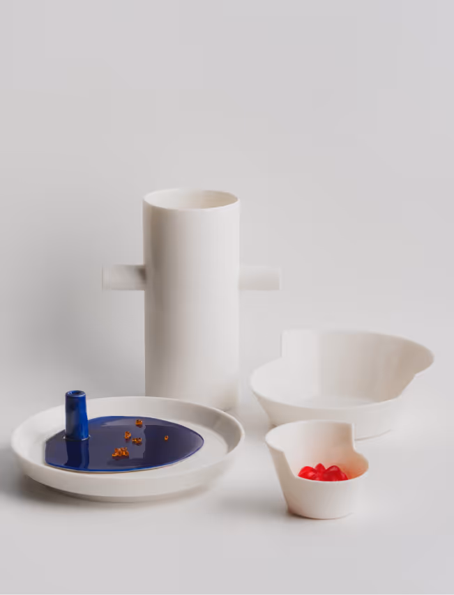
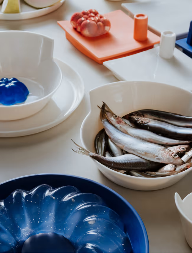
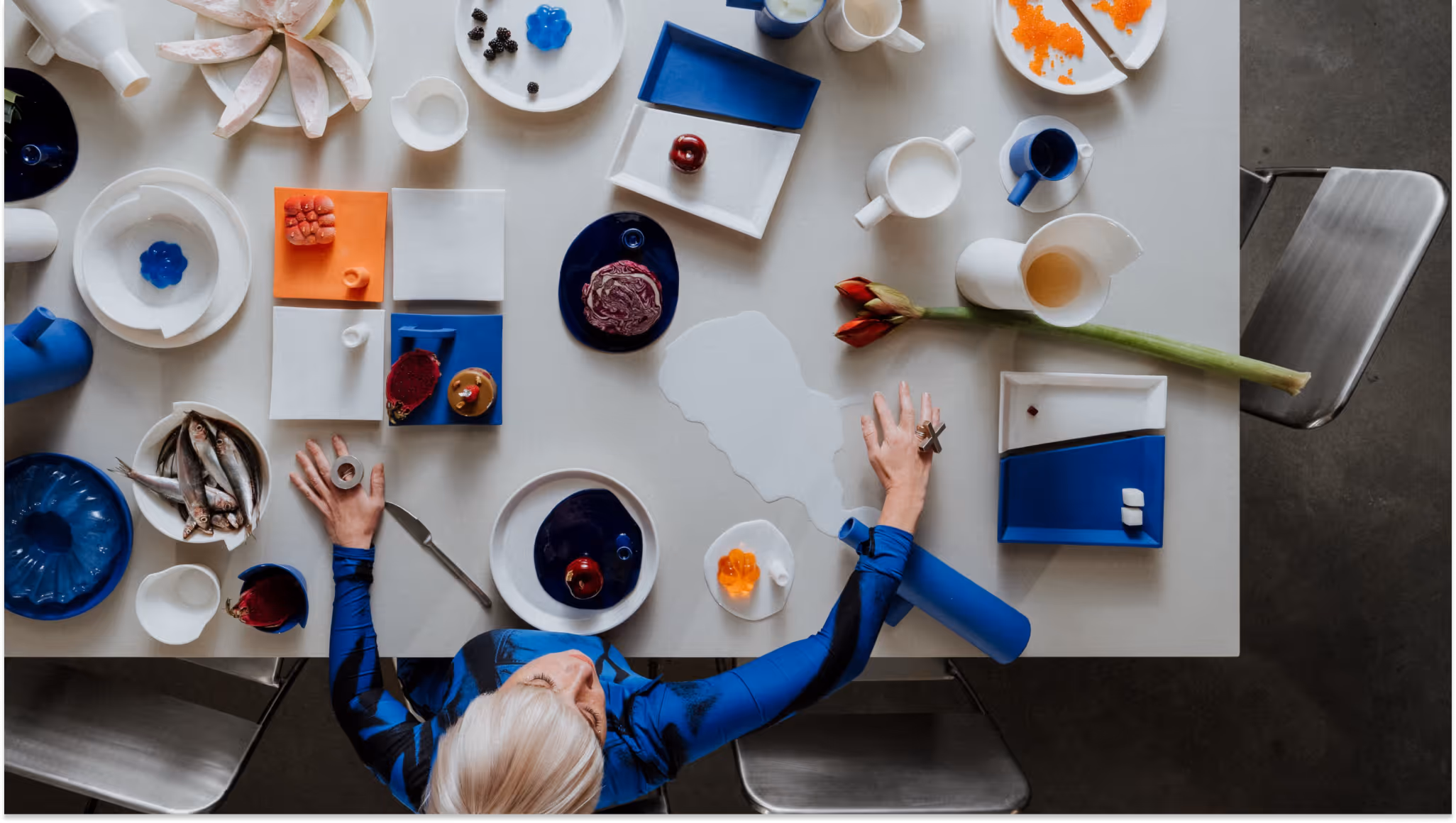
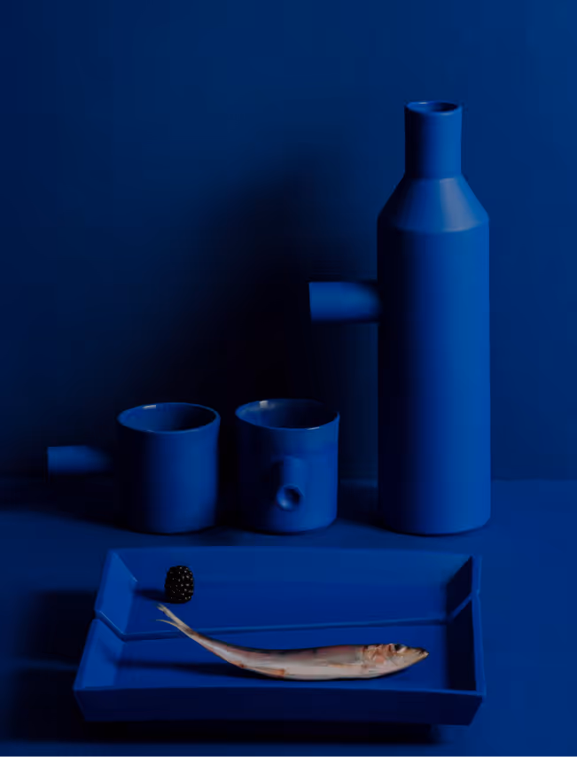
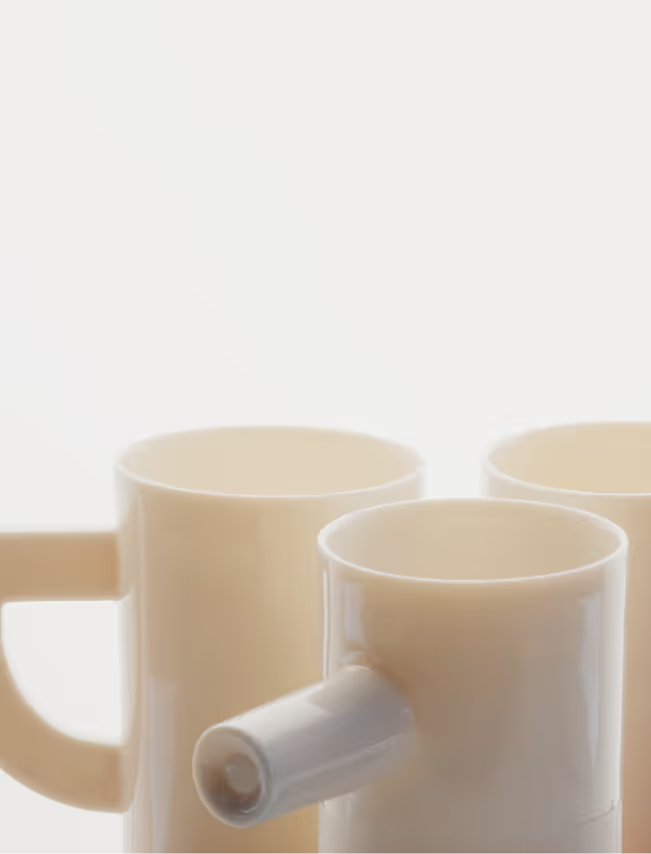
Open Architecture Design (OAD) founder architect Zane Tetere-Sulce introduces a ceramic collection that translates her architectural worldview into a bold, angular and geometric porcelain tableware. “I wanted to express the architectural form in something tangible - within objects that have a real purpose and serve people on daily basis,” she shares. The Porcelain Collection is the result of years of hands-on experimentation in the architect’s backyard studio. It challenges conventional ceramic craftsmanship by deliberately resisting porcelain’s natural fluidity and rethinking traditional approaches to color application. Handcrafted in collaboration with ceramist Esmeralda Purviske in Riga, Latvia.

LAYOUT3

LAYOUT2

Architect Zane Tetere-Sulce plays with form and materiality, shaping the collection over years of hands-on trial and error to transform the naturally fluid porcelain into clean, precise angles. The deeply saturated color is achieved by tinting the porcelain mass itself rather than applying traditional surface glaze techniques. Many pieces are partially glazed, creating a subtle tension between rawness and refinement, revealing the naturally soft texture of this graceful material. The result is a surprisingly laconic yet bold design pieces, defined by architectural thinking.
LAYOUT1
No material is wasted in the making of the collection. Leftover porcelain mass is poured freely, forming the Spill Plates - each unique and marked by its making.Form is not decorative but revealed through structure and proportion. Each object begins as an architectural idea, allowing geometry to become the main language of expression. A constant dialogue between control and chance, intention and accident shapes the outcome.

LAYOUT3

OPIECE was founded in 2025 by architect Zane Tetere-Sulce as a natural extension of OAD. With OPIECE, we are bringing our two decades of expertise in crafting bespoke interior objects to the global market.
LAYOUT3
OPIECE translates OAD’s architectural language into functional and experimental design pieces – tableware, furniture and lighting. Each piece emerges from a close collaboration between lead architect Zane Tetere-Sulce, OAD’s in-house designers and a selected network of artisans, bridging architecture, craft, and art.
LAYOUT3


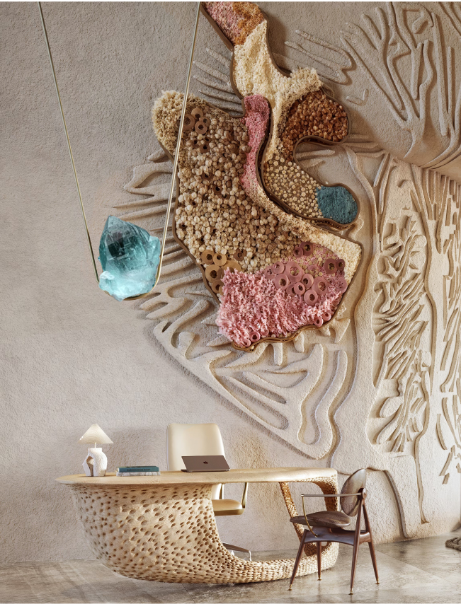
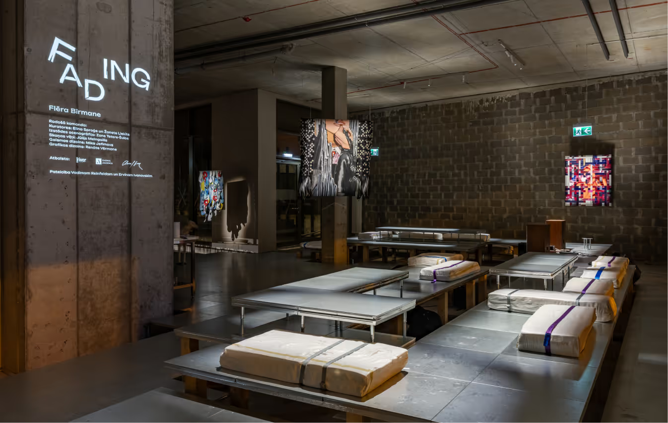
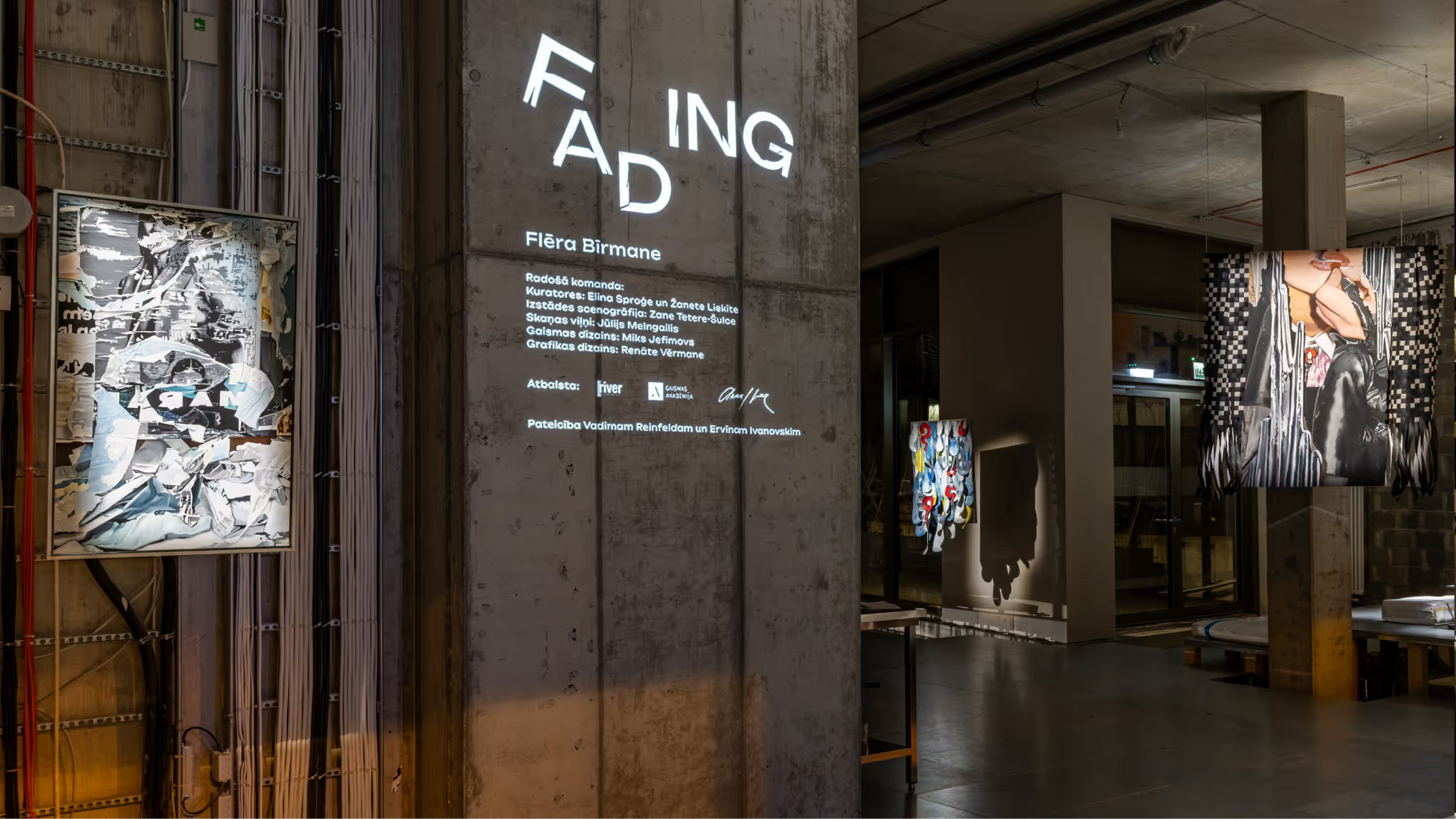
FADING
Exhibition Scenography
Latvia
Riga, Latvia
2025
Alvis Rozenbergs
Exhibition Scenography
Elina Sproge
LAYOUT1
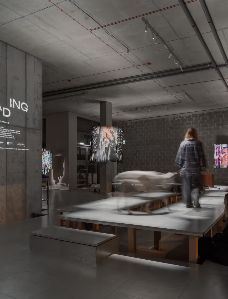
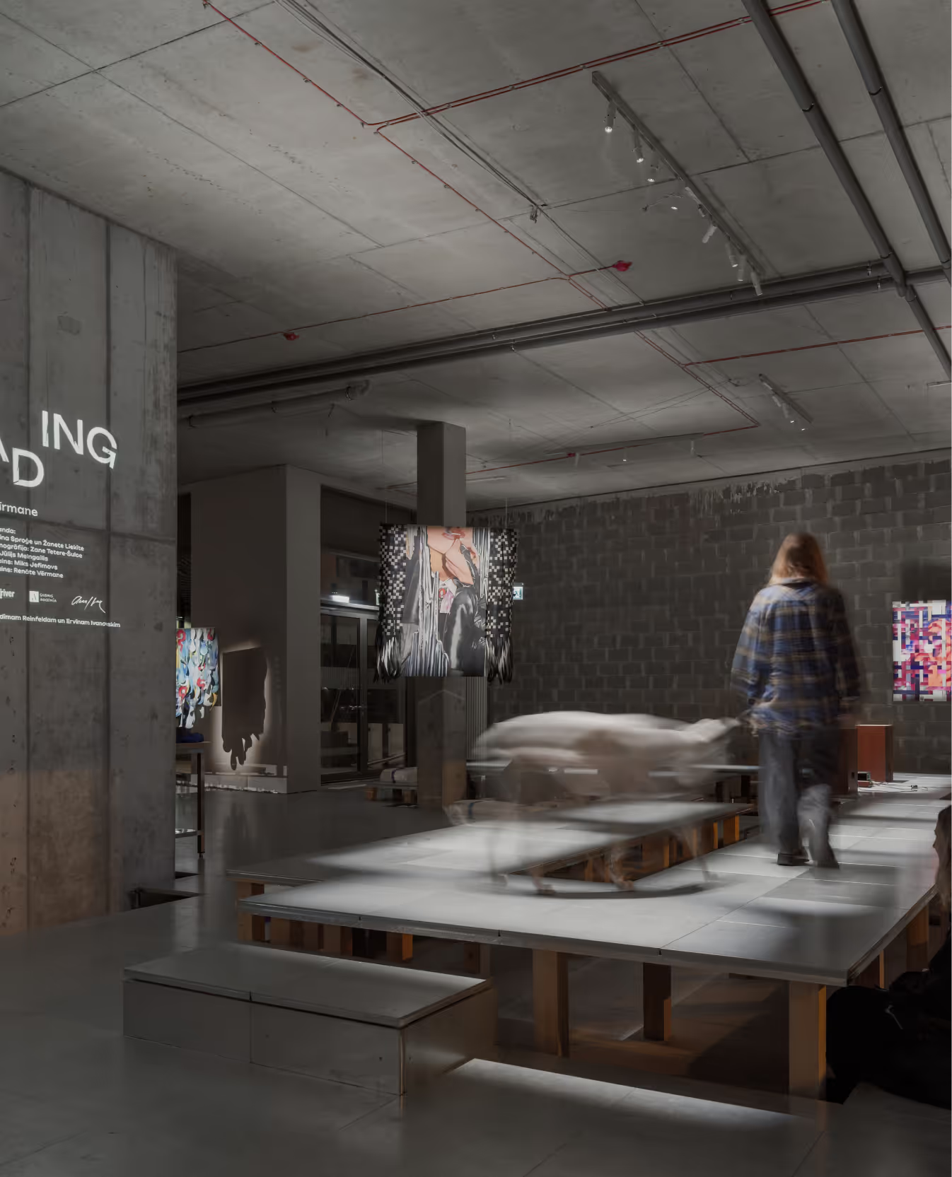
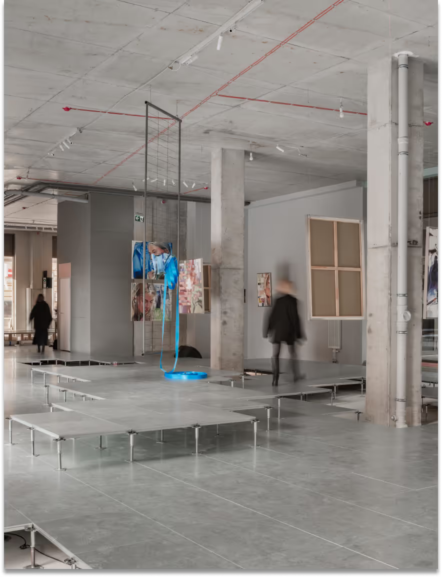
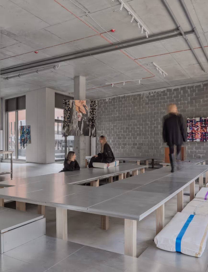
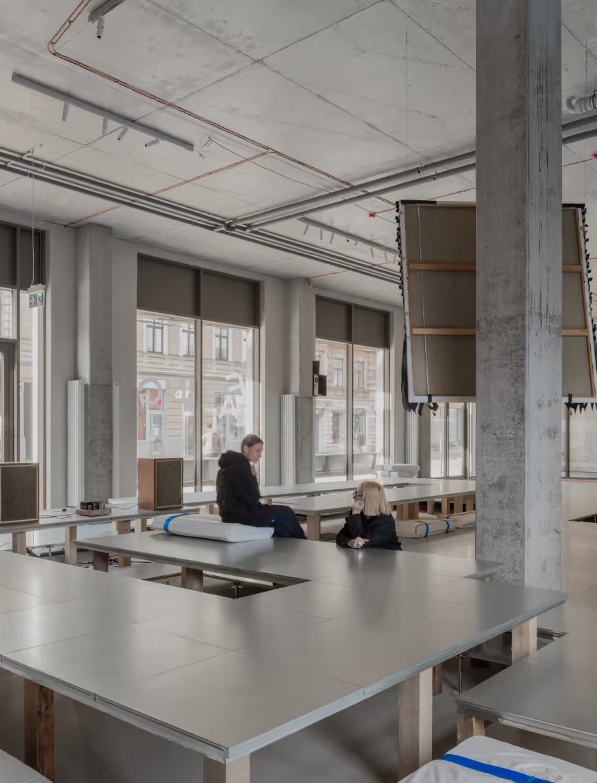
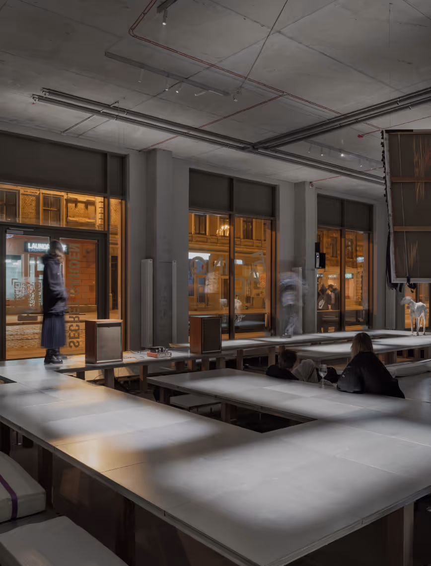
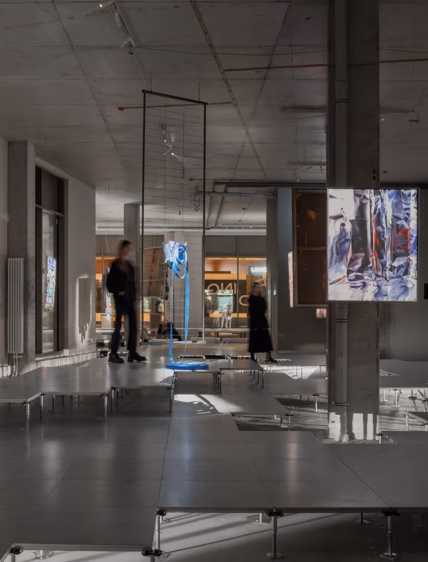
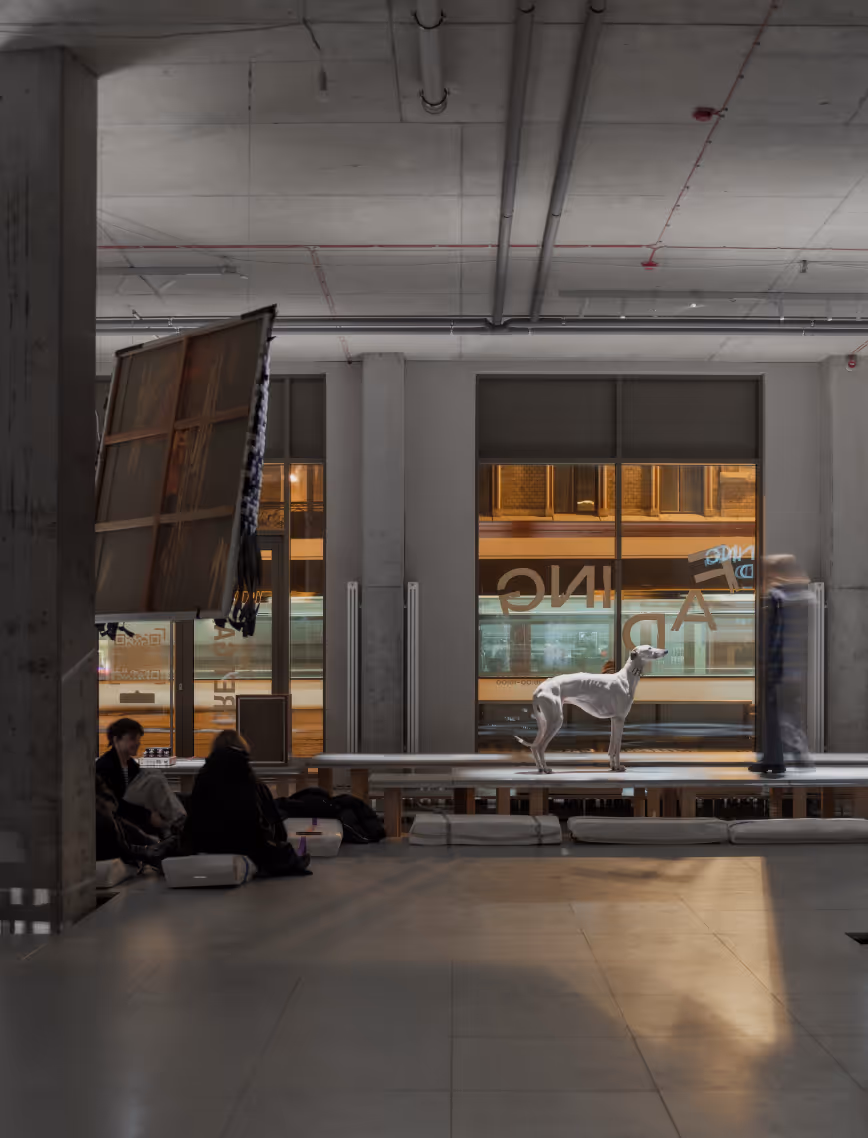
The art exhibition of Flera Birmane is raw and deeply emotional - an eruption of pain, a scream for freedom. It explores the act of breaking boundaries, shedding the sacred, and returning to the secular. It is not a conclusion, but a transitional space - uncontrolled, unanchored, suspended between what was and what might be. The scenography follows suit: untethered from matter, undefined, and slightly dangerous - deliberately chaotic.
LAYOUT3

LAYOUT3
The floor unfolds as a fractured platform, shifting the viewer’s perspective both physically and emotionally - challenging comfort zones, altering visual perception. Flera’s works float above the ground, suspended in midair to evoke the levity of free thought, an escape from traditional frames. These layers form an entirely personal experience of space - where seating becomes standing, and stillness holds movement.
LAYOUT3

LAYOUT2
With carefully curated lighting, the exhibition transforms from day to night. In daylight, the space is open, curious, and observant; by nightfall, it becomes more intimate - ripe for reflection and quiet connection. The lighting concept was embedded from the start, forging a powerful contrast between artwork and environment, amplifying the tension of the in-between.
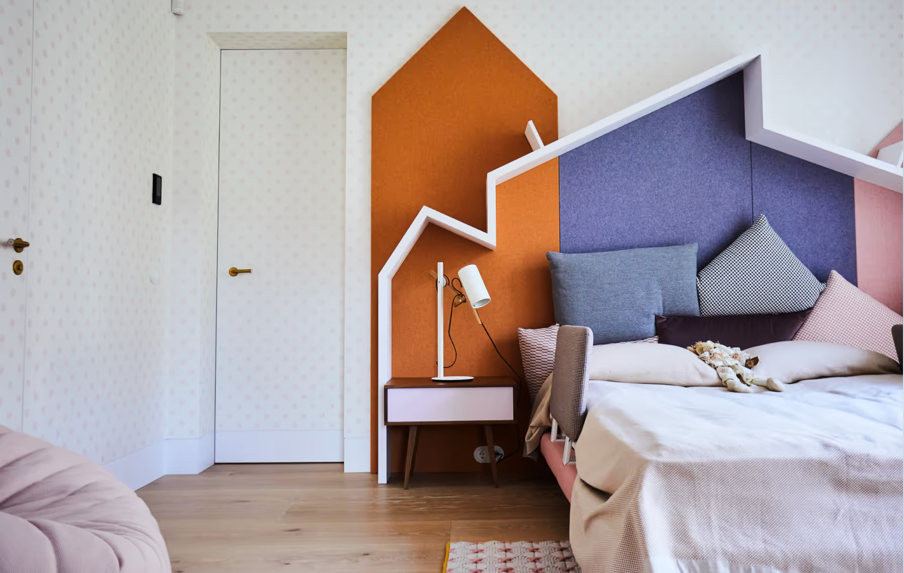
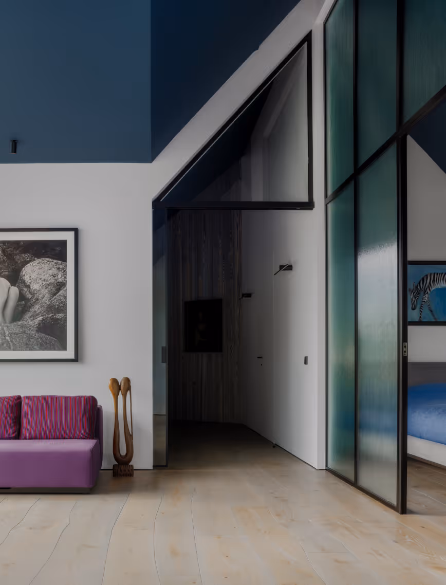
VD11
Apartment
Latvia
Jurmala, Latvia
2018
Daina Ozollapa
Apartment
Villa Dietrich
LAYOUT1
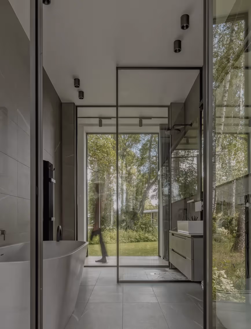
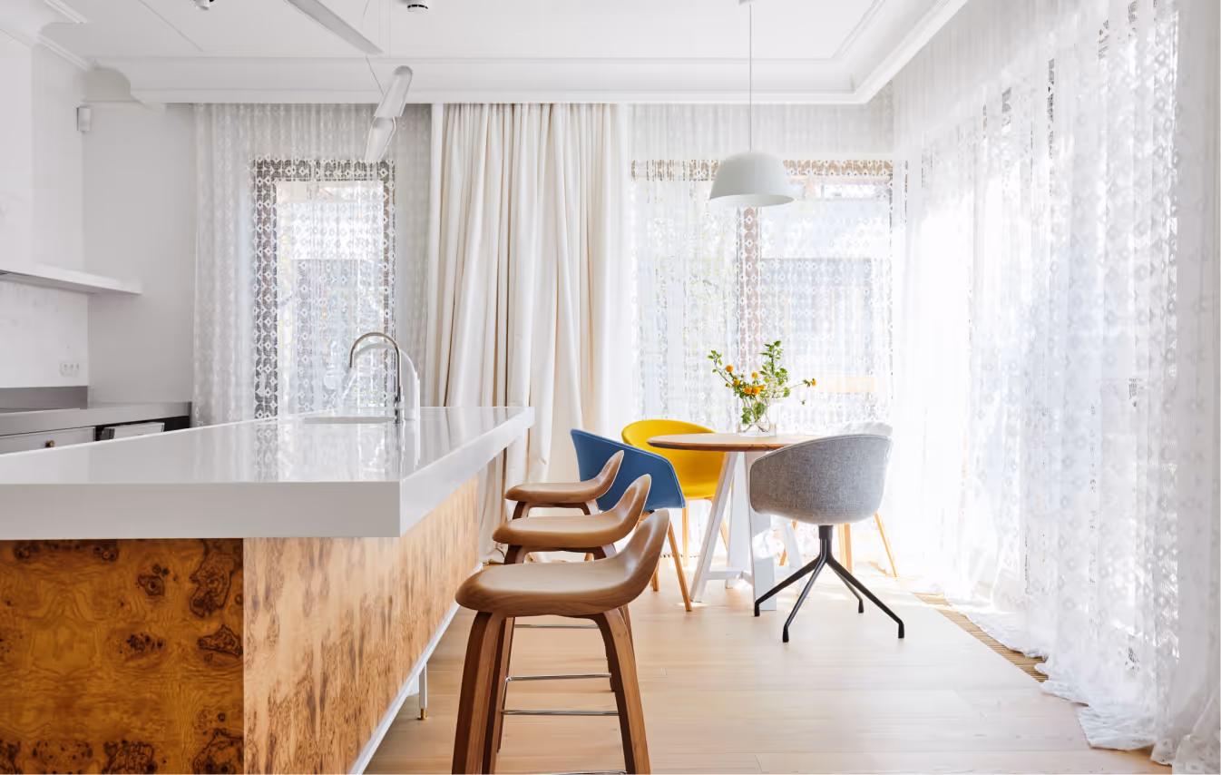
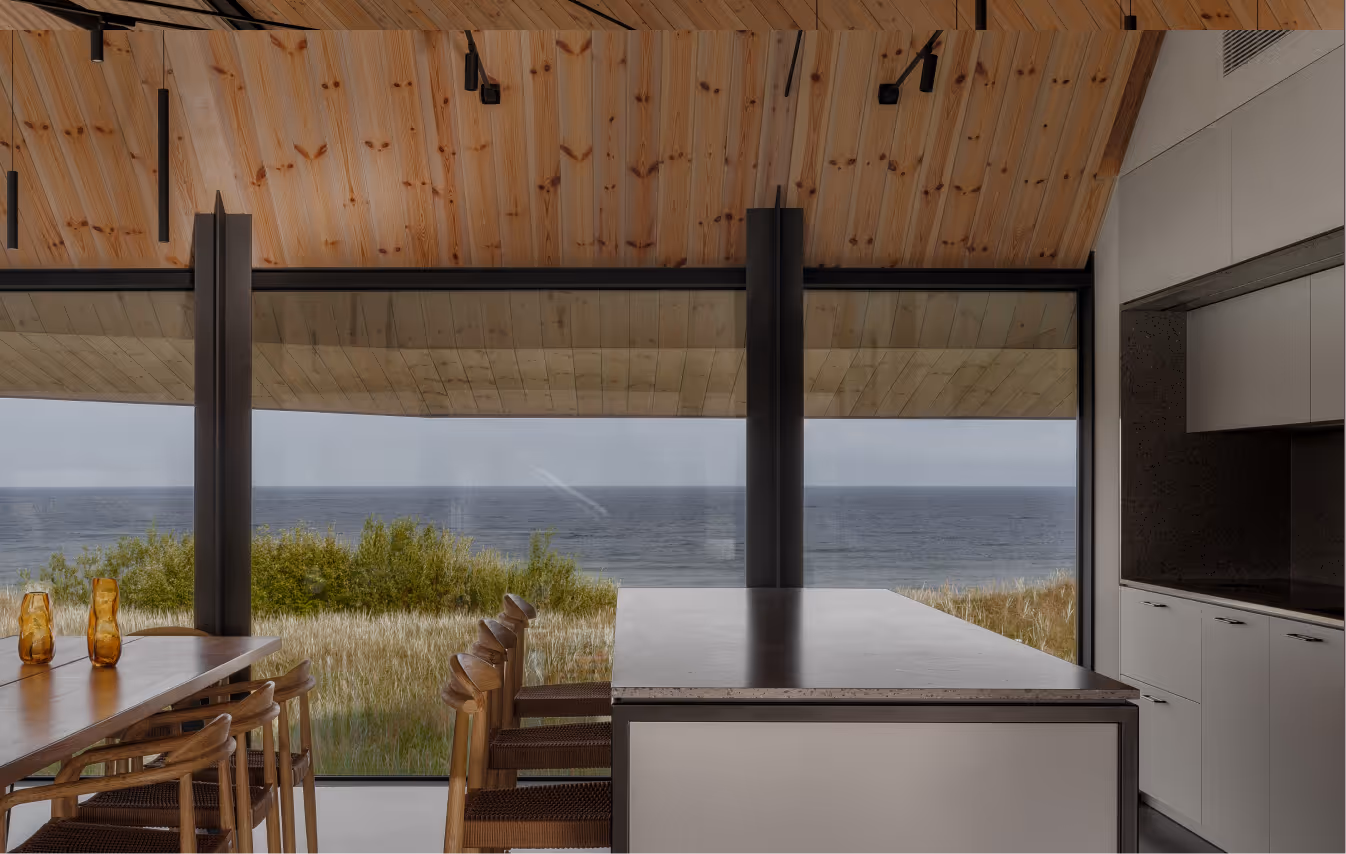
An apartment inspired by a nostalgia for the summer cottage aesthetic of the 20th century. This is just one of the family’s numerous homes. To give a strong sense of place, the main source of inspiration was the location itself and its history. Jurmala is a resort town on the Baltic coast in Latvia. The apartment is in a building almost directly by the sea.
LAYOUT2
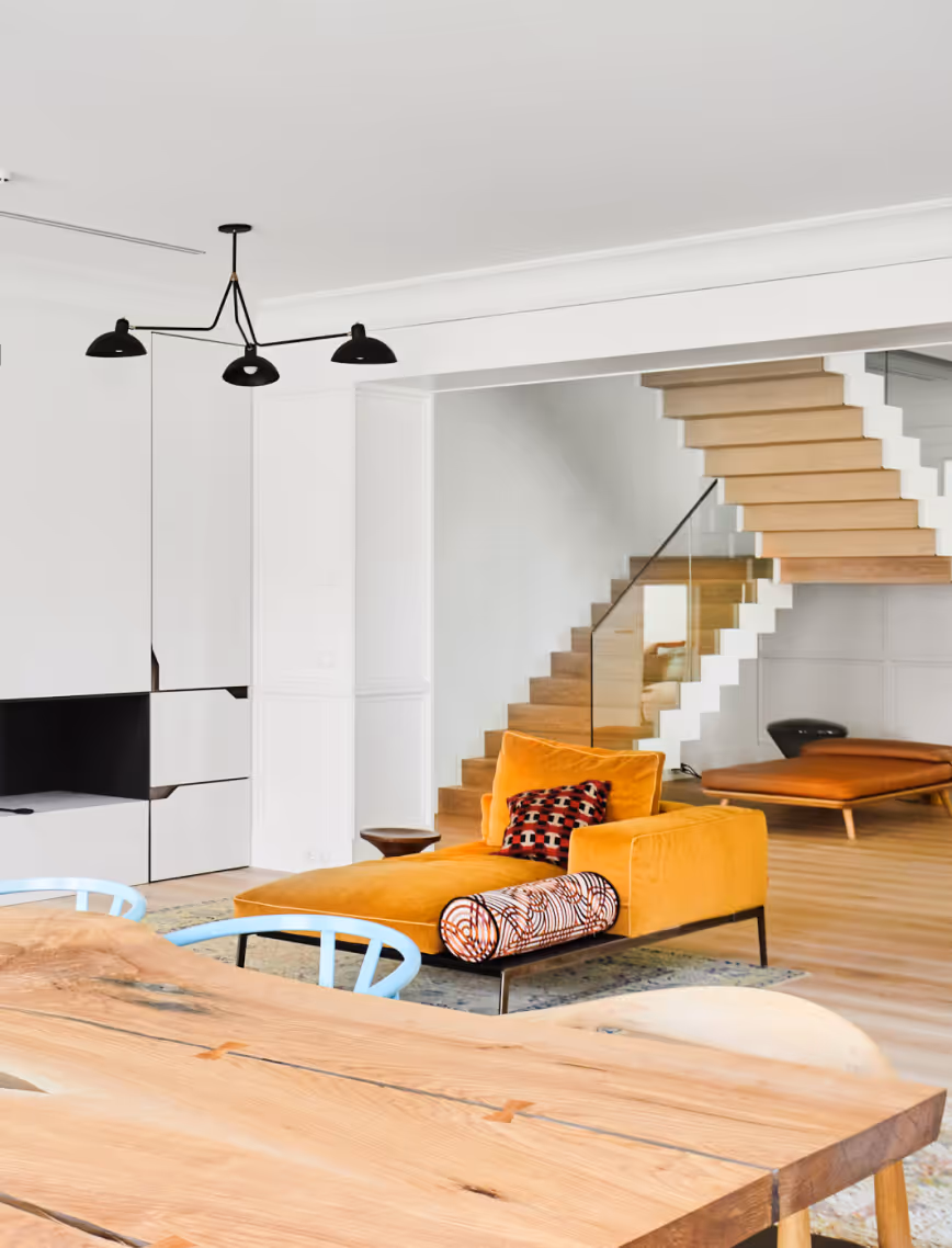
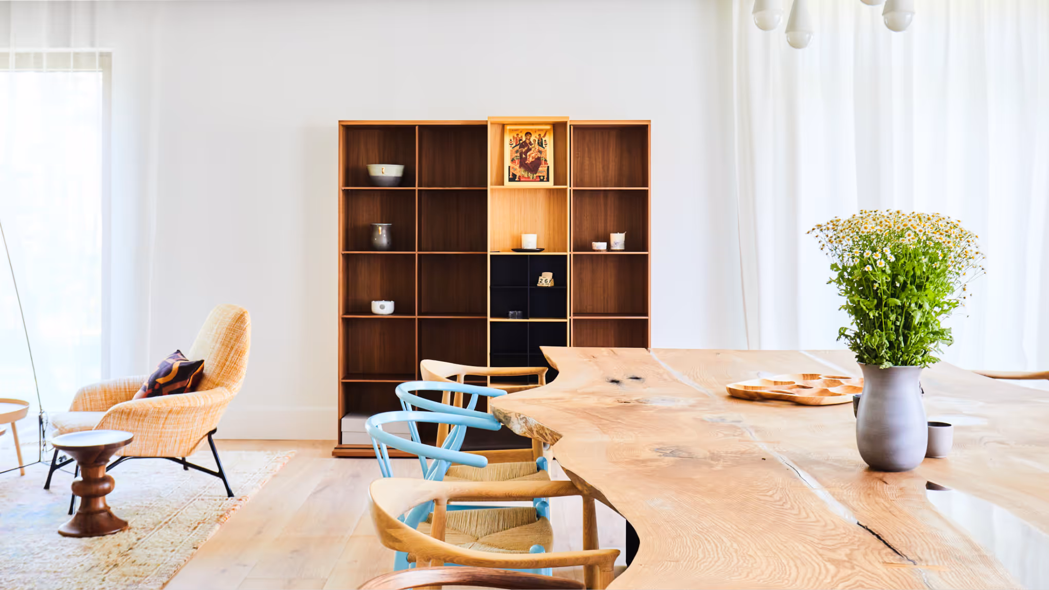
LAYOUT2
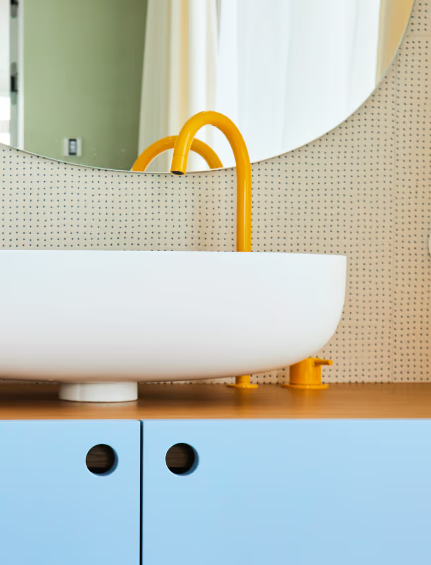
Jūrmala's traditional buildings are wooden cottages with intricate details. We imagined childhood memories of drinking tea at grandma’s place with the sun streaming through the net curtains. A powerful image we interpreted throughout the space. The curtains in the kitchen are a direct reference. On sunny days, the light bounces around the room just like it did in grandma’s kitchen when we were kids.
LAYOUT1
LAYOUT1
On the first floor, the backdrop is kept neutral to direct attention towards the design pieces, texture and materials. See, for example, the solid wood table. Our choice of materials was also inspired by the natural environment of Jurmala - its pine forests, dunes, sea and mineral waters.
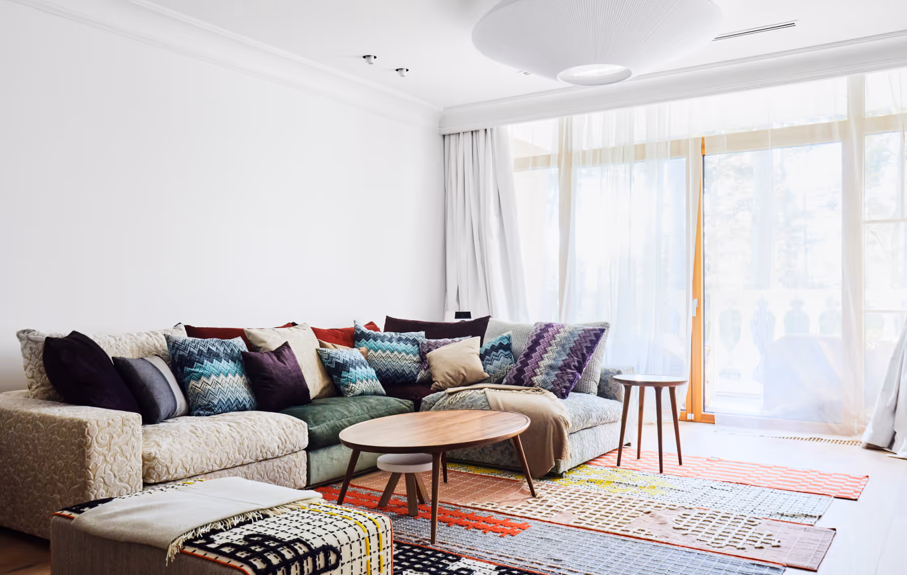
LAYOUT2
LAYOUT2
The second floor provides personal space for each family member. A lounge leads into the master bedroom, parents’ bathroom and dressing room.
LAYOUT1
LAYOUT2
LAYOUT1
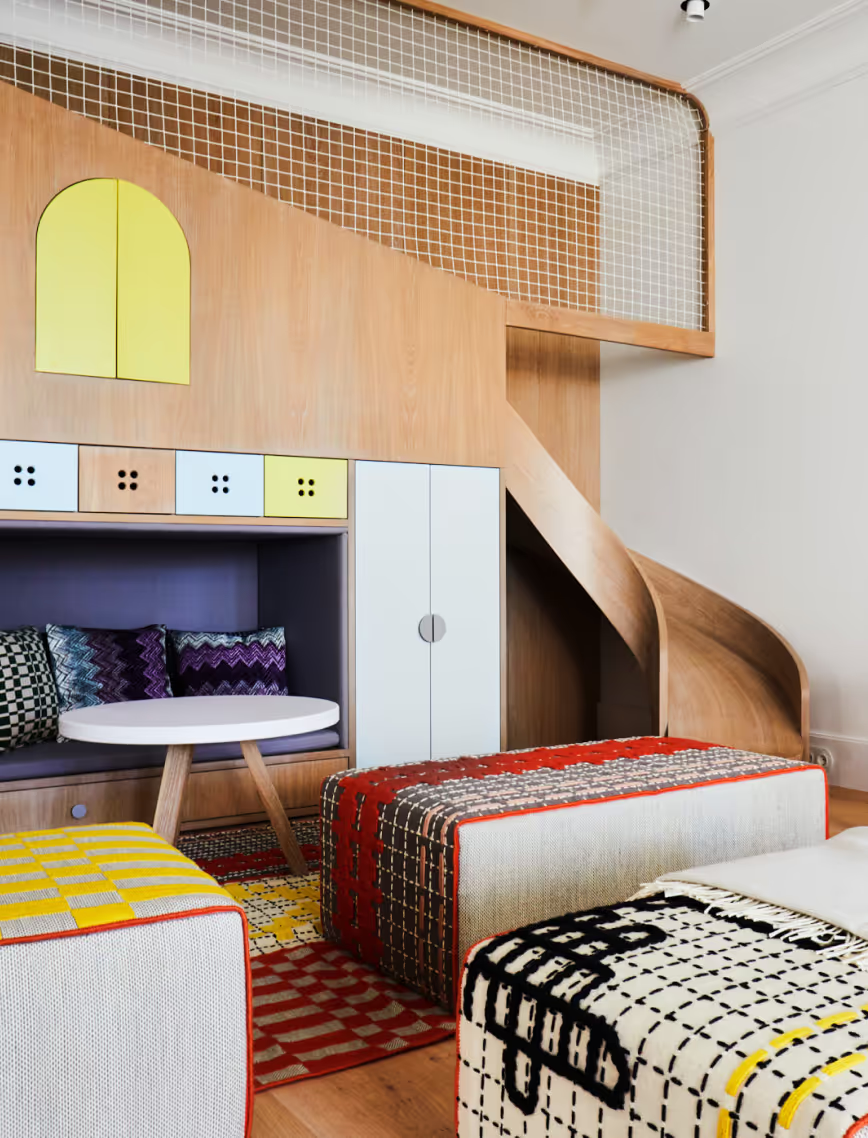
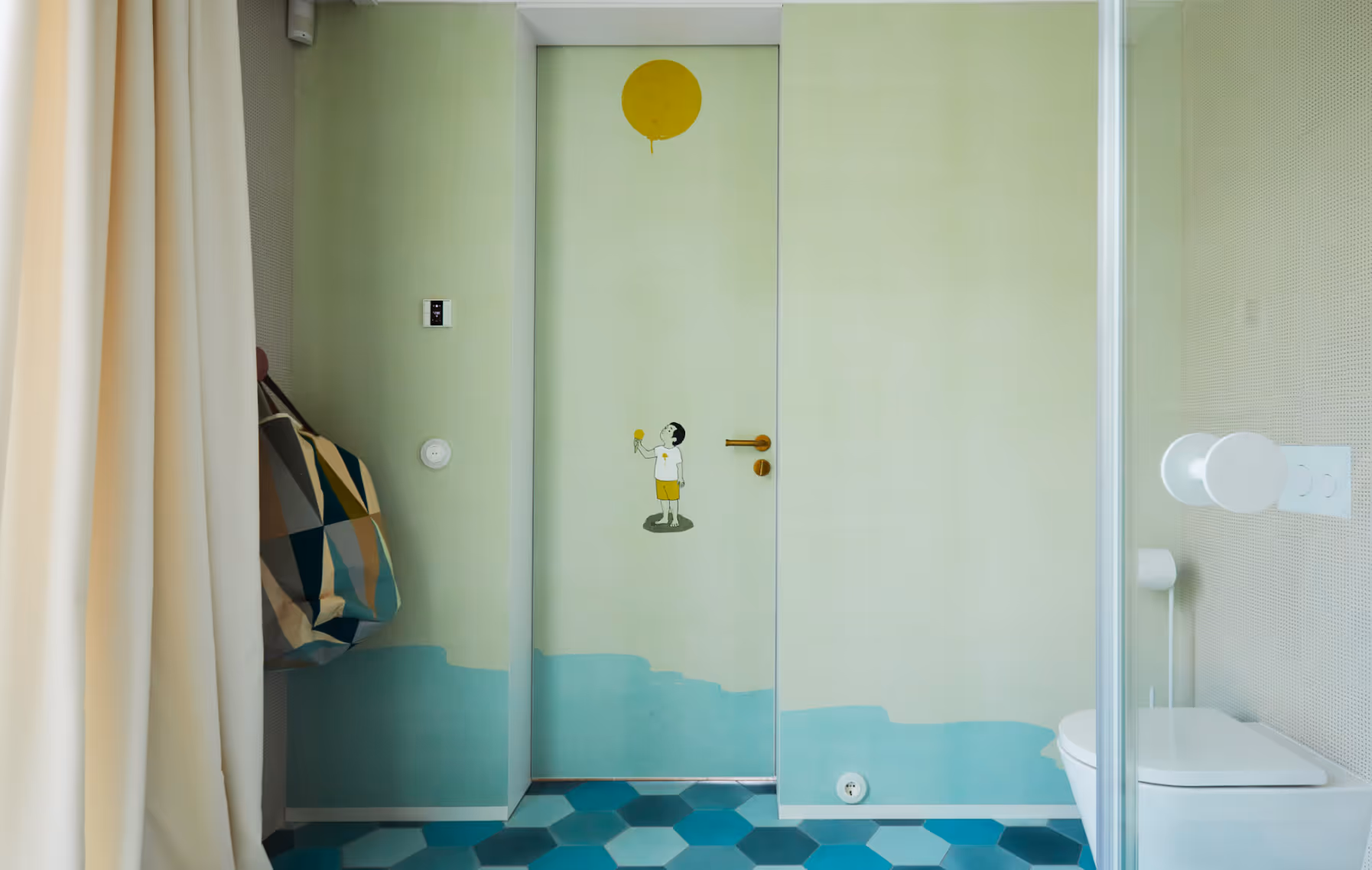
Considered equal family members, each child has their own quarters, as well as shared work and play spaces to foster creativity. Thanks to the moisture-resistant wallpaper, the children’s bathrooms feel like additional rooms rather than just space for personal hygiene rituals.
LAYOUT2
LAYOUT1
LAYOUT2
LAYOUT1
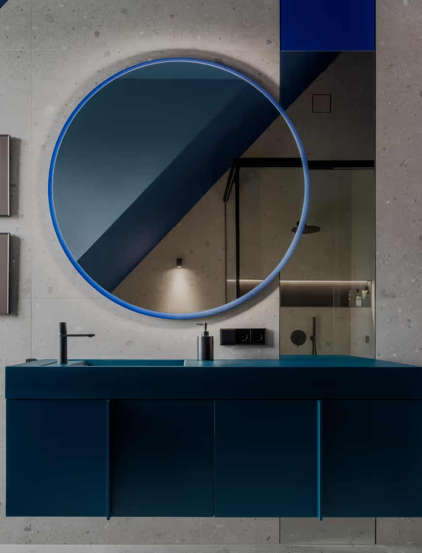
BPROM
Private Residence
Latvia
Bergi, Latvia
2025
Alvis Rozenbergs
Private Residence
Berģi
LAYOUT1
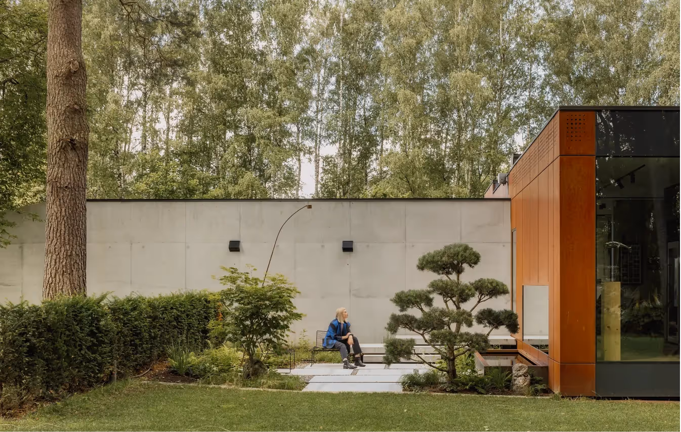
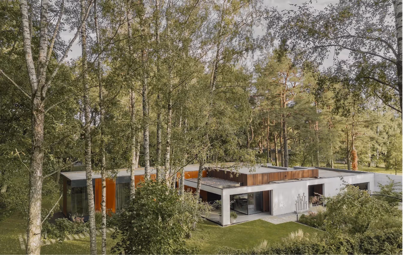
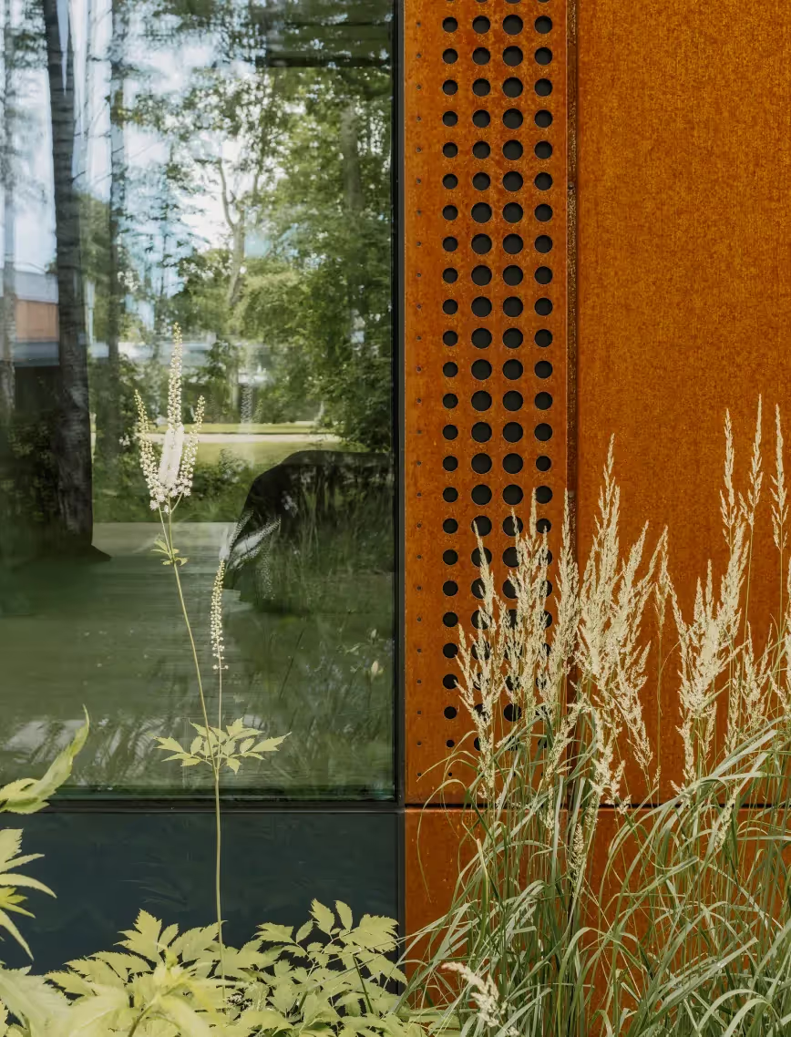
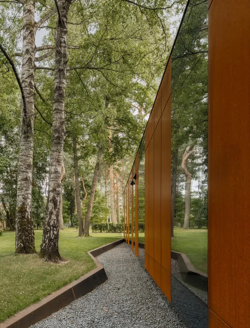
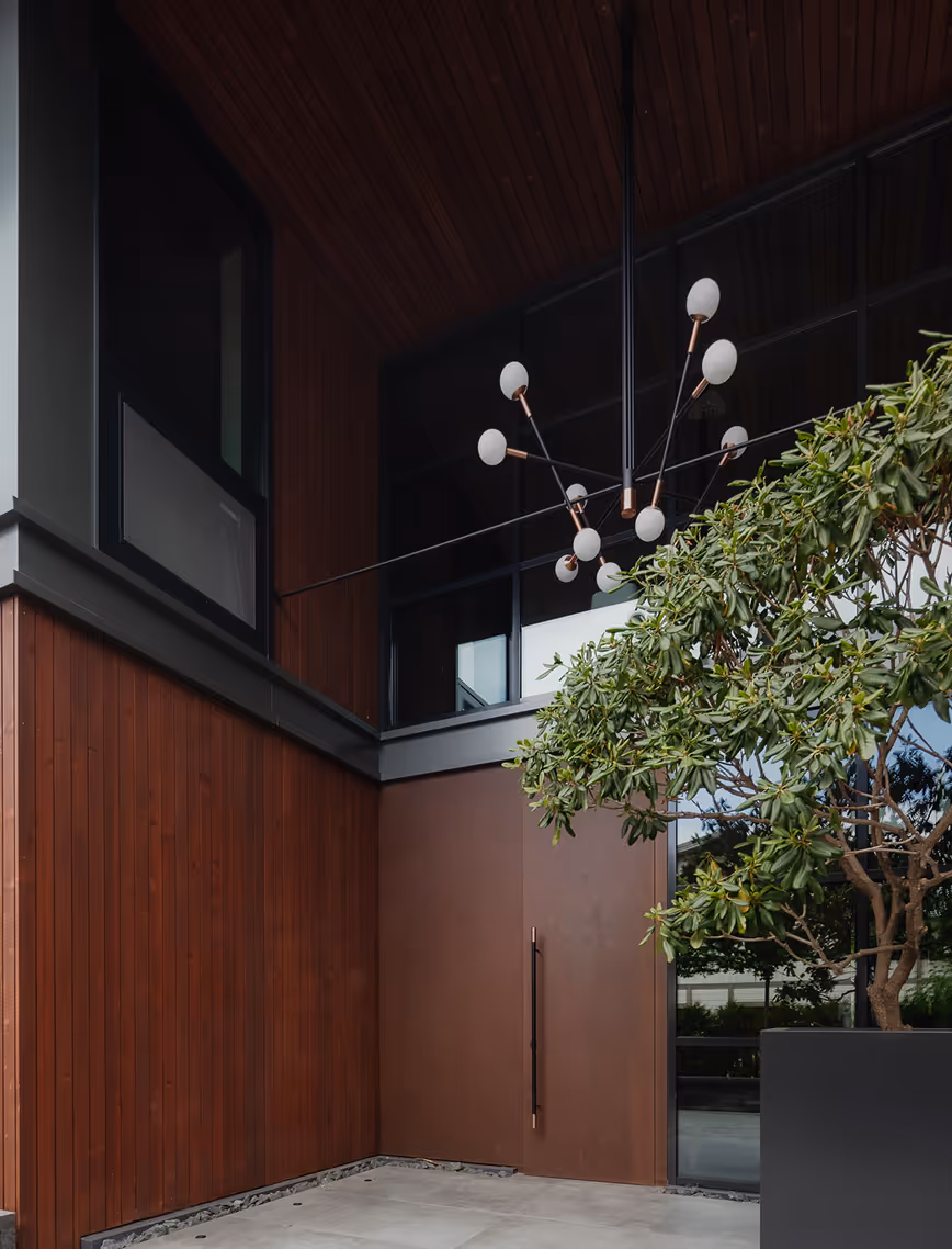
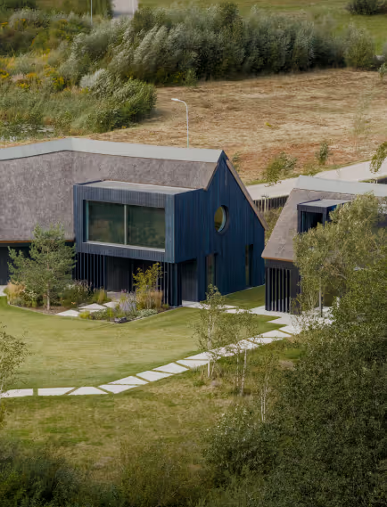
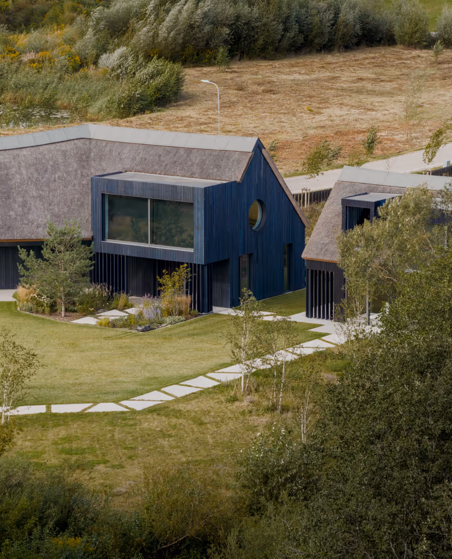
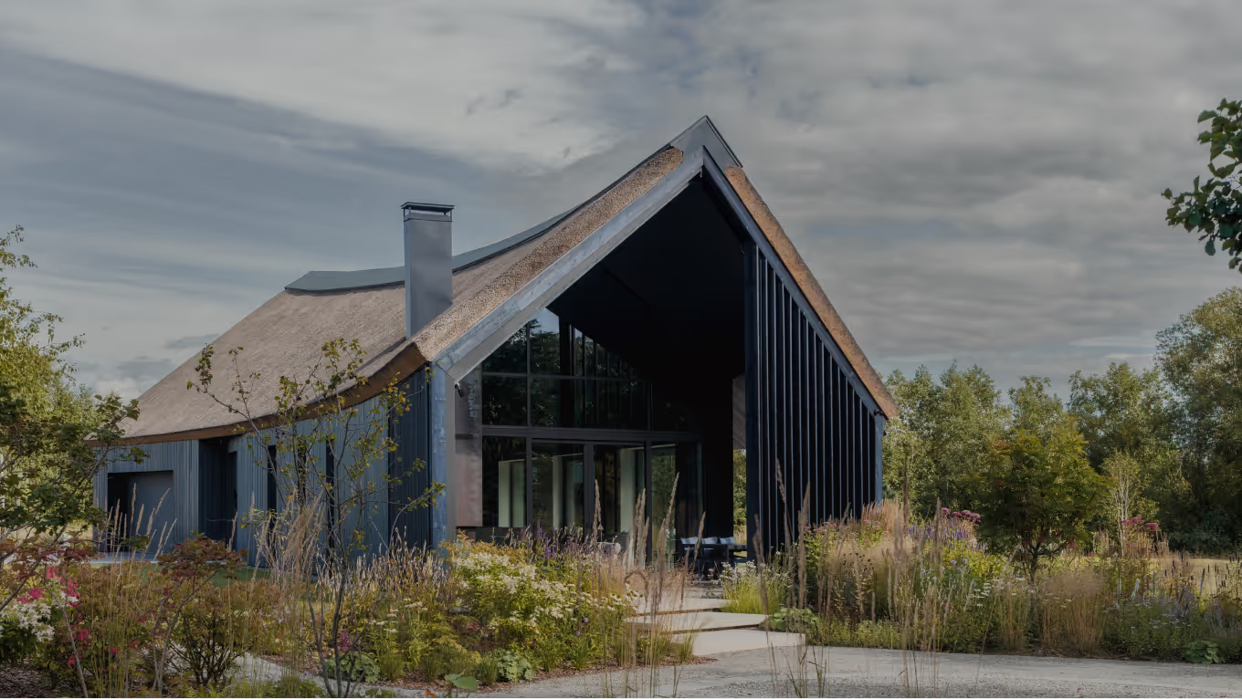
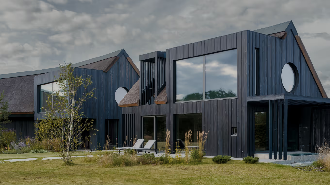
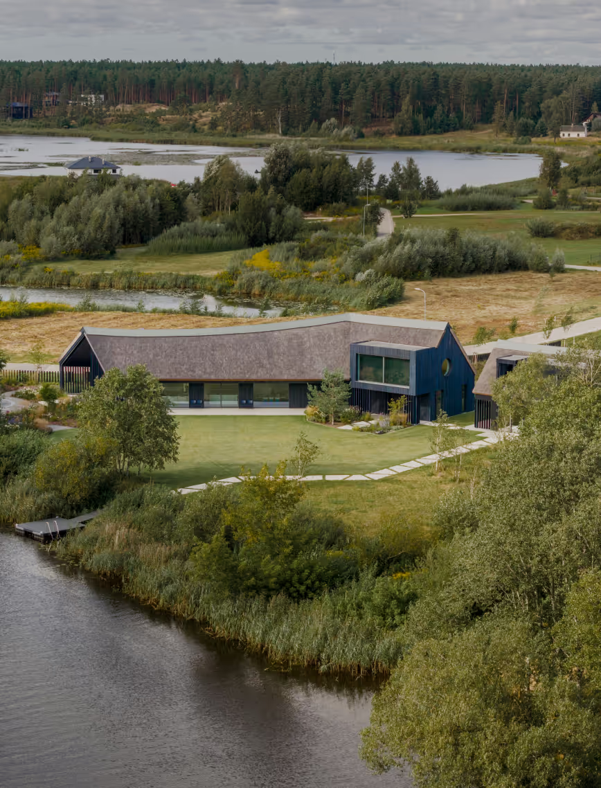
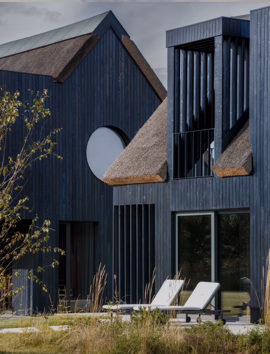
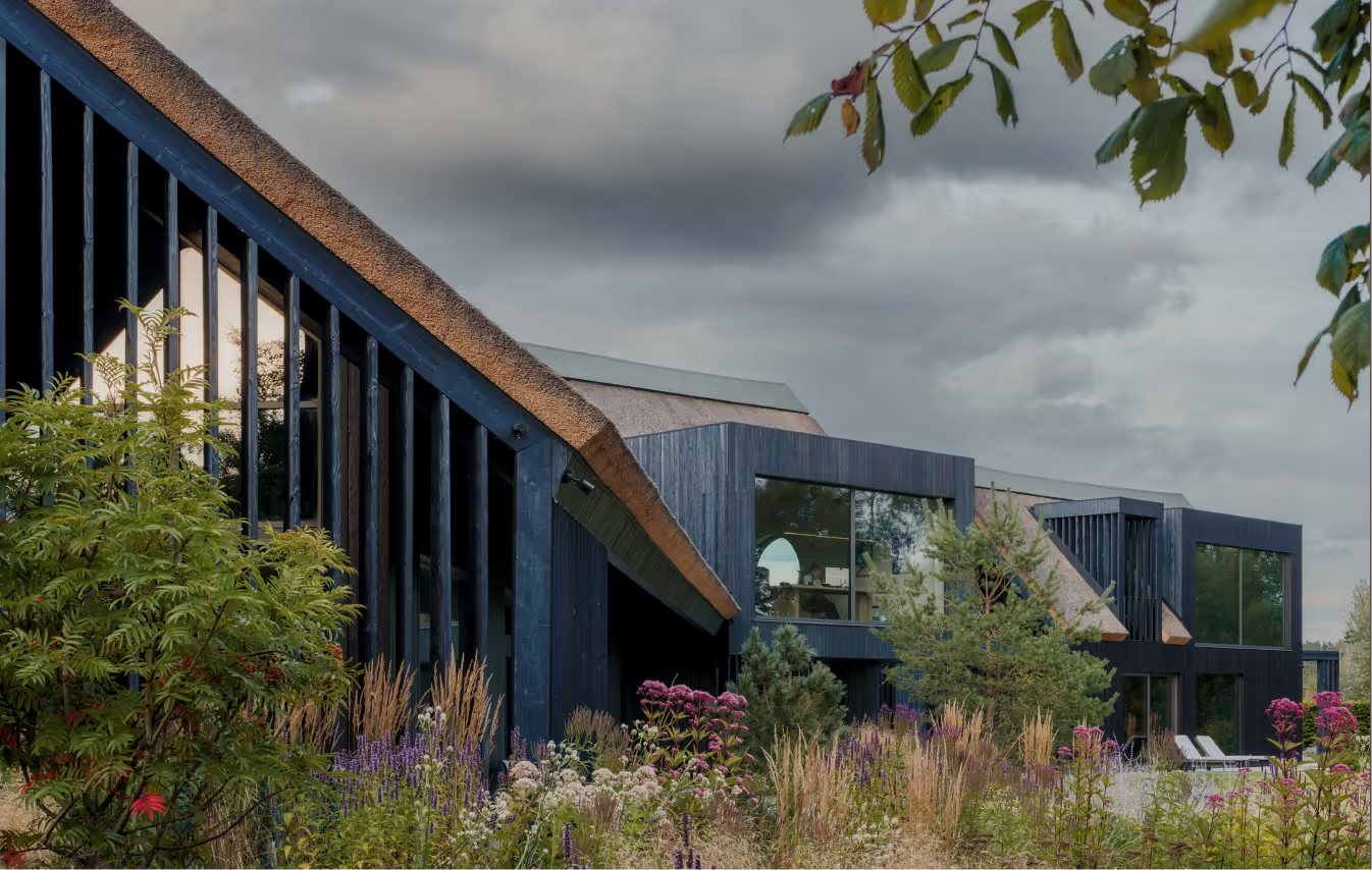
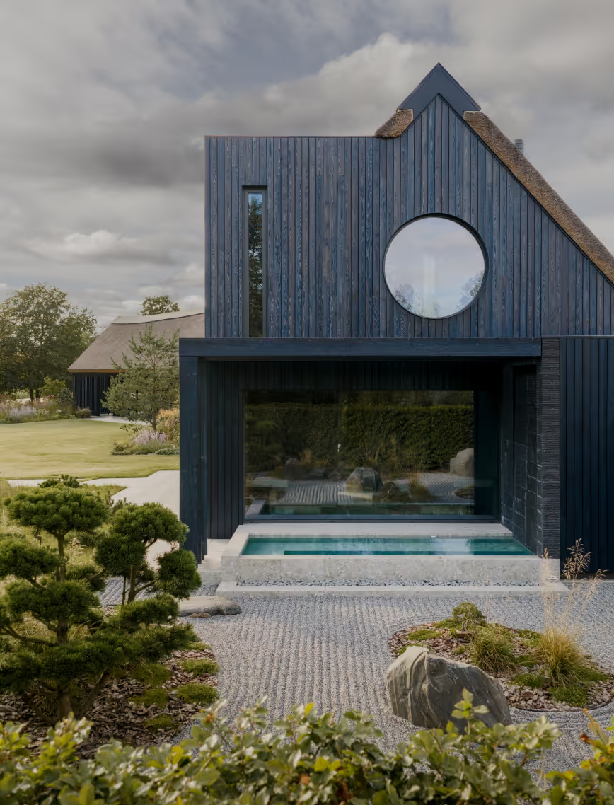
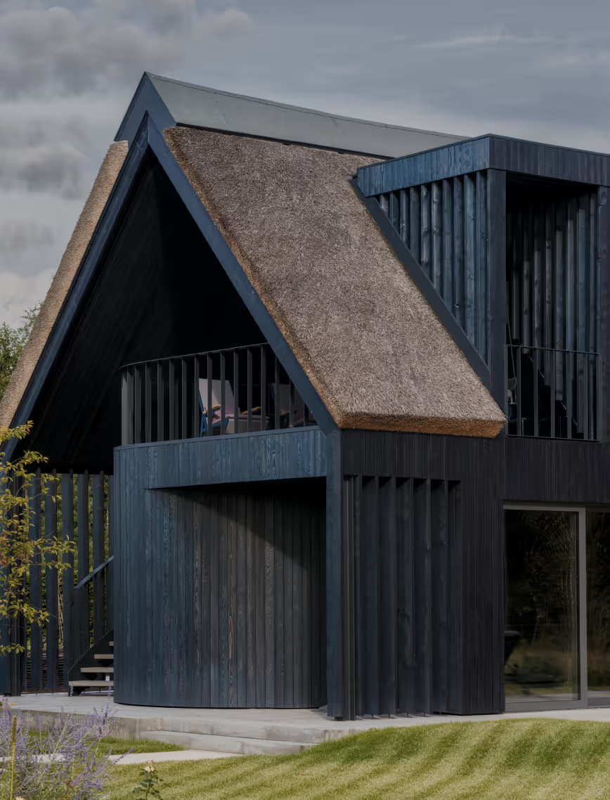
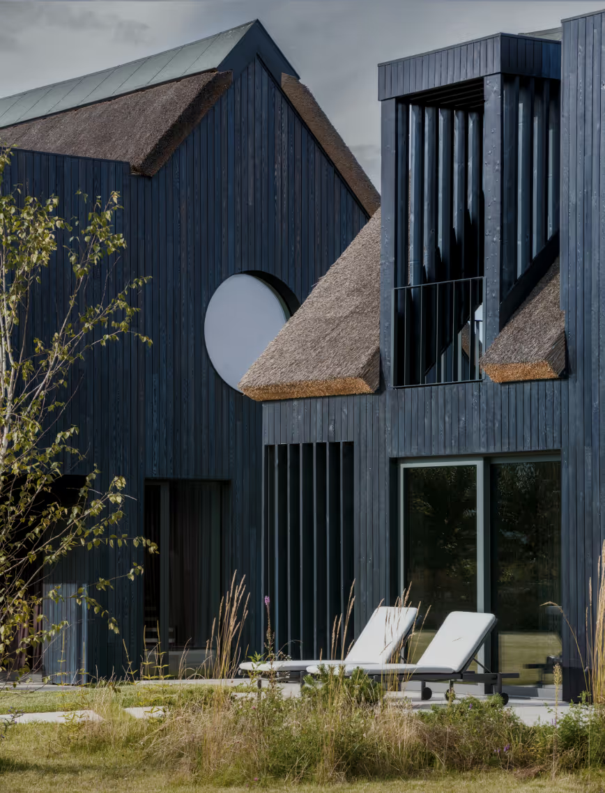
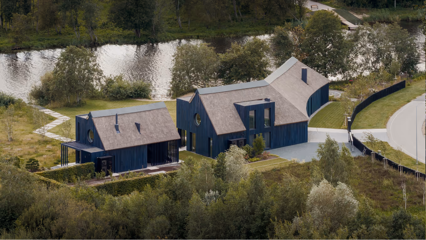
Set along a tranquil riverbank in the suburbs of Riga, the BPROM private residence pays tribute to Baltic ethnography, blending traditional character with the comforts of modern living.The architecture is deeply intertwined with the surrounding landscape, as the house bends along the natural curve of the road and river nearby, offering unexpected perspectives from every angle.
LAYOUT3
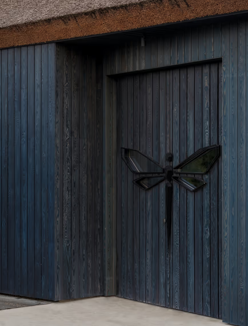
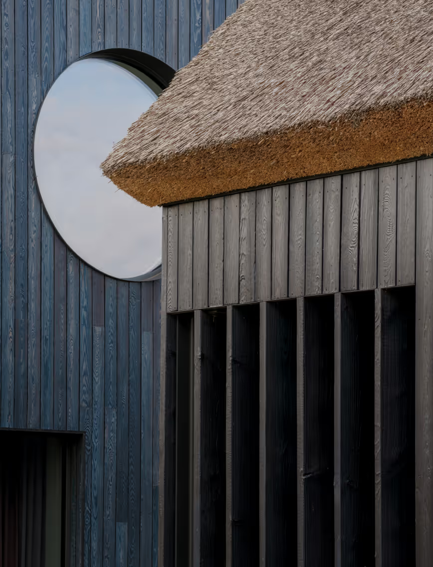
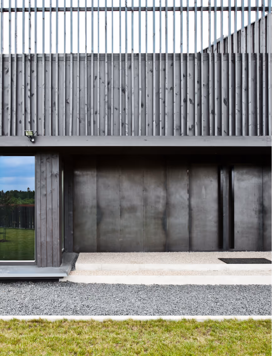
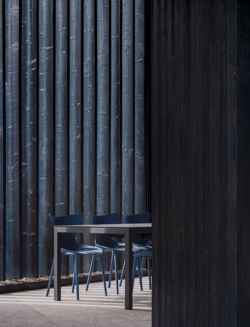
Grounded in the local craft, the project integrates forgotten materials to reveal the beauty of passing time - thatched reed roof and charred timber façade. The façade is stained in a blue pigment to mimic the creature that inspired the colour palette of the residence - a dragonfly.
LAYOUT3
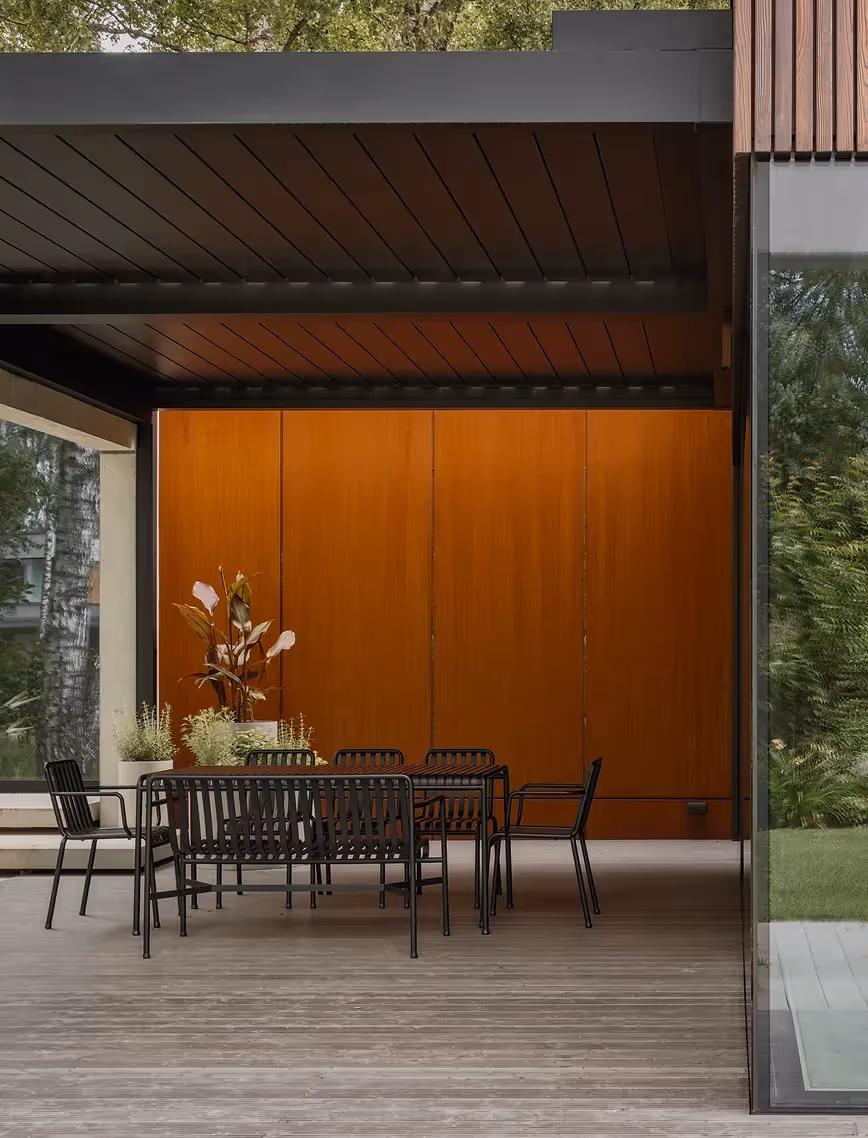
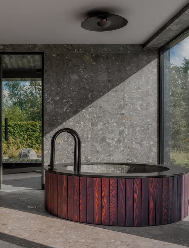
Designed as a summer holiday home, BPROM includes a main house and a guest house with wellness facilities - sauna and SPA.
LAYOUT2
LAYOUT1
LAYOUT3
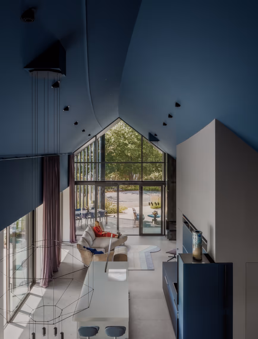
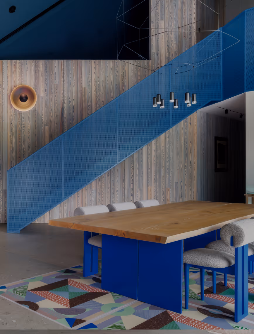
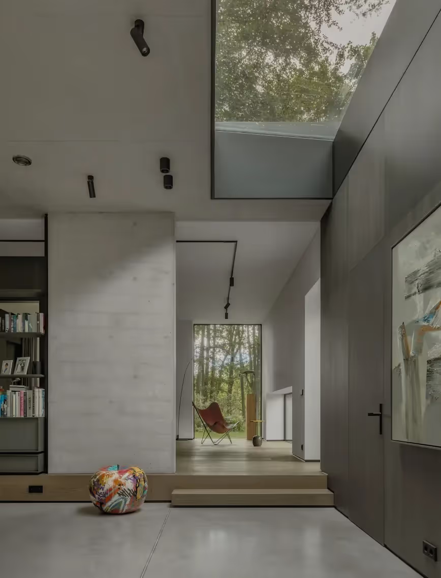
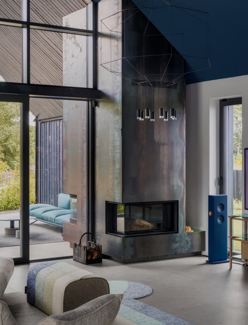
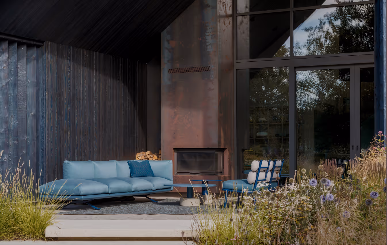
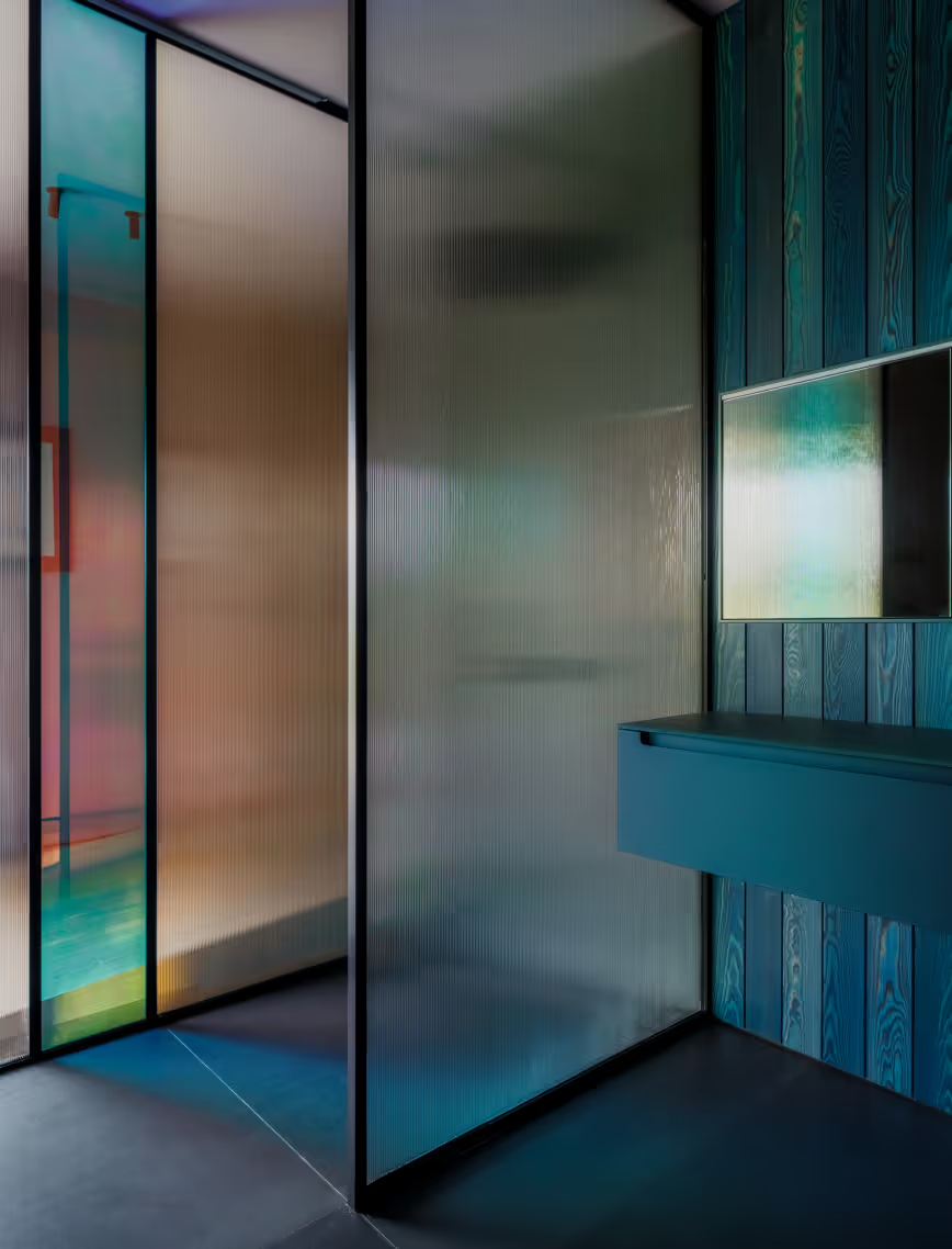
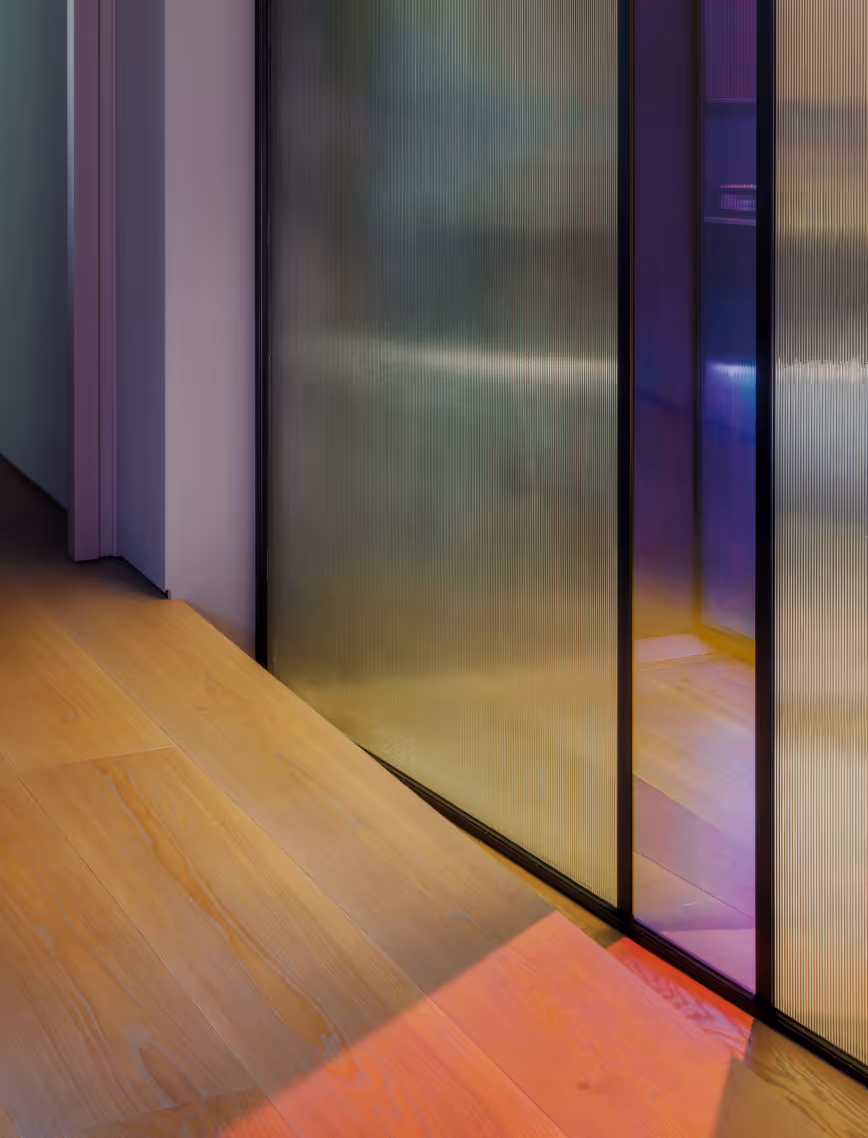
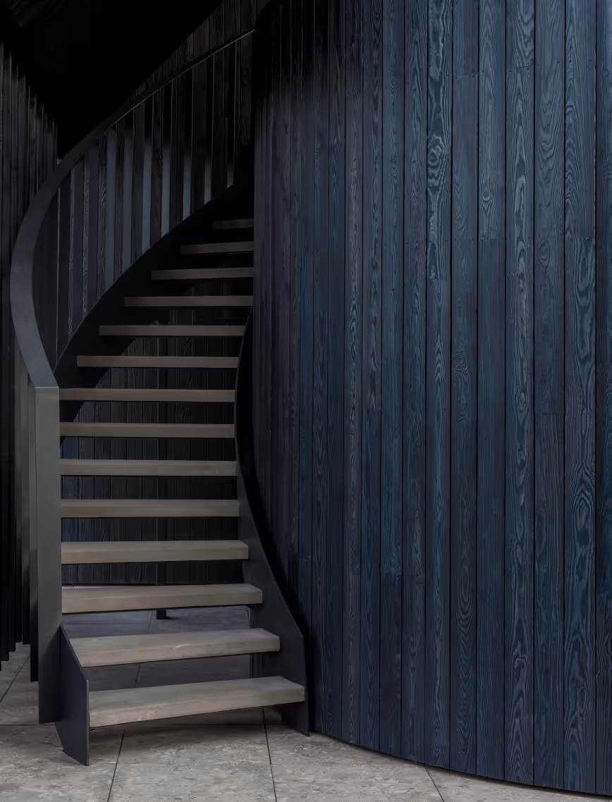
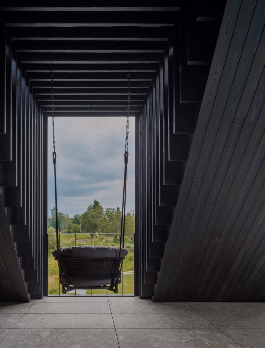
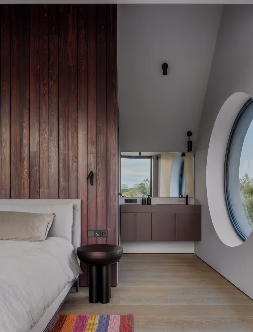
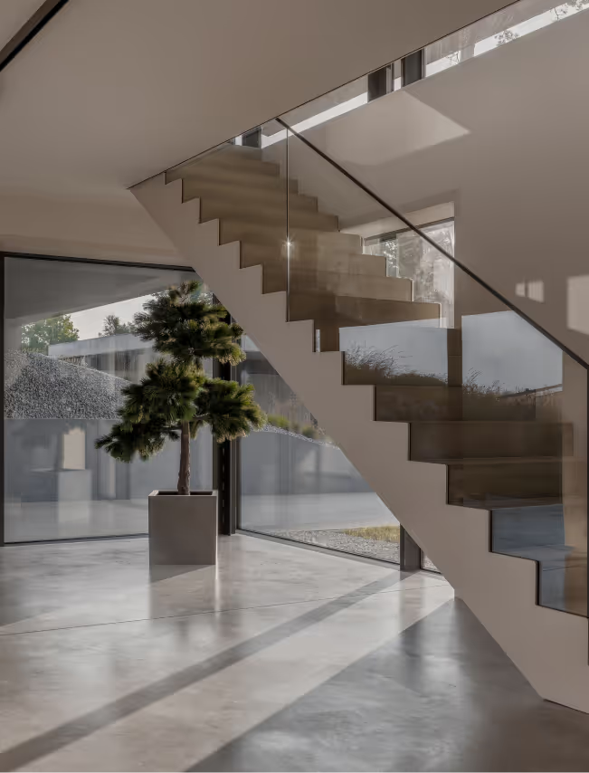
The interior is enriched with blue hues, cultivating a calming and grounding environment, while custom furniture and art pieces embody the residents’ individuality. Large windows and the translucent metal staircase work in harmony to foster a sense of openness. To deepen the connection between interior and architecture, a large metal fireplace extends both inside and out, appearing as a reflection across both spaces.
LAYOUT3
LAYOUT2
LAYOUT1
LAYOUT3
LAYOUT3
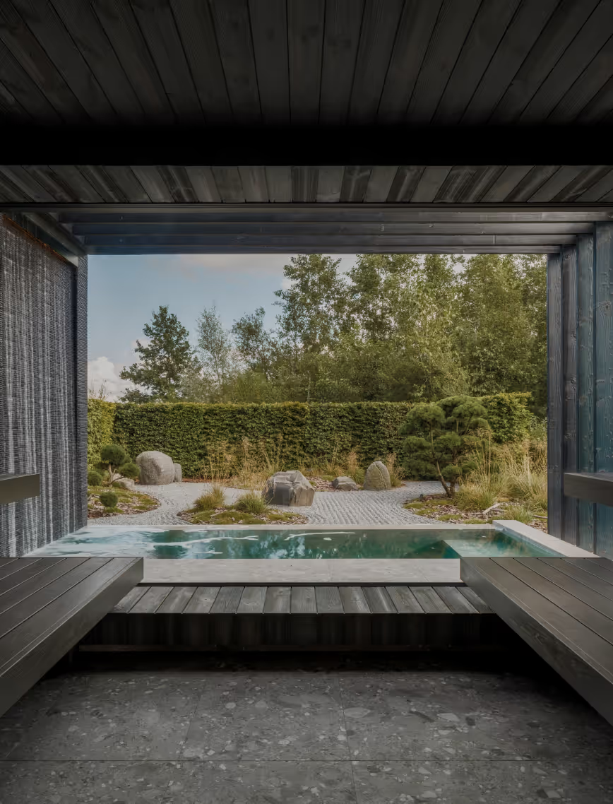
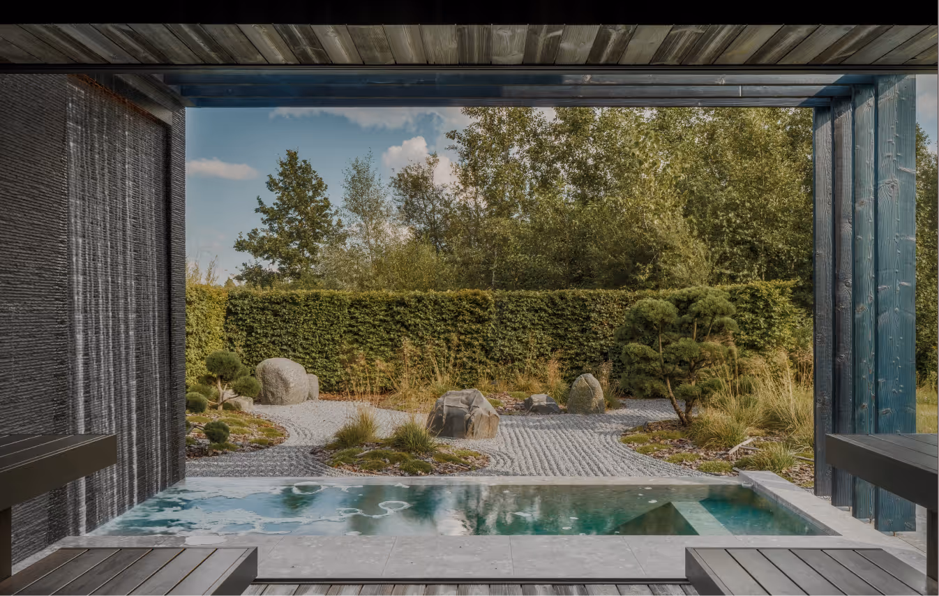
Baltic seasons are unimaginable without regular visits to the pirts - a ritual deeply woven into the local culture and architecture. BPROM residence was designed and built as a holiday home for restorative living, with the sauna house offering an intimate space to pause, take a deep breath and find strength through ritual and relaxation.
LAYOUT3
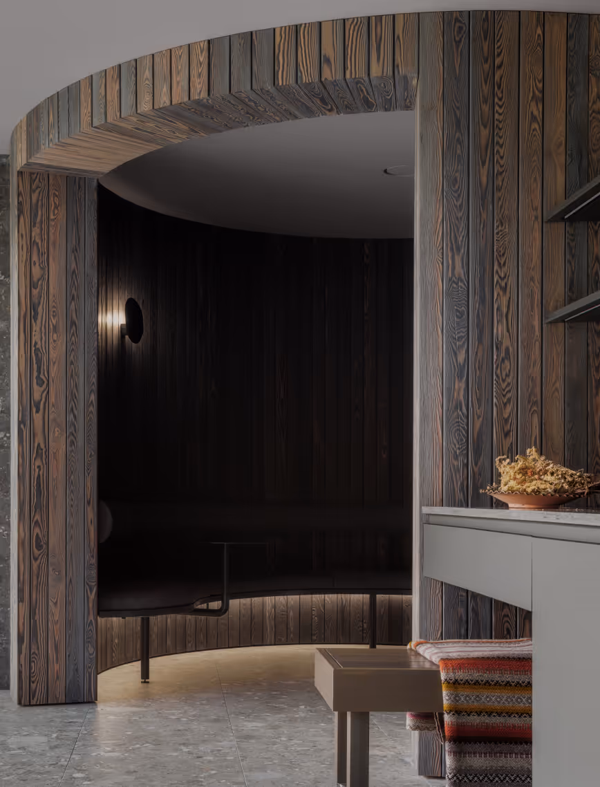
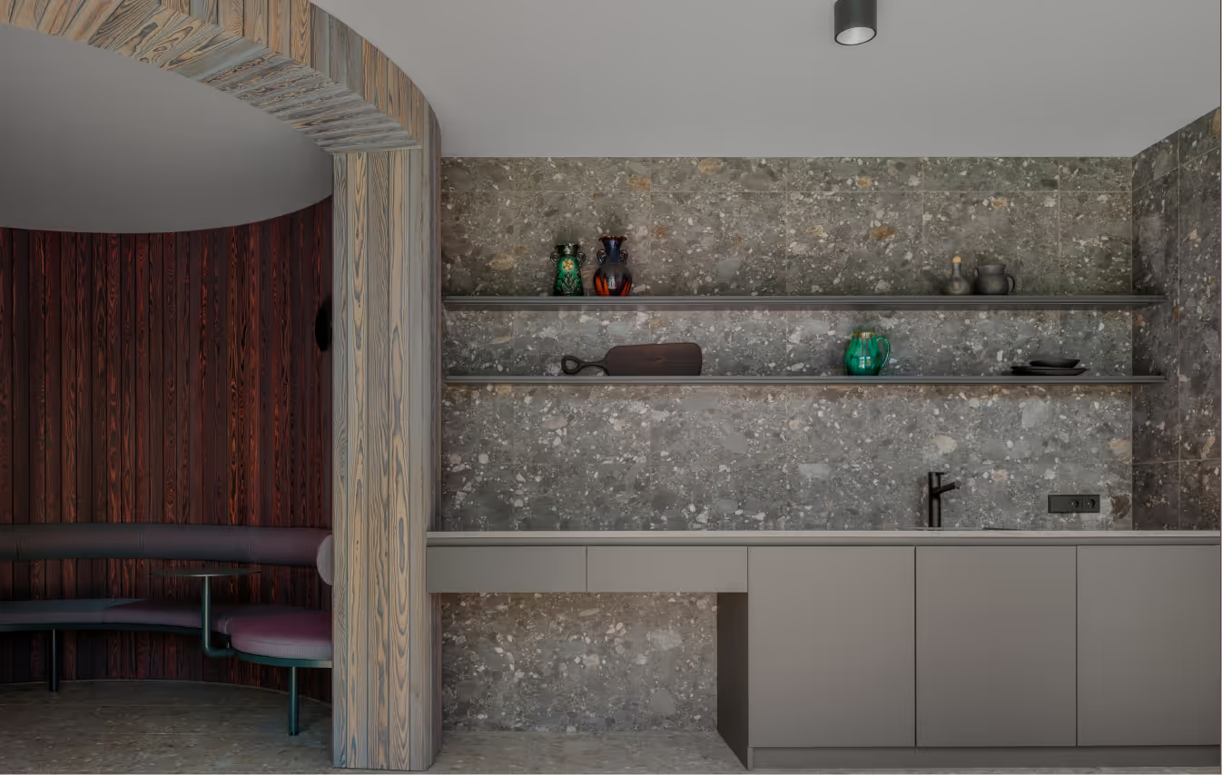
LAYOUT1
Here, various zones are blended into a recreational oasis. First, guests are welcomed into a kitchen and lounge area, softly illuminated by concealed lighting that sets a meditative atmosphere. The circular geometry of the lounge creates a natural focal point, promoting interaction and a sense of acceptance within the space. The pirts provides a calming view of the Zen garden, its stillness interrupted by a waterfall pool. Carefully nurtured by the homeowners, the Zen garden establishes a continuous dialogue between architecture and nature.
LAYOUT2
LAYOUT3
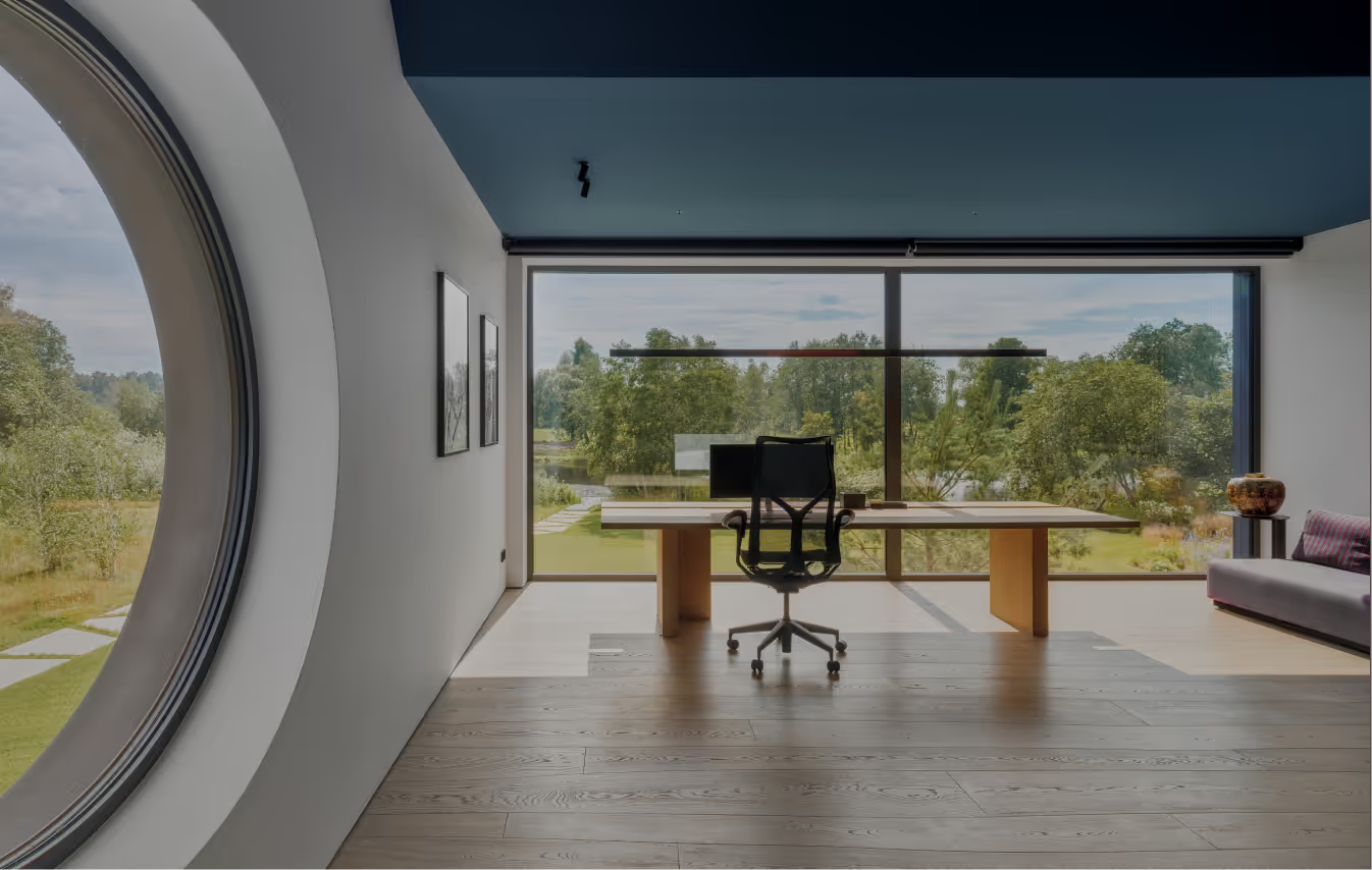
SAR
Private Residence
Latvia
Saraiki, Latvia
2024
Alvis Rozenbergs
Private Residence
Saraiki
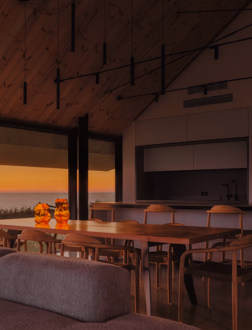
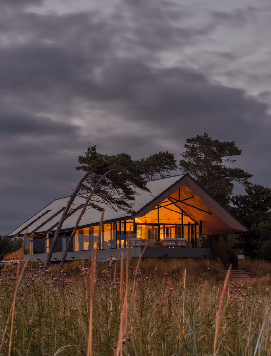
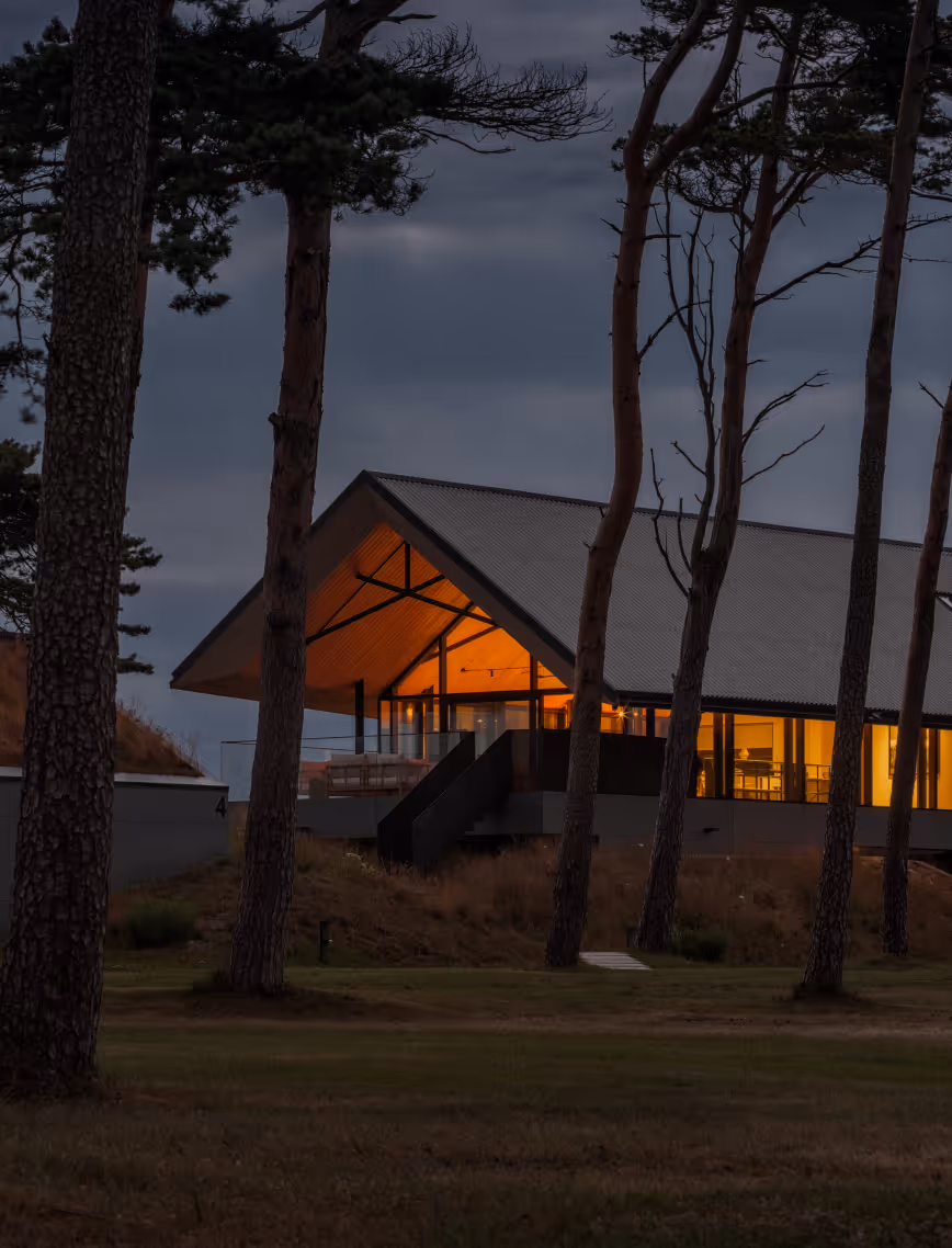
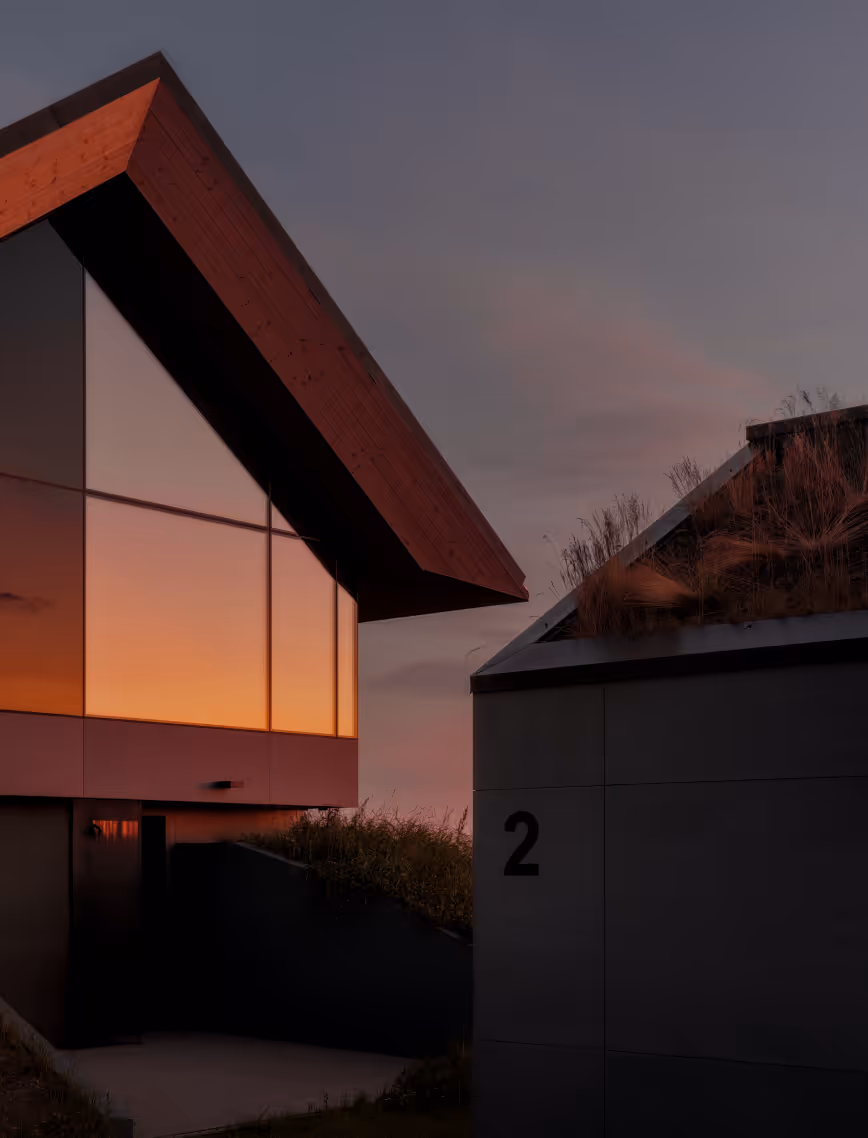
LAYOUT1
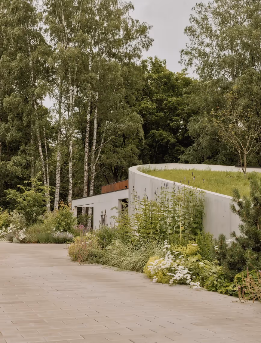
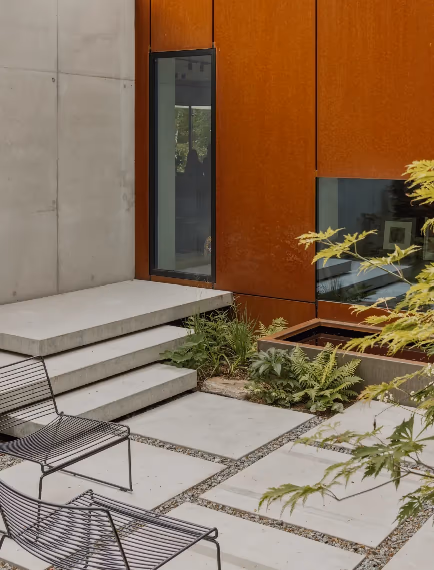
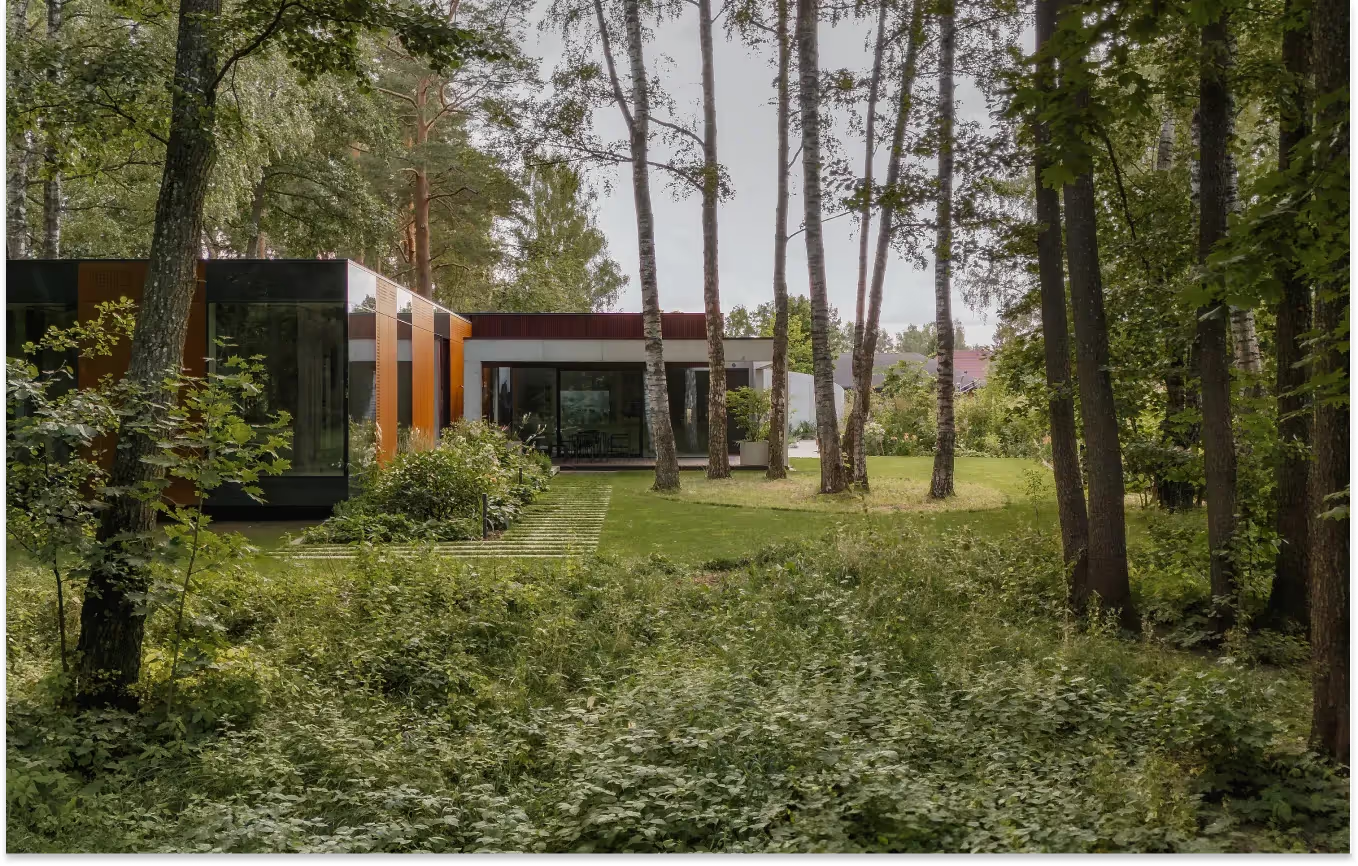
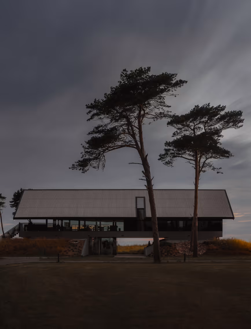
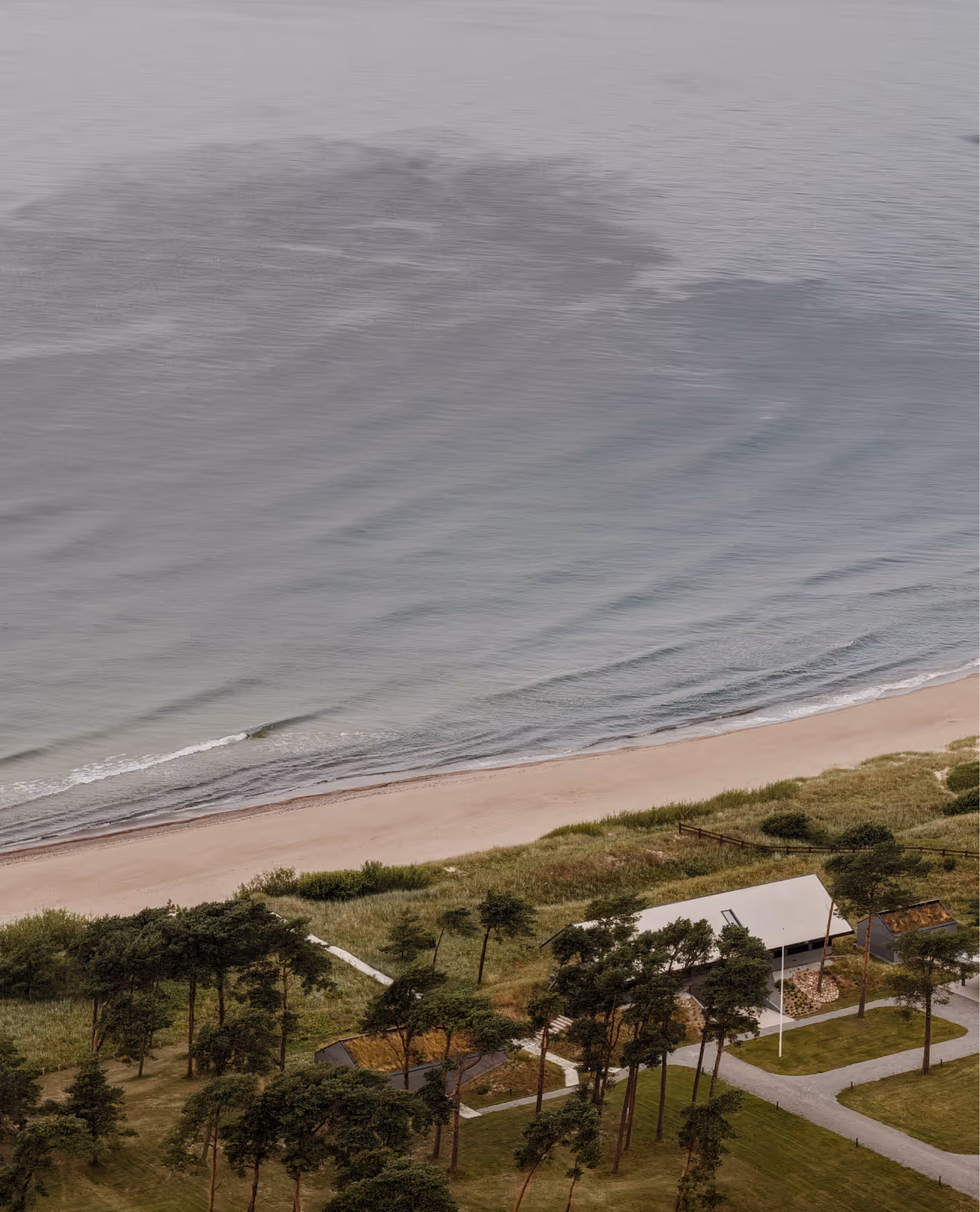
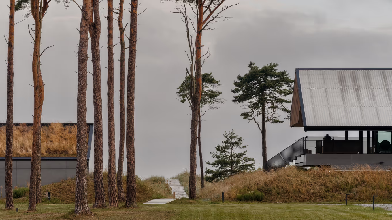
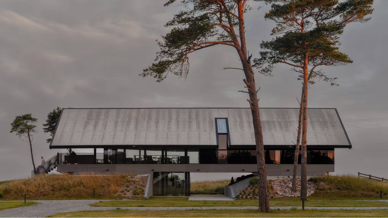
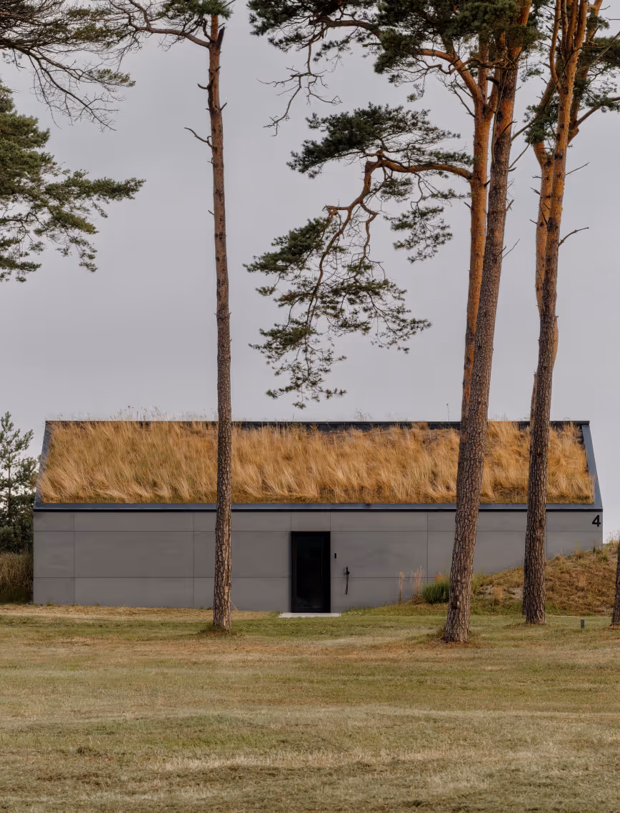
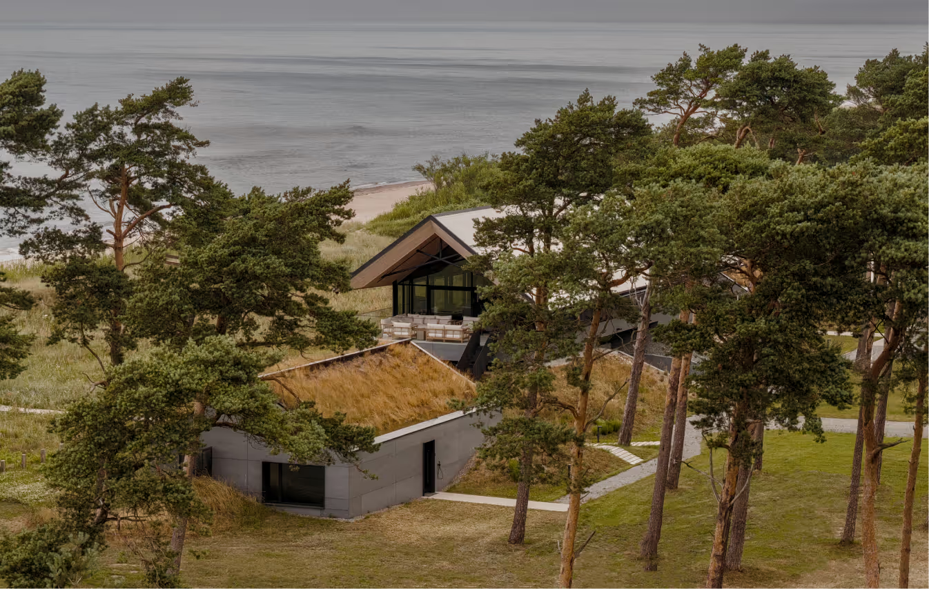
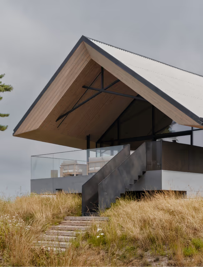
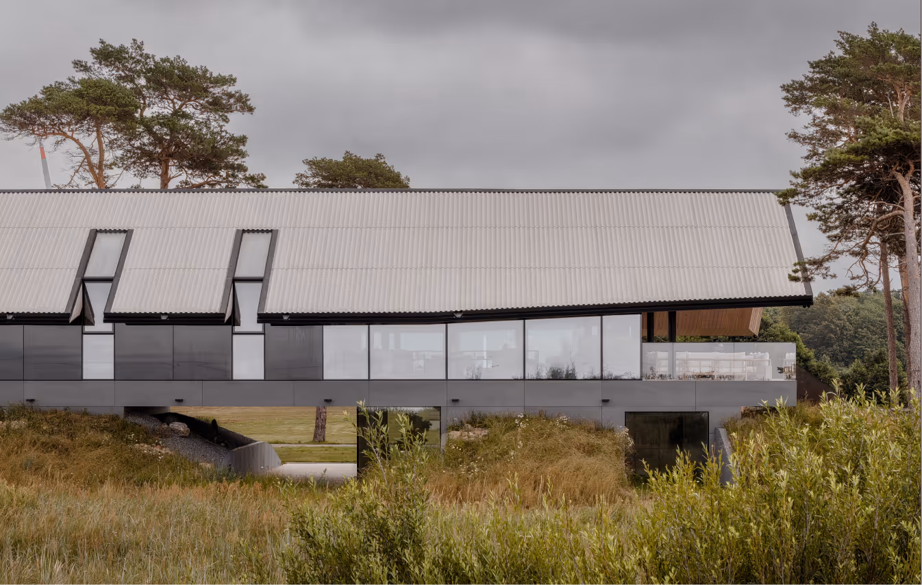
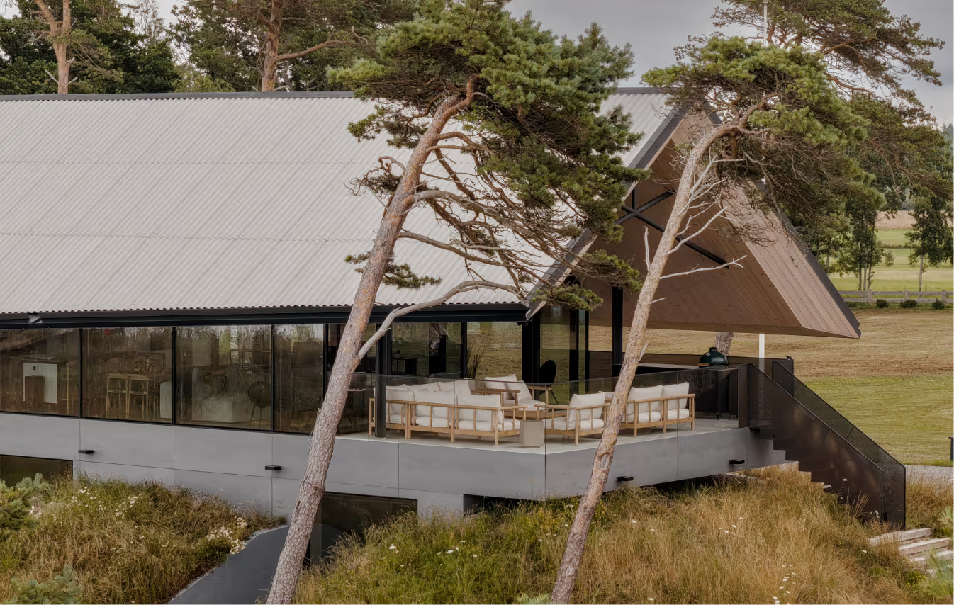
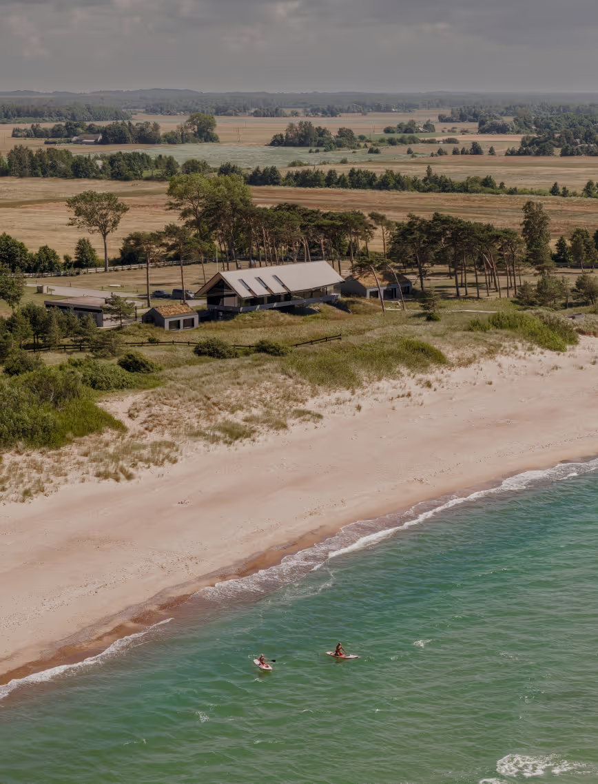
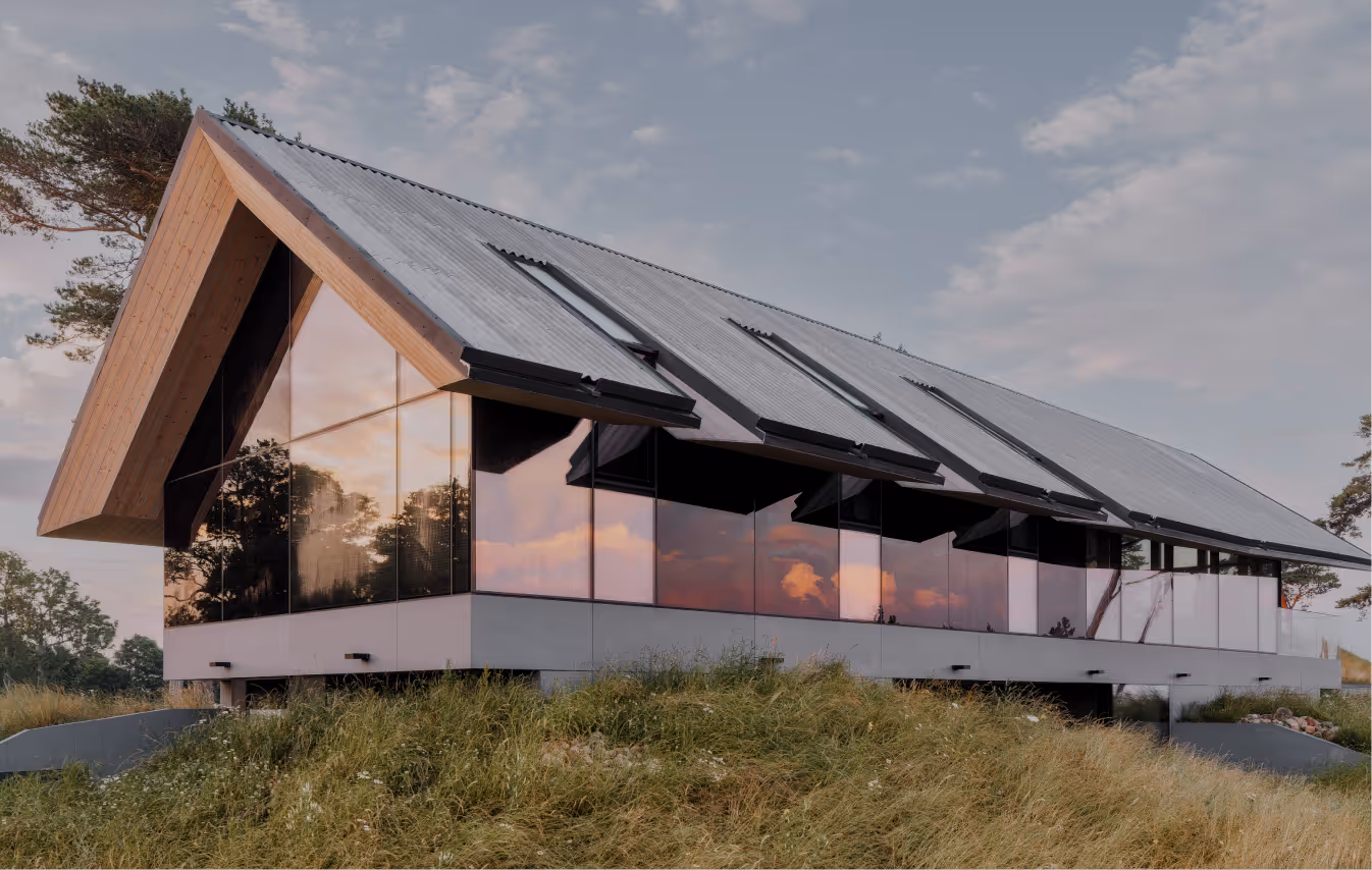
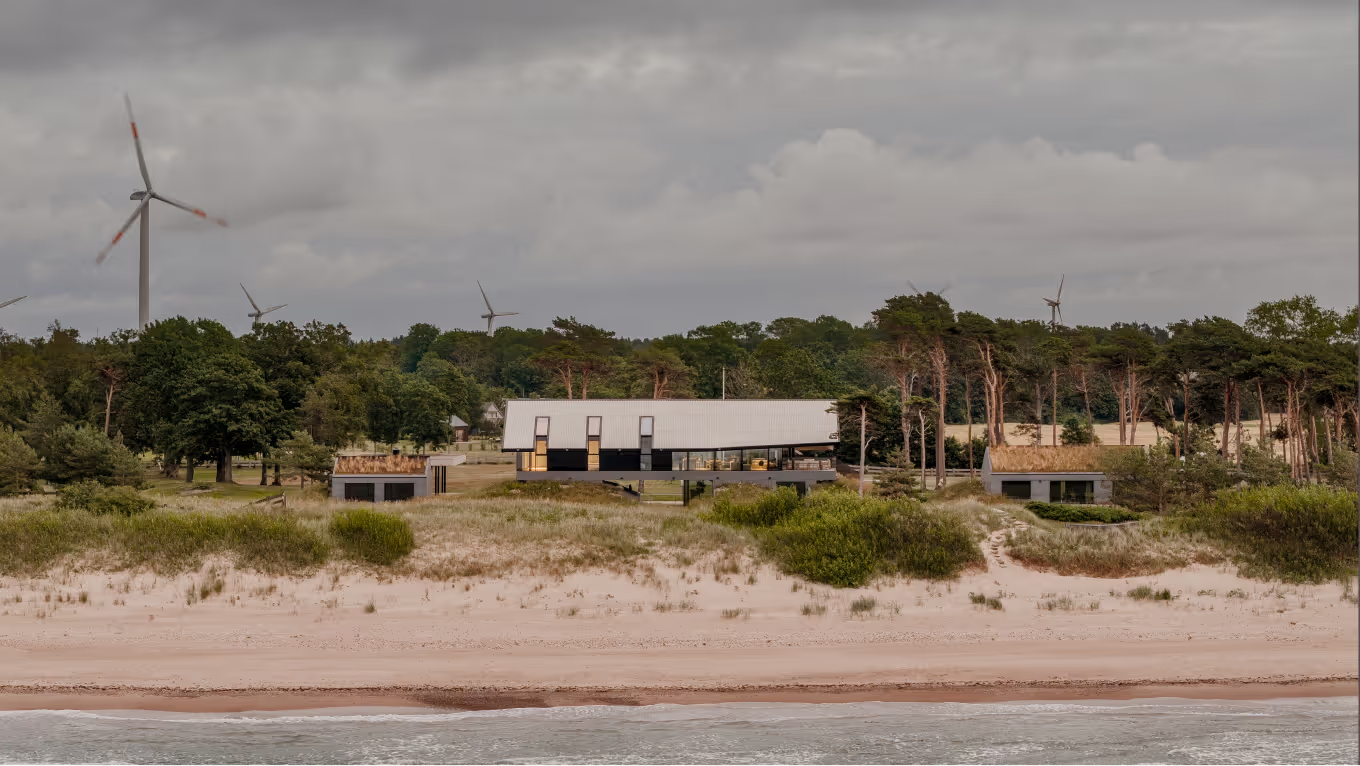
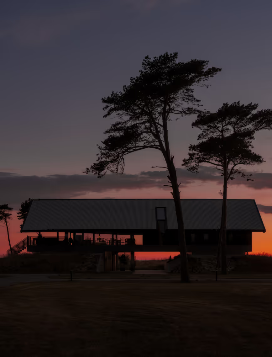
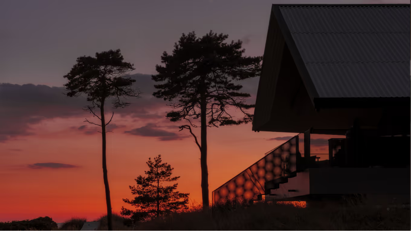
Constructed on historic foundations of Soviet-era military units to safeguard the Baltic coastal area as one of the world’s most vulnerable marine regions, this seaside home introduces an alternative path of sustainable architecture. Designed as the holiday retreat for a family of three generations, the minimalistic and raw structures seamlessly blend with the untamed wilderness, revealing a modern interpretation of the intricate local history.
LAYOUT3
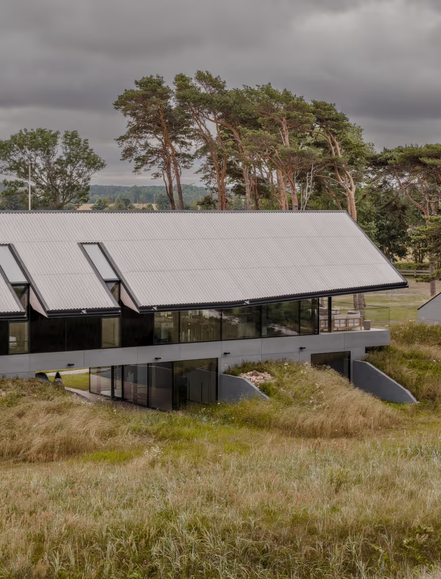
The project explores the role of a shelter within the domestic environment. Situated at the doorstep of the ever-approaching sea, the bold structures lay grounded against the harsh northern winds. The site was discovered with grass-covered and timeworn military bunkers, now transformed into one residential building and two guest houses.
LAYOUT1
LAYOUT2
LAYOUT3
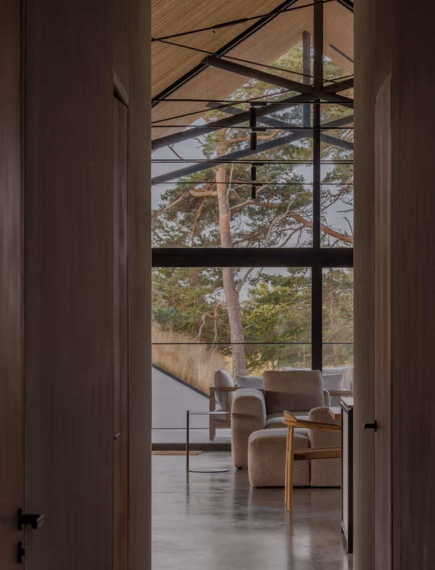
The essence of the main family house lies within its pronounced dual-sloped roof. While compliant with the local architectural regulations, it is redefined through a contemporary expression of fibre-cement panels, drawing a link to the Soviet-era architecture.
LAYOUT2
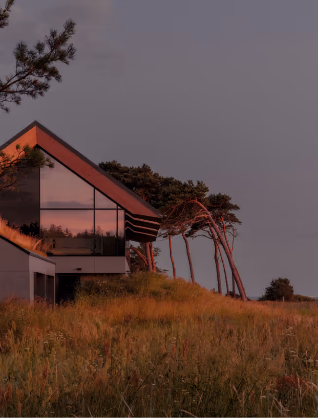
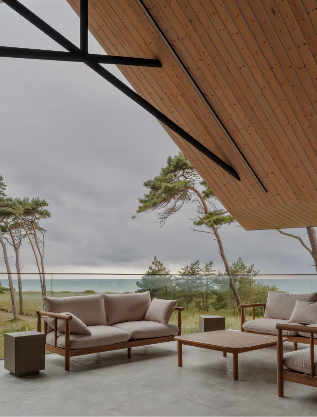
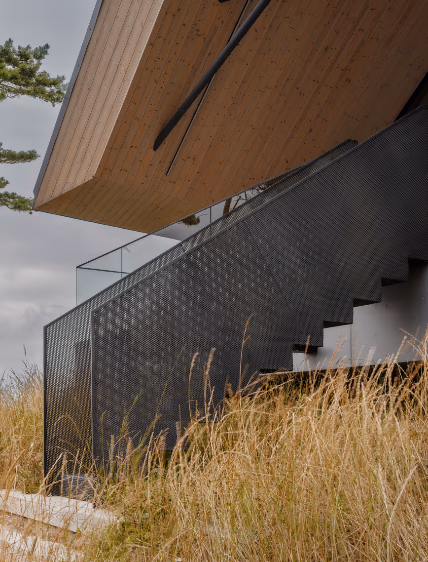
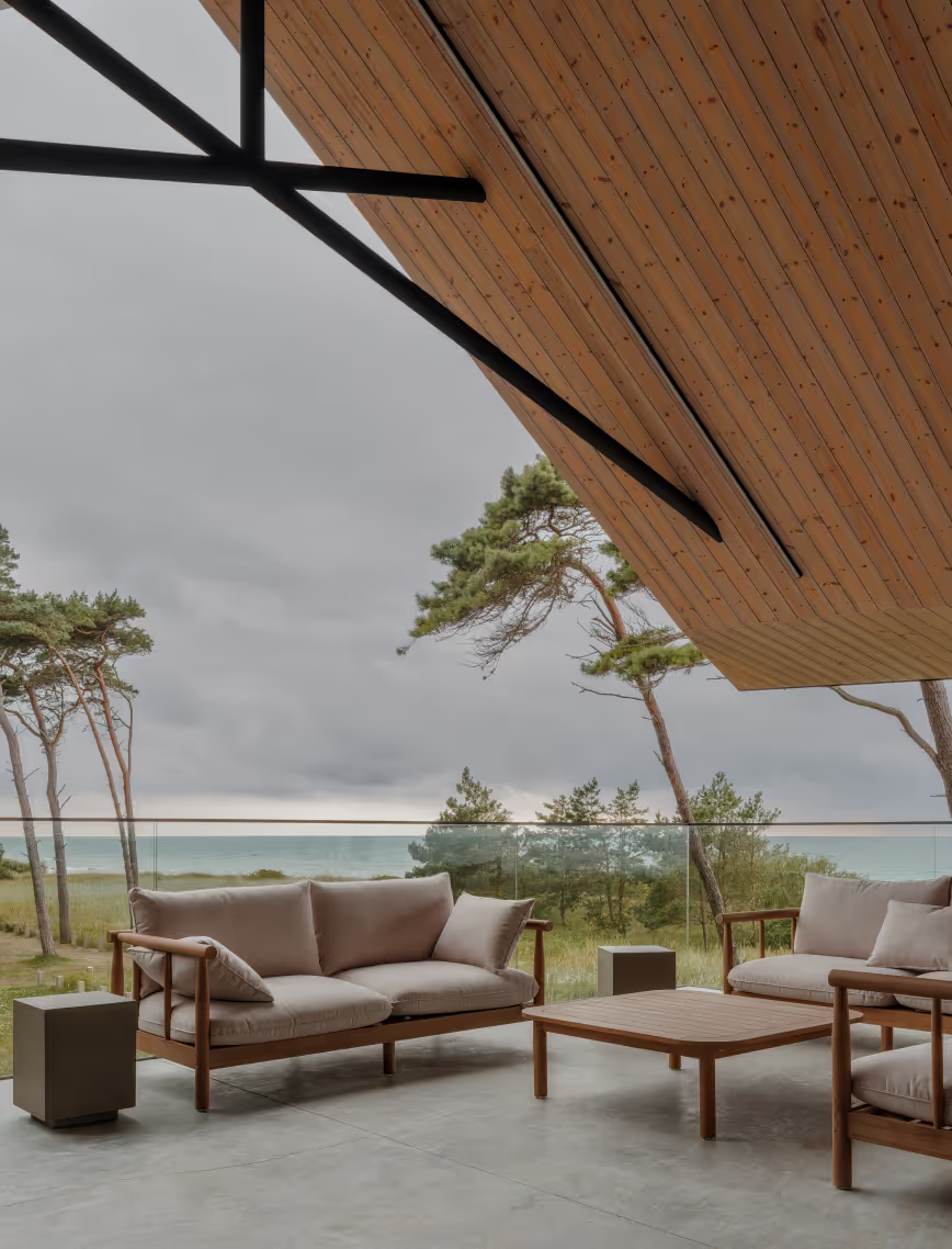
On the south side, the roof features deep upward-sloping overhangs designed to shield from summer heat while simultaneously filling the interior with natural warmth and light. Faced with the technical challenge of anchoring the massive roof over a glass facade, we developed a tailored metal frame that serves both as a structural and design element.
LAYOUT1
LAYOUT3
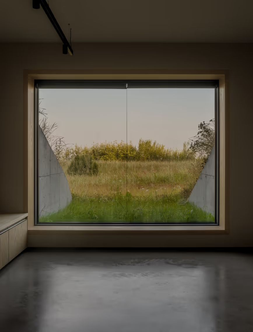
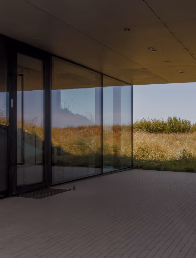
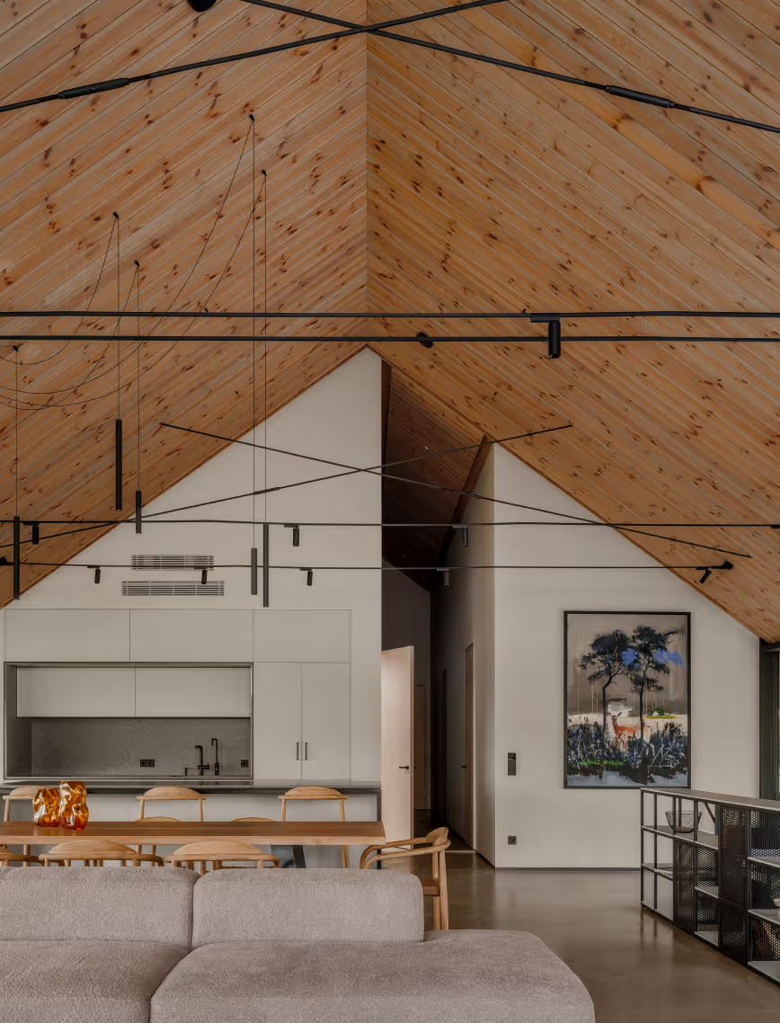
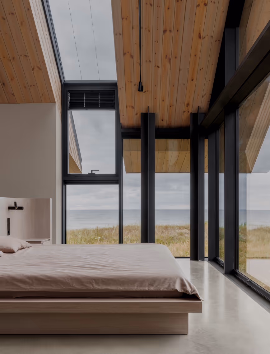
Life in the main house begins on the second floor, with the entrance tucked below the grand structure. Living spaces open toward the horizon of the Baltic sea, filling the family’s shared area with a sense of openness and purpose. Hovering above the ground like a cast-aside sailing ship, this is a home that does not conquer the land, but lives lightlyuponit.
LAYOUT2
LAYOUT3
LAYOUT2
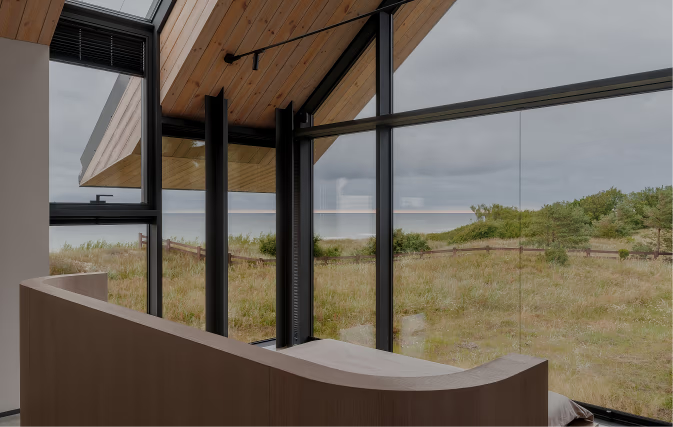
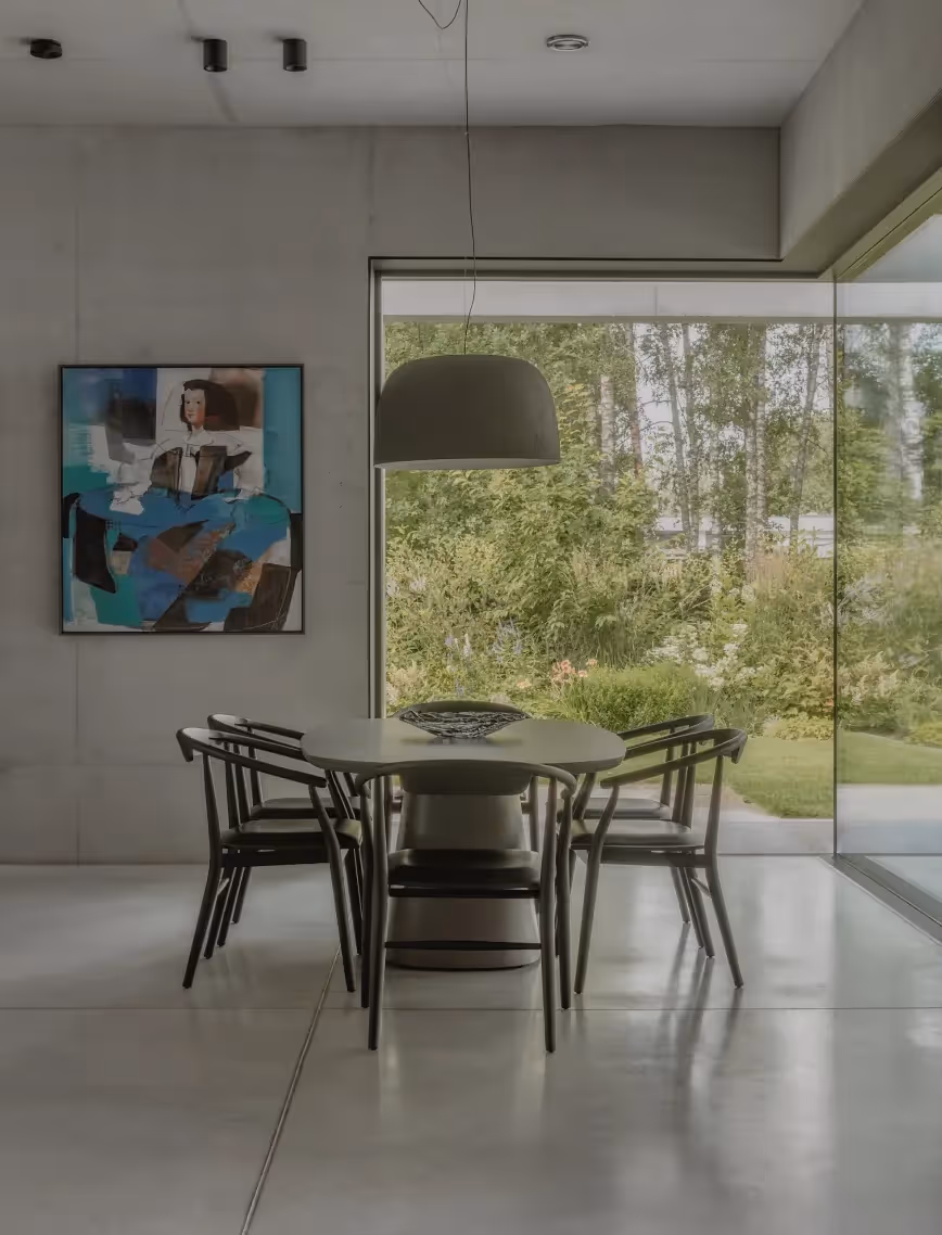
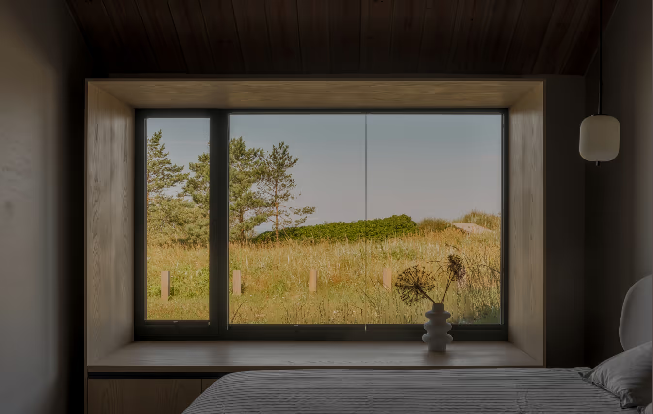
Inside, the architectural language is restrained, ascetic, and raw. Here, nature leads and architecture follows. The layout is designed to encourage residents to follow natural rhythms of life - the terrace and main living space are filled with morning light, while windows in the master bedroom capture sunset views of the Baltic sea. Transparent glass façade reinforces the connection to the land below, dissolving the boundary between the natural environment and man-made space.
LAYOUT1
LAYOUT3
This project is a poetic gesture. A human instinct to get closer and closer and closer. Here, we touch the sea with our fingertips, bowing to the ancient dunes and pines, seeking safety in familiar hands. Here, we embrace the aura of the Northern skies, standing above the horizon so vast, surrendering to the beauty of poetry.
LAYOUT3
.avif)
MOON RIVER
SPA
Latvia
Jurmala, Latvia
2015
Maris Lapins
SPA
R.evolution
LAYOUT1
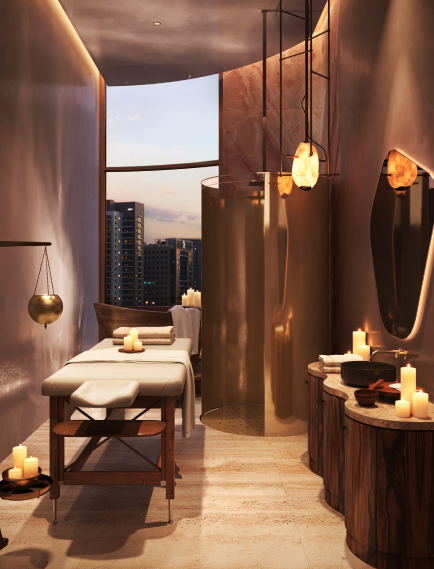
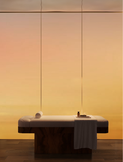
The ground floor of Villa Hepburn will host a corner for relaxation and health. Training in the gym equipped with a cardio trainer or in the yoga hall is a great way to recharge yourself with life’s energy. The spa complex will be open at any time of the year to help to regain your inner balance and relax. The large swimming pool, steam room, sauna, hot tub and a relaxation room will be accessible only to the residents of LEGEND. and their guests. In two massage rooms you will be able to get a full range of anti-aging and wellness treatments for your face and body, provided by leading Latvian spa specialists.
.avif)
LAYOUT2
.avif)
.avif)
LAYOUT1
.avif)
.avif)